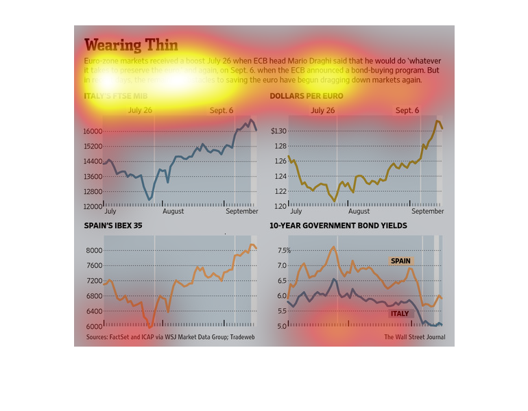
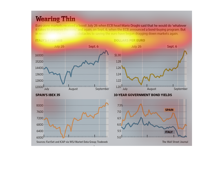
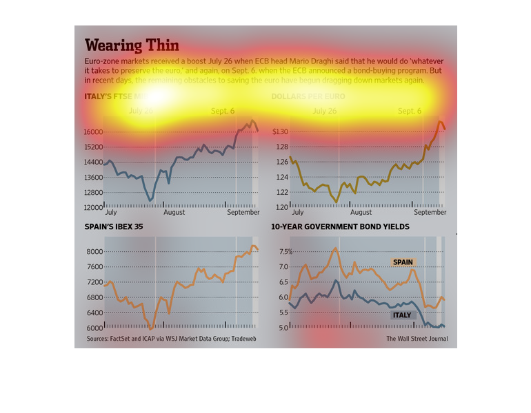
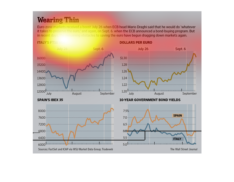
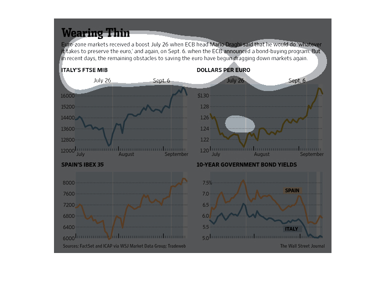
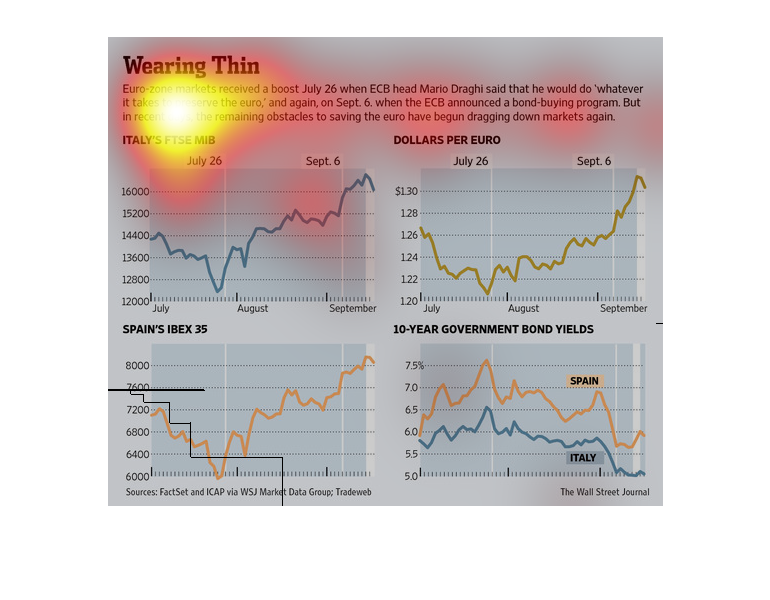
This data shows that Euro zone markets received a boost July 26 when ECB head Mario Draghi
said that he would do whatever it takes to preserve the value of the Euro.
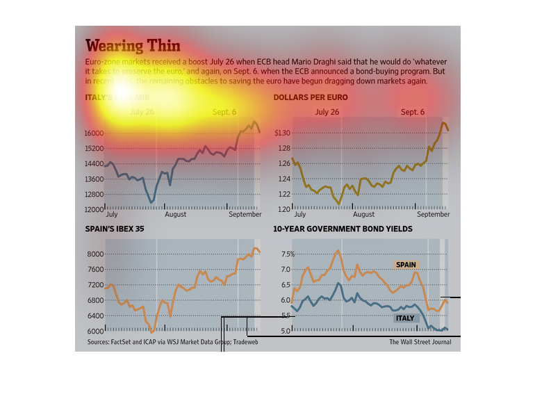
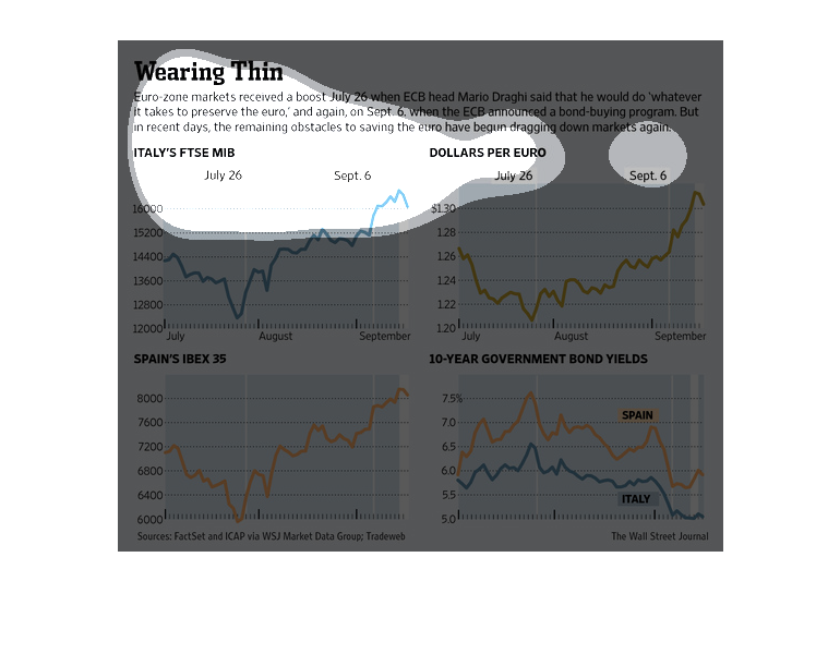
The image above is dealing with the value of the Euro and the effect of the bond buying program
that was introduced in July. It shows four different graphs: the first has something to do
with stocks in Italy, the second is the value of the euro compared to the dollar, the third
is maybe stocks in Spain, and the fourth I believe shows the bonds bought in Spain and Italy.
This is a series of charts depicting the rise with continued positive statements that action
would be taken to right the economy, persistent hurdles to that objective have begun to weigh
on the economy.

These graphs illustrate the strengths of the Euro over time, especially with relation to a
new bond initiative started on Sept 6. Italy's stock market has been increasing, even after
Sept 6. The strength of the Euro against the dollar has also been increasing, and it has grown
dramatically since Sep 6. Spain's growing market has seen slowed growth since Sept 6, and
the free-fall for 10-year government bond yields has stalled since Sept 6.
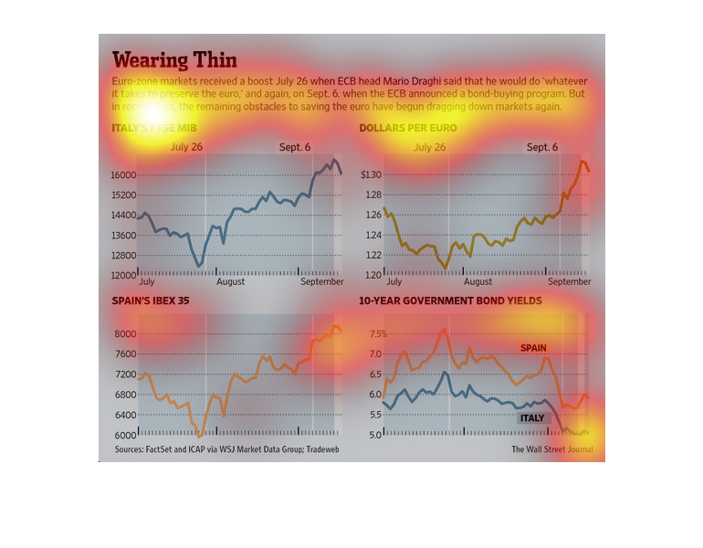
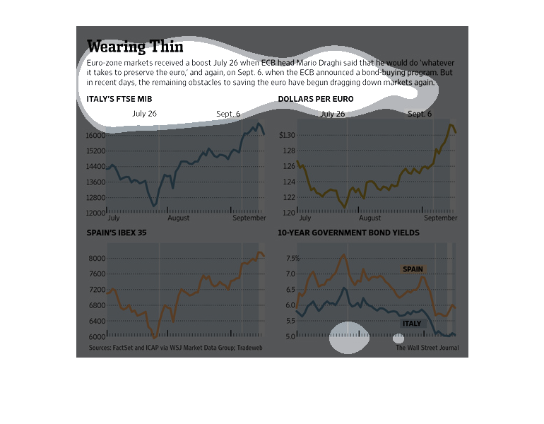
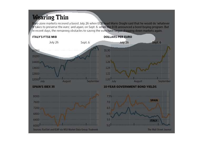
This picture shows a series of graphs that relate the the euro-zone crisis. Specifically,
it is showing the positive effects of commitments to preserve the Euro-zone, but the positive
gains seem to be losing their effects as other obstacles are starting to take it's toll.
The image depicts how Eurozeone markets reacted when attempts were made by an ECB head to
strengthen the Euro. However, a multitude of financial realities then dragged the Euro back
down.
The image depicts the Eurozone markets receiving a boost July 26 when ECB head said he'd do
whatever it takes to preserve the Euro currency. The data indicates that markets reacted positively,
but then began to decline again due to real-world obstacles in the markets.
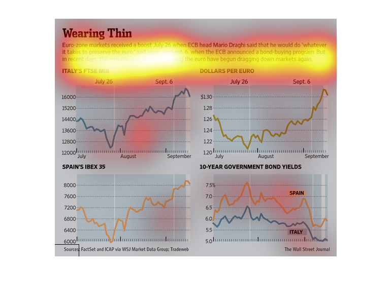
This is a series of color coded charts depicting the continued struggles in the Euro Zone
economies despite repeated promises by their governments to manage the problems.
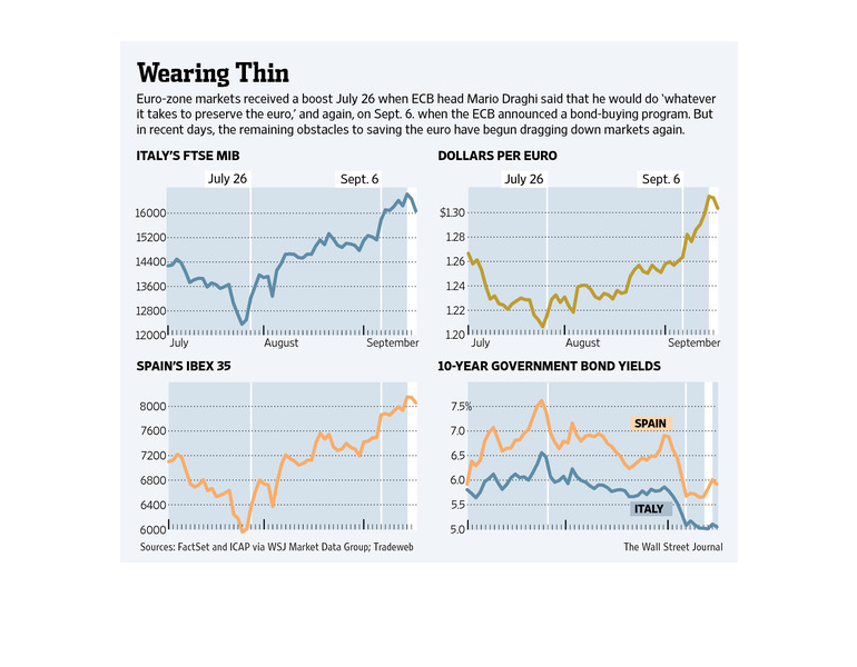
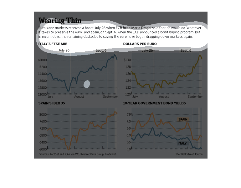
This chart describes wearing thin. Specifically, euro zone markets received a boost July 26
when ECB head, Mario Draghi, said that he would do whatever it takes to preserve the euro.
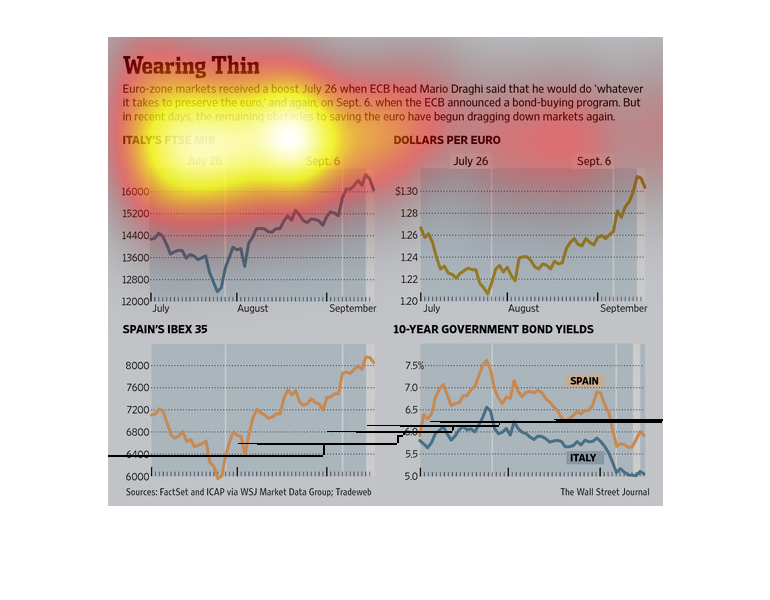
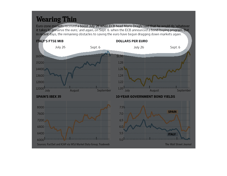
This chart shows the correct comparison between the USA And Europe financial markets. It shows
the comparison between the dollar and the Euro over time in value
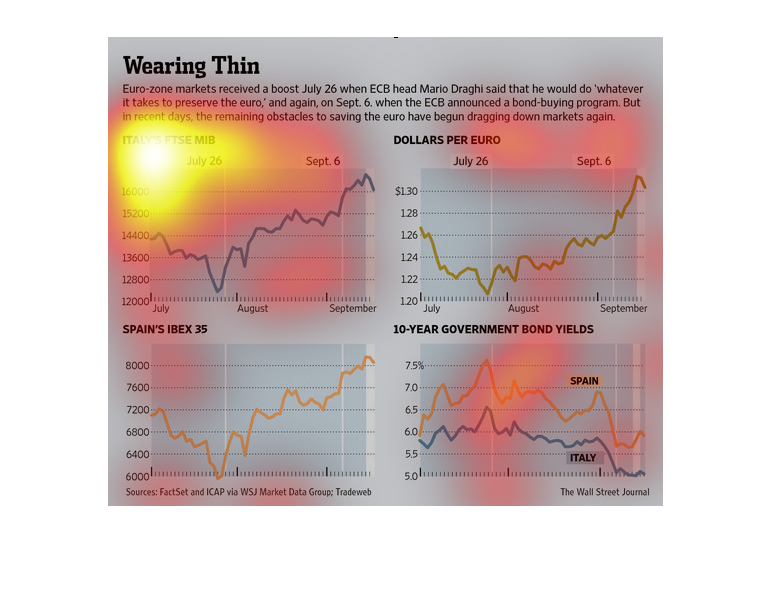
This chart describes wearing thin. Specifically, Euro-zone markets received a boost July 26
when ECB head Mario Draghi said that he would do whatever it takes to preserve the euro.
This looks to be a financial chart divided into four different sections. This is all based
around a certain event in which buying euros effected the economy.

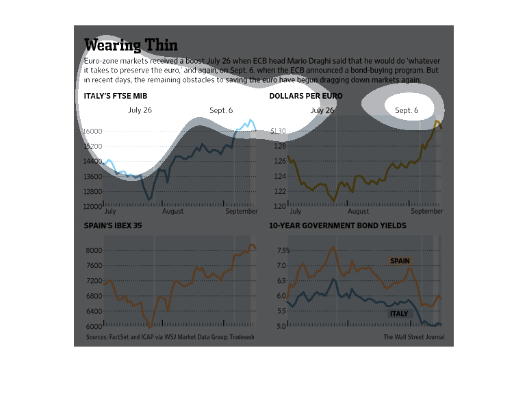
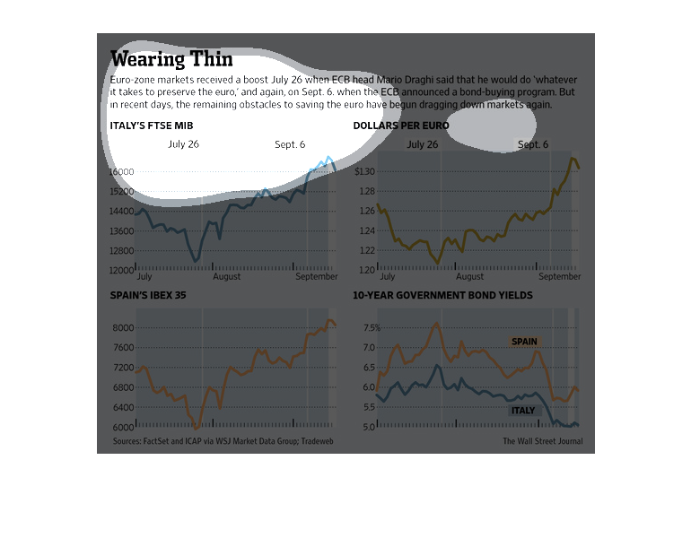
The following chart shows how the European union received a boost when Mario Dragi the Head
of the European Central Bank Promised to do whatever it takes to keep the Euro Stable.
The following chart shows how European Markets found a boost when the Head of the European
Central , Mario Dragi Bank came out and said that he would do anything that it takes to stabilize
the Euro.
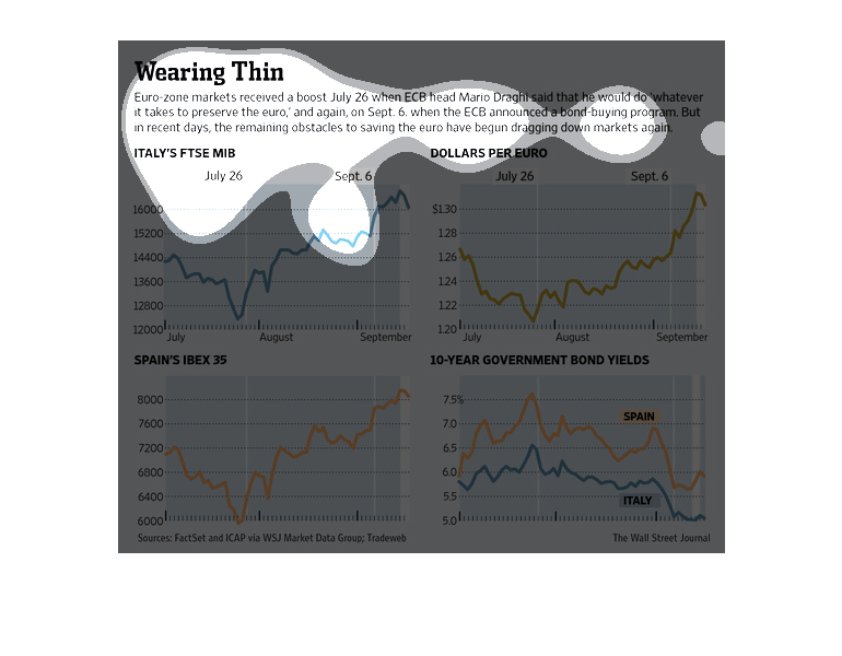
This chart shows how the Euro was given a boost in the stocks on July 26 because ECB head
Mario Draghi said he would do anything it takes to keep and improve the Euro.