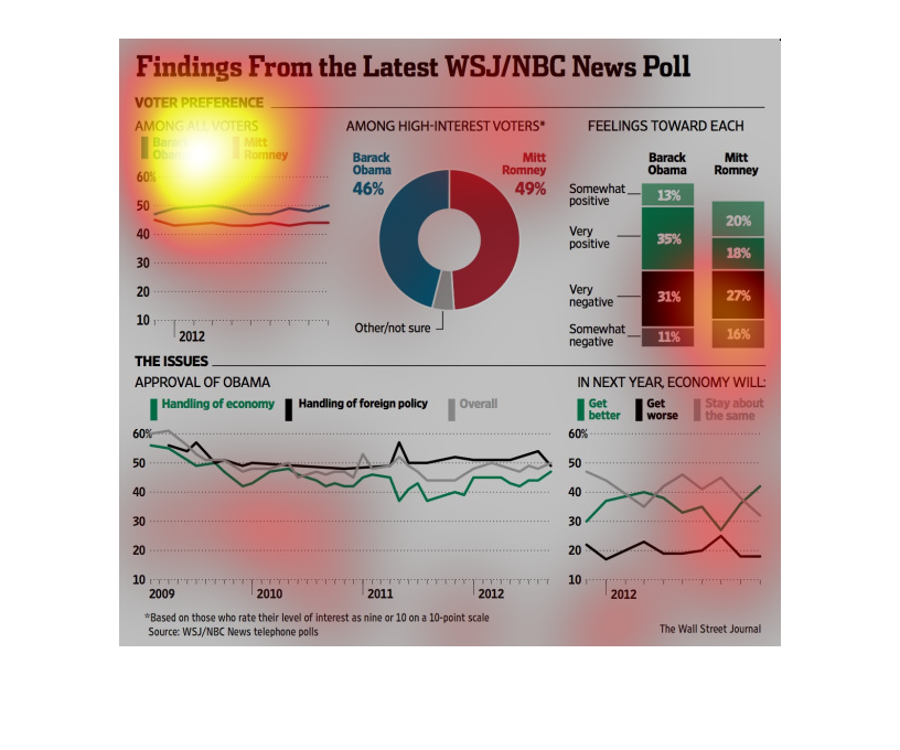
This chart is a chart that shows the comparison between mitt Romney and Barak Obama. The chart
is broken down by political issues such as the economy and foreign relations
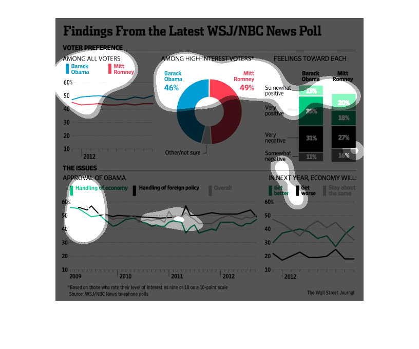
This graph shows Findings From The Latest WSJ/NBC news polls. The graph also includes voter
preference among all voters from 2009 through 2012. This includes Barack Obama and Mitt Romney.
This chart describes finding from the latest WSJ/NBC news poll. Specifically, voter preferences.
The chart is divided into two categories, Barack Obama and Mitt Romney.
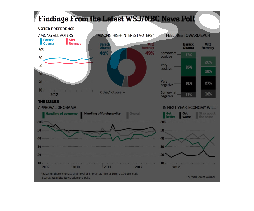
Finding from the latest WSJ/NBC news poll. Among high interest voters preference for Romney
only slightly eclipsed Obama. OVERALL preference for Obama was obvious.
The caption for this image is, "Findings from the Latest WSJ/NBC News poll".   The graphs,
charts and data within this image are taken back when Barack Obama was running for president.
 The information shows polling preference in comparison to then presidential contender Mitt
Romney.
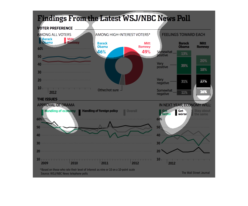
This image shows or depicts in various graphical statistical formats data concerning findings
from the latest WSJ/NBC news polls in relation to Obama vs Romney in last election.
In this Wall Street Journal study conducted from 2009 to 2012 shows the breakdown of support
for the candidates of both the democratic and republican party.
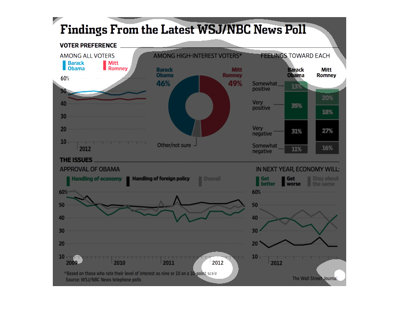
This chart gives the results of the WSJ/NBC News Poll. It compares opinion of Obama and Romney
among all voters, higher interest voters, likability of the candidates, and their approval
rating on handling certain issues and overall.
This chart shows the findings from the latest WSJ and NBC news polls. Apparently among high
interest votes Obama was behind Romney just 3%. But Obama was of higher interest to all voters.
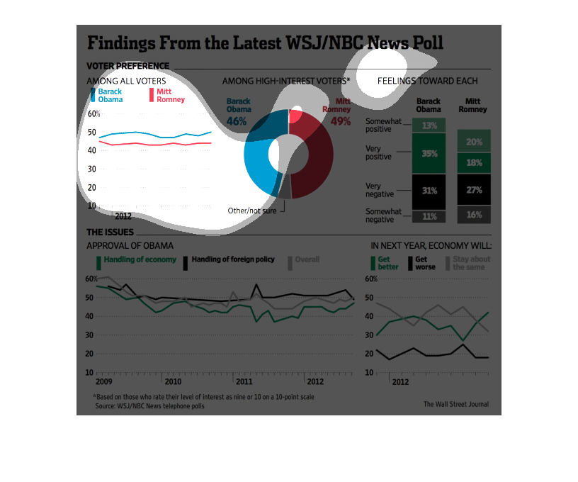
The image depicts US voter preferences for the 2012 general election. Barack Obama lead consistently
with all voters, while Romney lead with highly-interested others. Overall, the data looked
positive for re-election for Barack Obama in 2012.
This chart describes findings from the latest WSJ/NBC News poll. The chart is divided between
Barack Obama and between Mitt Romney, who were the two Presidential contenders.
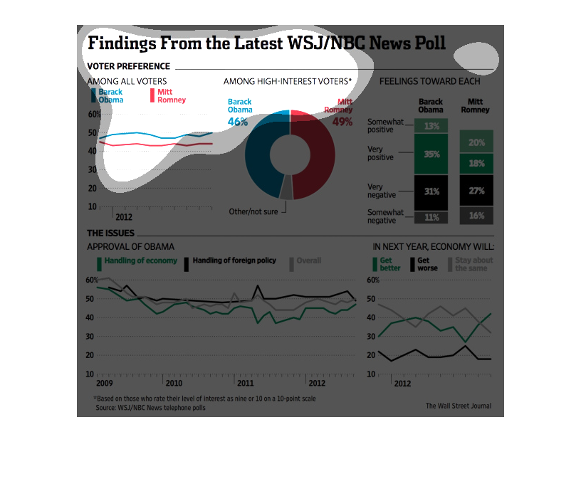
This is a series of color coded charts, graphs and statistics depicting findings from a Wall
Street Journal/NBC poll concerning varying aspects of the 2012 presidential election.
The image depicts voter preferences in the 2012 election. Barack Obama leads Mitt Romney with
all voters, with Mitt Romney leading with high-interest voters. Base on totality of the statistics,
Barack Obama's chances for re-election are good.