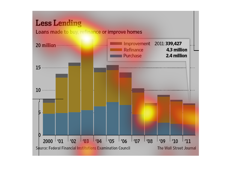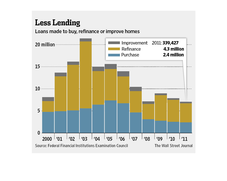
The following chart shows the steady decline in the amount ot total financing going into purchasing,
refinancing or modifying a house in the United States.
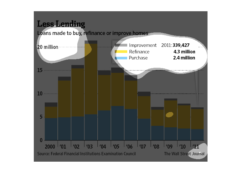
This image shows or depicts in statistical bar graph format data concerning Less Lending.
Loans made to buy, refinance or improve homes. For year 2011.
The image depicts the loans made to buy, refinance, or improve homes. The data cites 2003
as being an exceedingly high year for loans, with subsequent years falling off considerably
to an all-time low in 2011.
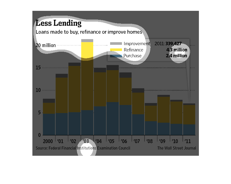
This graph show the correlation between home loan type and improvements made to the home in
a specific year. It is my belief the intention of this graph is to demonstrate the need for
type of borrowed money from banks to homeowners and the application of said money.
Less Lending provides loans to buy, refinance, or improve homes presented by the Federal Financial
Institutions Examination Council and was published in the Wall Street journal. The data is
in millions of dollars for the year of 2011.
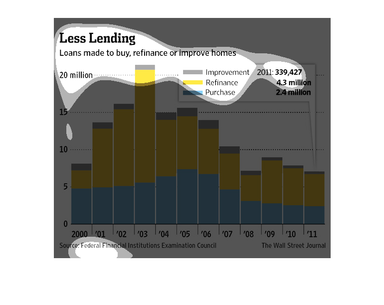
The caption for this graph is, "Less Lending, Loans made to buy, refinance or improve homes".
 Directly below this caption is a bar graph, vertically oriented.  The years for the information
are between 2000-2011.  The information captured on this graphs shows figures corresponding
to numbers of home loans for improvement, refinance and purchases.

This chart describes less lending. Specifically, loans made to buy, refinance, or improve
homes. Categories on the chart include improvement and purchase.
This chart shows the number of loans made to buy, refinance, or improve homes.  It details
by the three categories and shows volumes from 200 to 2011 as well as total loan values.
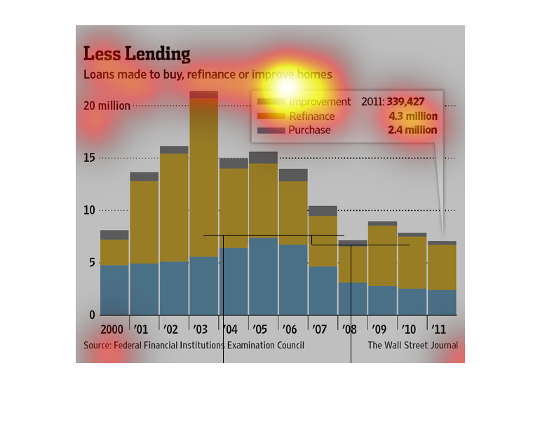
Chart details loans made for purchase, refinance and improve homes from 2000.-2011. The largest
amount was for refinancing which occurred in 2002-2003
This is a series of color coded charts and related statistics depicting loans made to buy,
refinance or improve homes from the years 2000 to 2011. It shows a flat trend over the long
term.
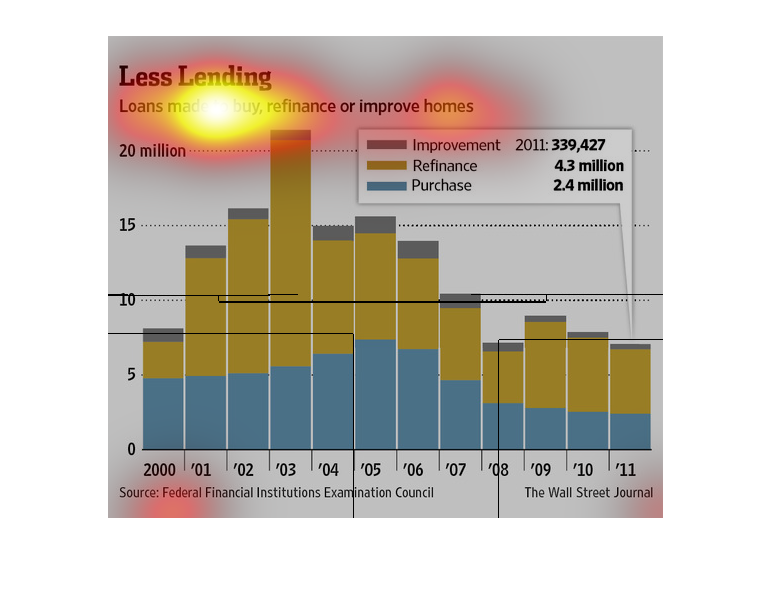
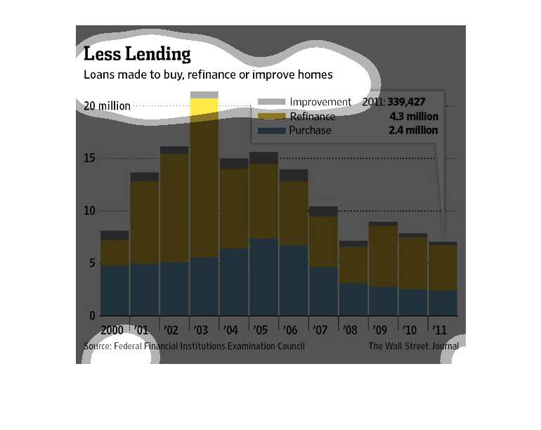
This chart describes less lending. Specifically, loans made to buy, refinance, or improve
homes. Different categories are represented by different colors.
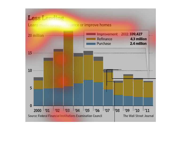
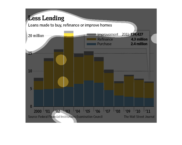
This image is a graph containing a bar chart comparing the amount of loans used to buy, refinance,
and refurbish homes.  The chart is divided by year and has a range of up to 20 million dollars.
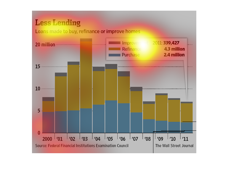
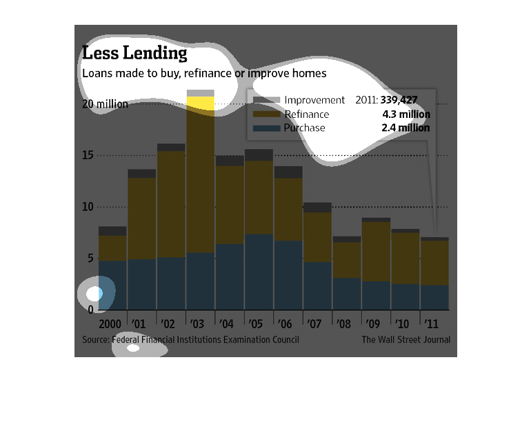
This graph shows loans made to buy, refinance, or improve homes between 2000 and 2011. Improvement
loans have not had much change over time but have decreased slightly.  Refinance loans peaked
in 2003 and have been decreasing since with the lowest year being 2008.  Purchases were slowly
increasing then drastically plummeted in 2008 and have been remaining about the same since.
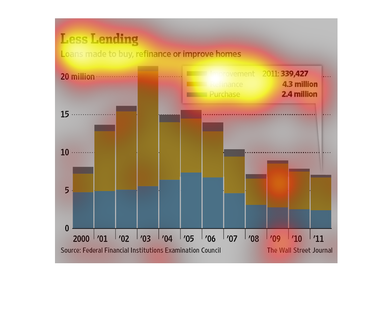
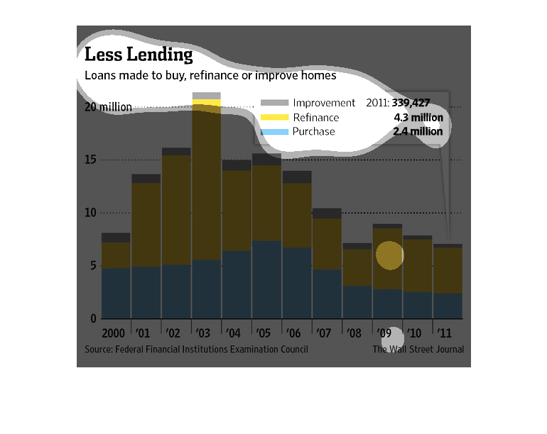
The image depicts the amount of loans made to buy, refinance or improve homes as peaking in
2003, and subsequently dropping off noticeably, on average, for the next few years.