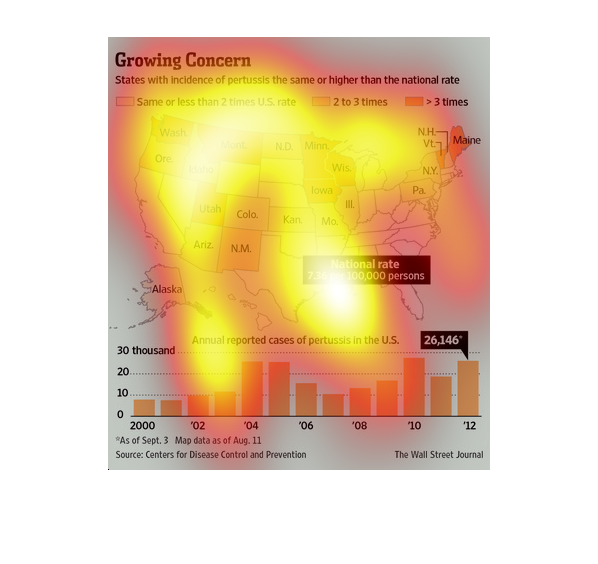
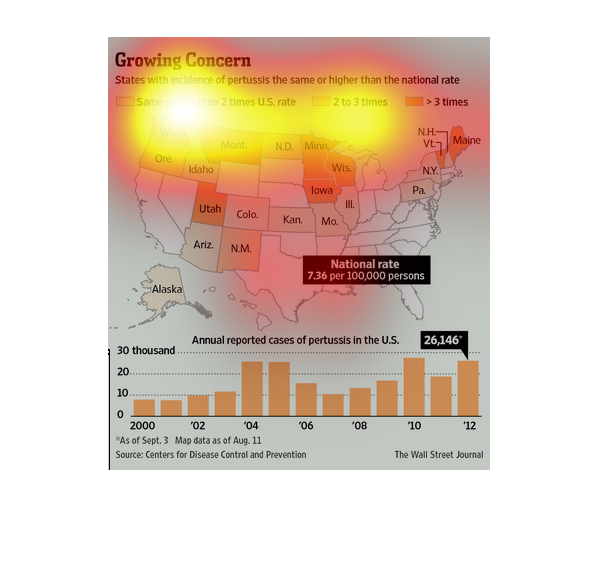
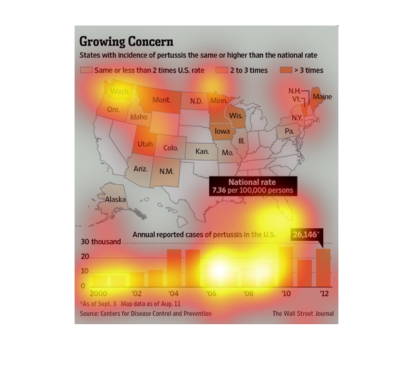
This is a graph of the states that have a higher occurrence rate of pertussis than the national
average. The data shows that the states in the MidWest are more likely to have a high occurrence
rate.
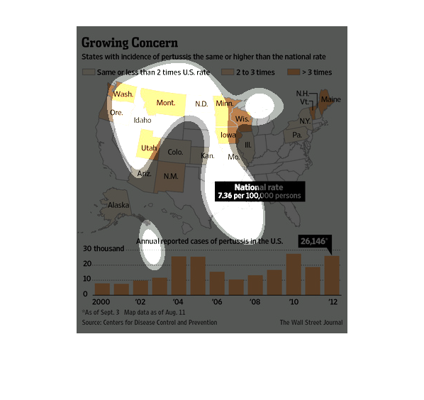
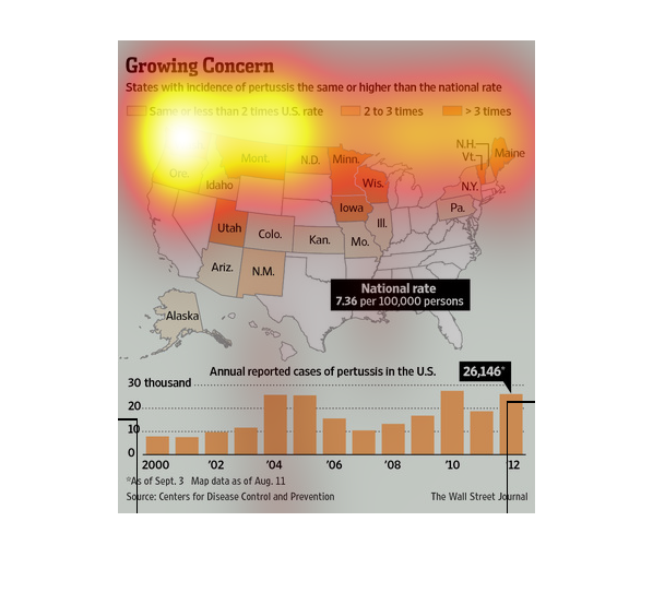
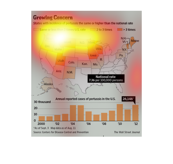
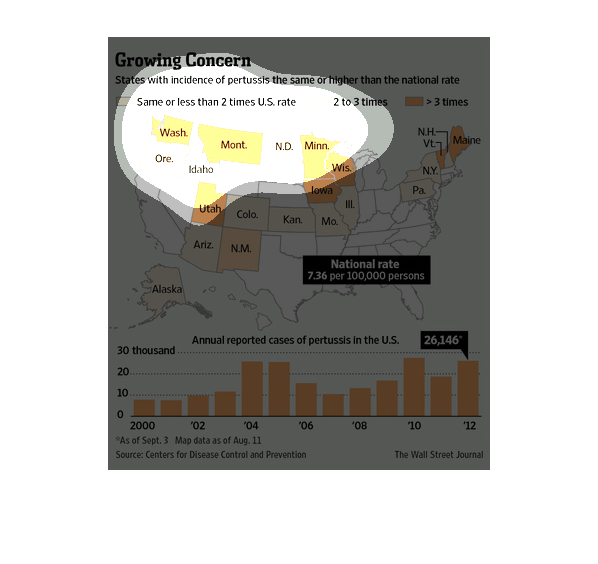
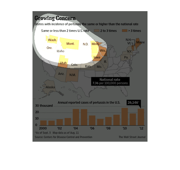
Growing concern. States with incidence of pertussis the same or higher than the national rate.
Based on a color coded map of the United States the northwest north central and northeastern
united states are experiencing higher than normal reports.
This is a series of graphs along with a map of the United States depicting the states with
incidence of pertussis in the same or at higher than average national rates.
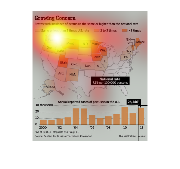
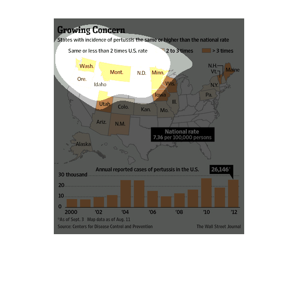
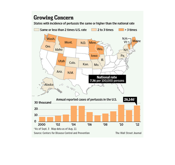
The above chart shows that many states in the US, especially in the west, Midwest, and northeast,
have more incidents of pertussis than the national average. The bottom graph shows that, overall,
the number of pertussis cases in the US has increased greatly since 2000, rising to 26,146
in 2012.
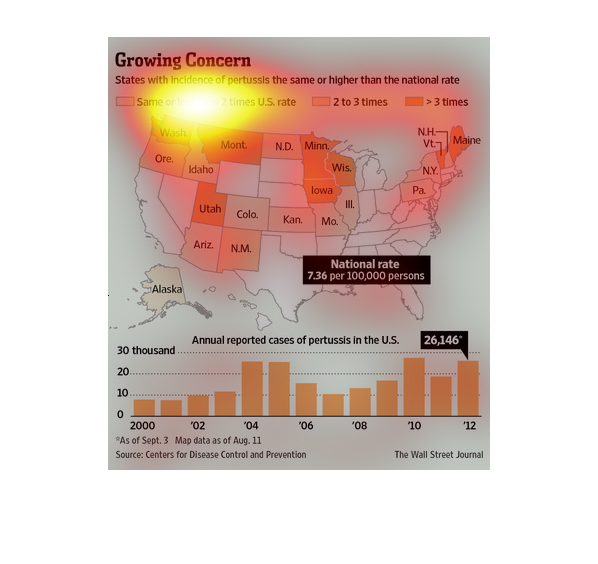
This is talking about a growing concern in rising pertussis. The amount seems to differ from
state to state but the national average seems to be rising and it is faster in some states.
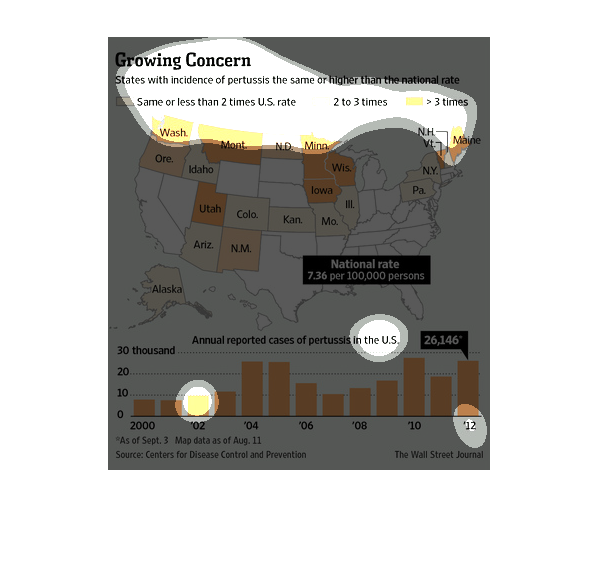
This is a color coded map of the US and corresponding bar graph depicting the states with
incidence of pertussis at the same or higher rates than the national average.
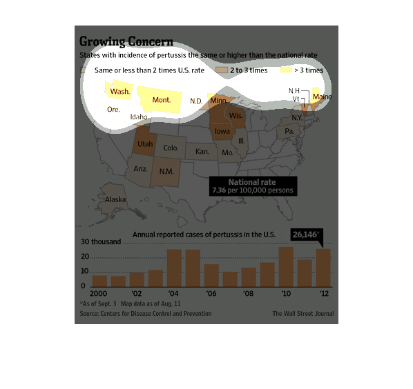
The image depicts states with incidence of pertussis, the same or higher than the national
rate. Nearly a dozen states appear to be dealing with slightly elevated incidence of pertussis,
above the national rate.
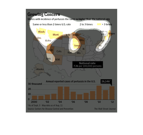
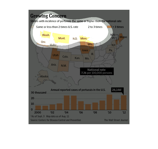
Growing corn states with evidence of pertussis the same or higher than the nation rate. Show
a small map of the united states and a bar graph of results.
This chart describes growing concern. Specifically, states with incidence of pertussis the
same or higher than the national rate. Categories include same or less than two times US rate.
This chart shows the amount of pertussis in the United States over a given time period. It
breaks down the amount of total cases and the amount of cases by state
This shows a map of states with an incidence of pertussis higher than the national average
by US state.  The bottom is a graph of the number of annual reported cases of pertussis in
the US.
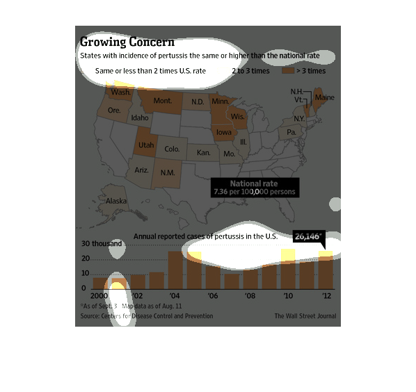
This chart describes growing concern. Specifically, states with incidence of pertussis the
same or higher than the national rate. The chart is divided into two.
The following chart gives the number of cases of pertussis in the United States from about
the years 2000-2012. It shows an increase in some states a decrease in others.
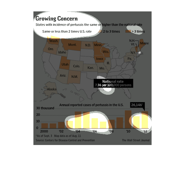
Above a map of the Unites States is a caption that reads, "Growing Concern, States with incidents
of pertussis the same or higher than the national rate".  The map reflects color coded areas
that correspond with incidents of this disease or it's non presence in some areas of the country
as well.
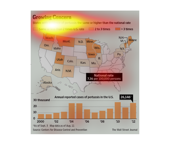
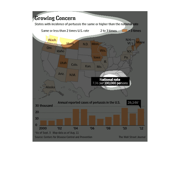
This chart is showing that a lot of states have a higher incidence of severe cough than the
national average. Some states even showing a 3x increase in pertussis.