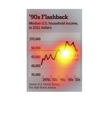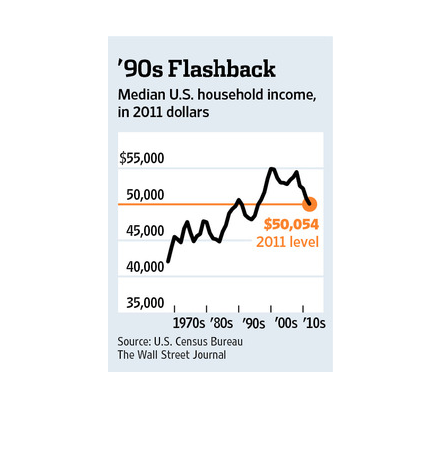
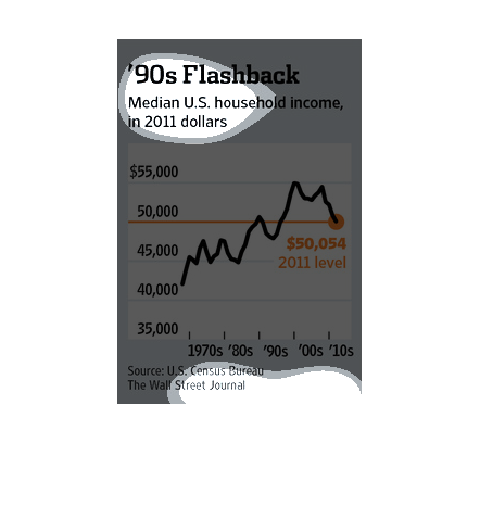
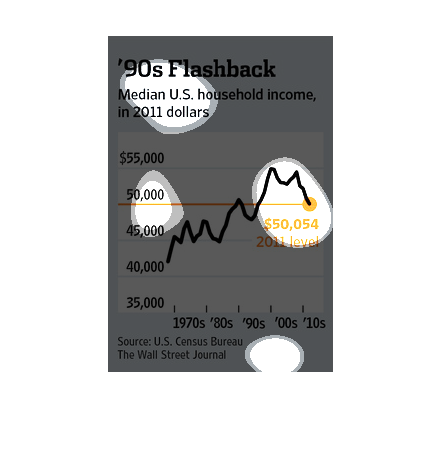
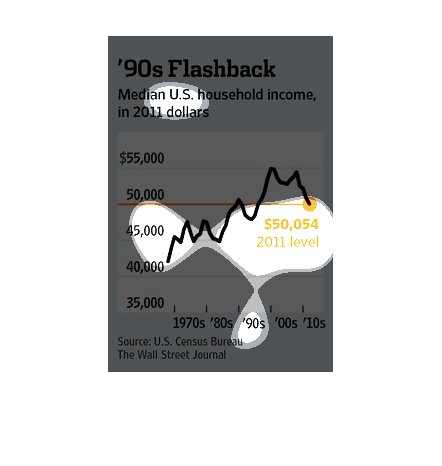
The median household income has steadily risen since data was collected in the 1970s but recently
that increase and plateaued and decreased.  2011 showed a sharp decline in income.
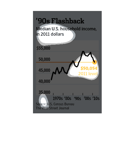
This chart describes '90s flashback. Specifically, median U.S. household income in 2011 dollars.
The chart is sourced by the United States Census Bureau.
This chart describes '90s flashback. Specifically, median US household income, in 2011 dollars.
The chart covers the 1970s, 1980s, 1990s, '00s and '10s.
This study by the Wall Street Journal states that since the 70s we have seen a sharp decrease
in the quality of life among the American populace. Not surprising since there is a wider
gap between the rich and the poor.
Median household income graph from the 1970's until 2011 when it rapidly started to fall because
the US Government along with Elite families need to destroy the US Middle Class to return
to feudalism.
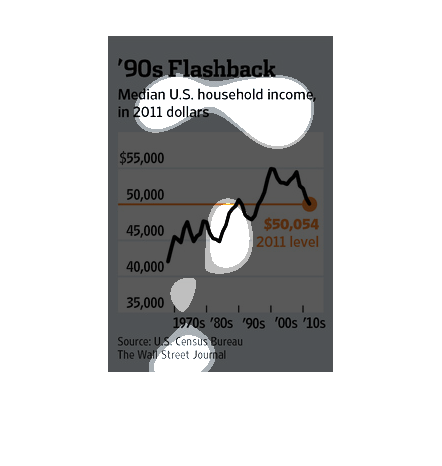
A 90s Flashback. A chart of median household income from 1970 to 2010s adjusted to show in
2011 dollar values. Showing general up and down rise until 2000 where median income falls.
The image depicts median US household income, in 2011 dollars. The data indicates that median
US household income has risen since the 1970's, and began a decline in the 2000's.
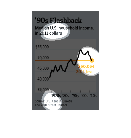
After average family income levels rose slightly from 1990 to the mid 2000s, wages began to
decline, so that by 2010 they were back to 1990 levels. The data are shown in consistent 2011
dollars, so the graph  represents a drop in real wages.
This line graph illustrates the median US household income in 2011 dollars for the years from
1970 to 2017.  The 2011 level is at $50,054 and range is roughly from 40-55 thousand.
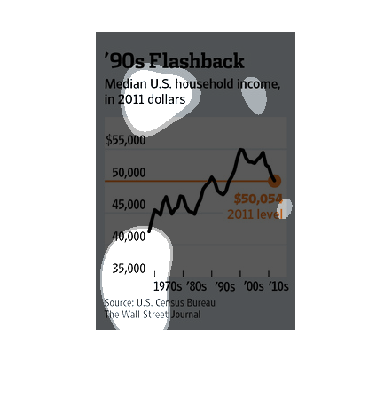
The image depicts median US household income changes from 1970-2010, in 2011 dollars. Household
income rose to highs around 2000, and steadily declined for the next decade.
This chart shows the median household income in the 1970s through the 2000s, in 2011 dollars.
 It seems the median is about $50,000. The highest income was in the year 2000.
This chart describes 1990's income based on 2011 dollars. A salary of $45,000 would be worth
a little over $50,000 in the year 2011.  It was worth more in previous years.
This Wall Street Journal study traces the mean income of the American Family from the 70s
all the way to present day 2010s. The graph actually states that the amount of income has
actually diminished.
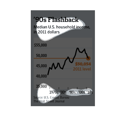
This is a small chart showing the income of people on average back in the 90's. It goes from
the 90's up until future years as well. The source is from the US consensus.
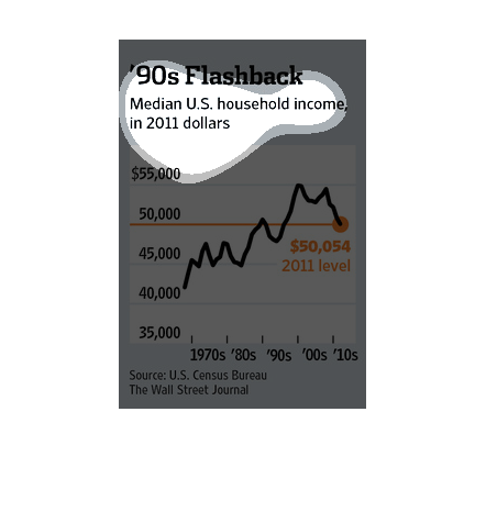
The image is a graph comparing median household incomes through some recent decades in the
U.S. The graph shows that the median income in 2011, $50, 054, most closely matches the previous
median income during the 1990s. The median income was on an upward trajectory, rose from the
1990s to the early 2000s, but decreased again approaching 2011.