There are about pie charts about countries and copper consumption and it says speed bumps
aheadsomething about China and a headwind and what countries consume copper
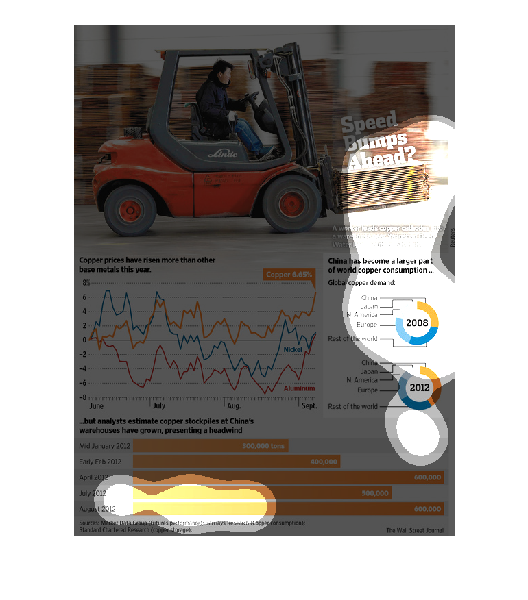
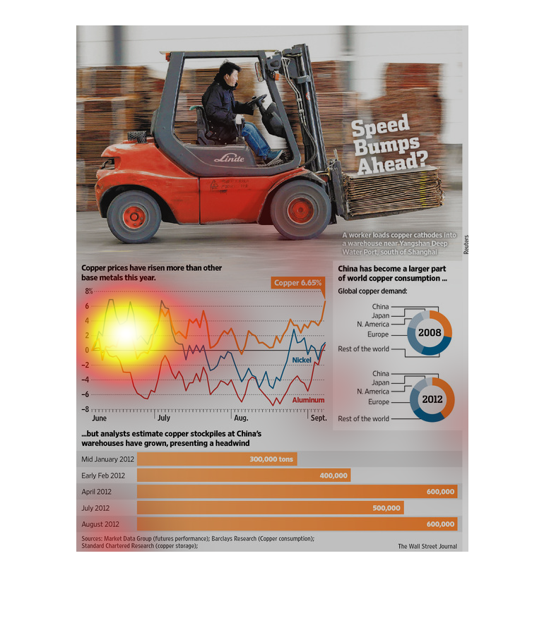
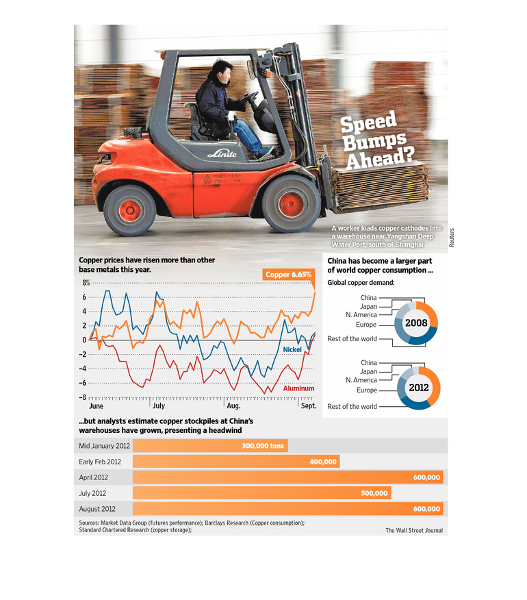
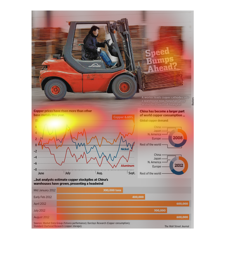
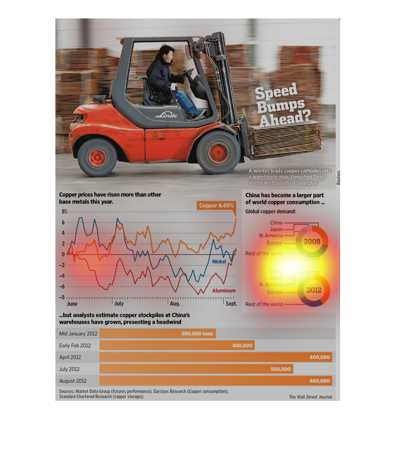
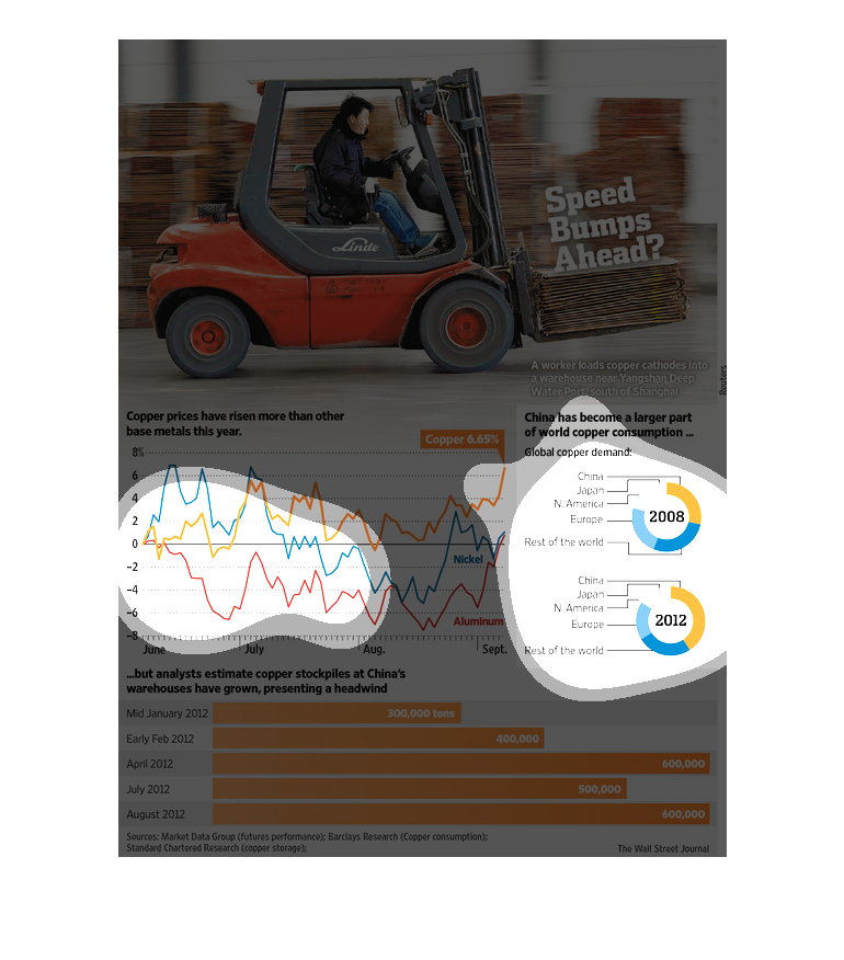
This is an image of a man driving a forklift with the legend "Speed Bumps Ahead." Beneath
it are some global statistics concerning copper. There is a graph of the rising price of copper
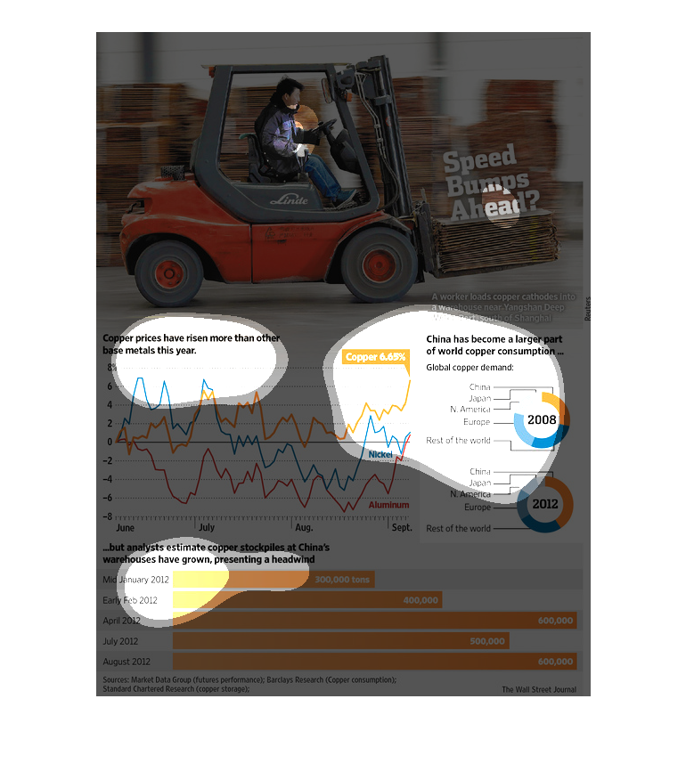
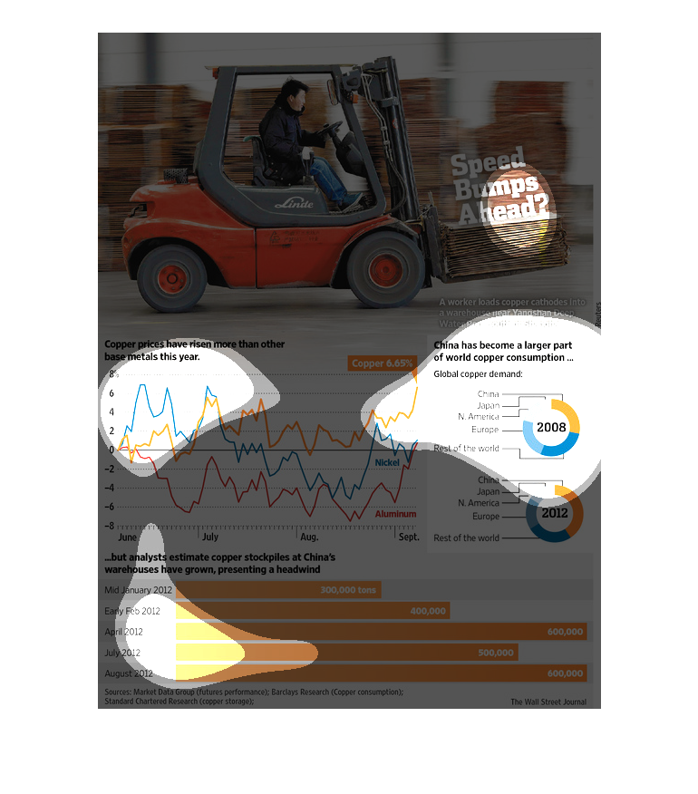
in the mid-left, two pie charts to the right indicating that China consumed more of the world's
supply of copper in 2012 than in 2008 and a graph on the bottom indicating that China is also
stockpiling more copper over the same period.


This is a diagram along with related graphs, charts and statistics depicting the status of
the worlds copper markets and their relation to the effect China has on that market.
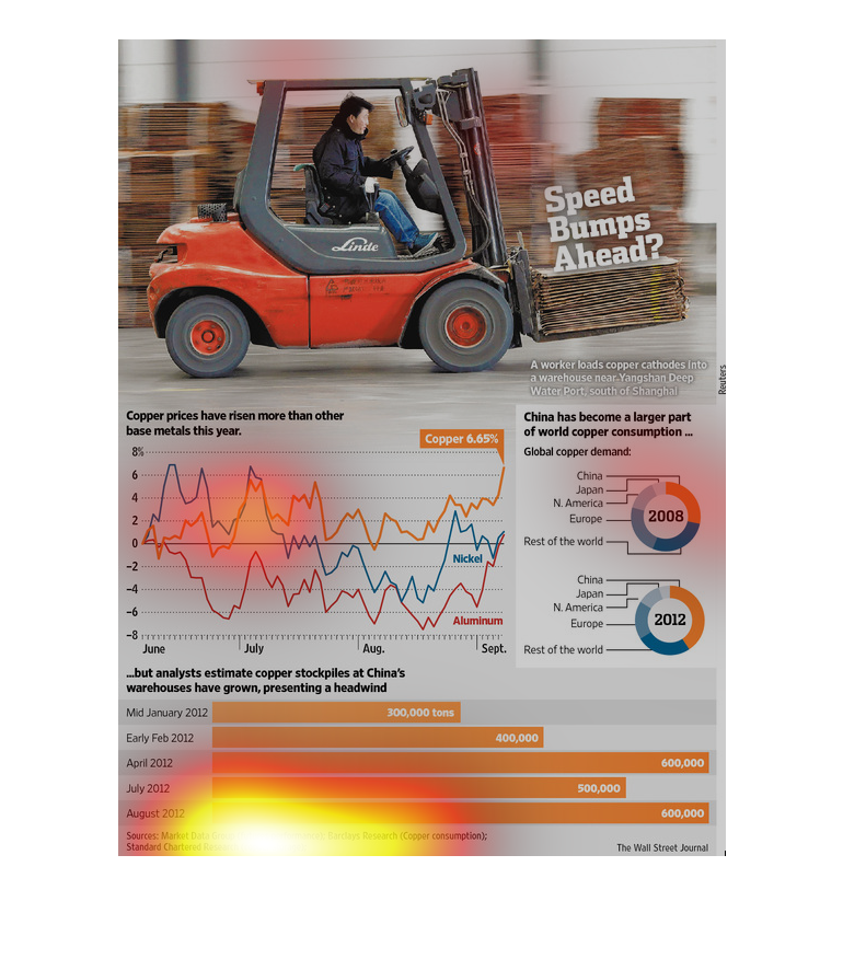
It seems that China has become the number one consumer in copper over the last few years.
 Also shows that the price of copper has has been rising as well.  It looks as though China
may be stockpiling copper to present a headwind.
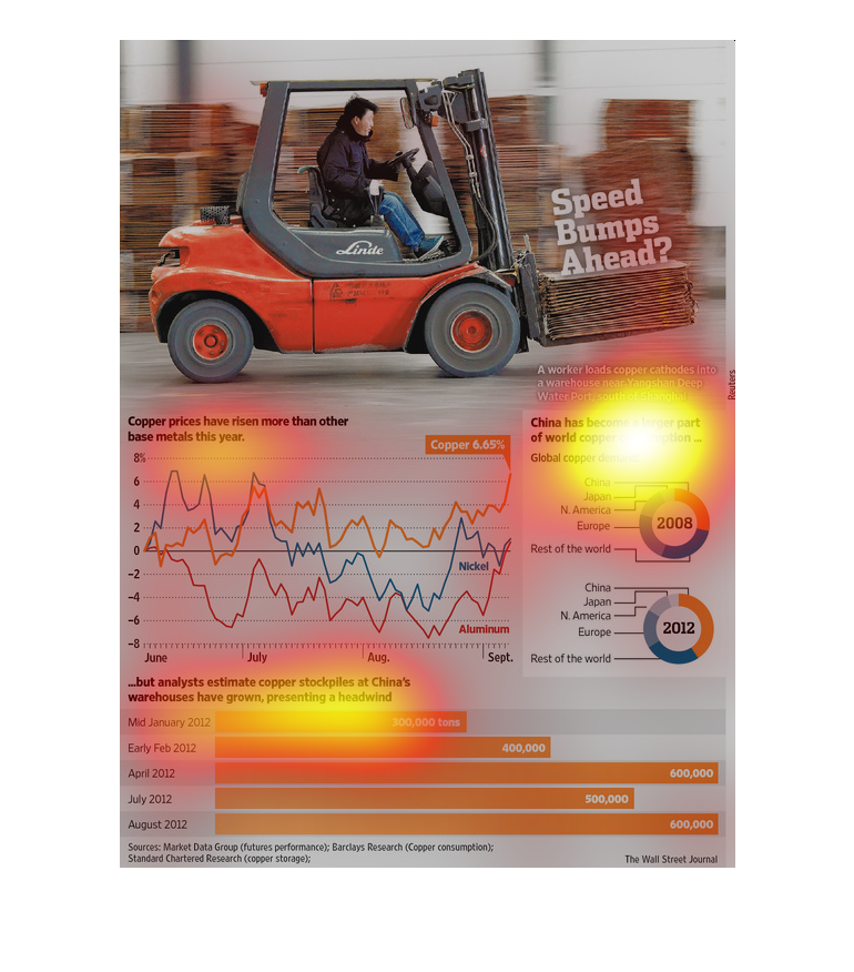

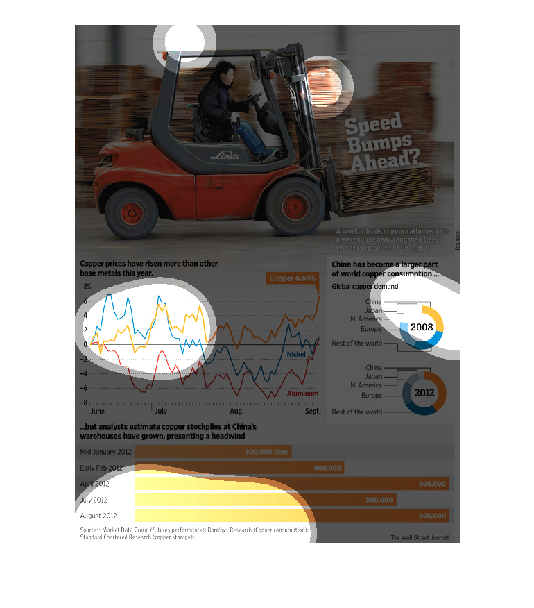
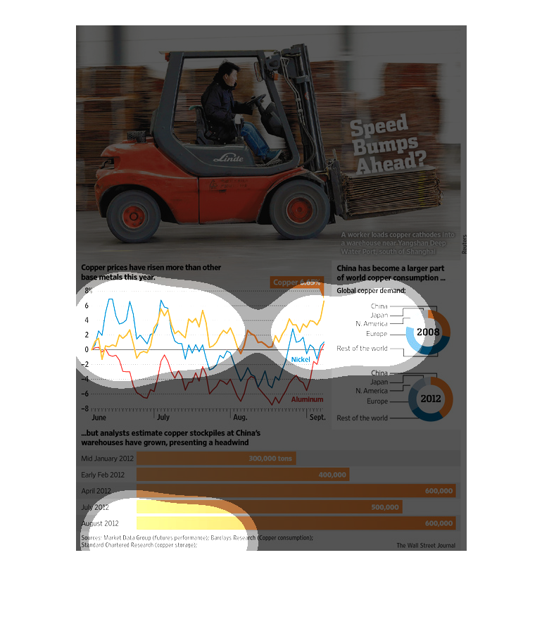
This graph is showing how copper prices have risen more than any other base metal this year,
which is 6.65% from last year. Experts are saying copper has seen increases in stockpiles
in China warehouses.
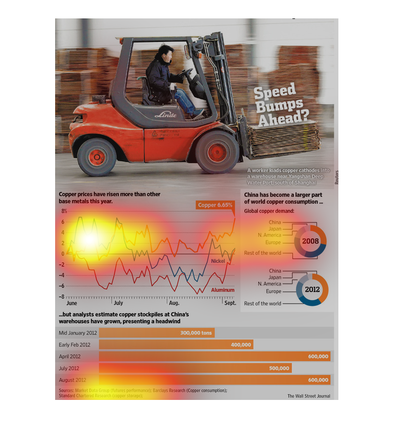
The image depicts statistics for copper demand, consumption and copper prices around the world.
The data indicates that China is stockpiling copper while prices rice and copper prices rise
higher than other metals.

The image describes how copper prices have increased more than any other base metals than
any other base metals. This could be attributed to the fact that China has become more invested
in copper consumption. Yet, the copper stockpiles in china have only increased.

This study conducted from 2008-2012 shows that the cost of labor has risen dramatically and
that it has put us in direct conflict with China as a result, as far a that goes. We need
to innovate to stay ahead.
The United States of America is heading on a colission course with China over labor, at least
that is what we are led to believe via this study conducted by the Wall Street Journal.
This chart shows that copper prices have risen more in value over other base metals this year.
It also states that China has became a large part of the world's copper consumption.
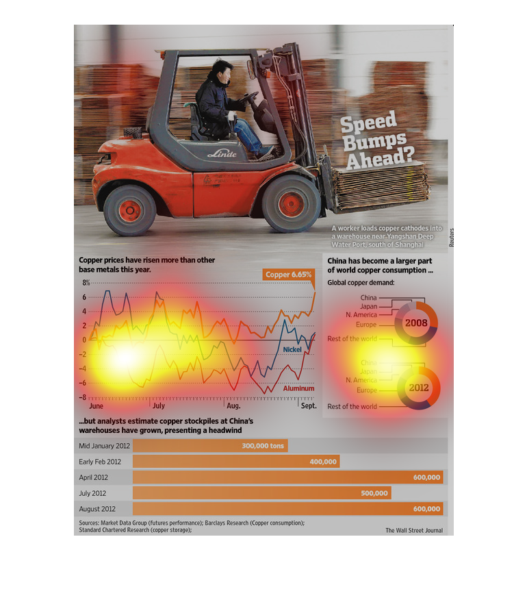

This graph is very hard to read. I believe it about prices of copper in comparison to other
metals. It also states that stockpiles of copper in China have grown, and they are a large
producer of copper worldwide.
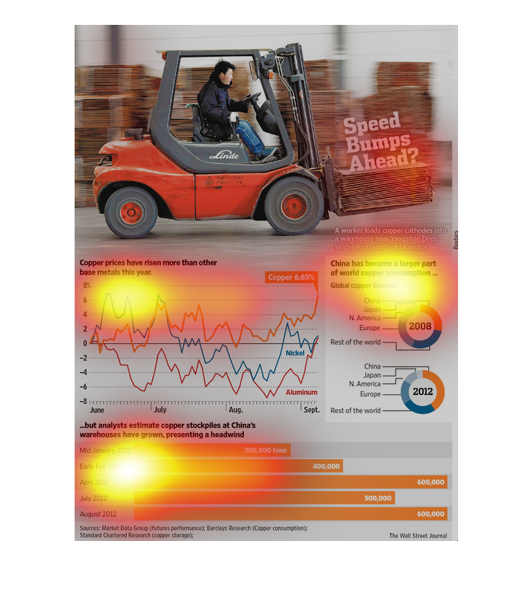
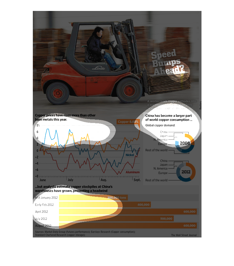
This is a series of charts, graphs and diagrams depicting the world copper markets and the
players and/or factors within that market. It shows that China has grown to a larger consumer
of the world copper supply.
This image is showing a man driving a car that more looks like a golf car. Below is the chart
with a graph. The graph is proubably estimates the speed of the golf cart or the percentage
of people who is using these particular cars.
This chart describes that copper prices have risen more than other base metals for this year.
Different categories are represented by different colors.