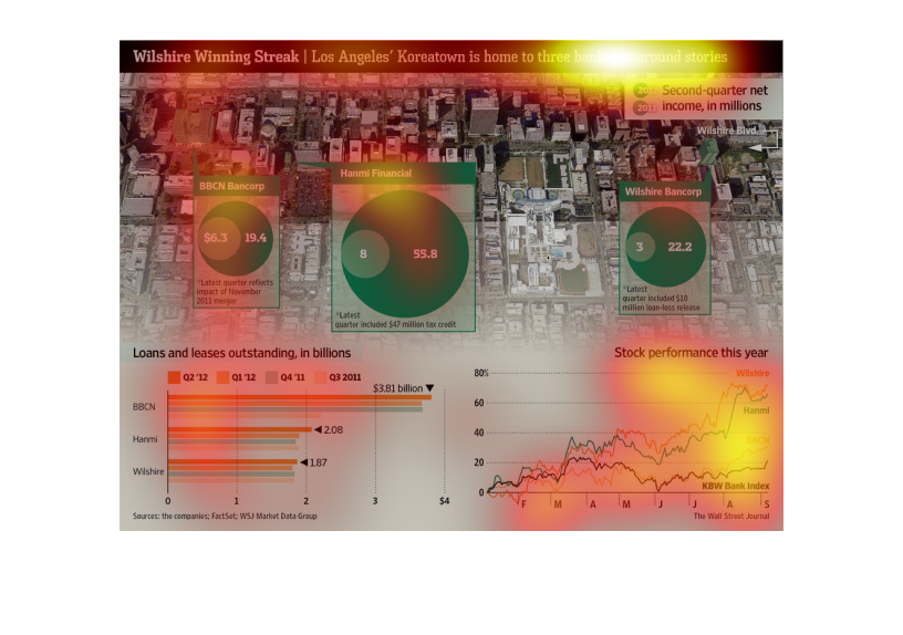
This is a map that shows loans and leases outstanding in the billions.  It also illustrates
net incomes for banks and stock performance over the past year.
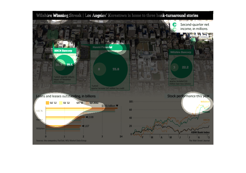
This chart describes the success of three banks in Koreatown. It compares the net worth or
net holdings of the banks in regards to a period of time ago and how they have increased their
holdings to improve the quality and success of the banks.
This a a graphical map and diagram depicting three bank turnaround stories from the Los Angeles
Korea-Town neighborhood and related graphs showing the progress of the recoveries.
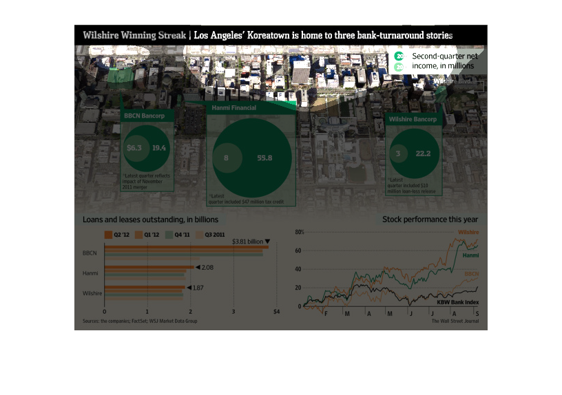
The thing about the recession that it was devastating, but the thing is that adversity breeds
injection and perseverance. This illustration shows that three banks were able to turn things
around for the better,
These graphics examine the costs of owning homes around Los Angeles based on the lender. It
also continues to look at how many billions of dollars in loans or leases each of the major
lending firms had in 2011 to 2012. BBCN has over a billion more outstanding loans than the
other banks. Does this impact the companies stocks? It seems to with BBCN being on the lower
end of stock value for the year.
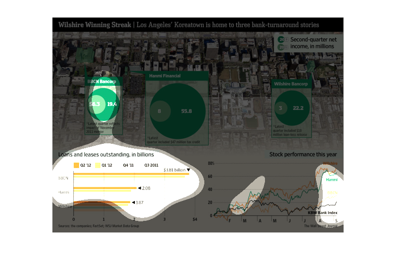
This chart describes wilshire winning streak. Specifically, loans and leases outstanding,
in billions. Different categories on the chart have different colors.
This image is about 3 banks in Koreatown Los Angeles that have turned around their performance.
It shows the 2011 and 2012 differences in income, stock and loans & leases outstanding.
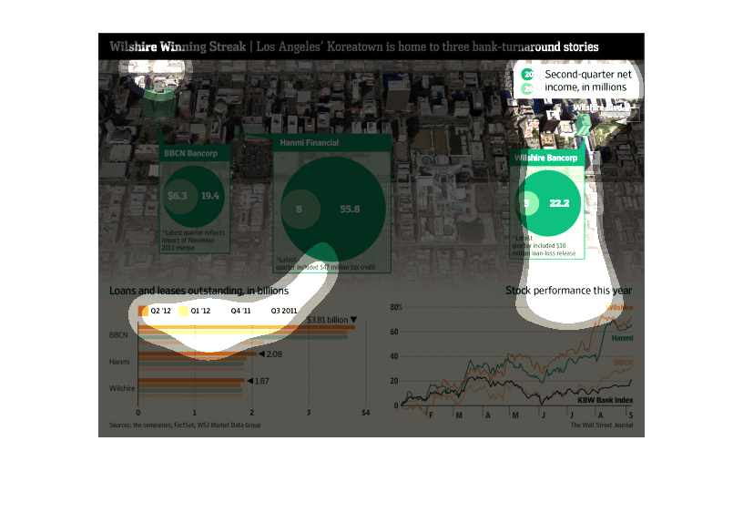
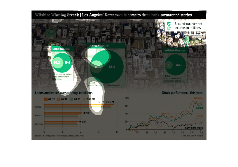
This is a confusing chart showing how WIlshire's stock has changed over the years and how
the banks in Koreatown in LA have been a key indicator of the change. The stock price has
increased over 80% in just one year.
This is a series of graphical charts and graphs with associated statistics depicting the turnaround
stories of three local banks in the Los Angeles area.
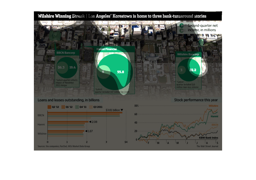
This chart describes the Wilshire winning streak. Specifically, Los Angeles' Korea town is
home to three bank turnaround stories. Different categories are represented by different colors.
I believe these graphs show the increased performance of some banks in LA's korea town. There
has been a fall in outstanding loans and leases as well increased stock performances.
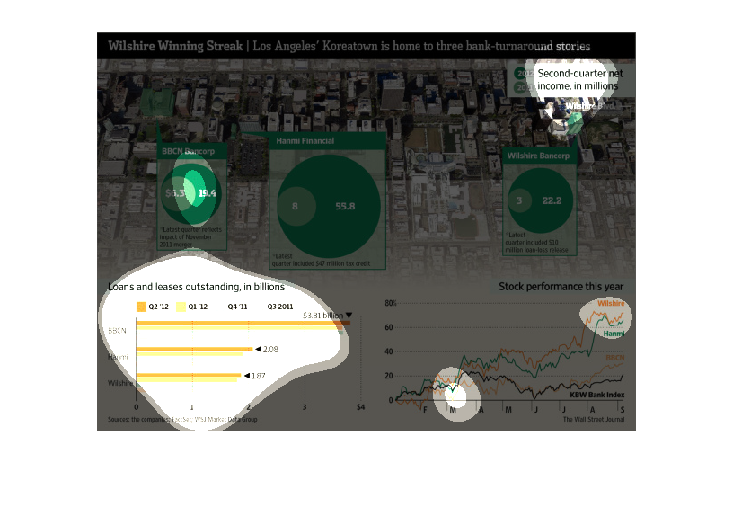
The image is a chart illustrating the amount, in billions, of BBCN Bancorp's and Hammi Financial's
outstanding loans and leases as well as the company's stock performance.
The image depicts how three banks in Los Angeles' Koreatown managed a turnaround in a difficult
financial climate, possible setting an industry-leading example for US banks.
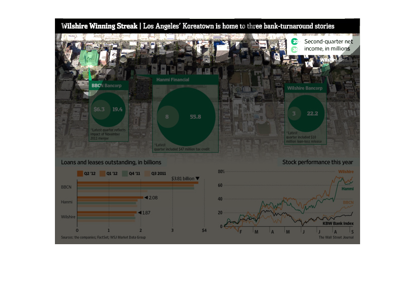
wilshire winning streak los angeles' koreatown is home to the three turnaround stories. We
see three different bubbles with smaller bubbles inside representing the growth of the three
financial institutions
The image depicts how Los Angeles Korea-Town is home to three bank turnaround stories. The
data indicates that among many failing banks, three banks managed to refine their approach
and turn their business around, and in the process lead by example.