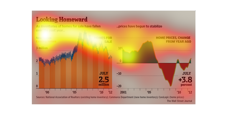
This chart describes looking homeward. Specifically, as inventories of homes for sale have
fallen over the past year. Different categories have different colors.
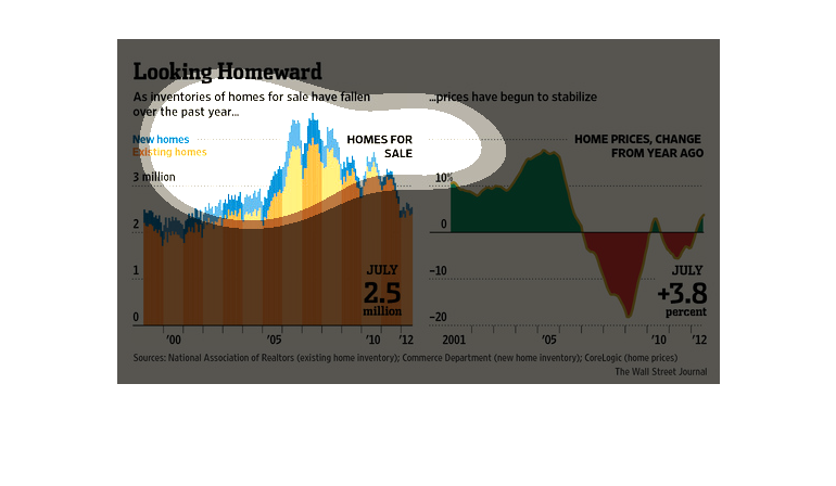
An infographic showing the change in home prices and homes available. The number of homes
for sale has fallen and as a result prices have begun to stabilize
The market is in flux right now as this chart leads us to believe. According to the study
conducted by the Association of Realtors the home equity has been up and down since 2000
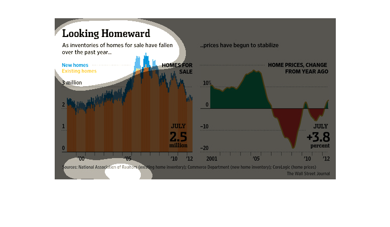
The graph compares home price changes and homes for sale from 2000-2012. It shows that has
the homes for sale decreases, the price begins to stabilize.
Two graphs, with the title "Looking Homeward". One uses blue and orange to show the correlation
between new homes and existing homes. Another one uses green and red to show how home prices
have changed.
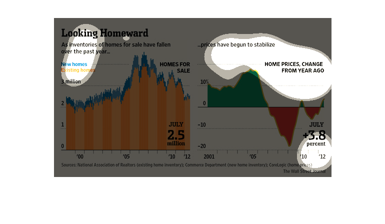
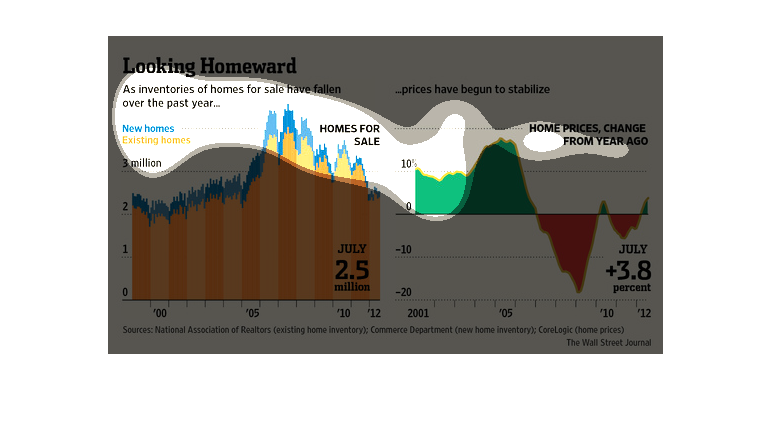
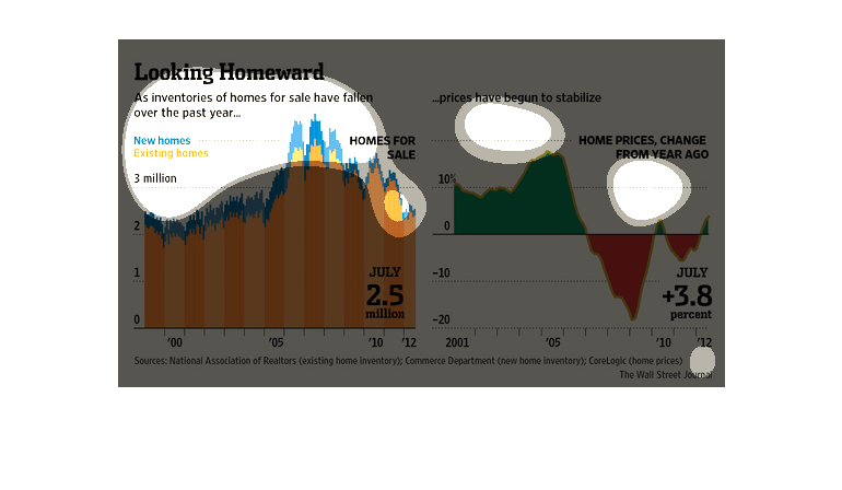
This is a series of color coded charts depicting that as inventories of homes for sale had
fallen over the past year prices for homes had begun to stabilize.
This graph shows too different comparisons. The first graph shows new homes on the market
and existing homes on the market for July. In July there were 2.5 million homes on the market.
 The second graph shows housing prices and how they took a sharp dive in price, but are slowly
beginning to rise for the month of July.
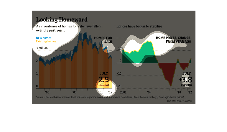
This chart compares the number of homes available on the market with house prices. In July
there were 2.5 homes available and housing prices increased 3.5% from a year ago.
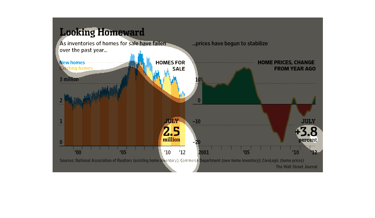
This graph details the relationship between falling home inventories and stabilizing prices.
The orange and blue graph detail how the home prices rose from the late 1990's, peaking around
2007, then dropping off dramatically through July 2012. The green graph details the home price
changes from the previous year, indicating that through 2007, home price changes increased
up to about 20% from the previous year, dropping off to -20% from the previous year until
2009, and stabilizing around 3.8% by July 2012.
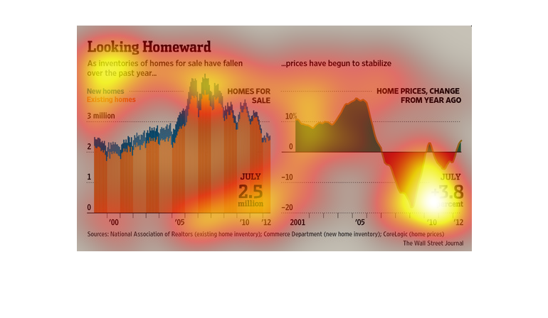
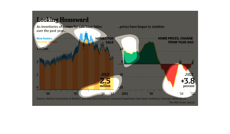
The left side of the graph shows how inventories of homes for sale of both new and existing
homes has fallen but prices have began to stabilize over the last year changes.
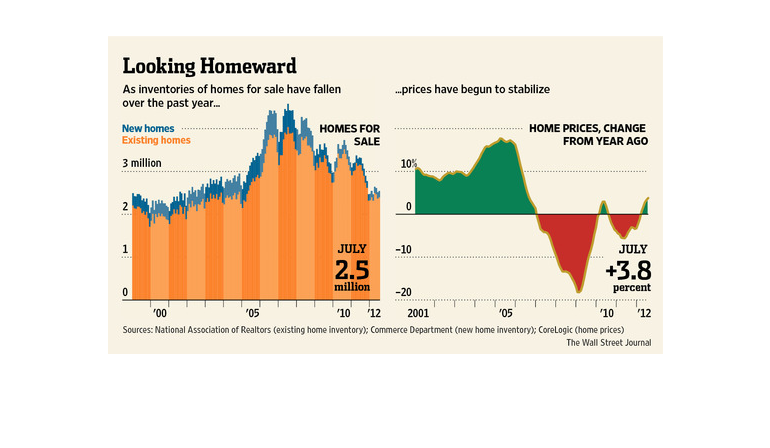
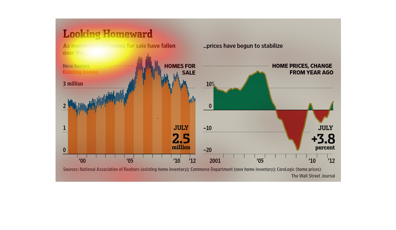
This chart describes how many homes have gone on the market over time. It seems as if homes
increasingly go on the market, and the prices decrease a little more each year. At one point
they claimed prices were stabilized, but then mentioned that prices have drop from only a
year ago.
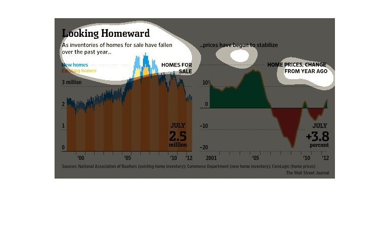
This chart describes looking homeward. Specifically, an inventories of homes for sale of fallen
over the past year. Different categories are represented by different colors.
This chart compares the inventory of homes available for sale with stabilizing prices. Prices
in July 2012 have risen 3.8%, there are 2.5 million homes available, compared to 2007 and
2008 when there were more than 4 million homes available and prices decreased almost 20%.
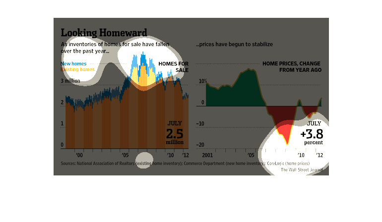
This is a chart showing that inventories of homes for sale have fallen over the past year,
causing prices to stabilize. Home prices have skyrocketed since over a year ago according
to the chart.
Currently a buyer's market is in store for the home shopper.  As prices of homes have stabilized
the number of homes available for sale have dropped.  However, the number of new homes has
fallen in line with the stabilization of the prices, which, in turn, gives the shopper more
options.