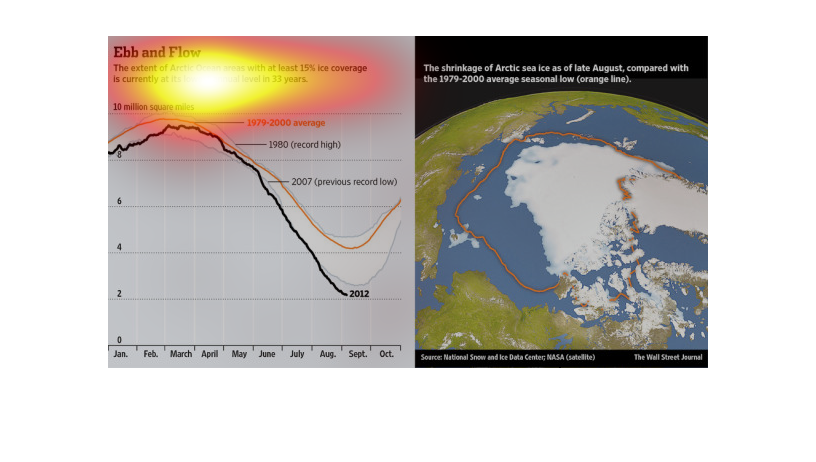
It is about high temperatures throughout the year and what our record highs I'm going to record
lows and that's all I'm going to see.  I believe it starts at 1979 and goes to 2000
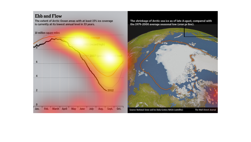
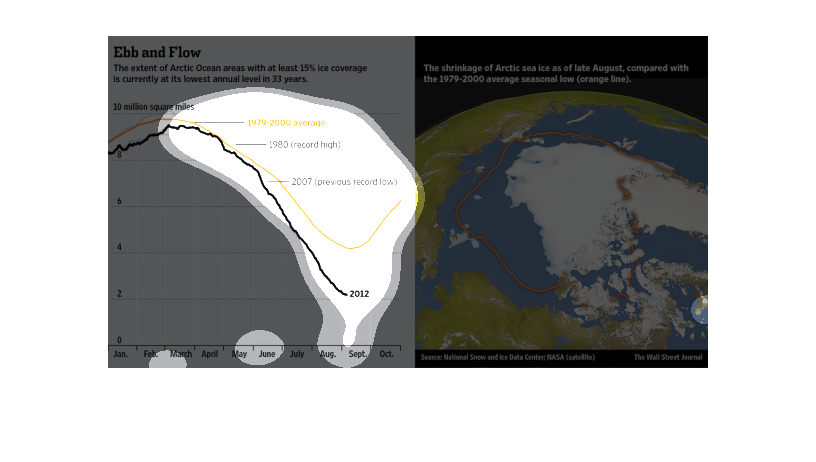
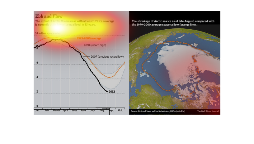
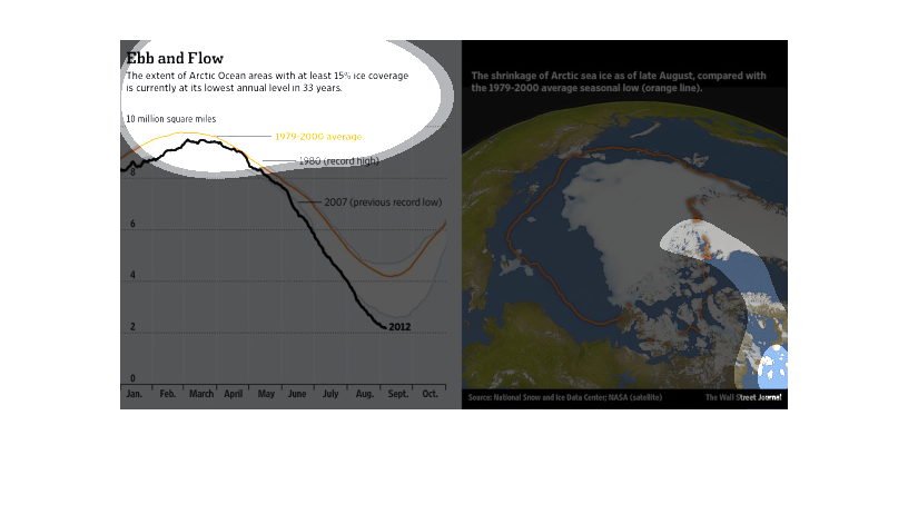
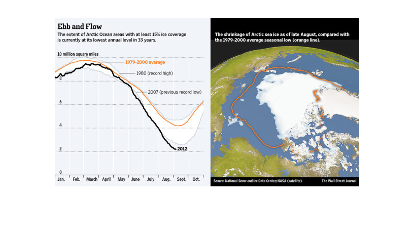
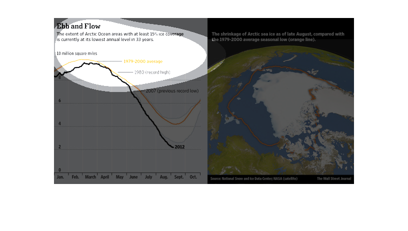
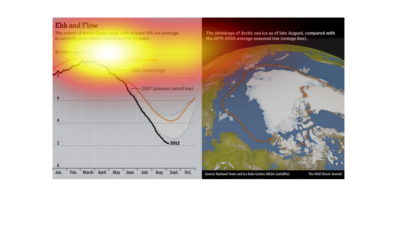
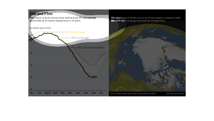
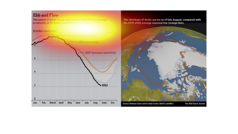
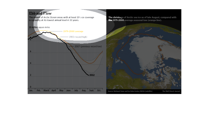
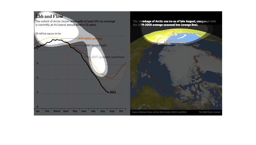
This chart describes ebb and flow. Specifically, the extent of arctic ocean areas with at
least 15% ice coverage is currently at its lowest annual level.
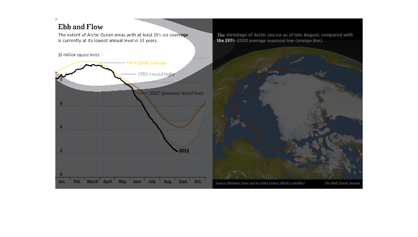
This is a chart and accompanying map of the arctic with related statistics depicting that
the extent of Arctic Ocean areas with at least 15% ice coverage is currently at its lowest
annual level in 33 years.
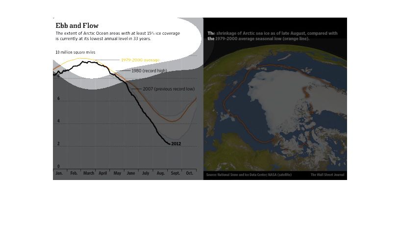
This chart is titled Ebb, and flow. It shows The extent of arctic ocean areas with at least
15% ice coverage is at its lowest annual level in 33 years.
This chart describes Ebb and Flow. Specifically, the extent of Arctic ocean areas with at
least fifteen percent ice coverage is currently at its lowest annual level in 33 years.
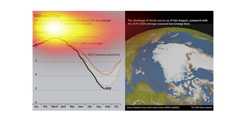
Global warming is becoming a significant issue in the political spectrum, the truth of the
matter is that it is affecting the world and we need to curb that trend, as this illustration
so beautifully points out.
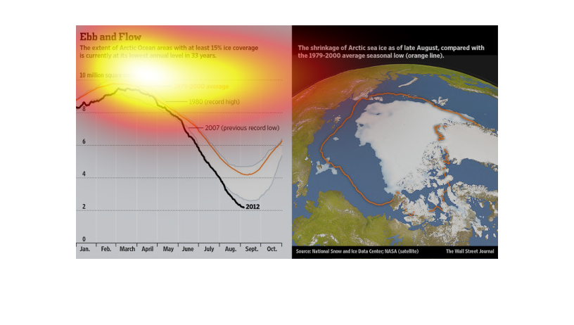
The left side of the image describes how the worldwide ice levels have decreased by 15% in
the past 33 years. The right side attempts to illustrate this point be offering an image in
which the ice levels of the Artic are compared to their past levels.
This chart clearly displays the Arctic Ocean areas within at least fifteen percent ice coverage,
with the lowest Arctic Ocean level that there has been in 33 years.
Global Warming is a serious issue that affects everyone living in this world. The fact that
the polar caps are melting is alarming, and will continue to have dexterous consequences for
everyone.
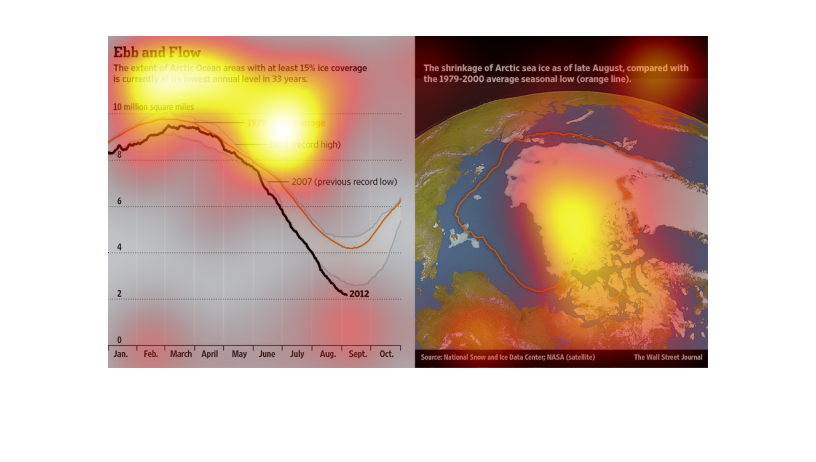
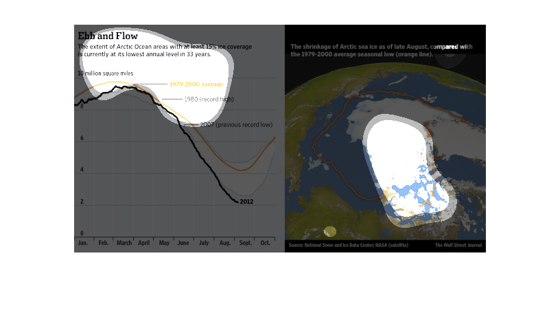
The following chart compares the amount of Arctic Sea Ice from the Year 1979 to the year 2012.
It shows a gradual decrease in the total amount of sea ice present.
The graph and accompanying image show the shrinkage of Arctic sea ice over time. The graph
on the left shows the amount of the arctic with at least 15% ice coverage over the course
of the year. The orange line represents the average from 1979-2000 and the black line represents
2012. There are also lines for the record high (1980 and previous record low (2007). In all
months of the year the 2012 line is below the average line, particularly in the months from
June to September. The image on the right shows the current amount of ice in white and the
previous average as an orange outline to show the reduction in ice coverage visually.
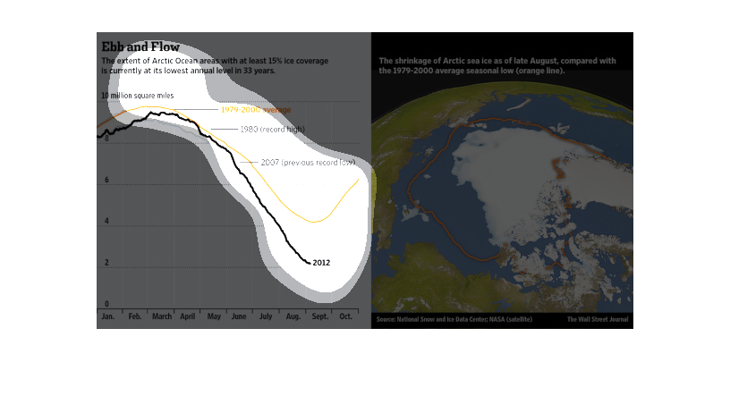
The image depicts the extent of arctic ocean with at least 15% ice coverage is currently at
it's lowest annual level in 33 years. The data indicates the effects of global warming are
real and present.
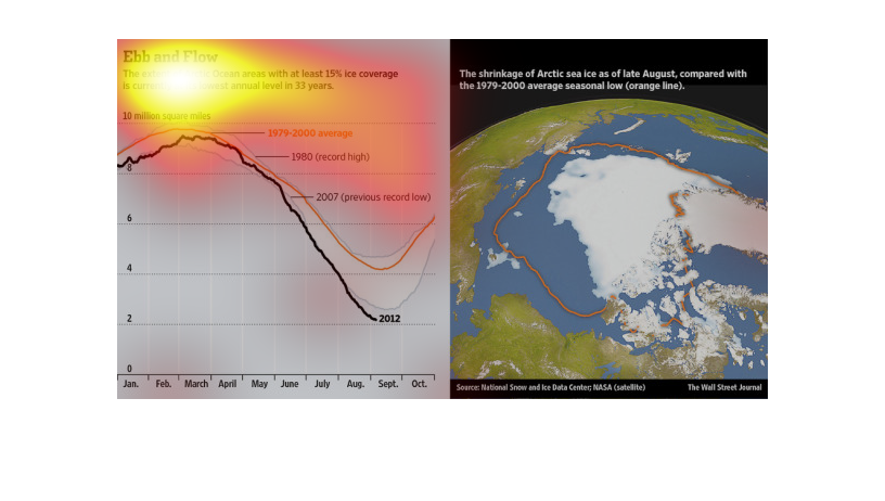
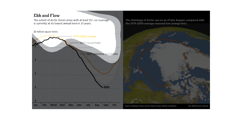
The graph shows the Ebb and Flow of the areas covered in at least 15% ice in the Arctic Ocean.
 The graph depicts information over the last 33 years.  From 1979 - 2000 the ice coverage
remained at a average rate with 1980 having a record high amount.  In 2007  the ice coverage
matched a previous record low.  The accompanying satellite image depicts the shrinkage of
the ice coverage over time.
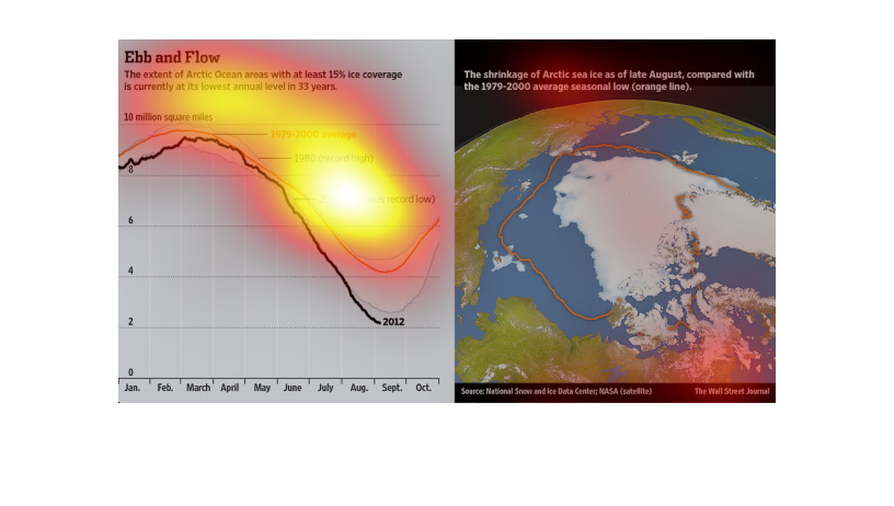
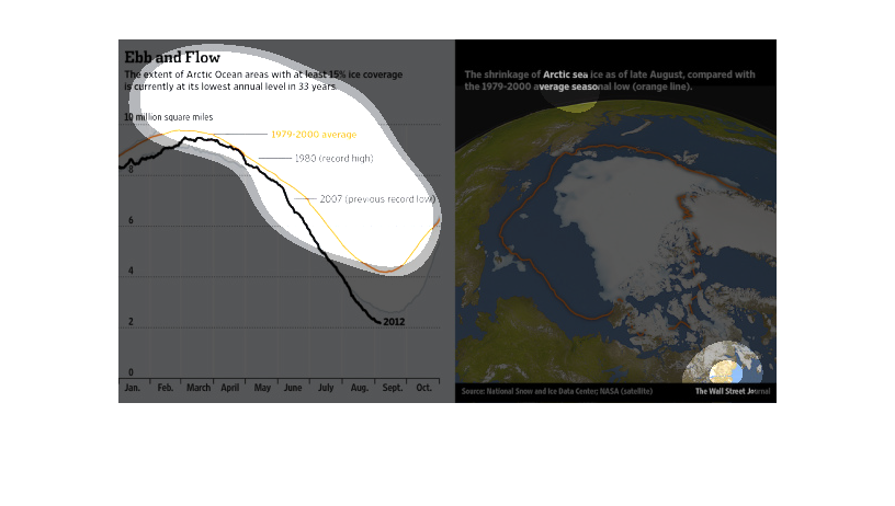
This is a chart and corresponding map showing the ebb and flow in terms of the extent of Arctic
Ocean areas with at least 15% ice coverage being at the lowest levels in 33 years.