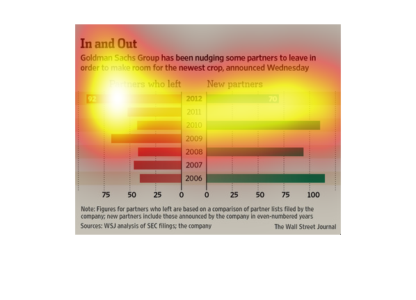
The graph details how Goldman Sachs effectively grooms their partner relationships to push
ineffective or stale partnerships out so that new partnerships can be formed that may have
more benefit. The graph also indicates that Goldman Sachs focus on adding new partners is
biannual in nature whereas pushing existing partners out is happening more year over year.
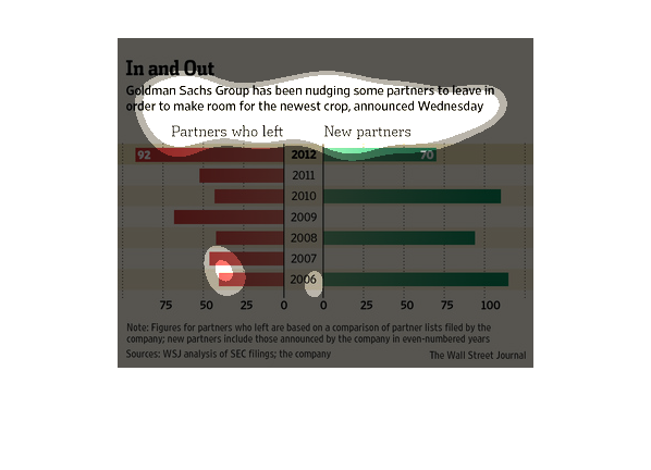
An infographic of Goldman Sachs partners showing since 2006 they have had large numbers of
partners forced to leaf to make room for new partnerships.
The graph depicts that Goldman Sachs is nudging out  current partners to make room for the
new crop of partners. In 2012 Goldman Sachs has 92 old partners and a steady creeping 70 new
partners.
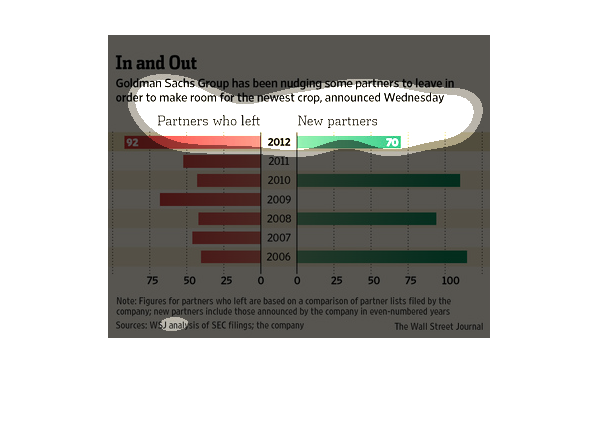
The graph is a bar graph that show the number of partners leaving Goldman Sachs and the number
of new partners brought on in that same year.  The period  of time that it covers is 2008-2012.
 In general, more partners joined Goldman Sachs than left.  However, it is noted that a larger
number left in 2012 than joined.
The image depicts how Goldman Sachs has been attempting to push certain partners out, in an
effort to attract and bring in newer partners, thereby refreshing their financial pool. More
new partners appear to be coming in versus older partners leaving as the years progress.
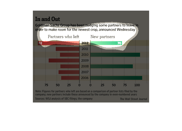
The Wall Street Journal conducted this study in which they compared the amount of executives
Goodman Sachs asked to leave in the wake of the grand economic recession.
This is a chart in the published Wall Street Journal from the WSJ Company that includes their
analysis of the SEC filings. It is to back up the statement that Goldman and Sachs are encouraging
partners are  to leave in order for new partners to move in. There are two bar graphs comparing
the amount of people that left each year to the new people that came in.
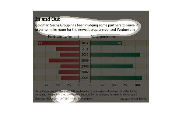
This is a series of color coded bar graphs depicting Goldman Sachs Group has been nudging
some partners to leave in order to make room for the newest crop.
In this report from an WSJ analysis of SEC Findings, it is reported the Goldman Sachs Group
is pushing out older partners for younger, new breed of associates.
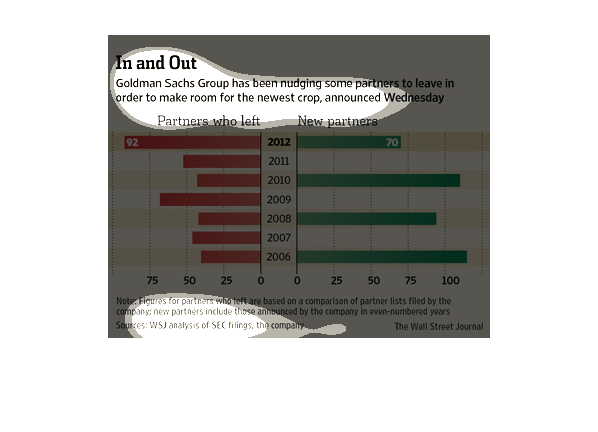
This chart shows partners who have left Goldman Sachs vs new partners they have acquired from
2008-2012. Shows a lot more departures than acquisitions as the years progress.
This chart describes in and out. Specifically, that Goldman Sachs group has been nudging some
partners to leave in order to make room for the newest crop.
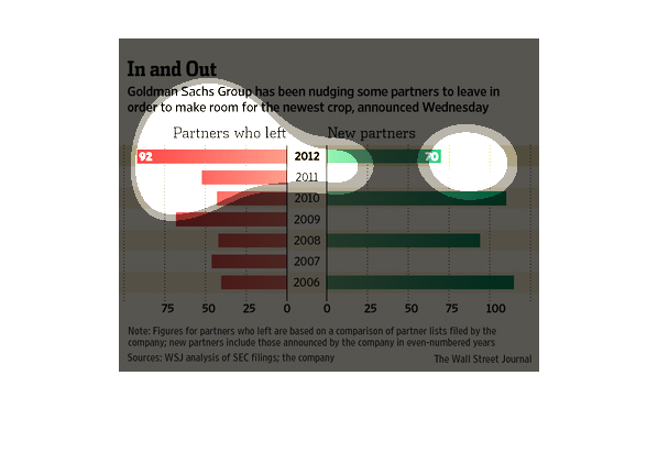
Goldman Sachs group has been pressuring some partners to leave to make room for newcomers.
The graphs show partners who have left versus new partners since 2006.  In 2006, less than
50 partners left, and more than 100 partners joined.  In 2007, about 50 partners left, and
no new partners joined.  In 2008 Less than 50 partners left, and about 90 new partners joined.
In 2009 about 70 partners left, and no new partners joined.  In 2010, about 50 partners left,
and more than 100 new partners joined.  In 2011, about 50 partners left and no new partners
joined.   In 2012, 92 partners left, while 70 new partners joined.
This chart illustrates the number of partners that are being asked to leave or resign at Goldman
Sachs in order to make room for new partners in the company.
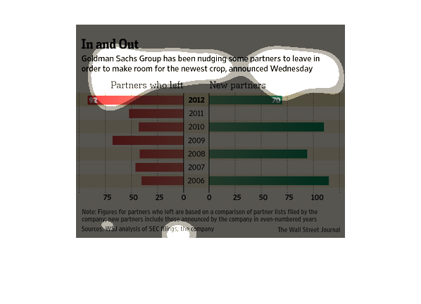
This chart describes in and out. Specifically, Goldman Sachs group has been nudging some partners
to leave in order to make room for the newer crop, announced Wednesday.