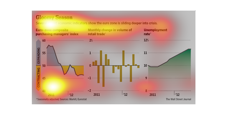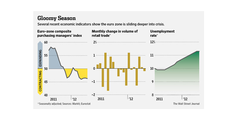
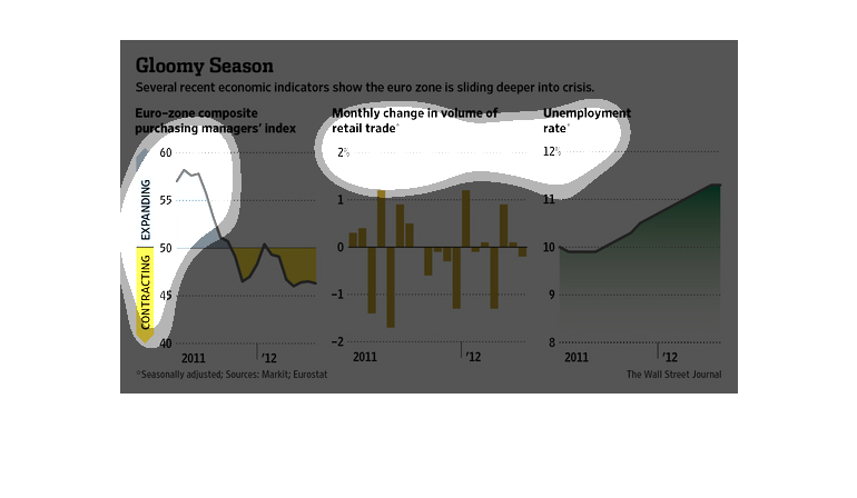
This chart depicts the euro-zones struggling economy. It faces unemployment rates rising swiftly,
a volume of retail trade dropping dramatically, and the overall number of purchases to stimulate
the economy dropping as well.
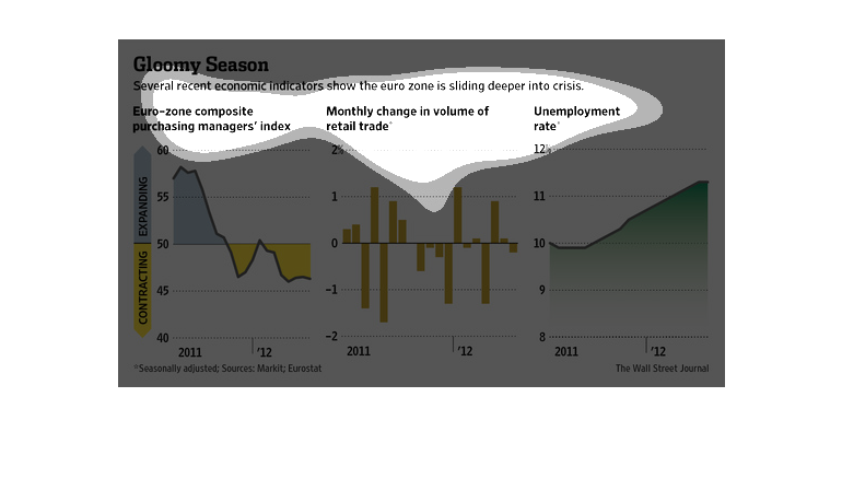
The image depicts how several economic indicators are showing that the Eurozone may very well
slip into further economic crises. The EU economy appears to be contracting much more than
it's growing, leading to inevitable very serious implications, while unemployment rates are
increasing as well.
This is a series f graphs and charts depicting that several  recent economic indicators showed
the euro zone was sliding deeper into crisis as of data available in 2012.
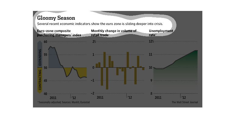
This chart describes gloomy season. Specifically, several recent economic indicators show
the euro zone is sliding deeper into crisis. Categories are represented by different colors.
I'm not sure what the Euro Zone is. But it is a graph of that and it shows their trade volume,
unemployment and management on a graph. Each one of the three graphs has a section for contracting
and expanding.
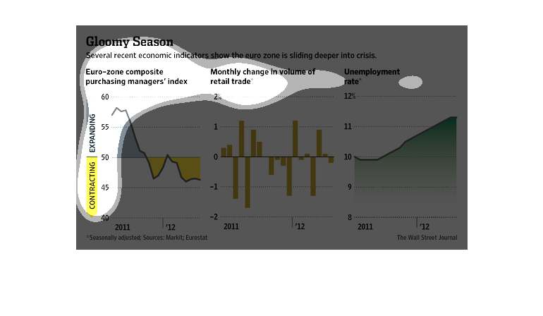
A graph infographic from 2011 to 2012 showing the Eurozone economy and showing that it may
be slipping deeper into an economic crisis. A rise in unemployment.
This chart shows the state of the Europe economy. The chart shows consumerism as well as the
amount of trade . It also shows the current unemployment rate.
This chart describes gloomy season. Specifically, several recent economic indicators show
the euro zone is sliding deeper into crisis. Different categories have different colors.
This graph illustrates economic indicators which show the euro zone sliding into crisis. It
has composite purchasing managers index, monthly changes in volume of retail trade, and unemployment
rate.
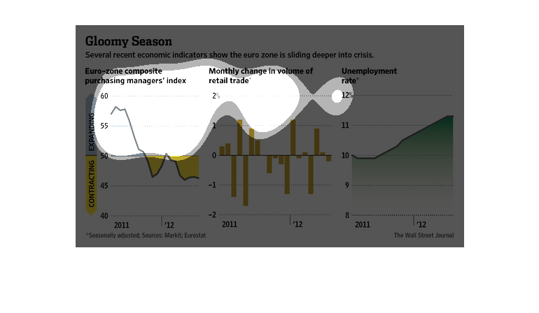
This chart shows the deepening economic crisis in the eurozone. The unemployment rate has
risen steadily from 2011 to 2012, retail sales are erratic, and the eurozone purchasing managers
index is contracting.
This chart is detailing how the eurozone is falling into financial crisis. The 3 sections
of the chart deal with the eurozone's composite managers index, retail trade, and unemployment
rate.
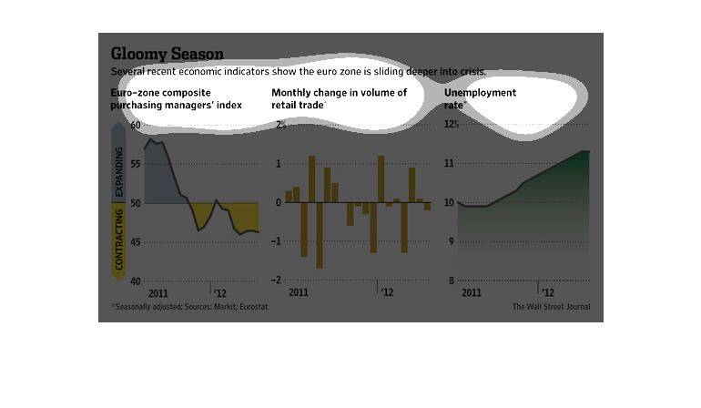
This chart or graph shows how badly the Euro-zone is  sliding deeper into crisis mode. The
things that it measures is unemployment rate, amount being spent on retail trade, and composite
purchasing managers index.
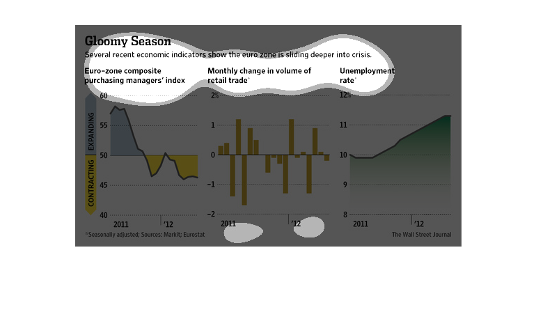
A few years ago there was talk of a major crisis about to erupt in Europe about just as bad
as what happened in the United States, and in this illustration we see that a study from 2011-2012
shows that this is a very likely scenario.