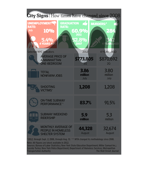
It's about the amount of people who are unemployed and college graduate and then it also cost
 apartments in populations in Manhattan  there also percentages of people
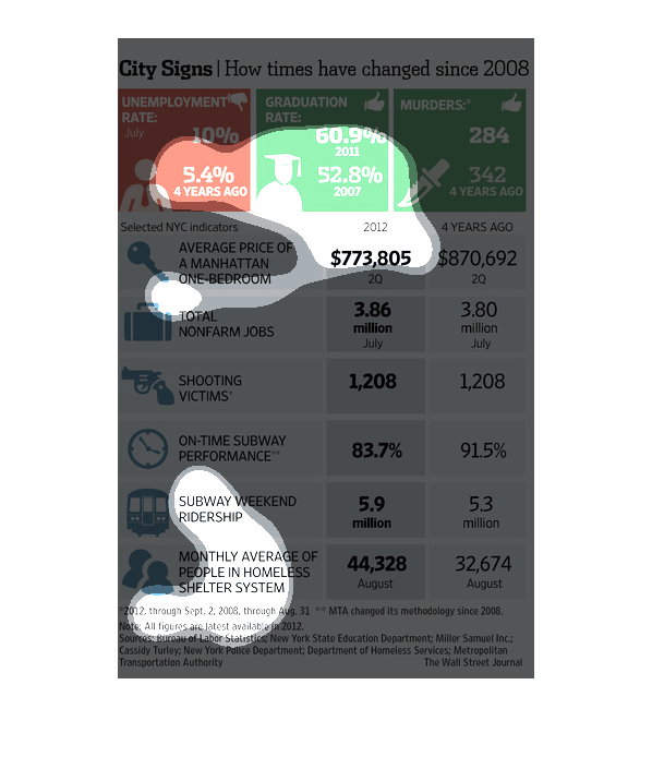
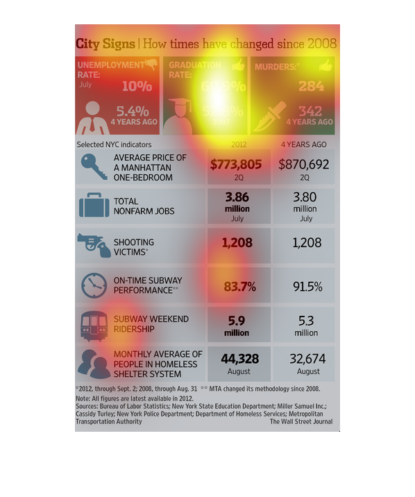
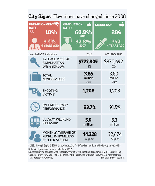
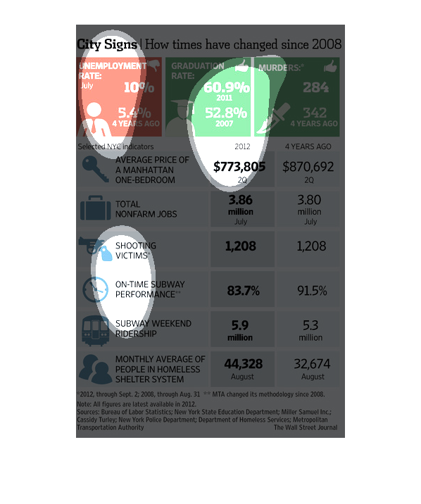
This chart describes city signs. Specifically, how times have changed since 2008 Categories
on the chart include shooting victims, and total non-farm jobs.
This is a series of statistics and related diagrams that depict how the times have changed
in New York City across a wide range of selected metrics/measurements.
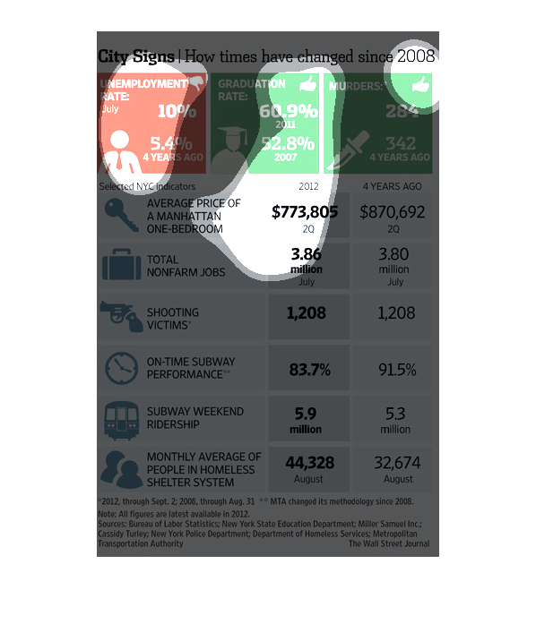
This chart compares different facts and figures from two different time period for one city.
The graph compares the unemployment rate, cost of living, and rate of people living in homeless
shelters. They appear to be a good predictor of a city's overall health. The graph is misleading
however in that 4 years ago was 2012 since it is 2016. It seems this article/graph was published
in 2012, however.
A study conducted through 2008 to 2012 showcases that the recession has given the way for
larger graduation and a decrease in murders in the 4 years as the positive thing.
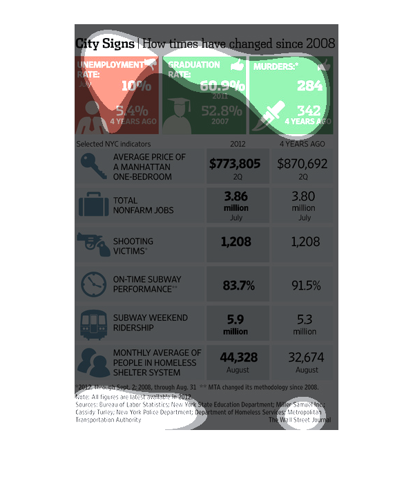
The image shows how times have changed since 2008. It shows how unemployment has increased
by 10%, yet also shows that graduation rates have increased and murder rates have decreased.
Additionally, it compares house prices, number of nonfarm jobs, shooting victims, one-time
subway performance, subway weekend ridership, and monthly average number of people in homeless
shelter.
In a study conducted by the Wall Street Journal from 2008 to 2012 showcases the vast areas
were the four year gap has changed things considerably, which in others we remain the same.
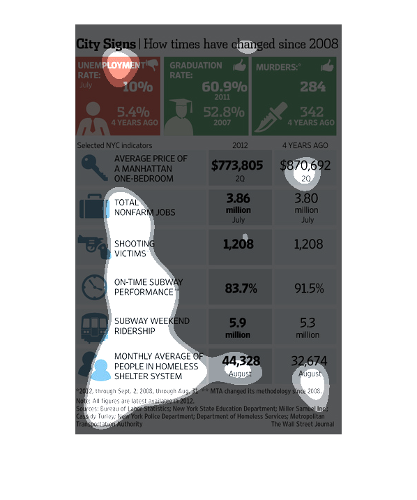
This chart shows the increase or decrease in the murder, unemployment, and graduation rate
since 2008 in New York City. Only the unemployment rate has increased , while the other two
notably declined. The chart further shows various other statistics important to know for living
in the city ,and how much they increased and or decreased.There was noticeable decline in
housing costs and one time subways. All of the other statistics stayed the same or increased.
This chart describes city signs. Specifically, how times have changed since 2008. Categories
on the chart include unemployment rate, and graduation rate.
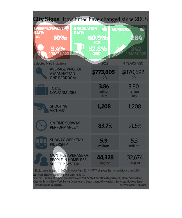
This is a chart that shows how murder rates, graduation rates, and unemployment rates have
changed since 2008. It shows that the unemployment rate has increased, the graduation rate
has increased, and the murder rate decreased. It also shows some differences in other categories
such as non-farm jobs.
This is a series of statistics and charts depicting how the city of New York has changed in
a group of selected varying metrics/measurements since the year 2008.
The image talks about the fall in unemployment, rise in graduation rates, and fall in murders.
Along with these, it shows an array of other positive changes that have happened in this particular
area over time.
This image compares statistics among unemployment, graduation, and murder rates from 2008
to 2012 in New York City. It also compares other statistics like the average price of a Manhattan
bedroom, subway statistics, shooting victims, and amount of citizens in homeless shelters.
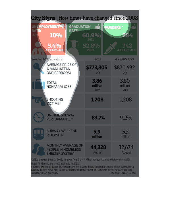
The image depicts the comparison of the unemployment rate, graduation rates, murder rates,
and a number of other categories from 2008-2012. The unemployment rate has increased, graduation
rates have increased, and murder rates have decreased.
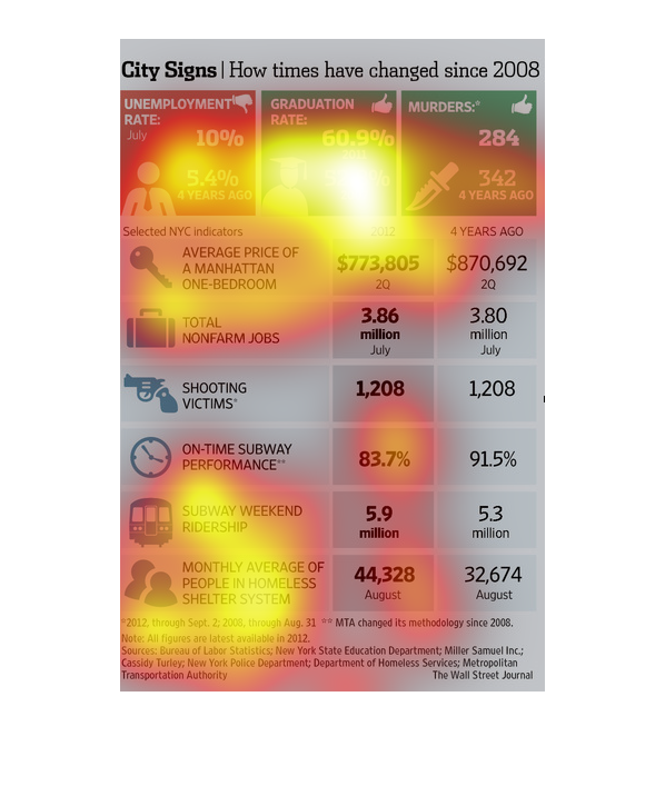
This poster shows signs, what they are now and what they used to look like. This chart shows
how signs evolve over time and to show visual diffrence. Might help someone who is curious
about past.