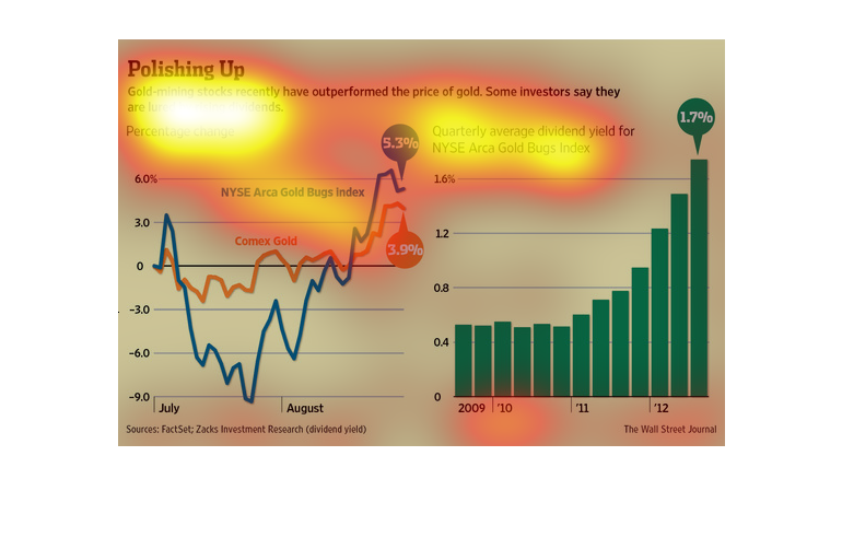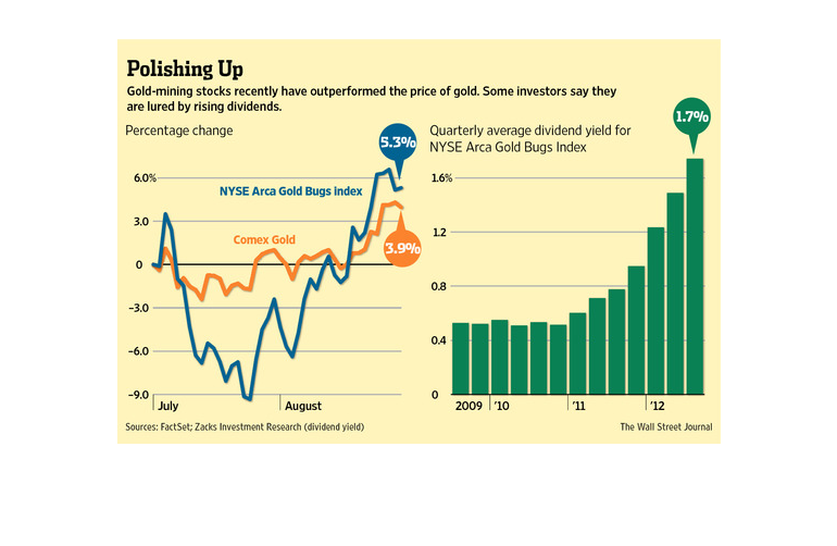
These two graphs show that the stock performance of gold is outpacing the price of gold. On
the left a dual colored line graph shows the percentage of changes, while a bar graph on the
right shows the quarterly yield stock performance.
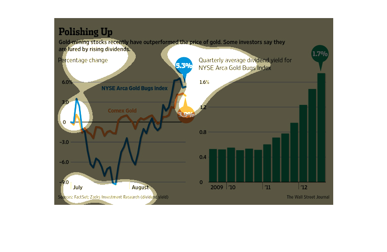
The image depicts how gold mining stocks have outperformed the price of gold, with rising
dividends being cited by some investors. The data appears to support this hypothesis.
This chart describes polishing up. Specifically, gold mining stocks recently have outperformed
the price of gold. Some investors say they lured by rising dividends.
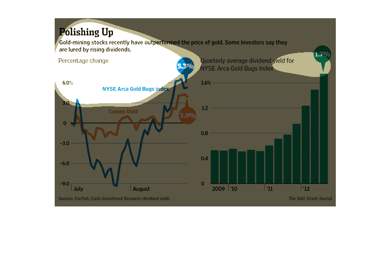
The first graph is the New York Stock Exchange gold index. Te second graph shows the quarterly
average dividend yield for NYSE Arca gold bugs index. They both a show a large increase.
This chart describes polishing up. Specifically, gold mining stocks recently have out performed
the price of gold. Different categories are represented by different colors.
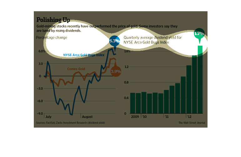
The image depicts how gold mining stocks have outperformed the price of gold. Rising dividends
may be a reason for this increase. The difference between the two is somewhere around 1%,
but a steady increase is observable in the data.
This graph is showing how gold mining stocks are actually out performing the gold stocks.
The gold mining stocks are showing an increase by 5.3% while the gold stocks are just increasing
at 3.9%.
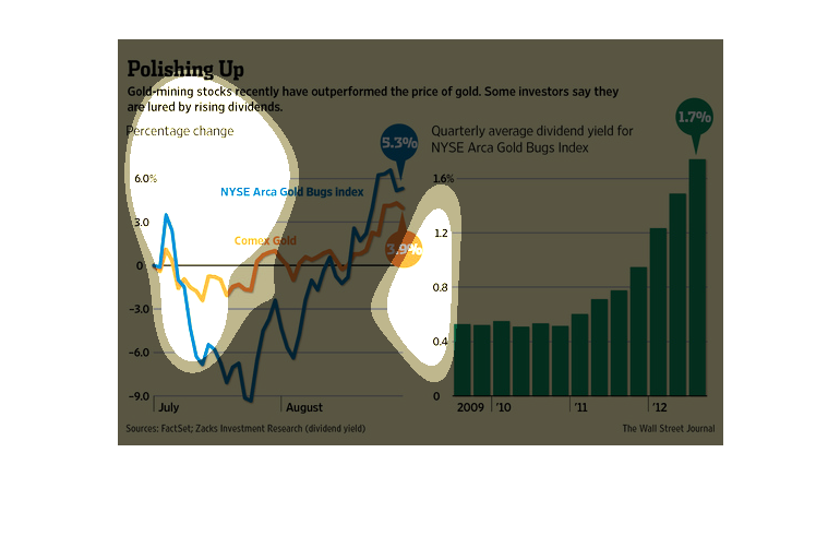
Polishing up, gold mining stocks have recently out performed the price of gold, some investors
say they are lured by the rising dividends. As displayed by a line graph gold prices have
only slowly climbed, m.ining plummeted and then quickly rose again
The image describes how gold stock prices have risen    to a greater extent than the underlying
commodity (the graph on the left). This may be due to the high dividend yield that these stocks
offer (the graph on the right).
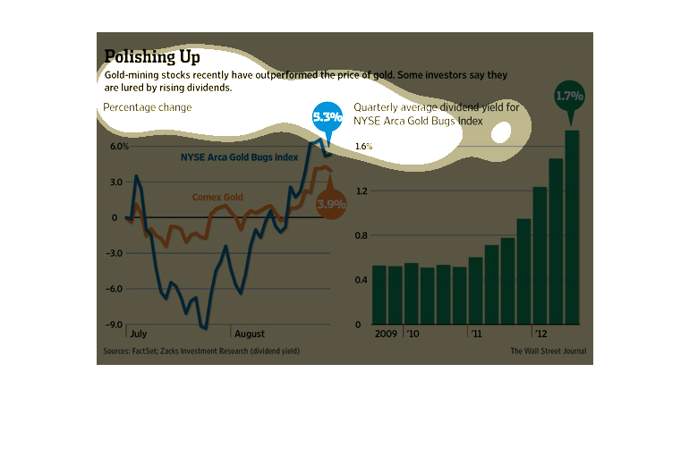
This graph illustrates the percentage change in gold mining stocks and the quarterly average
dividend yield for Arca Gold on the New York Stock Exchange.
This image shows or depicts in statistical line and bar graph formats data concerning how
gold mining stocks are outperforming the price of gold in general.
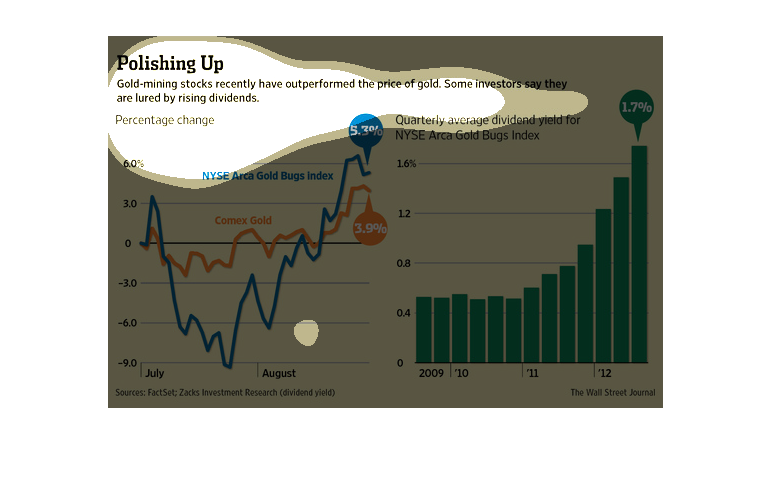
This is a series of color coded charts, graphs and related statistics depicting that gold-mining
stocks had recently outperformed the price of gold in general.
It is called Polishing UP Gold mining stocks have outperformed the price of Gold  There is
a graph for percentage change A graph for Quarterly for NYSE Arca Gold Bugs Index  Some investors
are lured by the rising dividends The graph for the Quarterly Index  is for 2009 to 2012
The blue line on the percentage change graph is for