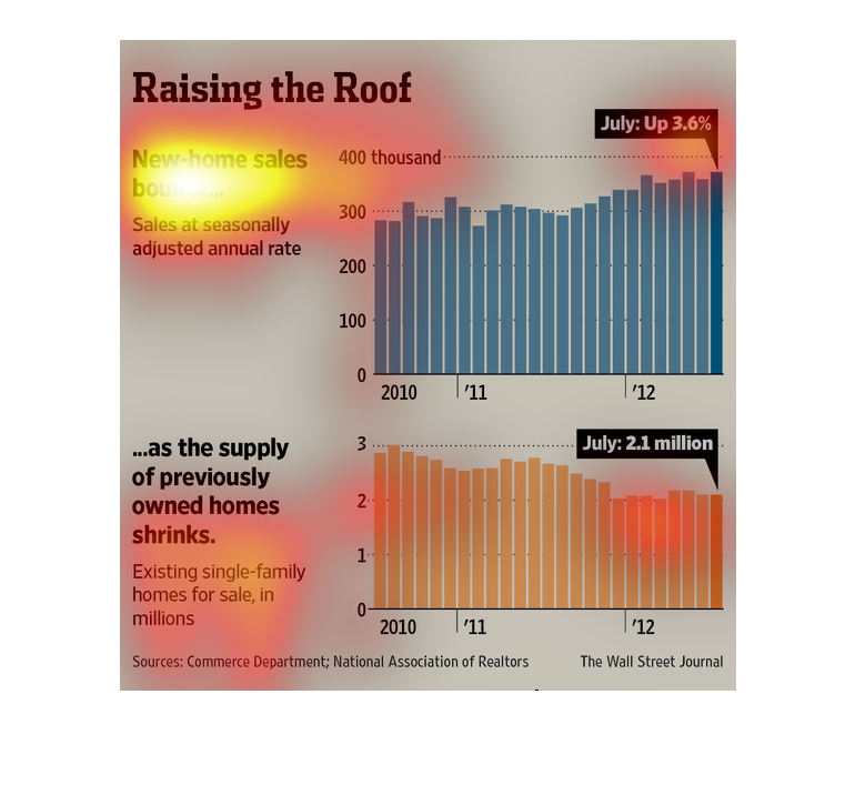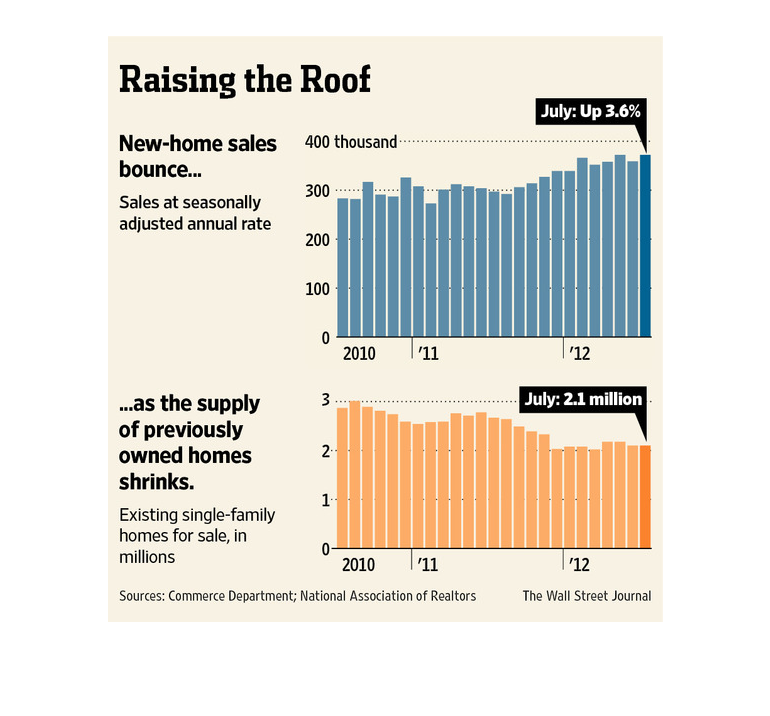
This is series of charts, graphs and related statistics depicting that seasonally adjusted
home sales had increased while the supply of existing homes had decreased.
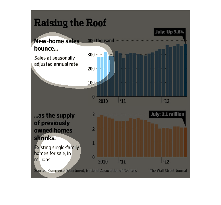
A study conducted by the Wall Street Journal from 2010 to 2012 shows that the amount of home
creation- construction- is up, while the sale of already build housing is low. Second recession
anybody?
Even though there are fewer homes up for sale, people are buying 3.6% more homes than they
did previously. The first chart clearly shows a steady increase from 2010 to 2012. It started
under three hundred thousand but is now over four thousand. In comparison, there were just
under three million homes up for sale in 2010 and that has dropped down to just over two million.
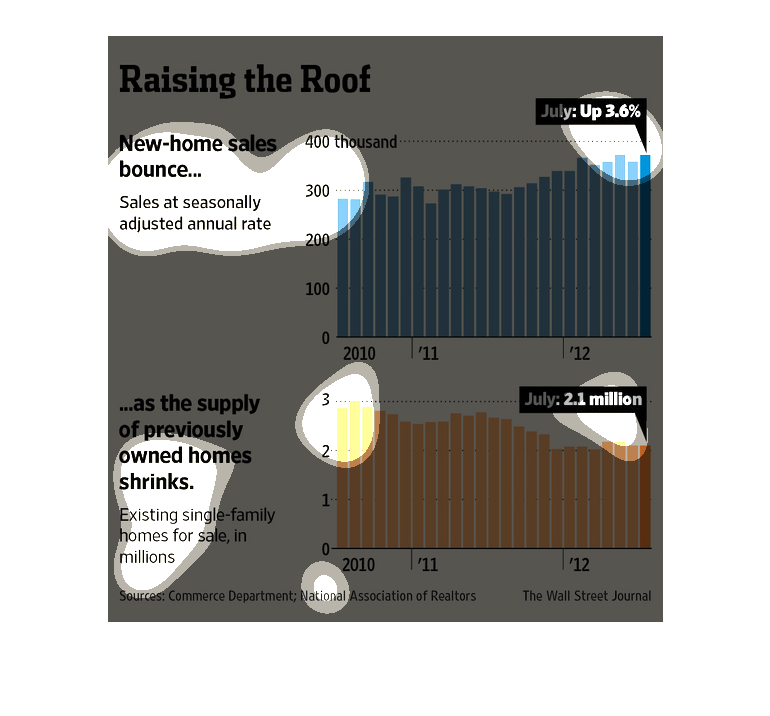
The top graph shows home sales at seasonal adjusted rate and their growth from 2010 to 2012
and the change in sales of existing single family homes from 2010 to 2012.
This chart describes raising the roof. Different categories on the chart are represented by
different colors. Specifically the colors blue and orange.
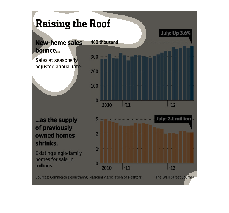
A bar chart infographic showing the inverse relationship between old and new home sales. The
supply of older her shrinks and as such new home sales have increased
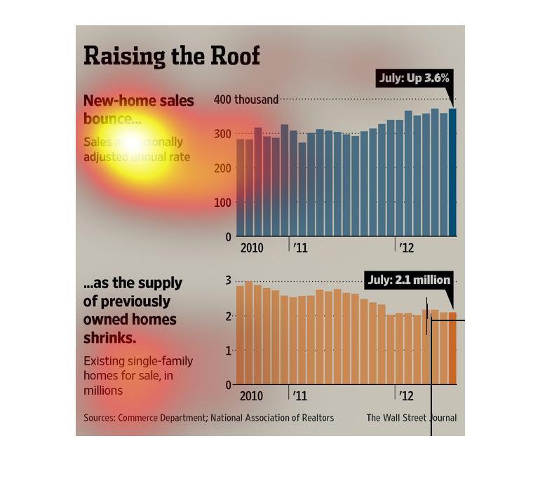
Homes prices are on the rise, as the economy recuperates we slowly start seeing it in the
cost of purchase. In this graphic there is a meticulous tracking of work that is really interesting.
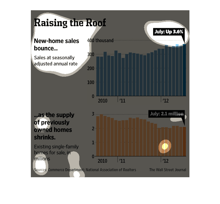
Two bar charts. One showing the rise in new home sales and the decrease in pre-owned single
family homes available for purchase.   For the years 2010-2012
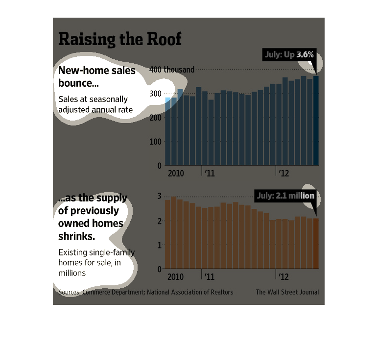
This is an image of graphs that depict a rise in new housing sales and a decrease in sales
of previously owned homes. The first graph shows that the sales were up 3.6% in July.
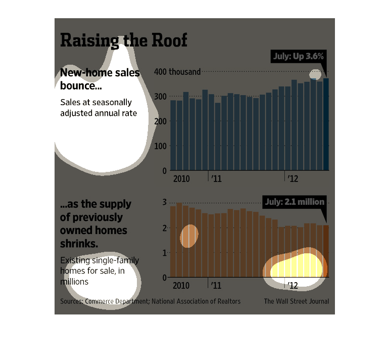
The diagrams discuss the housing situation in American. As sales of pre-existing homes have
increased, more and more new homes are being built. The month of July has been particularly
active.
These two charts represent the bounce back of home sales, from 2010 to 2012. The below graph
shows the sale of single family homes in millions, trending down, while the top shows the
annual sales in hundreds of thousands, trending up.
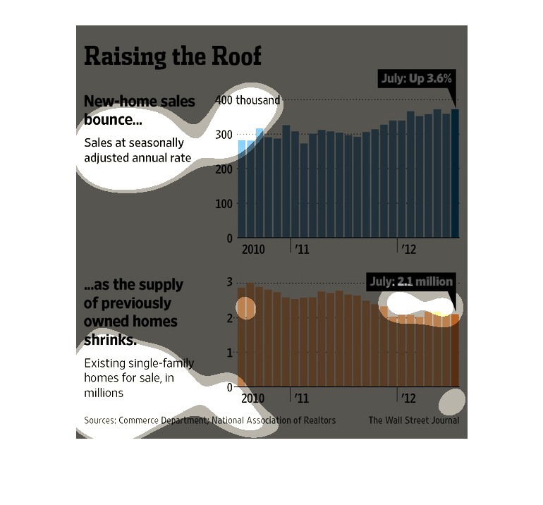
The image depicts new home sales increasing slightly from 2010-2012, as the supply of previously
owned homes shrinks. Sales were up 3.6% July. The price for homes seems to have fallen slightly
over the same time period.
Raising the Roof. New Home sales bounce. Sales at seasonally adjusted annual rate. This trend
is displayed in a bar graph with a sales on the Y axis and years on the X axis. This correlates
with supply of previously owned homes shrinking. A similar graph shows this trend.
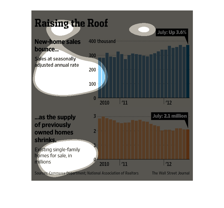
This chart describes raising the roof. Specifically, new home sales bounce, and sales at seasonally
adjusted annual rate. Different categories are illustrated by different colors.
The image is titled "Raising the Roof" and is of two bar graphs depicting  a bounce in new
home sales and the shrinkage of property available on the market.