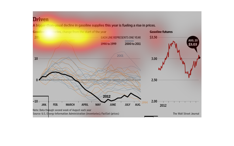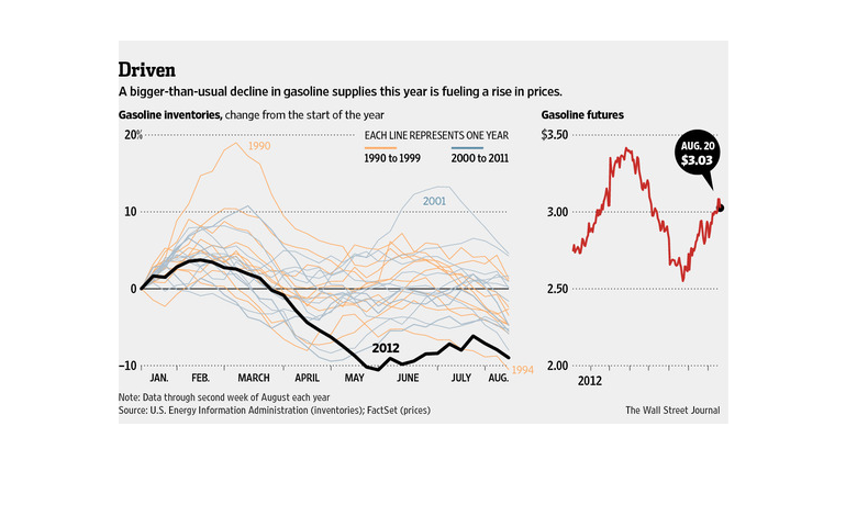
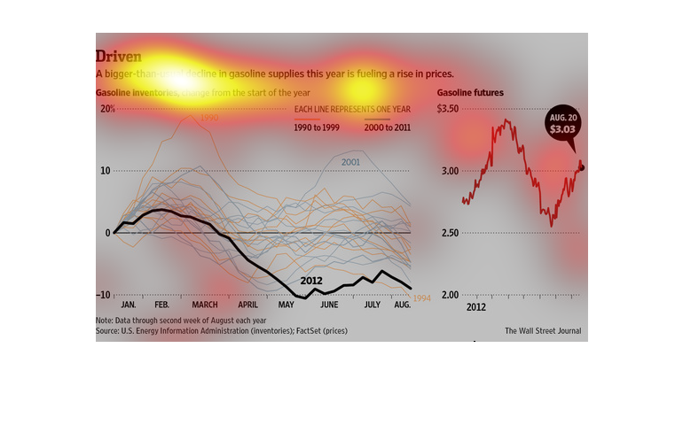
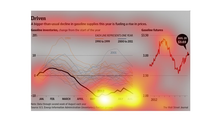
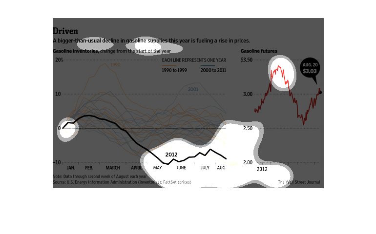
This is a series of color coded charts with related statistics depicting that a bigger than
usual decline is gasoline supplies that year was fueling a rise in prices.

As the recession is fading from memory to most people, it is alarming now that certain factions
are taking advantage of that fact, by keeping gasoline prices high even though oil prices
are quite low.
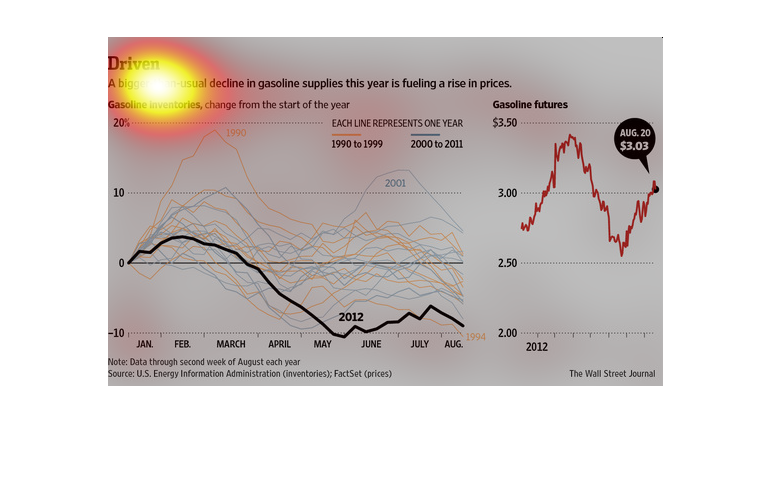
This graph shows, "Driven. A bigger-then-usual decline in gasoline supplies this year is fueling
a rise in prices.". The graph is a line graph that shows the steady incline of gas prices.
Fuel is at an all time high, yet oil has never been cheaper than it has been these past couple
of years; what is going on? In this graph it shows plainly that most people can't wrap their
head around it either.
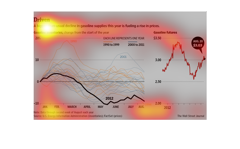
A drop in gasoline supplies in the summer of 2012 resulted in increased prices that summer.
Prices rose to almost $3.50 per gallon in June, from a low of $2.75 earlier in the year. Prices
began to recover in August, even though supplies were still down about 10% compared to previous
years.
 It lists the gasoline price by year. Starting with 303 per gallon  and then it has gasoline
inventories by month of the year starting with January and going through December. Not sure
what you're

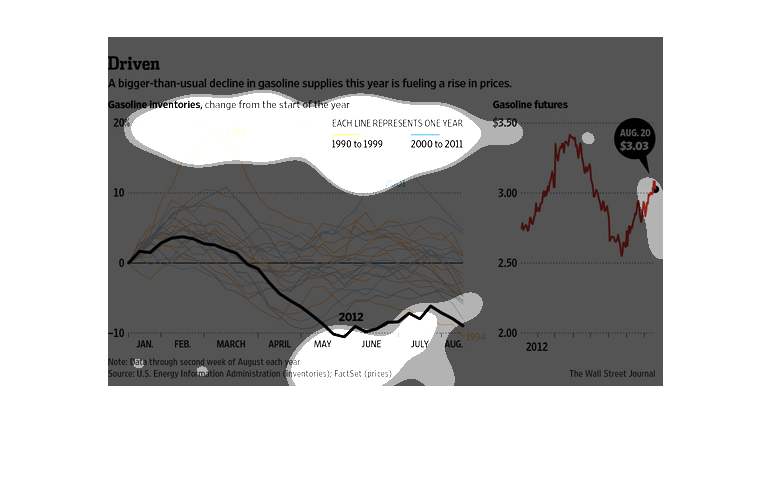
This chart describes driven. Specifically, a bigger than usual decline in gasoline supplies
this year is fueling a rise in prices. The highest spike on the chart comes in 2012.
This image is about how a bigger than usual decline in gasoline supply this year is fueling
a rise in prices. It depicts a graph comparing these two variables and predicts future prices
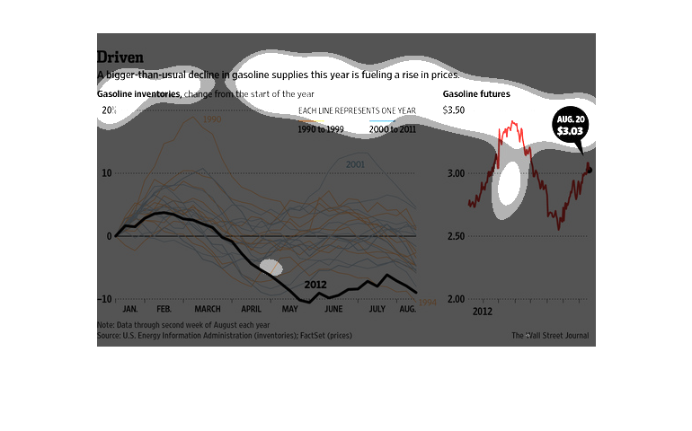
This chart shows the supply and demand of gasoline it also shows the price per gallon at the
pump and how it relates to supply and demand the price has fluctuated
This image is about how oil supplies declined while raising the price. The data and the graph
shows the timeline of the gas prices and supplies are interacting.
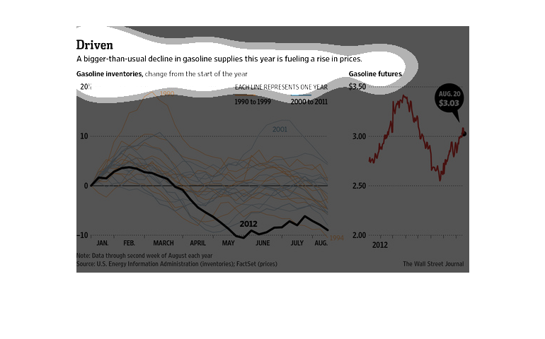
This chart shows information about gasoline supplies. It shows about how and why gasoline
supplies are declining. And because of that it means that there will be an increase in gas
prices and there is a chart to show that.
The charts describes how the price of fuel increased as gas supplies decreased. A change in
inventory over 10% resulted in a change in price of about 50 cents per gallon.
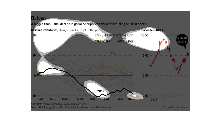
An unusual decline in the supply of gasoline in this year is causing a rise in gas prices.
Gasoline inventories are shrinking and gas futures are rising.
This chart describes driven. Specifically, bigger than usual decline in gasoline supplies
this year in fueling a rise in prices. The chart also describes that gasoline inventories,
change from the start of the year.