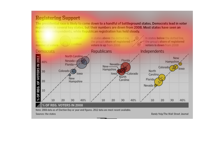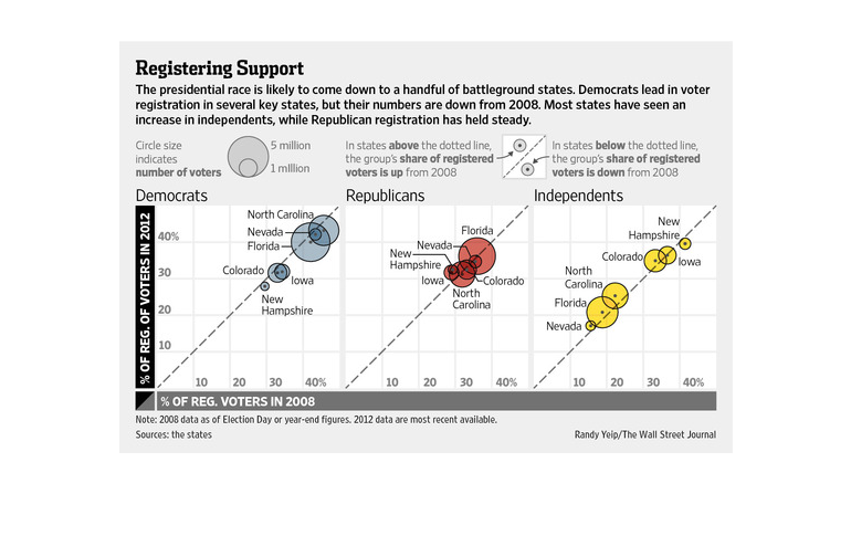
An infographic for the 2008 election registered voters in various battleground states. Shows
various number of registers voters by party and state generally
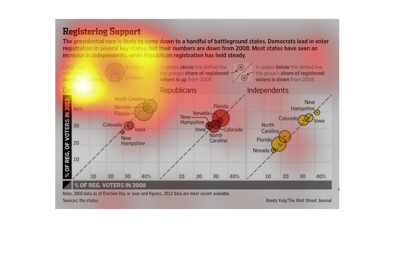
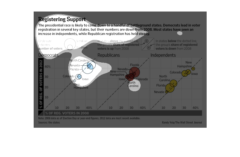
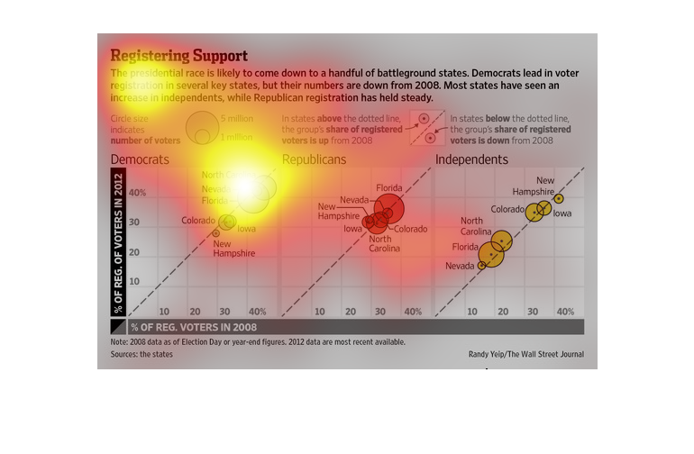
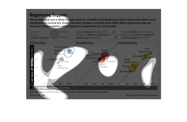
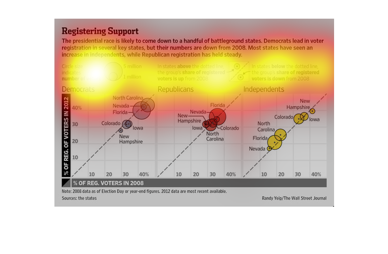
This is a graphical color coded chart depicting the presidential race is likely to come down
to a handful of battleground states during the election of 2012.

The following chart suggests that the presedential election in 2012 would come down to a few
crucial swing states. Those states mentioned Where Florida, Iowa, Colorado, New Hampshire,
North Carolina and Nevada.
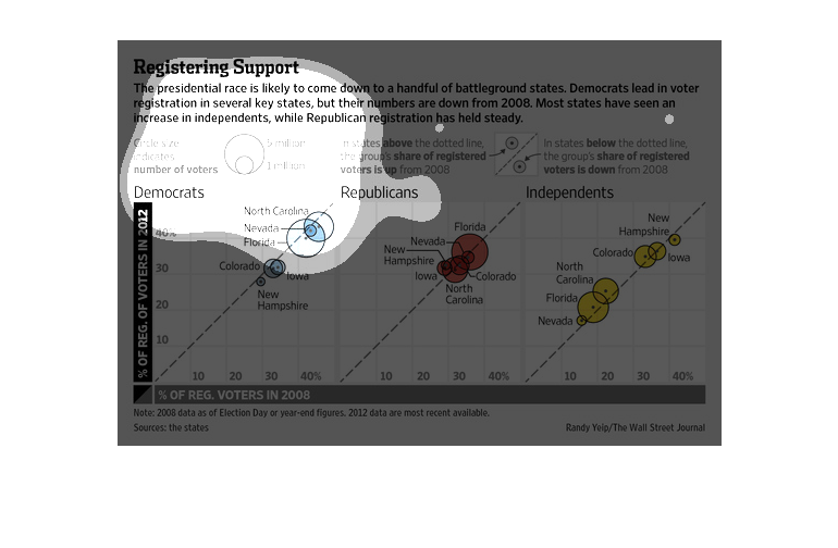
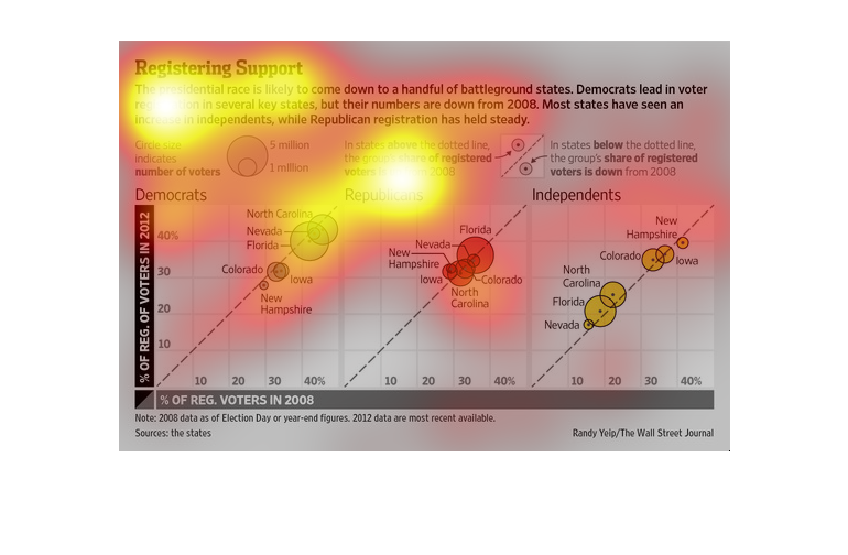
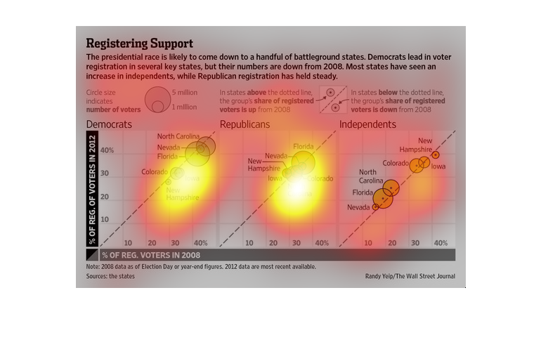
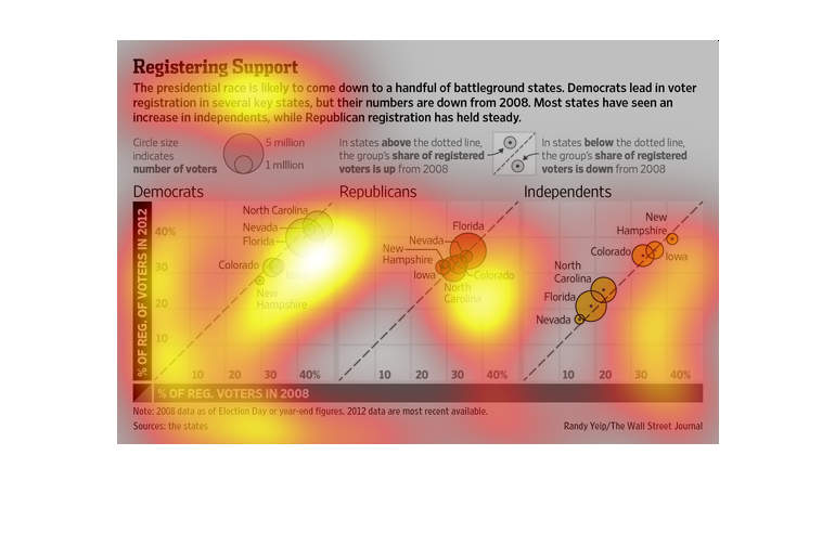
This chart describes registering support. Specifically, the presidential race is likely to
come down to a handful of battleground states around the US.
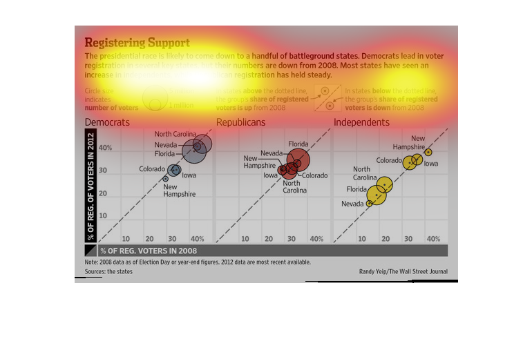
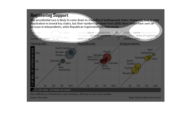
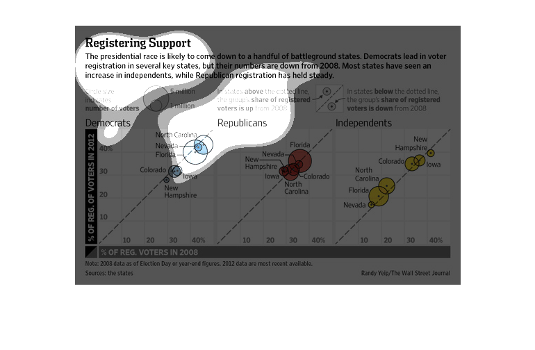
This chart clearly displays the amount of voters who represent the Democratic, Republican,
And independent parties. The chart shows several circles for each state, the size of the circle
representing how many people.
This graph compares the number of  Demographic voters in both 2008 and 2012, as well as important
states which can determine the outcome of a presidential race.  These states are also known
as 'Battleground' states.
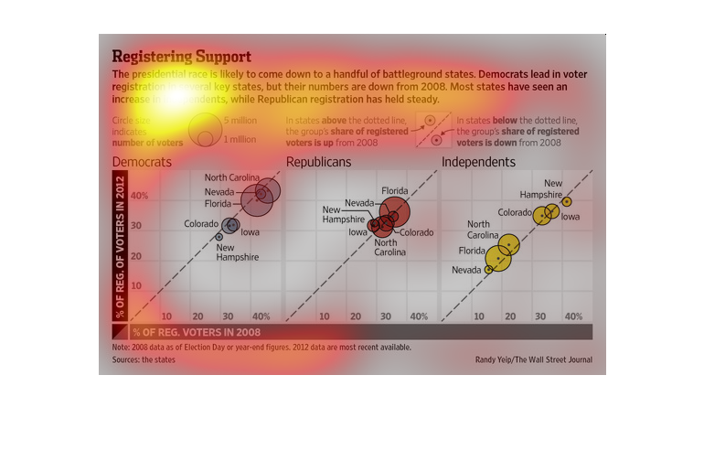
This is a series of plot line charts depicting that the presidential race was likely to come
down to handful of battleground states Democratic registration numbers were shown to be down
over the 2008 election cycle.
The presidential race is heating up, and this study tries to explain the vast complexity of
how the state to state campaigns are being run, and how effective they have been.
The image depicts how the 2012 election will come down to a small number of battleground states,
with democrats leading in voter registration in a number of states, yet lacking the same numbers
they had during the 2008 election (as expected).
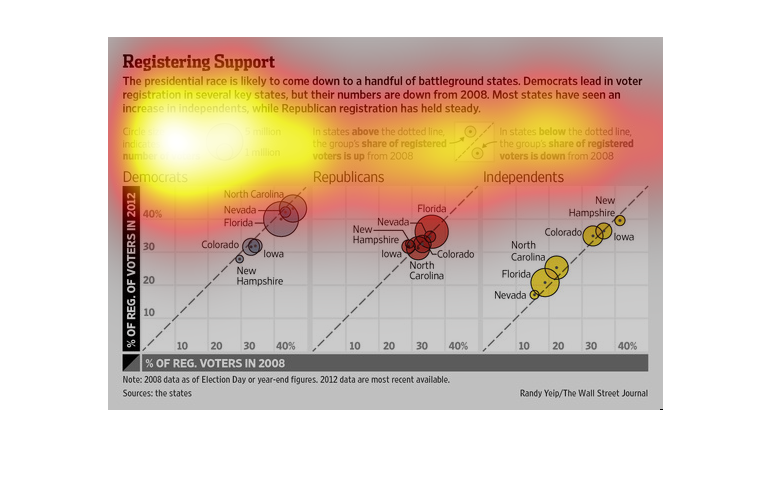
While Democratic registrations are the largest in the current election, the numbers are still
lower than they were in 2008.  Especially in Florida we see that the numbers of registered
Democrats have decreased.  The number of independents in America has also increased in most
states, most notably Florida and North Carolina.  However, Republicans have remained constant.
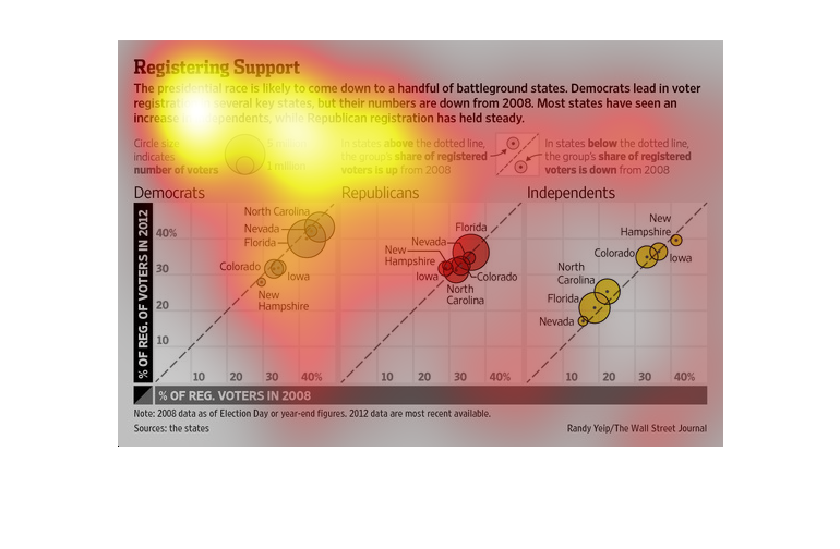
Depiction of a circular pictograph illustrating the amount of voters per state in a particular
demographic (here being the political party associated with it) ( republians, independents,
democrats, with florida, iowa, and colorado as well as north carolina being the most significant
states, having the largest number of voters  )
This is a chart that describes the trend of votes that are registered for the 2008 and 2012
election. It is broken down by republican, democrat and independent. Each data point is also
noted for each state and the mount there.
This image shows or depicts in a bubble flow chart statistical format data concerning how
this presidential race will be coming down to registered support of a handful of battleground
states.
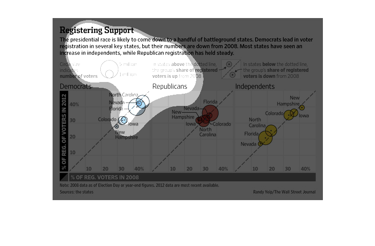
This chart shows how tight the presedential race is becoming. It says that Republican support
is remaining the same, while independents are increasing and Democrats are still maintaining
a lead.
This chart describes registering support. Specifically, the presidential race is likely to
come down to a handful of battleground states. Democrats lead in voter registration.