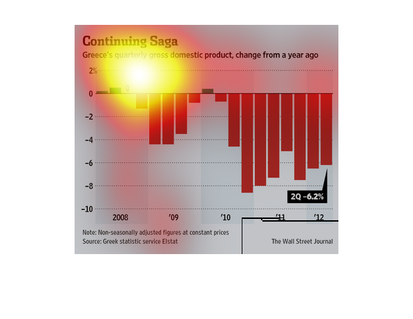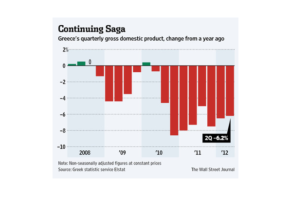
This graph published by the Wall Street Journal details Greece's declining economy through
representation of their quarterly gross domestic product as reported by Elstat. Beginning
in Q4 of 2008 Greece has been at a deficit with their GDP. In Q1 of 2010 there was a short
recovery which then led into a period of sharp decline followed by a slow recovery. The highlight
being that over the course of a year from Q2 of 2011to Q2 of 2012 there was little to no improvement.
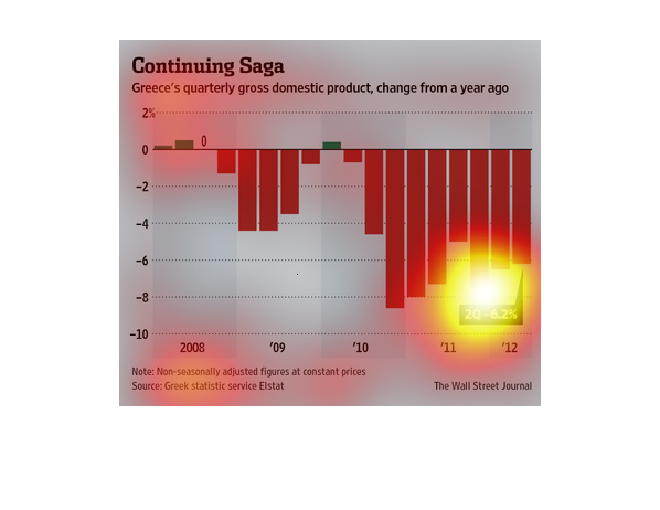
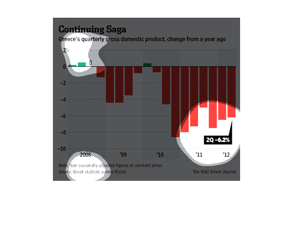
This graph describes Greece's quarterly GDP change from one year ago. We see that there is
positive change in 2008, but beyond that point from 2009-2012 there is negative percentage
of change in GDP. Specifically, the negative change in GDP is greatest between 2010 and 2011.
The graph is a bar graph showing the change in Greece's Gross Domestic Product.  The time
period is 2008-2012.  During most of this time, Greece's  GDP fell as evidenced by the red
bars.
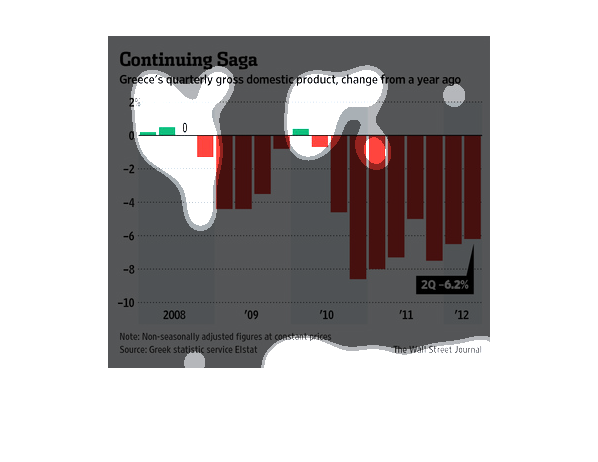
This chart describes continuing saga. Specifically, Greece's quarterly gross domestic product,
change from a year ago. Different categories are represented by different colors.
This study conducted by The Wall Street Journal from 2008-2012 shows the steady decline in
economic growth of the state of Greece. This is a huge deal that we now see affecting the
other Euro nations.
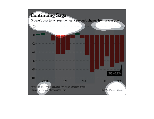
It is a graph showing the change in Greece's Gross Domestic Product numbers since they year
of 2008 and forward. It seems the number has dropped drastically.
The chart shows the change of Greece's gross domestic product over the last year. After a
brief rise at the beginning of 2010, the GDP has fallen to 6.2%.
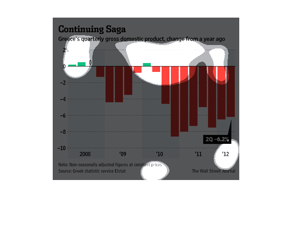
This chart compares Greece's GDP change from a year ago. During the second quarter of 2012,
Greece's GDP was -6.2%. The lowest it has been was in 2010, -8%, the highest was in 2008.
the name of this graph is called countinuing sage and its about greece and their money and
 stuff they need to keep living, the bar graph is red and
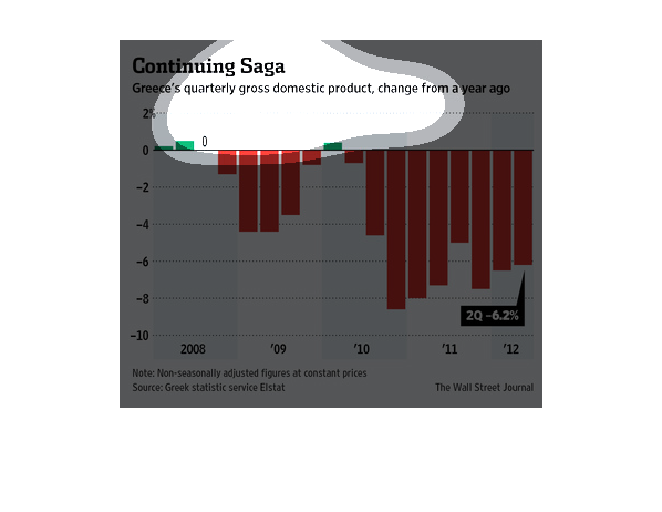
It's a graph of Greece's quarterly gross domestic product change from a year ago, for the
period between 2008 and 2012. Most years are red (negative) meaning there has been a negative
change in Greece's gross domestic product (GDP).
This graph illustrates Greece's quarterly changes in gross domestic product.  It begins with
a positive in 2008 and goes to almost 6.2% negative in 2012.
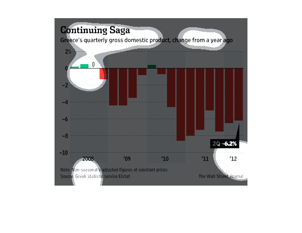
This graph shows how Greece's quarterly gross domestic product has trended since 2008. In
just the last two quarters of 2012, it fell to -6.2%. Even in 2008, it was barely above 0.
The image depicts Greece's quarterly gross domestic product, changes between 2008-2012, specifically
focusing on the changes from in the last year. Growth has contracted to -6.2% in Q2.
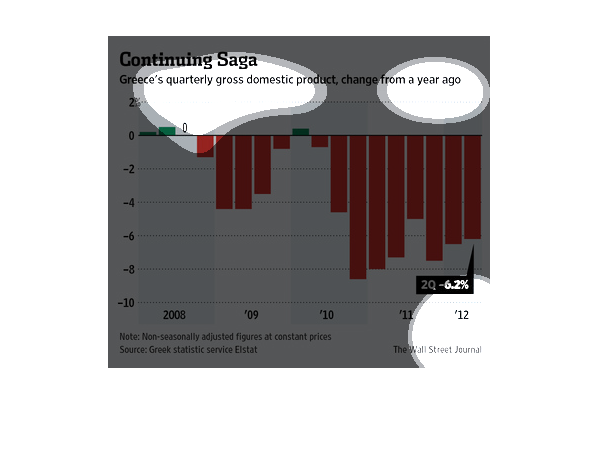
This chart describes continuing saga. Specifically, Greece's quarterly gross domestic product,
change from a year ago. Different categories are represented by different colors.