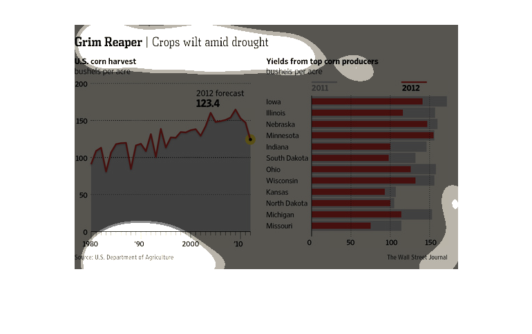
This chart from the Wall Street Journal shows how corn bushels per acre have started to level
off because of the drought in corn growing regions in the US
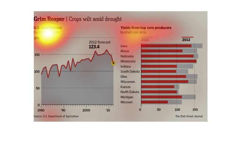
The United States Department of Agriculture has released some data- thoroughly analyzed by
the Wall Street Journal- that drought is affecting a plethora of crops across the nation.
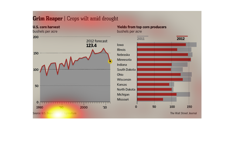
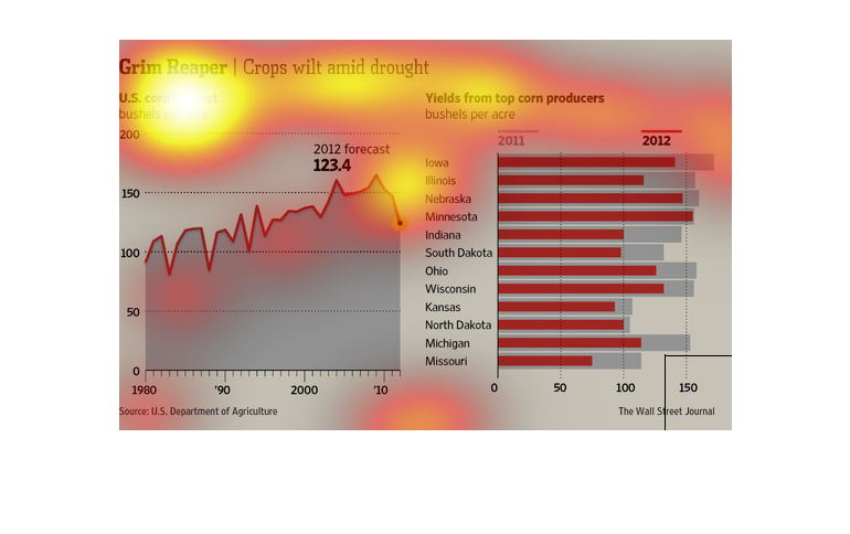
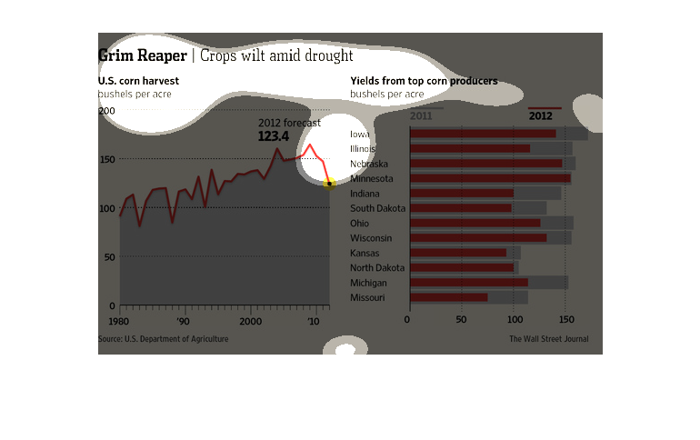
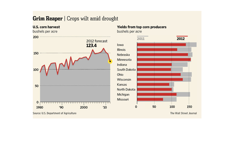
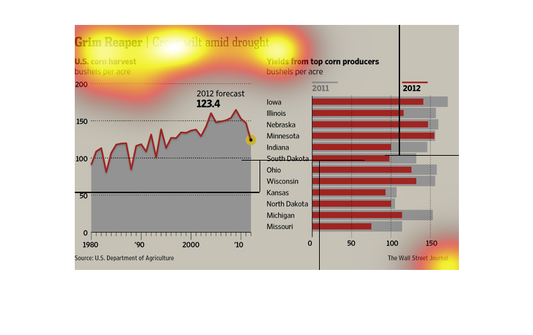
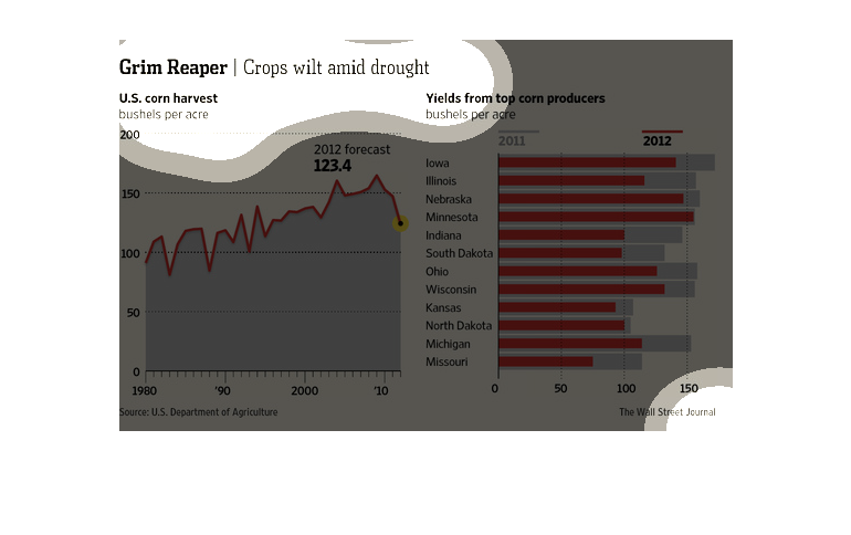
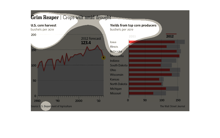
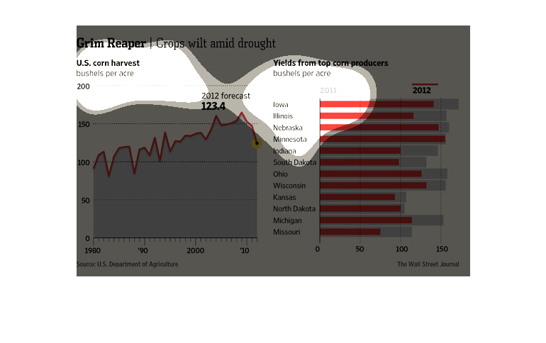
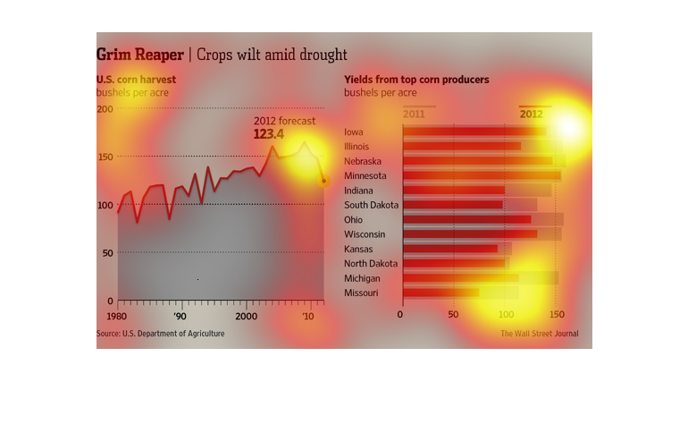
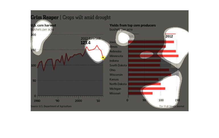
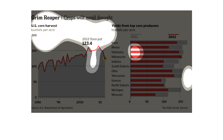
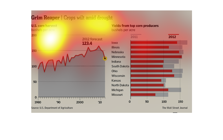
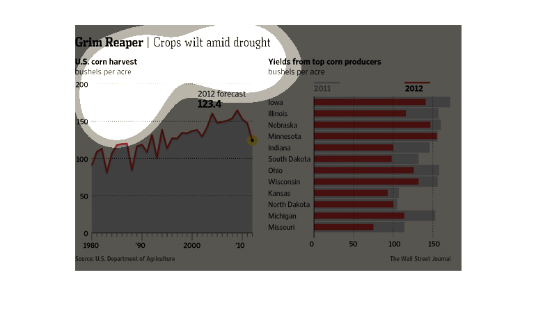
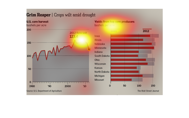
The title for these images is, "Grim Reaper, Crops wilt amid drought".  There are two graphs.
One graph displays U.S. corn harvest bushels per acre, from 1980-2010.  The second graphs
displays the yields from the top corn producing states, bushel per acre.
This chart shows how many Unite Sates corn crop yields have been decreasing over time due
to wilt and drought. Data has been taken since 1980. The graphic also compares some state's
crop growth.
This graph shows the effects of drought on corn production.  The left portion shows historical
data for total harvest from 1980-2012.  The right portion shows the difference in yields between
2011 and 2012, broken down by state.  Both sides indicate a large drop in production from
2011 to 2012.
The first graph depicts the crop failures related to drought. The crop loss has increased
steadily and was at over 150 bushels per acre in 2012. The second graph shows the yield per
acre from different states for 2011 and 2012. Iowa had the highest yield in 2011, while Minnesota
took the honors in 2012. Missouri had the least productive crops in 2012 of those listed on
the chart. North Dakota had the worst crop production in 2011.
This chart from the Wall Street Journal shows how the US corn harvest as measured in bushels
is flatlining because of the worsening drought in the area
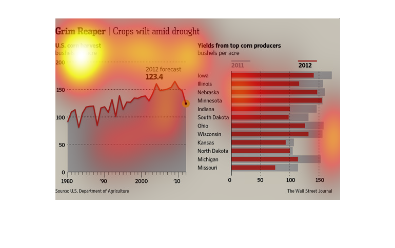
The title of this graphic is Grim Reaper: Crops wilt amid drought. It gives the numbers for
the US corn harvest bushel per acre and the yields of top corn producers.
The image depicts US crops wilting amid the drought, as well as top yields from corn producers
across multiple states. The 2012 forecast appears to be rather high, with yields dropping
across the board in multiple states listed.
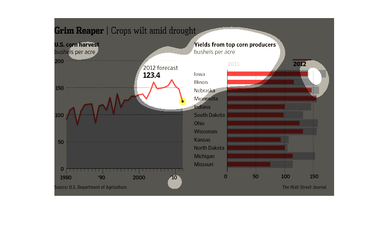
The charts shows the results a recent drought had on food and crop production in the United
States. The graph shows the effects of the drought and how corn harvest have been effected
from 1980 to 2010.
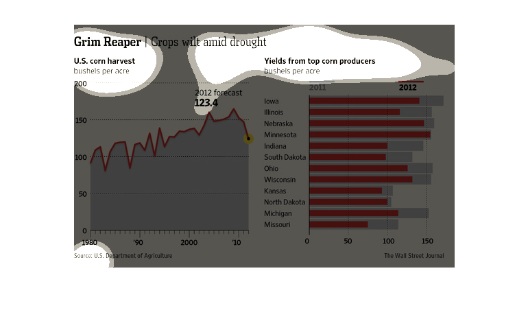
The left side of the graph shows the US corn harvest in bushels per acre from 1980 to 2010.
 The right side shows yields from top corn producers with Iowa and Illinois leading the pack.
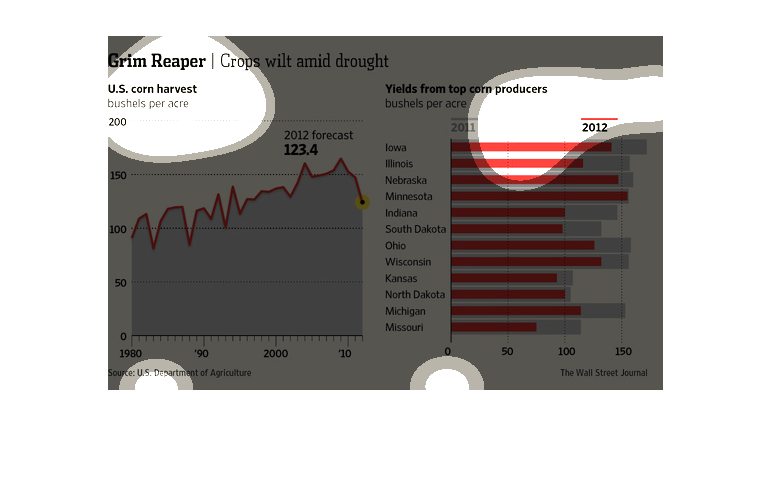
This is a series of charts, graphs and related statistics depicting the effect of a current
drought were having on the corn harvest as measured from the years 1980 to 2010.