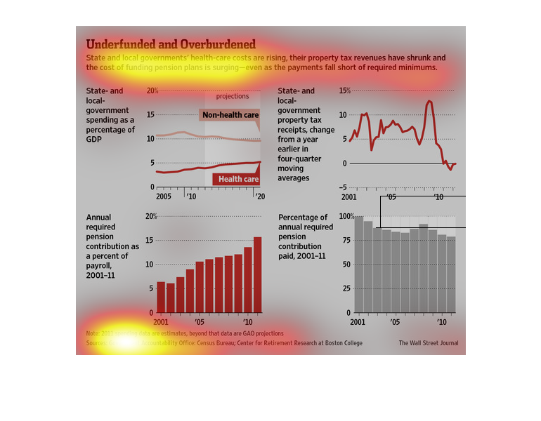
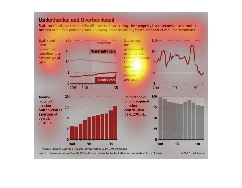
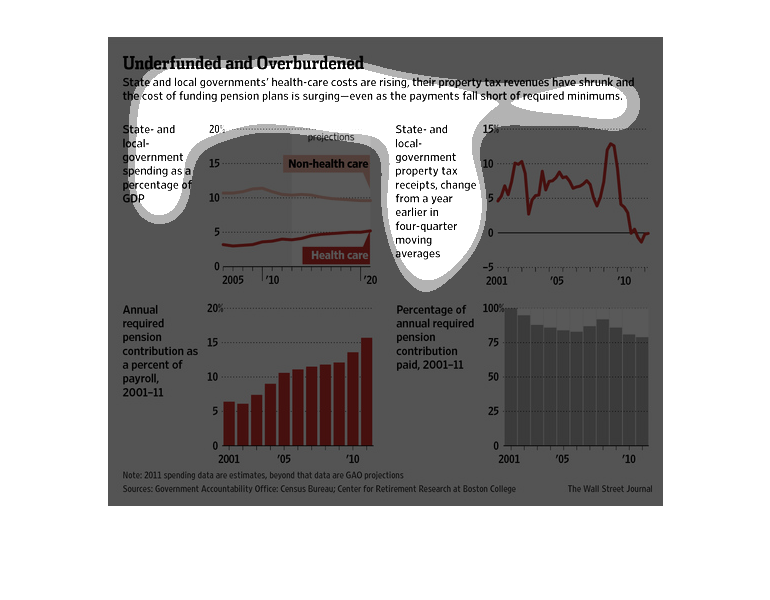
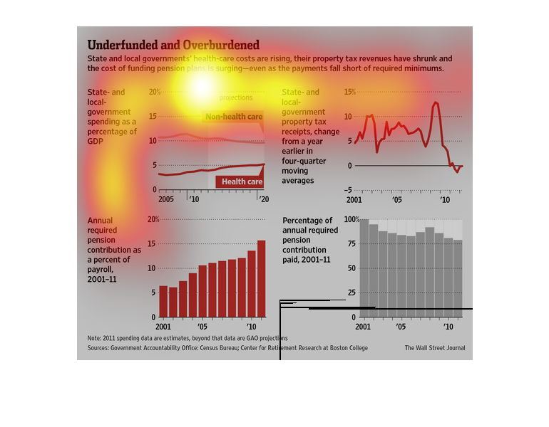
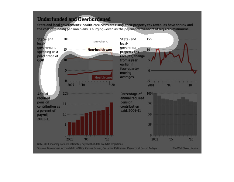
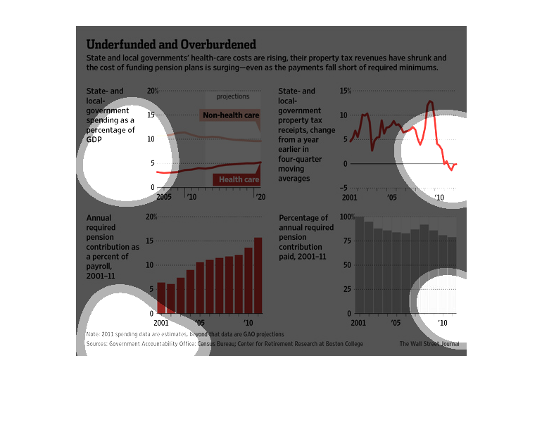
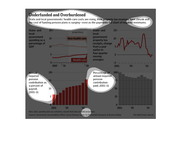
This chart from the Wall Street Journal shows how state and local governments are feeling
the pinch with higher health costs but lower budgets to face these costs
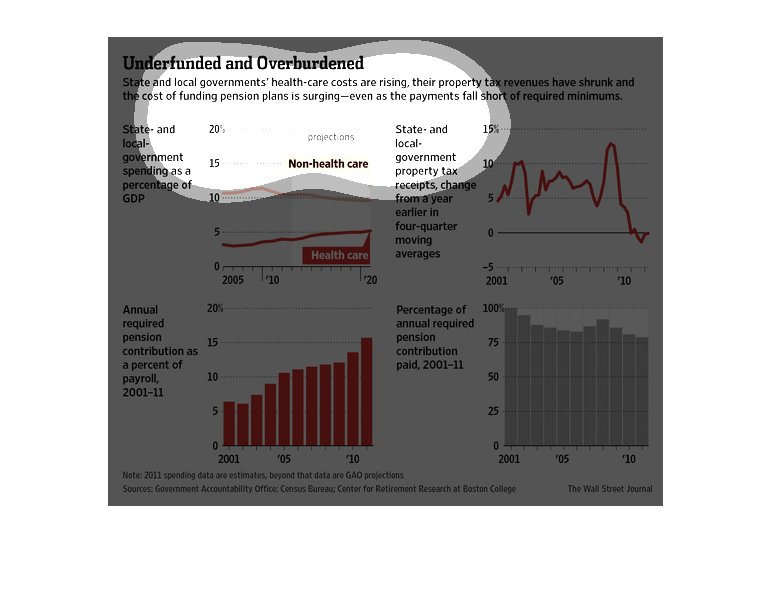
These graphs aim to show a staggering rise in the costs of health-care and pensions for its
government employees over time, while hinting at a notion of decreased revenue to meet budget
obligations.
This chart/graph shows that local health care costs are rising and tax revenues have shrunk
dramatically. It shows the graph also of State and local government spending.
This chart from the Wall Street Journal shows how local and state government taxes are unable
to cover the health care costs of their respective health programs
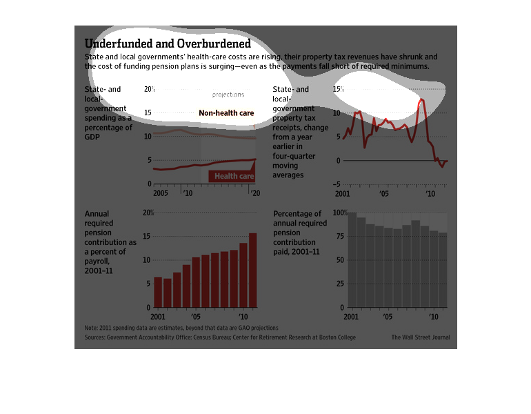
The upper left shows state and local government spending as a percent of GDP.  The top right
shows state and local government property tax receipts.  The bottom left shows annual required
pension contribution as a percent of payroll.  The bottom right shows percentage of annual
required pension contribution.
This chart describes under funded and over burdened. Specifically, state and local governments'
health care costs are rising, their property tax revenues have shrunk.
Underfunded and Overburdened: State and local government's healthcare costs are rising, property
tax revenues have shrunk, and the costs of funding pension plans are surging.   These facts
are supported by numerous bar charts.
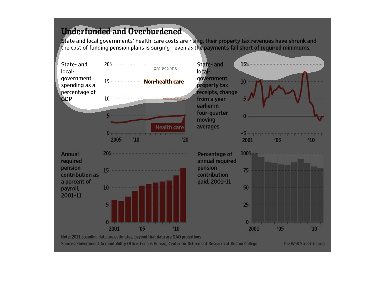
This series of charts and graph denote state government spending and taxes, and shows how
they are underfunded and overburdened. One graph shows healthcare and nonhealthcare spending,
while another shows the revenue collected by property tax. Another bar graph shows the annual
required pension contribution from 2001-2011, and finally the same data in percentage paid.
Shrinking Tax revenues, underfunded government health care costs, shrinking pension funds
all continue to unfold and overburden the elderly.  This is a chart of the annual percentage
required to the pension contribution for the years 2001-2010 and then a projected chart for
up to 2020.
Health care costs for local and state government is rising and a problem of funds is affecting
everyone. The graph shows the effect of health care costs are having while property taxes
are shrinking. Study is from retirement research of Boston College and posted by the Wall
Street Journal.
This chart is about people that are underfunded and overburdened. This shows how the state's
and governments health-care costs are rising, their property tax revenues have shrunk and
the cost if funding pension plans is surging - even as the payments fall short of required
minimums.
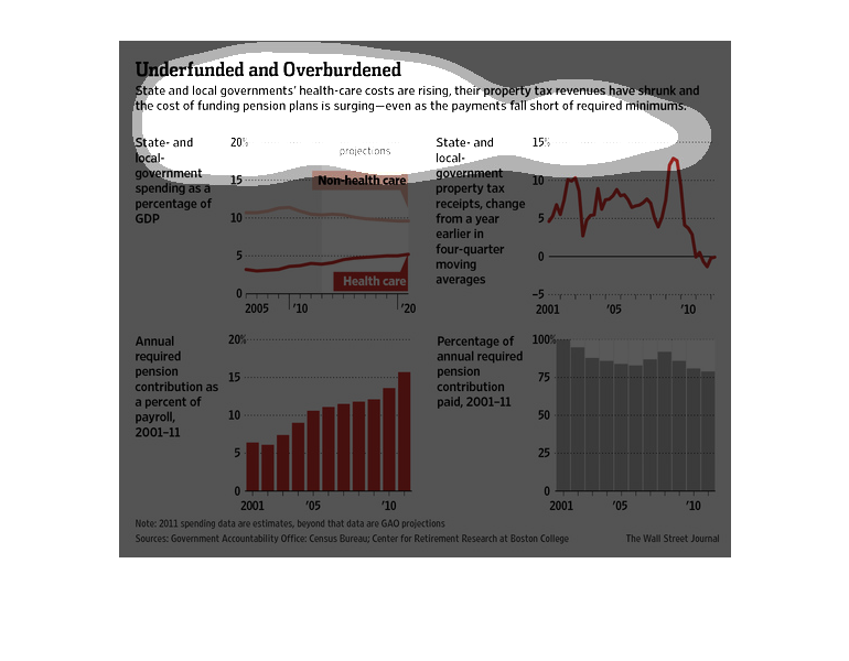
This is a chart depicting information about how the health care costs seem to be rising and
the property and tax revenue is beginning to be lowered. There are a few charts showing the
information.
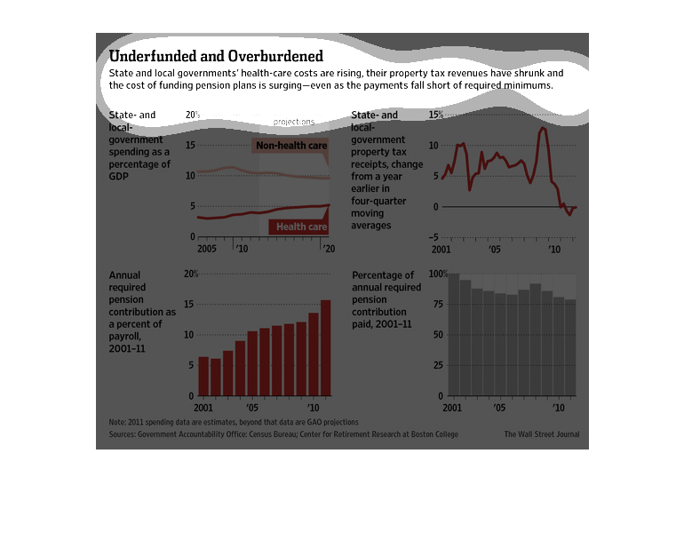
In this study conducted by the Wall Street Journal- from documents obtained from the Government
Accountability Office- there have been some shady stuff going on in the financial sector after
the recession.