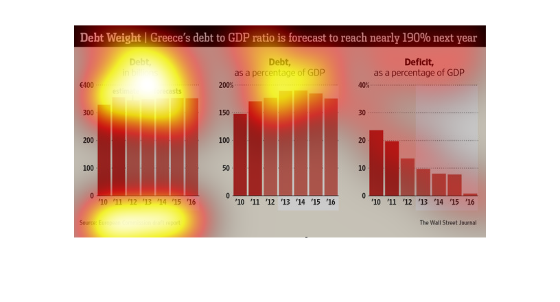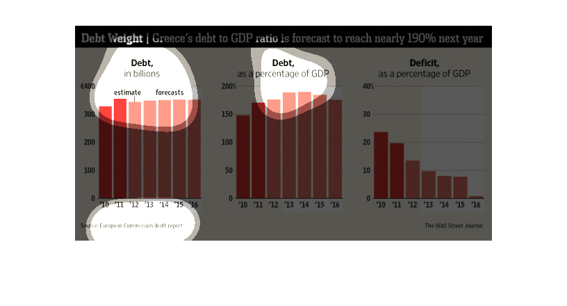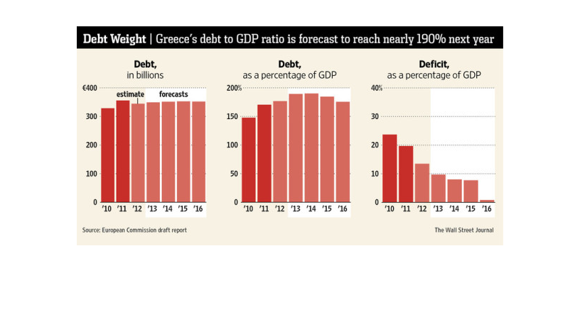
There are three graphs. The title is about Greece's debt to GDP Ratio reaching nearly 190%
in the future. The first graph shows debt ($) vs years. the second graph shows debt (%) vs.
years. The third graph shows deficit (%) vs. years.
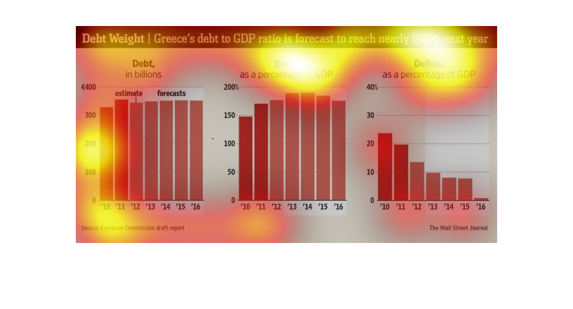
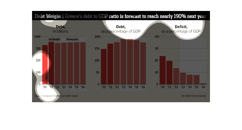
The image is talking about Greece's debt problem. The image features many charts, each describing
either debt, debt as a percentage of GDP, and the deficit as a percentage of GDP. All of the
charts, with the exception of the deficit chart, seem to grow sharply to a rather large amount,
and then plateau. The deficit chart, on the other hand, drops steadily.
This chart from the Wall Street Journal shows how the budget deficit and overall debt of Greece
has changed over time as a result of the crisis in Greece
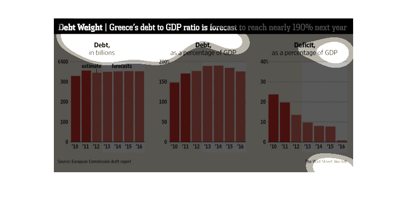
This chart describes debt weight. Specifically, Greece's debt to GDP ratio is forecast to
reach nearly 190% next year. Categories include debt in billions.
This shows an evolution of Greece's debt with debt in billions on the left, debt as a percentage
of GDP in the middle, and deficit as a percentage of GDP on the right.
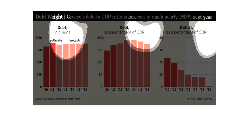
This series of charts details Greece's debt to GDP ratio with debt estimate and forecast on
the left, debt as a percentage of GDP in the middle, and deficit as a percentage of GDP on
the right.
This chart from the Wall Street Journal shows how the debt levels in Greece will reach 190%
of GDP during the Greek debt crisis, which is unsustainable.
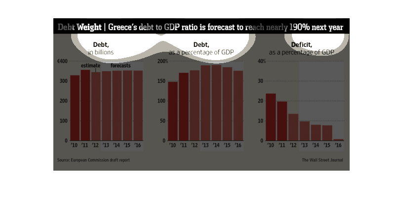
This image describes Greece's debt in dollar amounts, percentages and also shows the deficit.
It also shows that the estimate and the actual amounts are very similar.
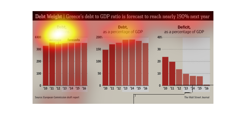
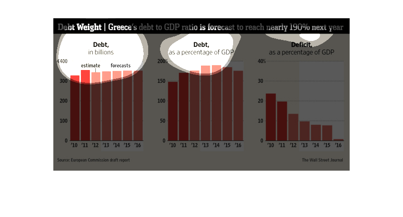
This chart describes debt weight . Specifically, Greece's debt to GDP ratio is forecast to
reach nearly 190% next year. The highest spike on the chart comes in the year 2014.
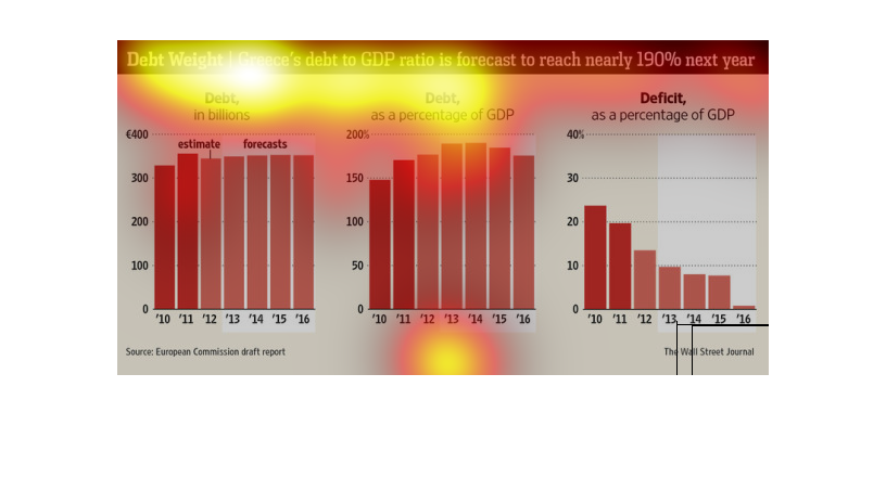
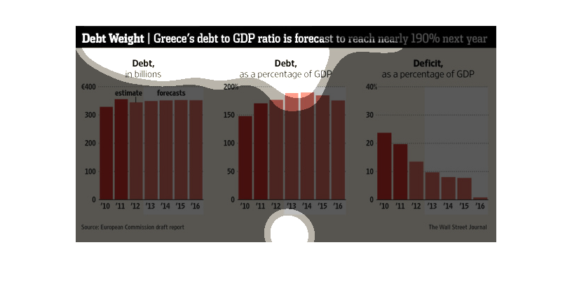
The title of the graph is debt weight: Greece's debt to GDP ratio is forecast to reach nearly
190 percent by next year. It gives the numbers for the national debt and the GDP.
The caption for this graph is, "Debt Weight, Greece's debt to GDP ratio is forecast to reach
nearly 190% next year.  The image here consist of three sets of bar graphs orientated vertically.
 Each set of graphs captures data from 2010-2016.  The first graph on the furthest left measures
debt in billions, with a breakdown showing an estimate as well as a forecast.  The middle
graph charts debt as a percentage of GDP.  The last graph displays deficit as a percentage
of GDP.
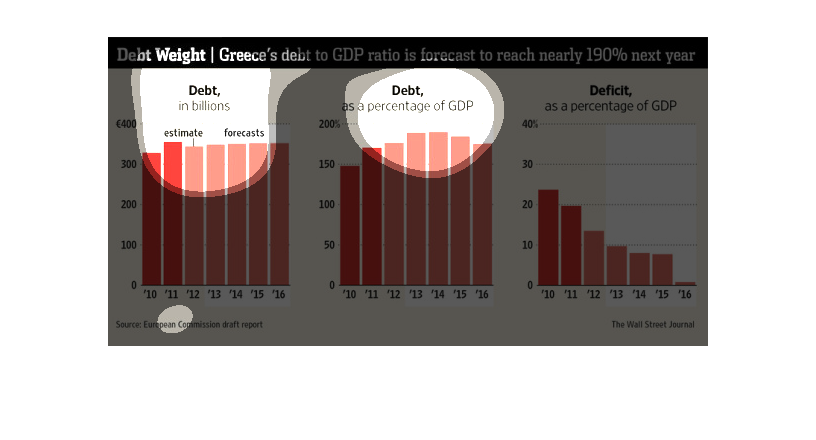
This is a series of bar graphs with related statistics depicting the ratio of debt to GDP
held by Greece was forecast to reach nearly 190% the following year.
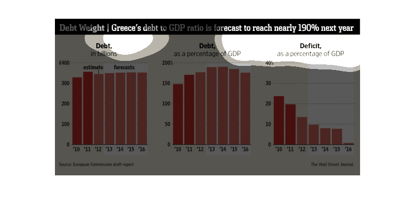
This graph describes Greece's debt to GDP ratio.  The debt in billions has been relatively
stable since 2010, however the deficit as a portion of GDP has declined significantly.