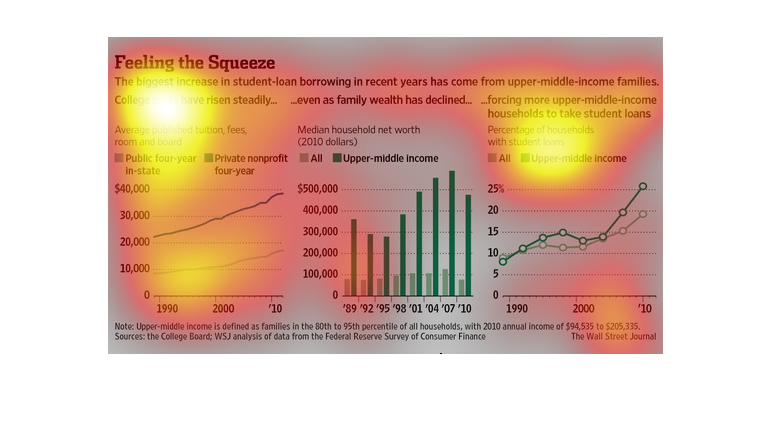
For 1990 2010 the two decade saw Student loans in middle income families have increased while
the income levels of declined. In both private and public institutions tuition increases were
seen over the same timeframe.  Household media income Doubling in public institutions form
$10,00 to $20,000 and from  $20,00 to $40,000 in private institutions. Median household net
worth for all households hovered right at $90,000 for that same period of increase tuition
costs.  The percentage of all household student loans rose from 9 to 20%.
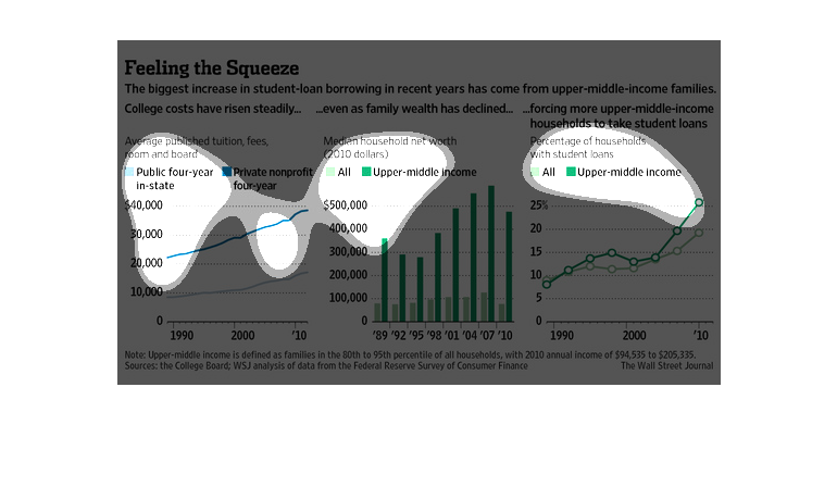
This chart describes feeling the squeeze. Specifically, the biggest increase in student loan
borrowing in recent years has come from upper middle income families.
This chart from the Wall Street Journal shows how the increases in student loan borrowing
in the United States have increased dramatically recently.
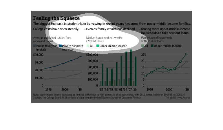
This is a chart showing that college costs have kept rising steadily and it shows that people
are taking out more loans and bigger loans. mostly middle income families.
The left graph shows how college costs have risen from 1990 to 2010.  During the same period
the middle graph shows how median household income has decreased.  Consequently, the right
graph shows the increase in student loans.
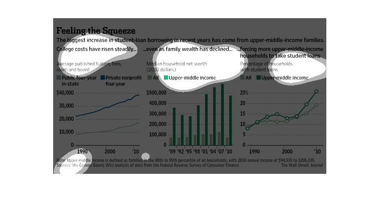
This graph shows the changes in student loan borrowing and tuition costs. It shows the relationship
using a bar graph and a line graph. It displays a positve correlation between the two.
This chart from the Wall Street Journal shows how student loan debt is increasing rapidly
but amongst middle to upper middle income borrowers because of increasing costs
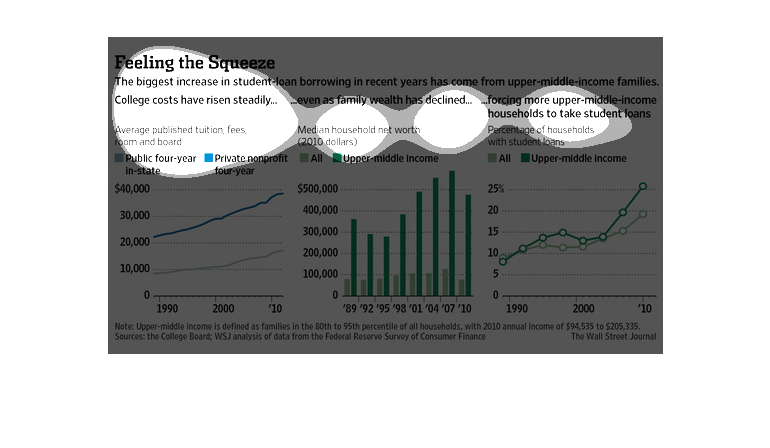
This chart describes feeling the squeeze. Specifically, the biggest increase in student loan
borrowing. The highest spike on the chart comes in the year 2007.
Student loans are increasing in recent years for middle-income families. College costs are
increasing even as income is decreasing so there has been a steady incline of student loans
for both private and public institutions. The number of households with student loans has
increased by about 10% since the 90s.
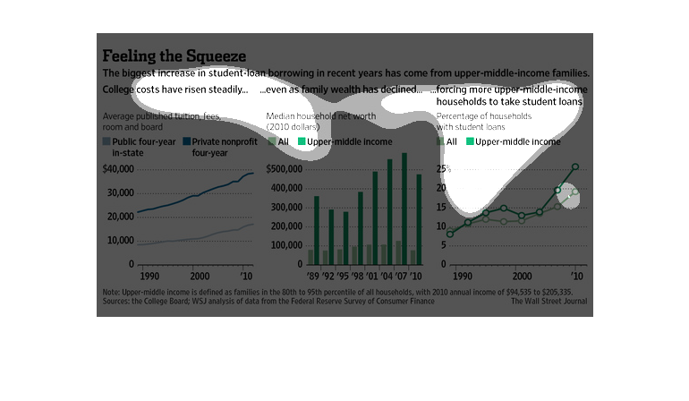
The caption for this image is, "Feeling the Squeeze, The biggest increase in student loan
borrowing in recent years has come from upper middle income families".  There are a total
of three graphs here.  One graph depicts tuition costs for public four year in-state colleges
versus private non-profit four year schools.  The second graph displays median household net
worth, general population versus the upper middle class.  The last graph charts the percentage
of households with student loans.
Three graphs illustrate the relationship between average tuition costs, median net worth of
households, and the percentage of households with student loans over a 20 year period.  Tuition
costs have been steadily increasing, more so at private universities than public. Upper-middle
income median net worth has increased similarly to the tuition costs, but overall median net
worth has not increased nearly as significantly.  The percentage of households with student
loans has increased steadily as well, much more so in the upper-middle class than overall
as well.
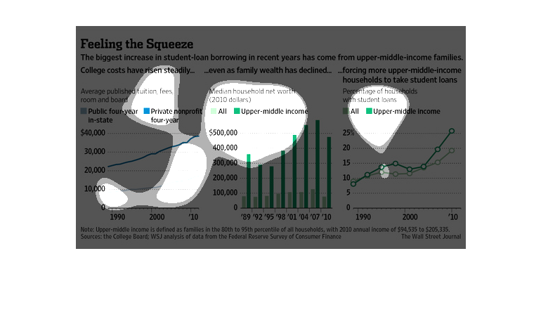
This graph depicts the increase of student loan borrowing from upper middle-income families
in relation to the rise in costs of tuition. Private insitutions have been rising quicker
than public institutions while the borrowing of money have come dramatically largely from
upper-middle income families over all. The amount of student loans from upper middle income
on average has increased dramatically over all from 2000 to 2010.