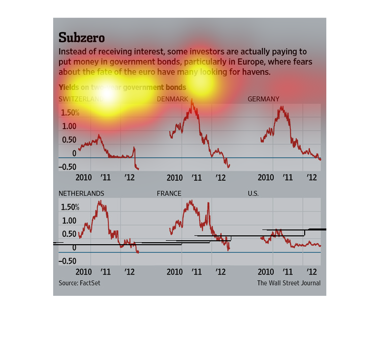
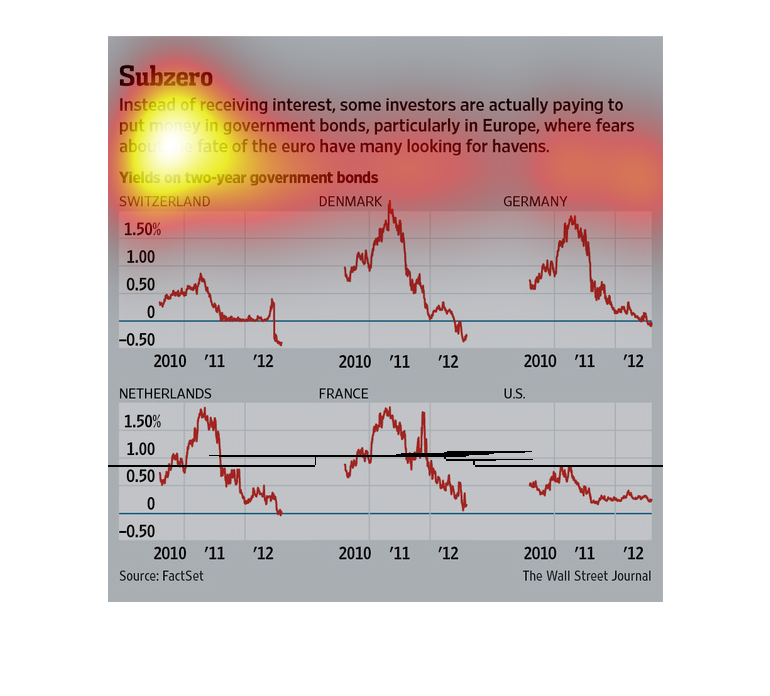
The image depicts how some investors are actually paying to put money in government bonds,
particularity in Europe, rather than receiving interest on investments. These actions are
being driven by the fate of the euro currency.
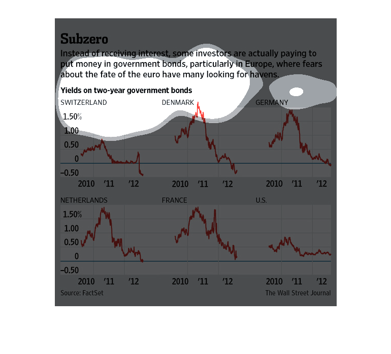
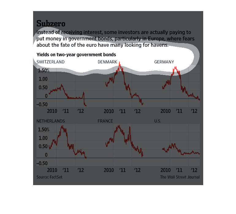
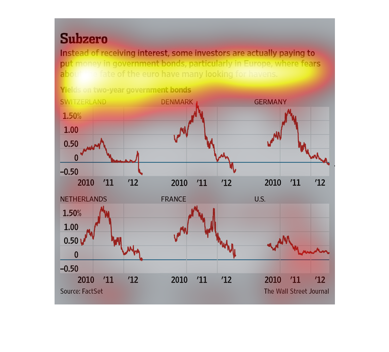
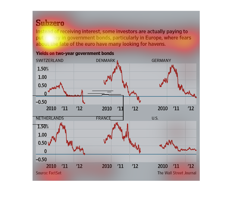
This chart describes subsero. Specifically, instead of receiving interest, some investors
are actually paying to put money in government bonds, particularly in Europe.
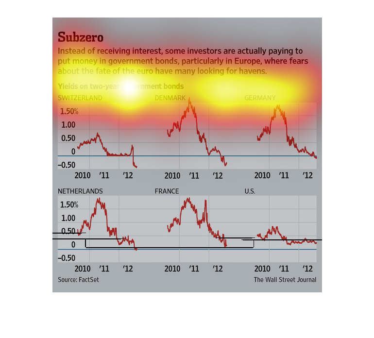
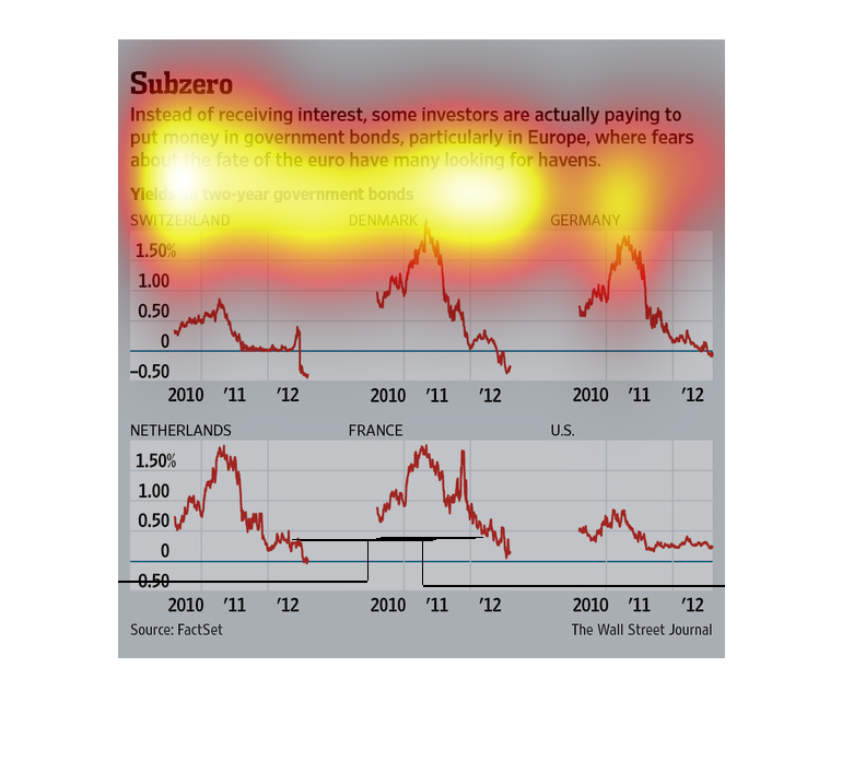
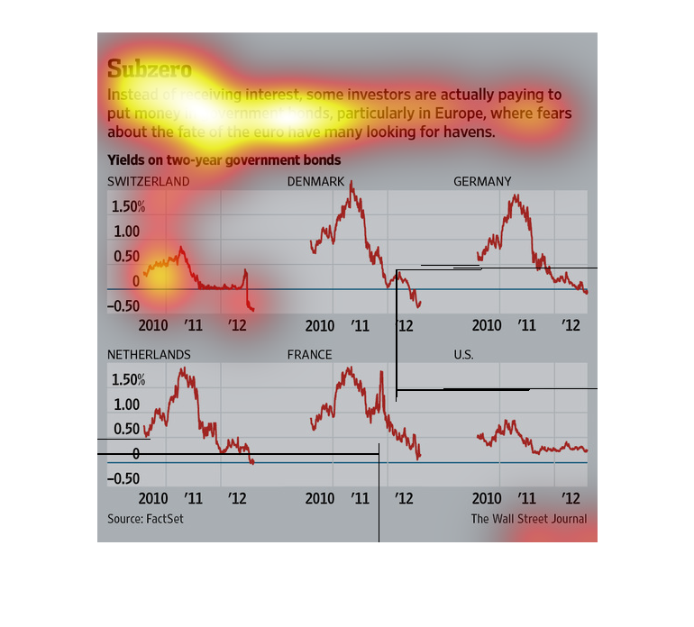
The title of this image is, "Subzero".  There are six line graphs representing six countries,
five of which are European, the sixth being the U.S.  Each of the graphs show the price on
two year government bonds back between 2010-2012.
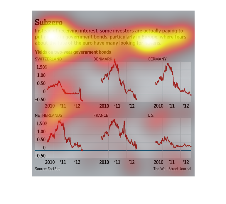
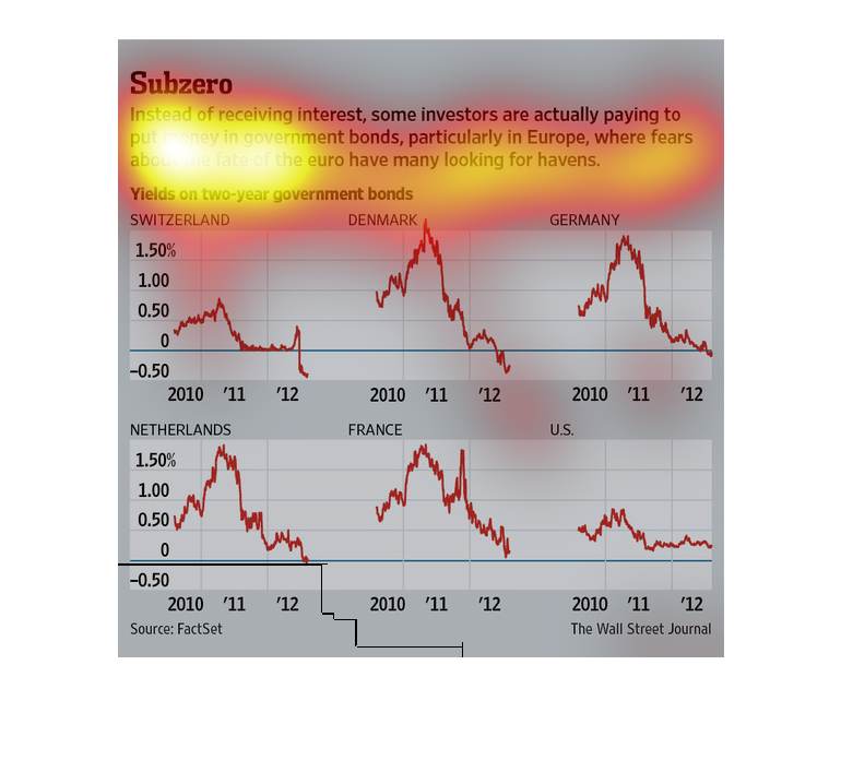
The image depicts how some investors are paying to put money in government bonds, particularity
in Europe, instead of collecting interest. Yields on government bonds are decreasing.
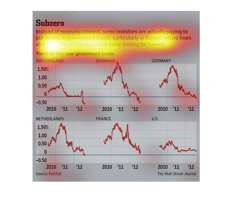
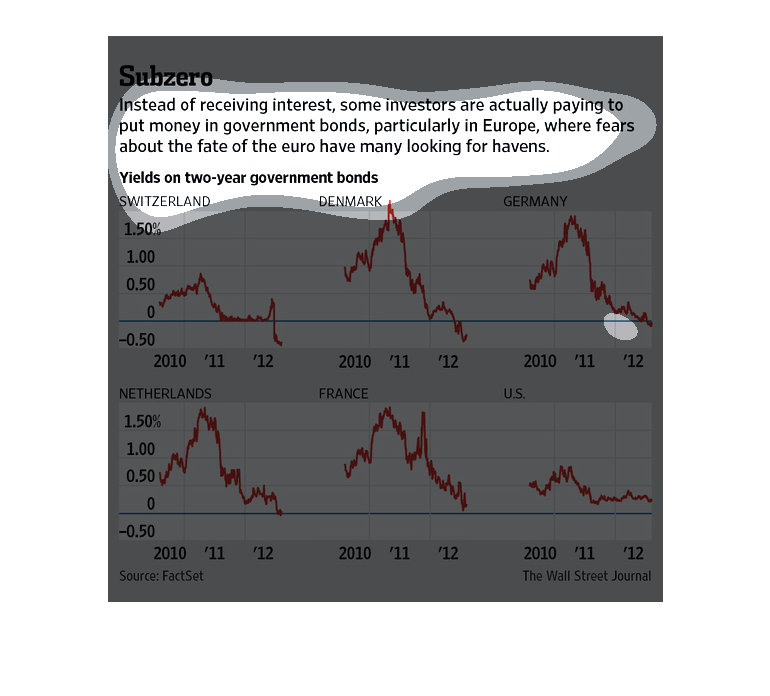
This image shows Yields on two-year government bonds. It also explains that investors are
wanting to put their money particularly in European accounts because of the fate of the Euro.
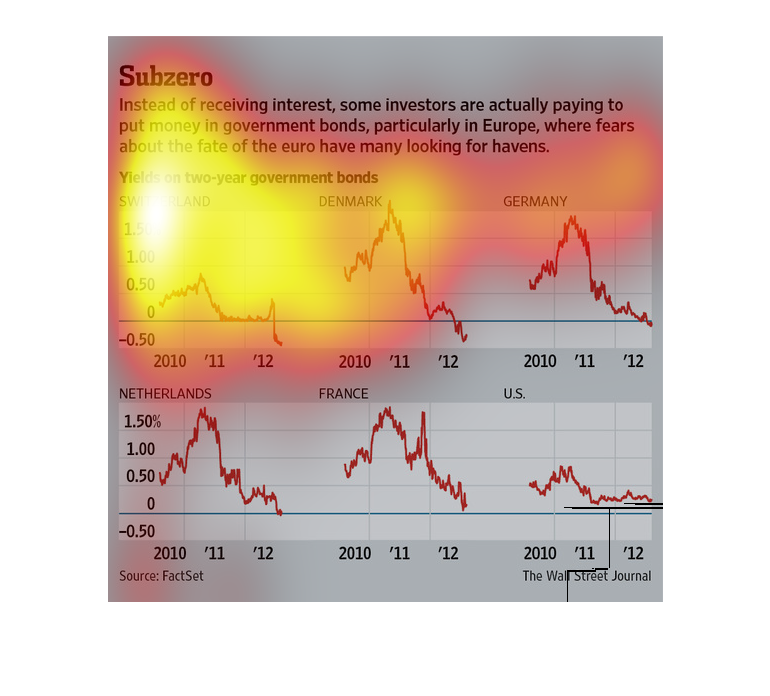
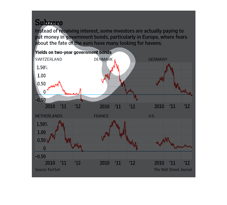
This line graph shows yields on government bonds decreasing over time in Europe and the United
States. This data was collected from 2010 to 2012. In some cases, rates have dropped by almost
1.5%.
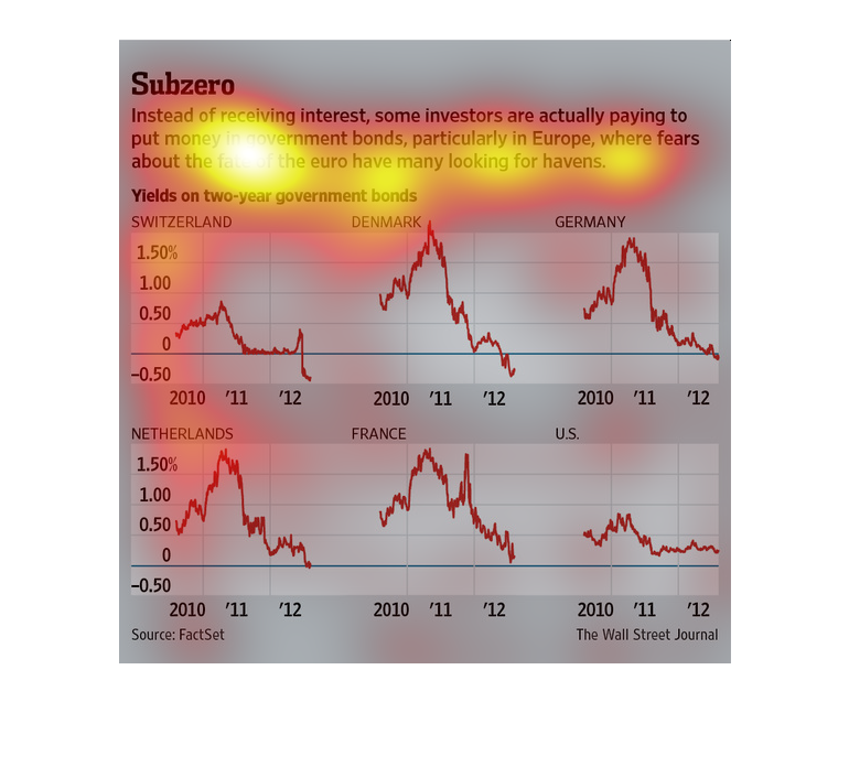
This chart describes subzero . Specifically, instead of receiving interest, some investors
are actually paying to put money in government. Categories on the chart include Denmark.
The title of this graph is subzero. It says instead of receiving interest, some investors
are actually paying money to put into government bonds particularly in Europe.
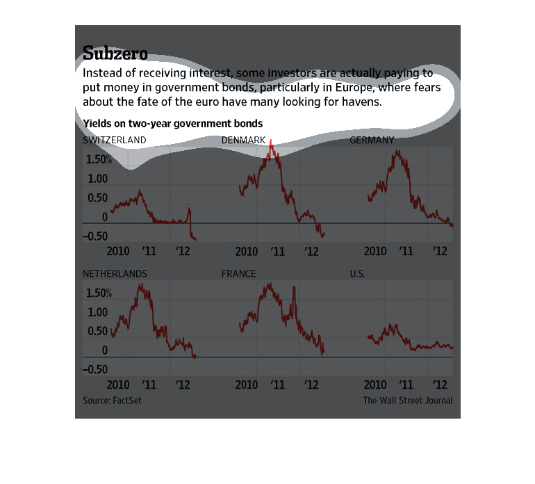
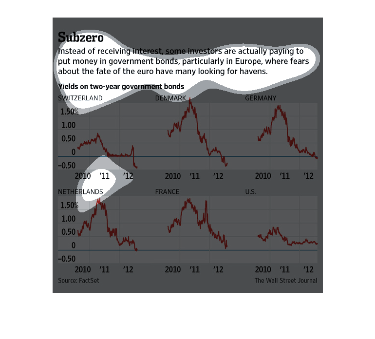
This is a chart showing that instead of getting interest on the bonds they put in the government.
They are having to pay for them instead. There are chart depicting this information.
This chart from the Wall Street Journal shows how countries around the world now have negative
interest rates and investors are now paying to own bonds
This image is about government bonds, especially in Europe. Investors are fears about the
affect will bring due to the fate of euros. Then there are graphs showing the yields on two-year
government bonds of some european countries, such as Switzerland, France, Denmark, Netherlands,
Germany and in comparison to the US. It shows the yields are much higher in European countries
than the US during 2010 to 2012.
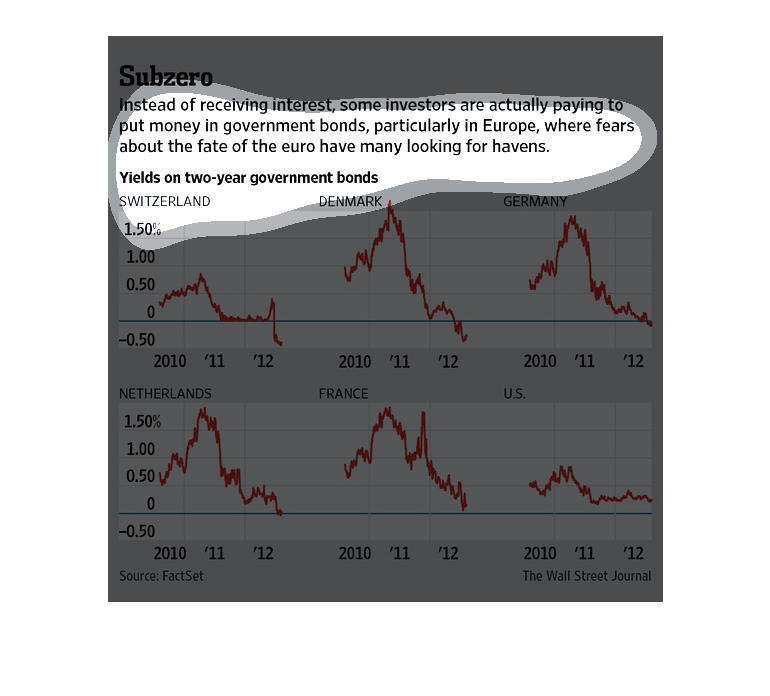
In this study conducted by the Wall Street Journal- from information provided by FactSet-
from 2010 to 2012, it has actually been investors putting in money to goverment bonds to keep
them afloat.
This chart is about how some investors are choosing to put their money into government bonds,
specifically in Europe.  The reason for this is due to the fear of the change in the Euro.
  The graph shows the yields on two year government bonds in Switzerland, Denmark, Germany,
the Netherlands, France, and the US. The trends are similar in all of the countries, except
for the US.
This chart from the Wall Street Journal shows how investors in certain countries are investing
in a negative interest rate environment, which is bizarre
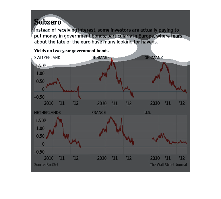
This is a series of charts and related statistics depicting that instead of receiving interest,
some investors are actually paying to put money into government bonds.