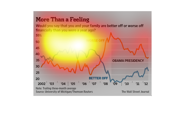
This chart tracks people's perceptions of whether they feel better off financially than they
did compared to an earlier time period.  The percentage of people feeling worse off increased
during the beginning of the Obama presidency but later fell somewhat.
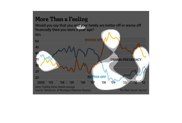
Graph about whether or not you and your family are better off financially now than a year
ago. Appears to have decreased and the percentage of people who think they are better off
has decreased since Obama has come into office.
This graph illustrates a survey of whether families think they are better or worse off financially
than they were a year ago.  It contains data form 2002 to 2012.
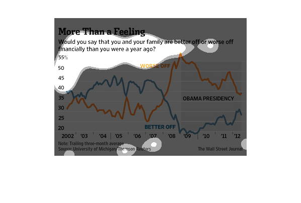
A chart of results when a group was asked the question "Would you say you are better or worse
off financially now than you were a year ago?"  The results cover the years 2002 through 2012.
This chart from the Wall Street Journal shows how consumers have changed their feelings with
regards to their personal financial health over time.
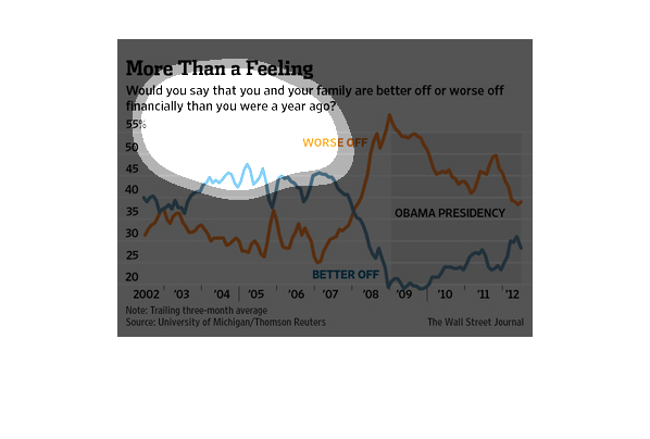
This image shows or depicts in line graph statistical format information concerning whether
or not people are doing better or worse economically now as opposed to a year ago.
Are you better off now or a were you better off a year ago? This interesting question was
posed by the Wall Street Journal, and they try to answer it quite well here. The economy is
bad, so no. People are worse off according to the data.
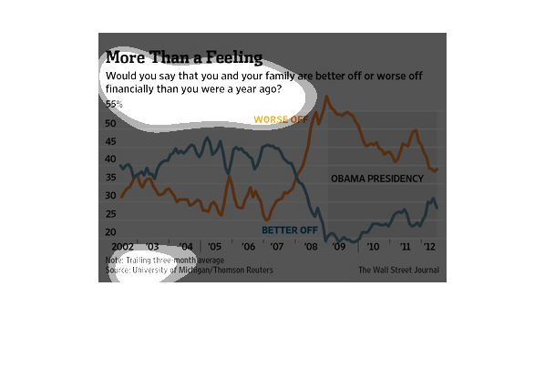
This chart/graph is a poll that is taken asking if you think your family are doing better
off financially this year or not. The graph trails the course of 3 months.
This chart from the Wall Street Journal shows how consumer sentiment has changed before, during,
and after the recession in the United States. It relies on survey data
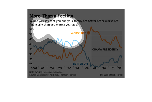
This chart describes more than a feeling. Specifically, would you say that you and your family
are better off or worse off financially. Different categories are represented by different
colors.

The image depicts respondents answers to the question of: "Are you and your family better
off or worse off financially than you were a year ago?" A majority of respondents say they
are worse off, during the Obama presidency.
The title of the graphic is more than a feeling. Is says that would you say that you and your
family are better off or worse off financially than a year ago.
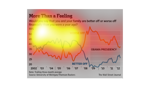
The image depicts the polling results when asking people whether they feel better off or worse
off financially than they were a year ago. A majority of people say they are worse off.
This chart describes more than a feeling. Specifically, would you say that you and your family
are better off or worse off financially than you were a year ago.