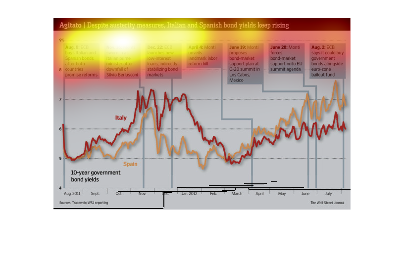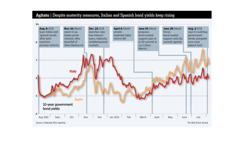
This chart describes Agitato. Specifically, despite austerity measures, Italian and Spanish
bond yields keep rising. Different categories are represented by different colors.
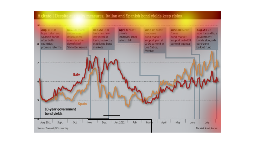
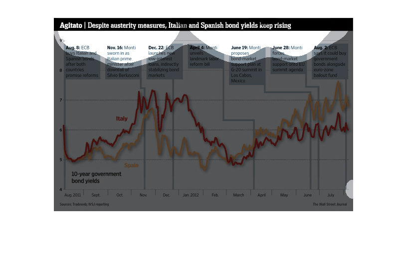
This is a chart that involves Agitato. Despite austerity measures Italian and Spanish bond
deep rising. Ten year government yields. Chart starts in August 2011 and ends in June 2012.
This graph illustrates the rising yields of Italian and Spanish bond prices. It shows 10 year
government bond yield prices and milestones along the timeline.
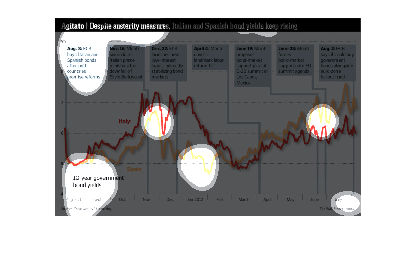
This chart describes Agitato. Specifically, despite austerity measures, Italian and Spanish
bond yields keep rising. The chart is divided into seven categories.
This image is entitled "Agitato:  Despite austerity measures, Italian and Spanish bond yields
keep rising."  Pertinent dates are across the top of the image ranging from August 8 throughout
the following year to August 2.  The graph shows the rise and fall of 10-year government bond
yields according to various announcements and events.  Graph dates range from August, 2011
through July, 2012.  Data was obtained from The Wall Street Journal.
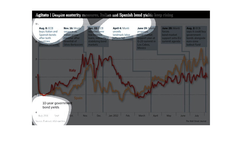
Despite austerity measures, Italian and Spanish bond yields have risen. In April, when the
landmark labor reform bill was unveiled, the yields dropped, but then rose again.
The caption for this image is, "Agitato, Despite austerity measures, Italian and Spanish bond
yields keep rising".  The information captured here follows the bond prices on ten year government
bonds for both of these countries.  Above the graph are several dates and commentaries listing
actions taken and other events as they unfolded at the time, relevant to austerity measures
and these bond prices.
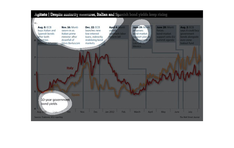
This graph illustrates how Italian and Spanish bond yields keep rising.  It shows the change
in ten year government bond yields in 2011 and 2012 with milestones and dates.
In this study from the Wall Street Journal, conducted from research obtained from trades reporting,
the cost of Italian and Spanish bonds keep rising.

This is a series of color coded charts and related statistics depicting that bond yields kept
rising in Italy and Spain, despite austerity measures being made.
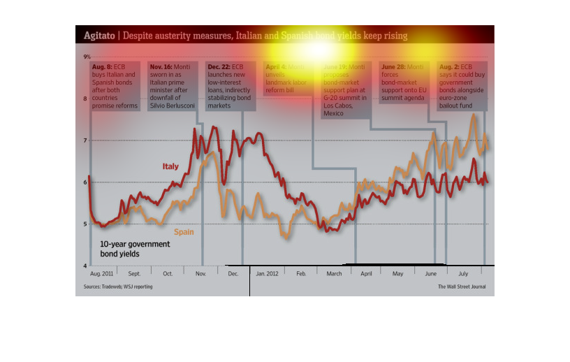
This graph shows an increase in bond yields in Spain and in Italy. This chart doubles as a
timeline, in which certain economical measures taken by he governments of the two countries
are shown.
This chart from the Wall Street Journal shows how italian and spanish bond yields are increasing
despite severe austerity measures intended to be able to pay back debt
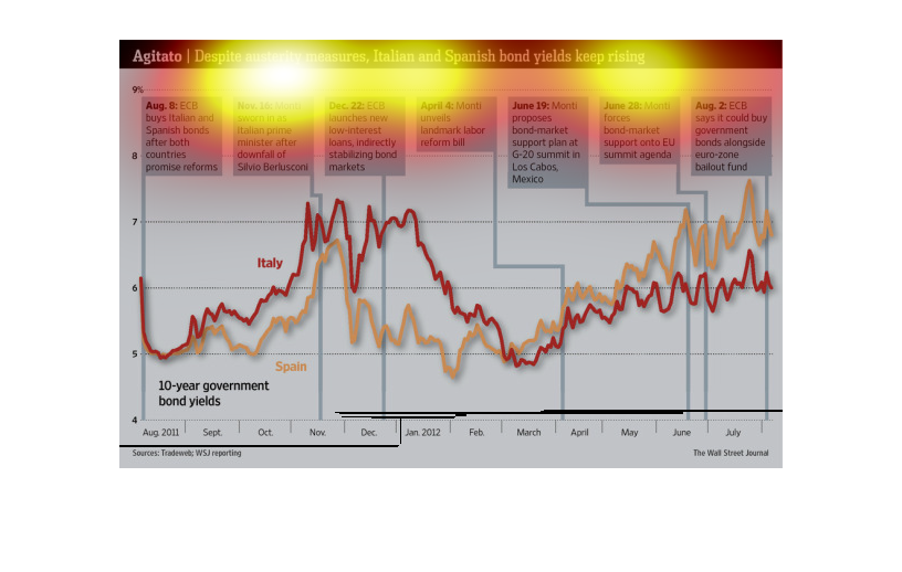
This chart shows the 10-year government bond yields of Italy and Spain from August 2011 until
July 2012.  Both Spanish and Italian bond yield have gone up and down drastically throughout
this time.
This chart from the Wall Street Journal shows how bond yields are increasing in Italy and
Spain despite increasing austerity and budget cuts, which is strange