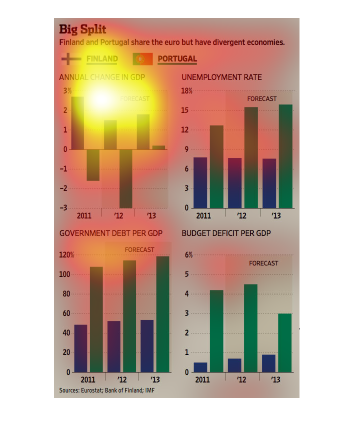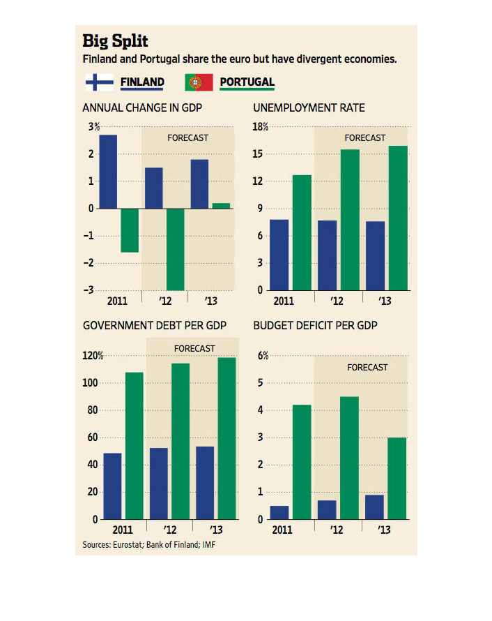
There are four graphs. They are about Finland and Portugal's different economies. The top
left graph shows change in GDP vs. years - Finland is positive and Portugal is negative. The
top right graph shows unemployment rate vs years - Portugal is much higher than Finland. The
bottom left graph shows government debt of GDP vs. years - Portugal is might higher. The bottom
right graph shows budget deficit vs GDP and Portugal is much higher.
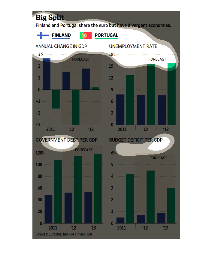
2011 - 2013, Findland and Portugal both members of the ERU saw divergent economies. Finland
saw and annual change in the GPD of 2.75% in 2011 down to 1.9% by 2013. Portugal however went
from -2% to -12% in the same timeframe. In Portugal an increase in unemployment of 12% in
2011 up to 16% by 2013. Finland's unemployment hovered right at 6%.  Government debt in Finland
rose slightly for 45% to 55%, while Portugal's government debt escalated from 110% to 119%.
The comparison of the budget deficit of the GDP was about .5% in Finland in 2011 rising slightly
to .95% in 2013. Portugal was at 4.5% in 2011 saw a slight increase in 2012 to 4.8% , however
in 2013 the budget deficit of the GDP dropped to 3%.
This is a series of charts describing the differences between Finland and Portugal's economies,
even though the two share a common currency. In all the charts, Finland seems to be doing
much better than Portugal.
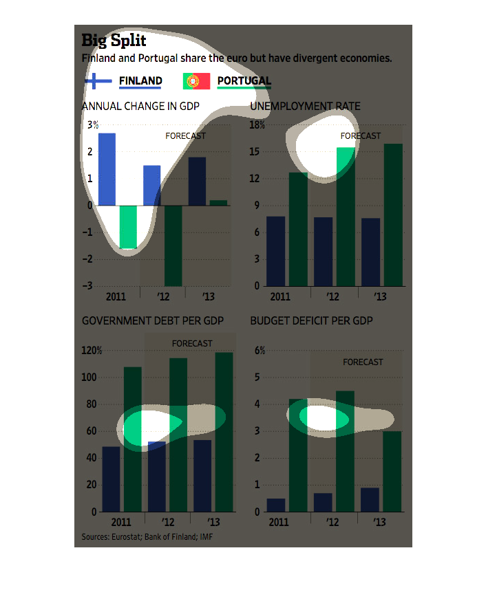
This chart describes big split. Specifically, Finland and Portugal share the euro but have
divergent economies. Different colors on the chart represent different categories.
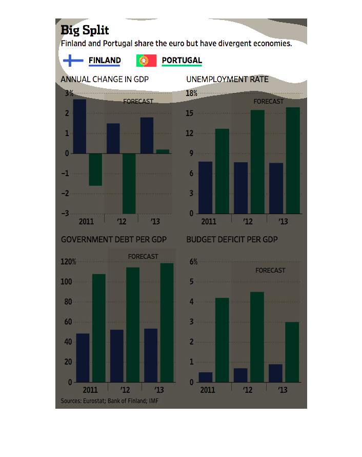
This chart from the Wall Street Journal shows how the portuguese and finnish economies have
diverged despite sharing the euro zone and having integrated economies
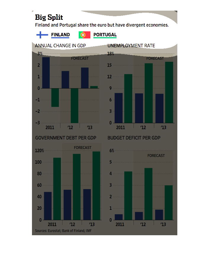
This graph shows Finland and Portugal share the euro but have divergent economies. Portugal
has decrease in GDP and higher unemployment rates. Portugal also has higher percentage of
debt.
This compares Finland and Portugal on annual change in GDP, unemployment rate, government
debt per GDP and budget deficit per GDP between the two countries.
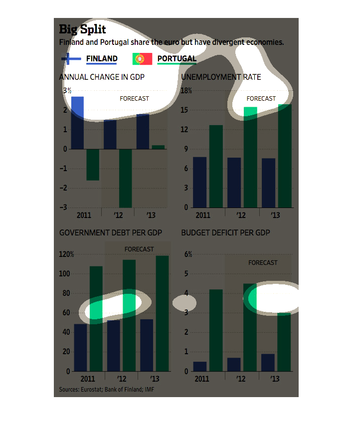
The top left shows annual change in GDP the top right shows change in unemployment rate, the
bottom left shows government debt per GDP, and the bottom right shows budget deficit per GDP.
This graphic shows the difference in fortunes between two countries that use the Euro as their
currenices. The graphic utilizes bar graphs to display economic data from Finland and Portugal.
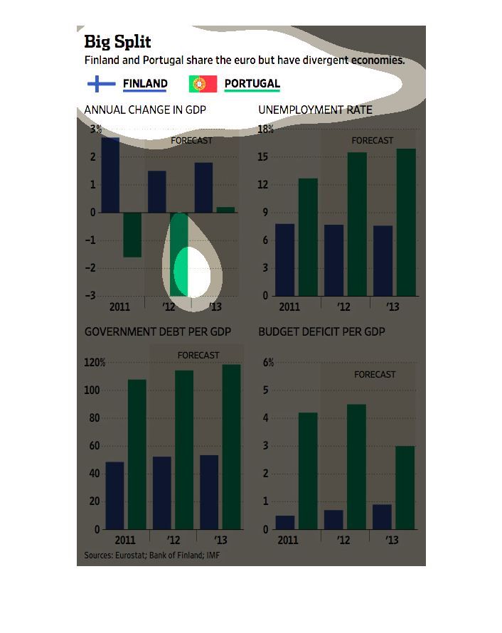
This chart from the Wall Street Journal shows how Finland and Portugal are experiencing diverging
economies despite sharing the euro currency.
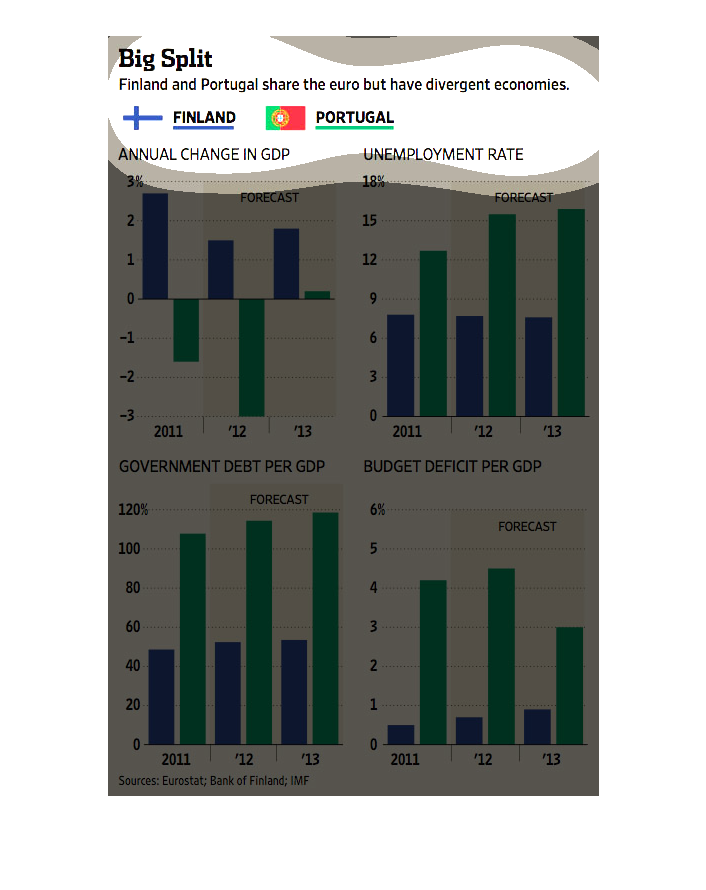
Finland and Portugal both use the Euro but have very different economies. Portugal has increasing
debt per GDP, budget deficit per GDP and a higher unemployment rate. Finland has remained
more consistent through the years while Portugal has seen negative change.
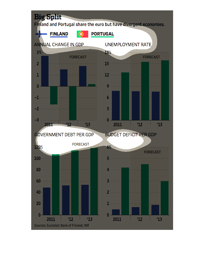
These graphs depict Finland and Portugal sharing the euro but having divergent economies.
The first image shows that Finland will have an overall decline in it's change in GOP whereas
Portugal will increase it's GOP. Second showing Portugal's unemployment rate slightly rising
while Finland's slightly decreasing. Government dept per GDP shows Finland and Portugal will
both rise. Portugal will have a lowered budget deficit while Finland will increase.