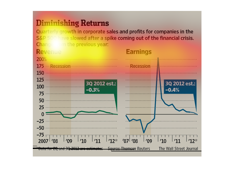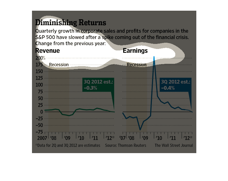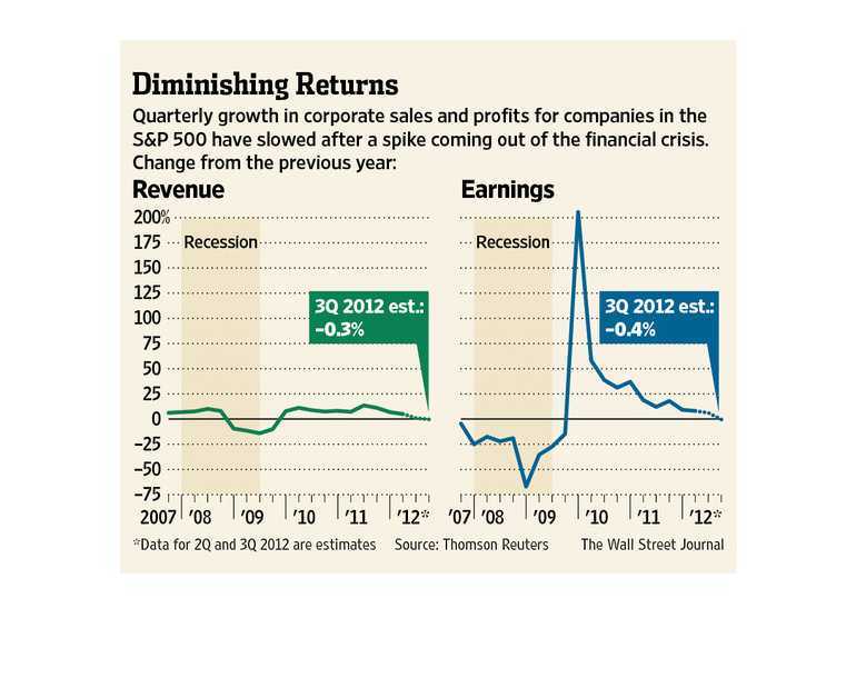
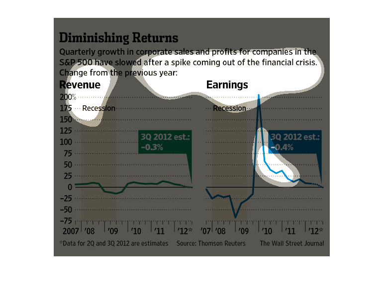
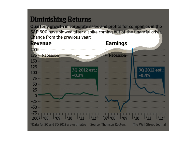
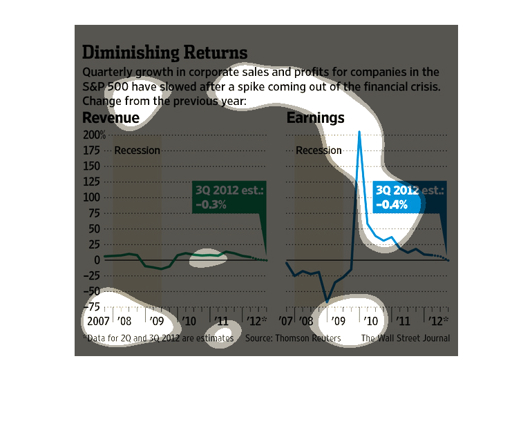
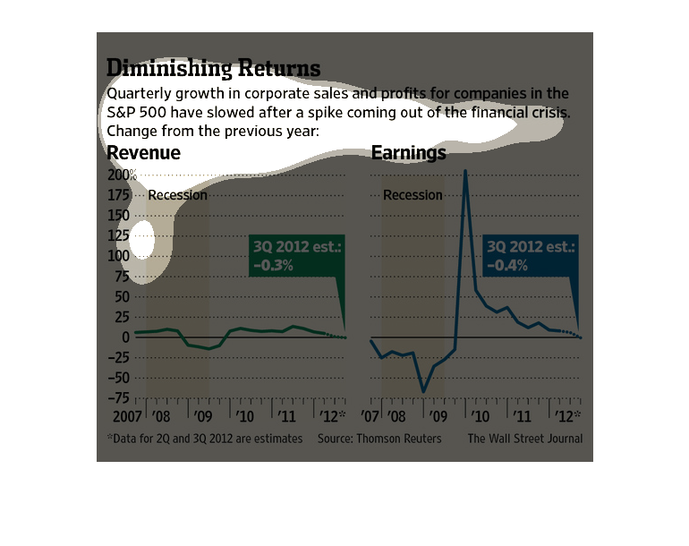
This chart describes diminishing returns. Specifically, quarterly growth in corporate sales
and profits for companies. Different categories are represented by different colors.
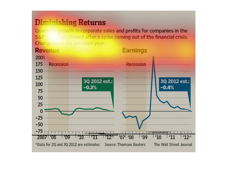
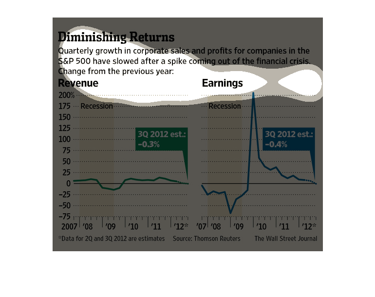
This is a chart showing growth in the corporate sales on a quarterly basis. It also has a
large chart showing a graph of revenue versus time that has passed.
"Diminishing Returns" represents quarterly growth of S&P 500 companies. Shows two Graphs,
the left being revenue vs time and the right being earnings vs time. The graph on the left
shows a steady revenue around the 0 mark between 2007 and 2012, with a dip to negative 25%
between 2009 and 2010, right near the end of the recession.   The graph on the right supports
the data on the left graph, revealing a decrease in earnings down to -75% before 2009 before
a massive spike in earnings to 200% between 2009 and 2010 before dipping back down to the
0 mark, slightly decreasing 20 -4% past 2012.
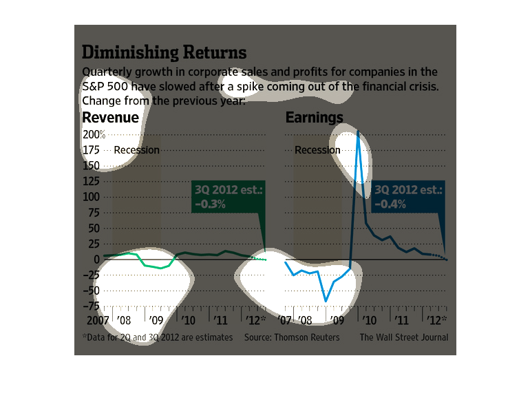
This is a chart showing that the quarterly growth for these big companies is beginning to
slow down. There are two charts showing the information with revenue percent versus time.
The image depicts quarterly growth and profits for companies in the S&P 500 slowing after
seeing a spike in 2008 coming out of the financial crisis. Revenue and earnings are down.
This chart shows how economical growth in the S and P 500 companies has slowed down after
coming out of the recession in 2008. The change from the previous year is also noted.
This chart from the Wall Street Journal shows how the profits and revenues from S&P 500 firms
have started to slow since the exit from the financial crisis
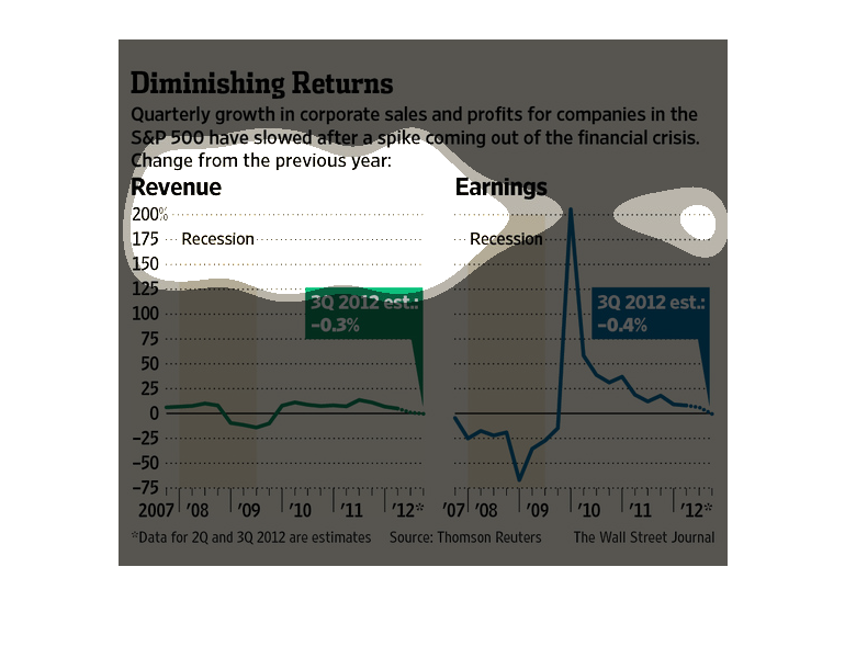
The graph shows revenue numbers from the recession in quarters. Seems like revenue is decreasing
after coming out of the financial crisis. Green notes 3Q in 2012 with -.3% and blue denotes
3Q with -.4%
This chart shows the quarterly growth and sales of companies in the S&P 500 have slowed after
a spike coming out of the financial crisis in 2009.  The graph shows revenue and earnings
for these companies from 2007 - 2012.
This chart from the Wall Street Journal shows how corporate growth in sales and profits have
diminished over time when measured in the S&P 500 index.
Corporate growth has slowed according to the charts depicted here. After a significant spike,
both the revenue and earnings have suffered from a .3% and .4% decrease respectively.
This is a series of color coded charts and related statistics depicting that quarterly growth
in corporate sales and profit for companies in the S&P 500 had slowed.
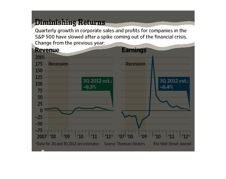
This series of graphs shows how corporate growth has slowed following an initial spike after
the financial crisis. On the left we have revenue from 2007 to 2012, and on the right we have
earnings, which spike SHARPLY before declining just as fast.
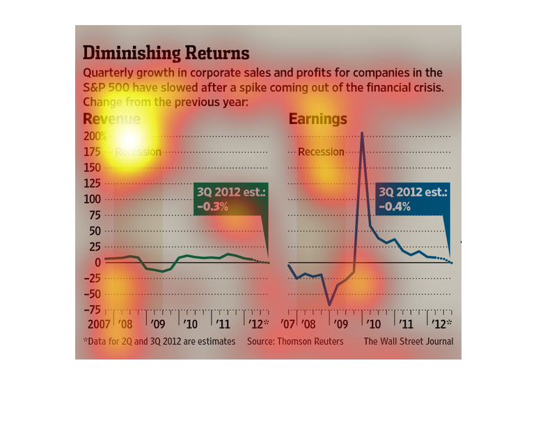
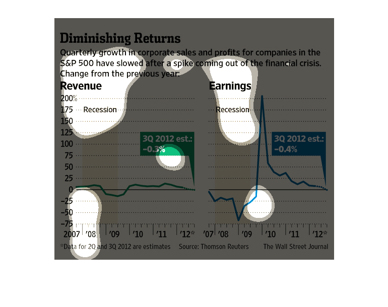
In a study conducted by the Wall Street Journal from 2007 to 2012 we see that several companies
have continued to experience losses following the recession period.
This chart describes diminishing returns. Specifically, quarterly growth in corporate sales
and profits for companies in the S&P have slowed after a spike coming out of the  crisis.