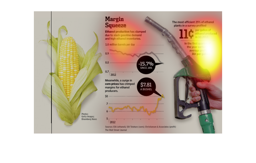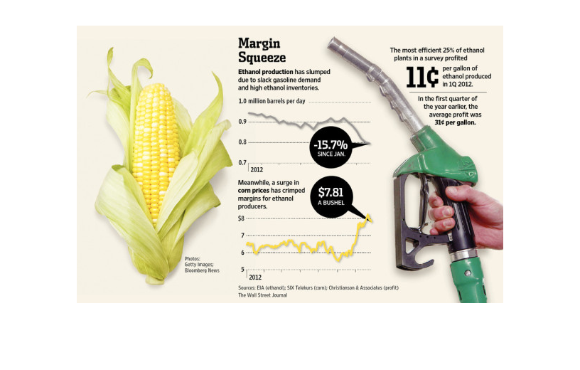
The cost of corn has multiplied ten fold since the invention of biodiesel. In this illustration
we see that the cost have steadily risen and pretty soon it is going to be just as expensive
as regular gasoline.
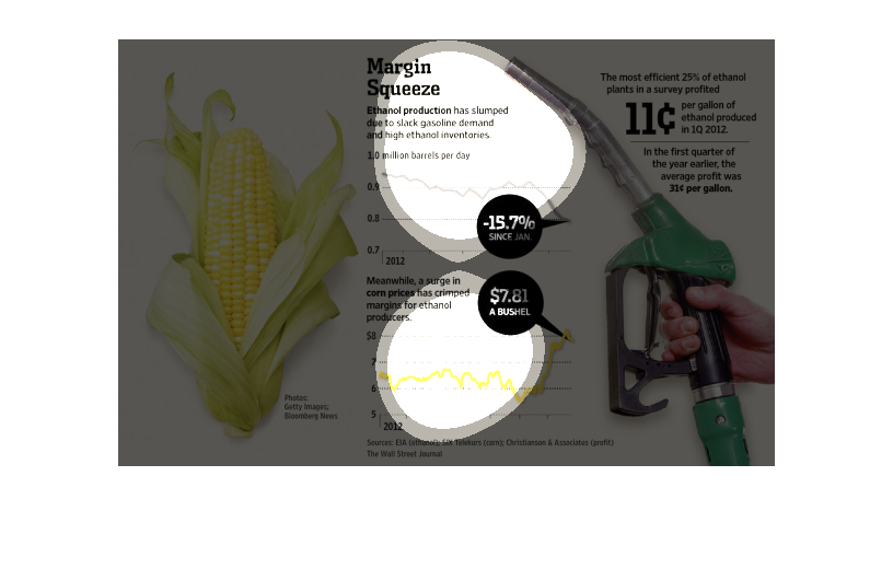
This chart from the Wall Street Journal shows how the prices earned for gallons of ethanol
made from corn have been squeezed over time and how it is not profitable
This is210  a chart showing about ethanol production. It tells what the most efficient twenty
five percent of ethanol making plants are and there is information saying it has slumped.
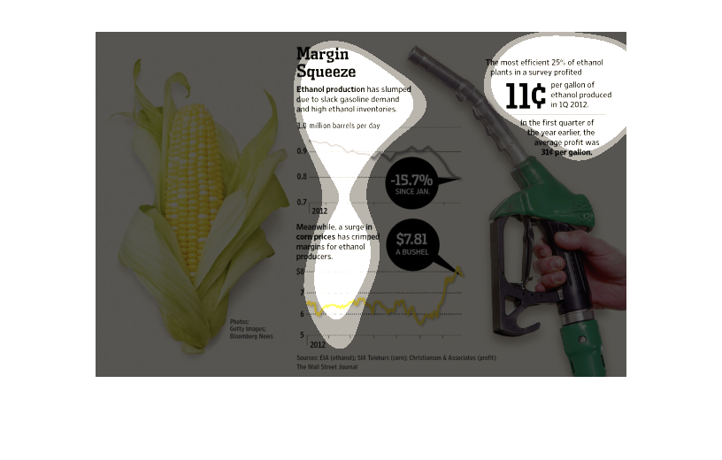
This graph shows how ethanol production has decreased due to decreases in demand for gasoline.
Simultaneously, an increase in the price of corn has been recorded.
There is a picture to the left of a yellow ear of corn still in its husk.  To the right is
information on Ethanol production, which has slumped due to slack gasoline demand and high
ethanol inventories. Also speaks of a surge in corn prices, which has crippled margins for
ethanol producers. The accompanying graphic is of a hand holding a gasoline pump nozzle.
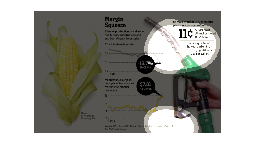
This chart describes Margin squeeze. Specifically, ethanol production production has slumped
due to slack gasoline demand and high ethanol inventories.
this chart illustrates how ethanol growth has slumped because ethanol gasoline demand has
been decreasing and inventories remain high.  It talks about profits for ethanol and corn
production.
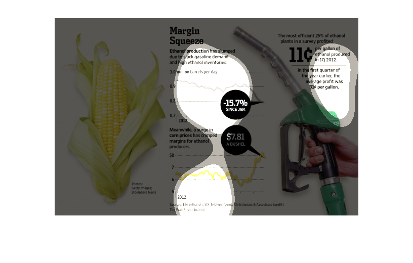
This is a series of diagrams and related statistics depicting that ethanol production had
slumped amid slack gasoline demand coupled with high inventories.
The title of the graphic is margin squeeze. It says that ethanol production has slumped due
to a slack in gasoline demand and high ethanol investors.
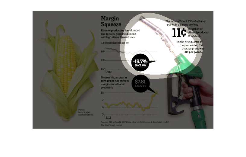
This chart describes margin squeeze. Specifically, Ethanol production has slumped. The chart
contains photographs to enhance the information presented.
The chart shows the slump in ethanol production starting in 2012.  It was at 1 million barrels
per day and fell -15.7%.  The chart attributes this to  a surge in corm prices and slack demand
for gasoline.
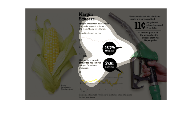
Here in this image is a peeled ear of corn opposite a picture of a hand holding a gas pump.
 The caption for this image is, "Margin Squeeze".  The information depicted shows that Ethanol
production has gone down.  One of the graphs shows barrels produced per day in millions.
Ethanol production is compared to corn prices.  Ethanol production has been decreasing over
the course of the year which the data is for and corn prices have been increasing.  This significantly
decreases the profit margin for ethanol producers.
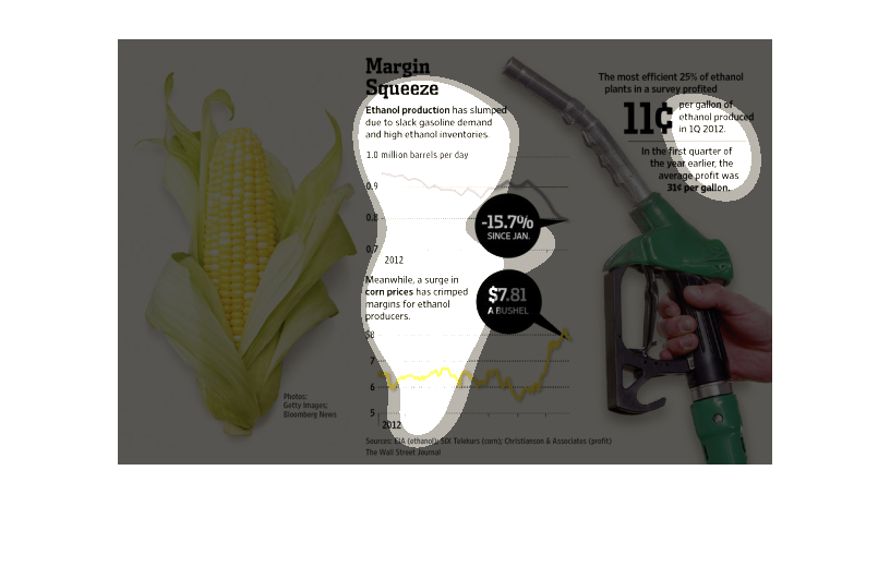
This chart details the slump in ethanol production, the surge in corn prices.  It talks about
the average profit for ethanol produced per gallon and per bushel of corn.