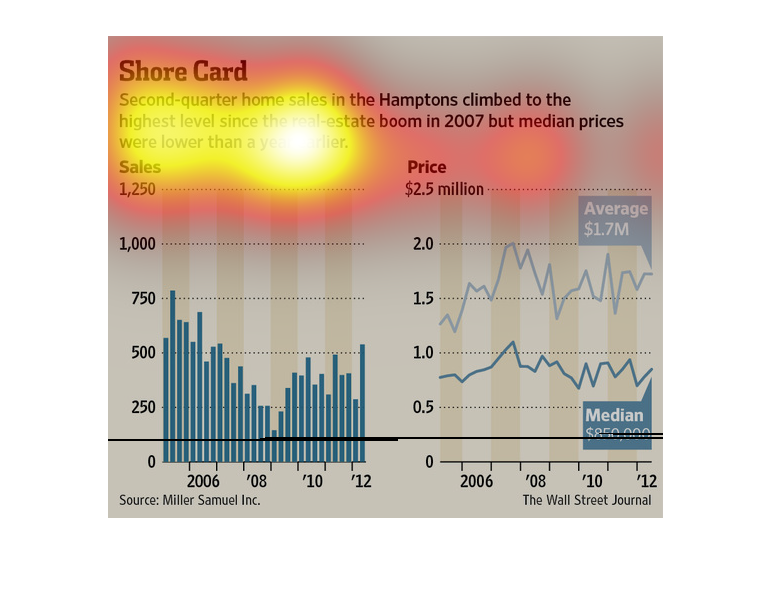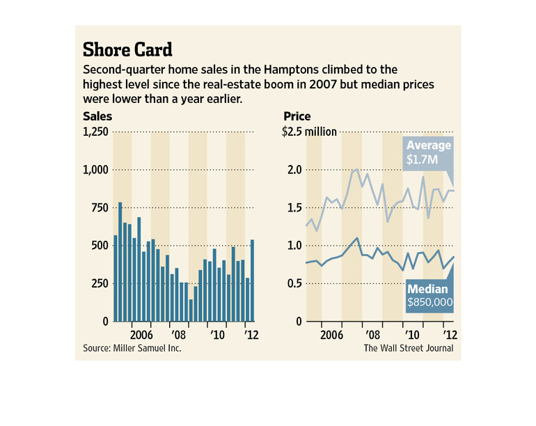
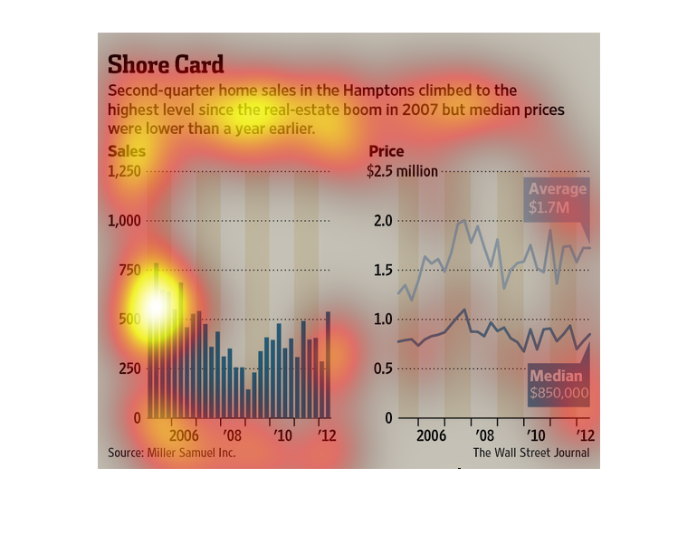
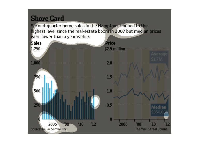
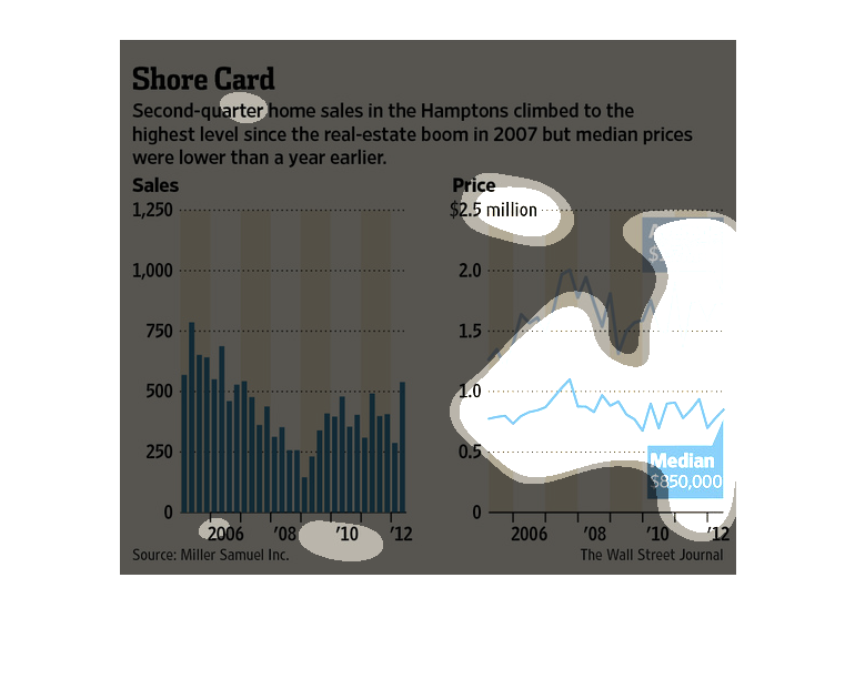
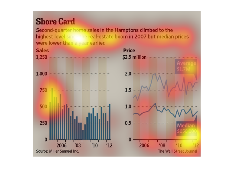
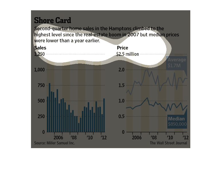
These graphs show how second quarter home sales in the Hamptons climbed to the highest level
since the real-estate boom in 2007 but that median home prices remained lower than a year
earlier. In 2007, home sales were around 750 million, but by 2008 it was only around 150 million.
Since then, the market has recovered to just above 500 million. While this has increased,
the median home range remains arounds 850,000 while before it was at 1.7 million.
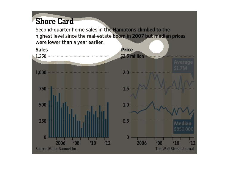
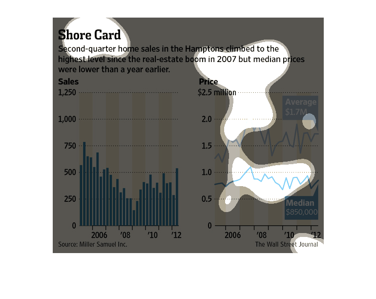
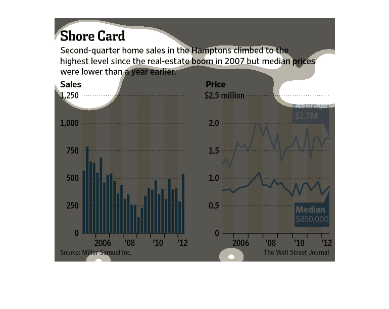
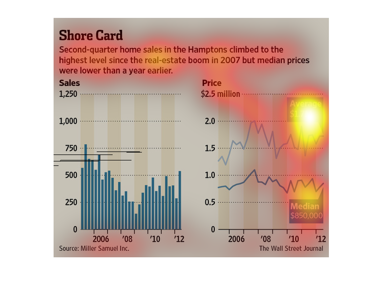
The image depicts second quarter home sales in the Hamptons increasing to the highest levels
since the real-estate boom in 2007, while median prices were lower than previous years. Average
price is 1.7 million, with median price at $850,000.
A chart and graph examining land sales in the Hamptons. Notice a dip in sales around the 2008
recession. Median and average plotted on line chart with increasing disparity between the
two values.
The name of this graph is called the shore card it's about the ocean at the beach. It is a
line graph with a medieval. Time looking thing on it. What is this
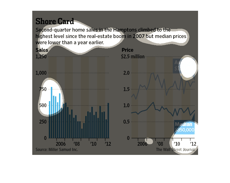
These graphs illustrate home sales in the Hamptons in New York with sales for 2000 to 2012
on the left hand side and price of homes for the same time period on the right hand side.

Second quarter home sales in the Hamptons climbed the highest they have since 2007, but median
prices were still lower then evern just year prior. A higher $1.75 million puts the now $850,000
in perspective.
As reported in the Wall Street Journal, home sales in the Hamptons have reached their highest
level since the real estate market crash in 2007. The average price is $1.7 million with a
median price of $850,000 which is actually lower than the median price one year earlier.
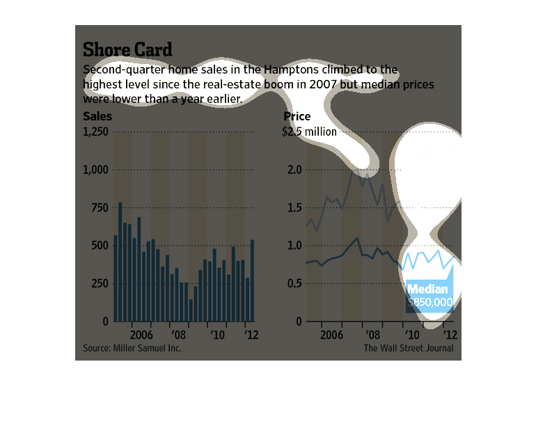
This chart from the Wall Street Journal shows how home sales in the Hamptons is increasing
slowly since the economic downturn in 2009. The home prices are also increasing
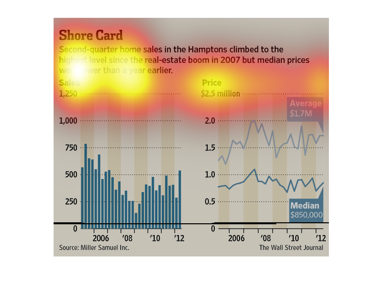
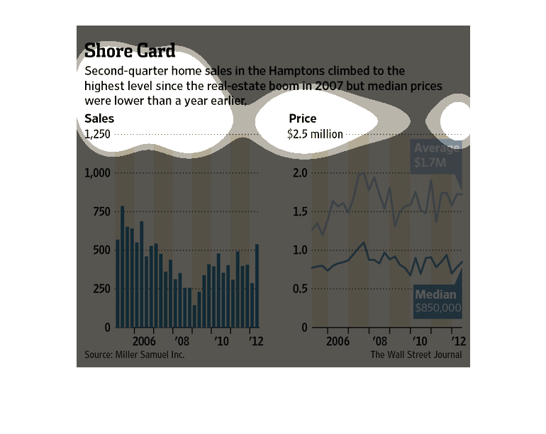
the image is a description of how home sales in the Hampton's have  with charts showing that
growth from 2006 to 2012 one showing the growth in sales and one showing the growth of price.
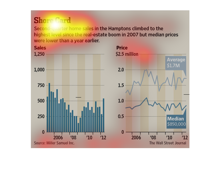

This shows home sales in the Hamptons with the left hand graph showing total sales from 2006
to 2012 and the right hand side showing total price per house sold.
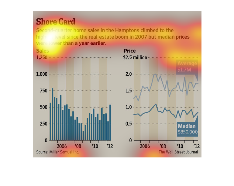
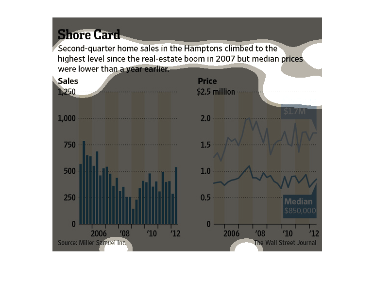
The following chart showed that home sales saw there peak in the Hamptons of New York in the
year 2007. However the price of homes has now gone above the peak average of 2007.
This chart describes shore card. Specifically, second quarter home sales in the Hamptons climbed
to the highest level since the real estate boom in 2007.
This chart from the Wall Street Journal shows how the second quarter home sales in the Hamptons
in New York have increased after a brief decline in years prior