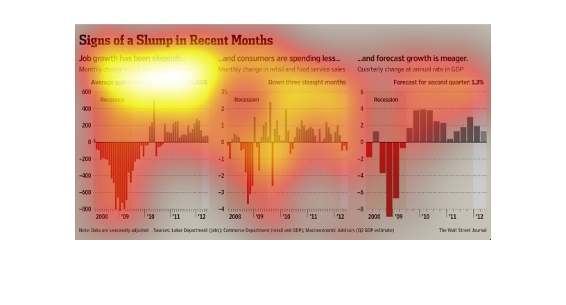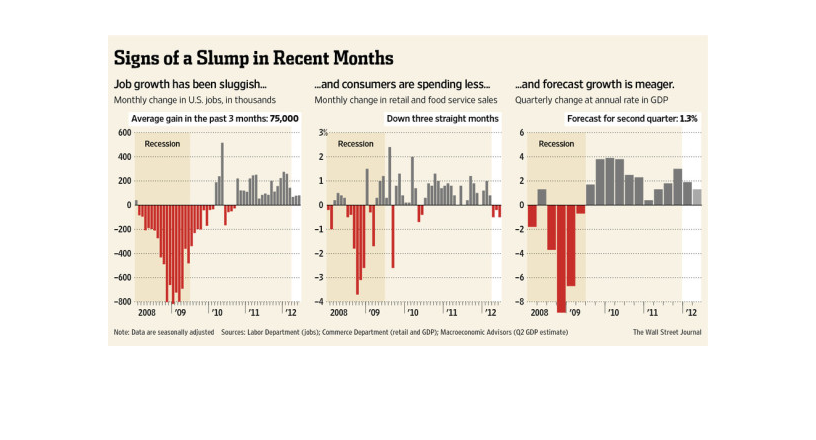
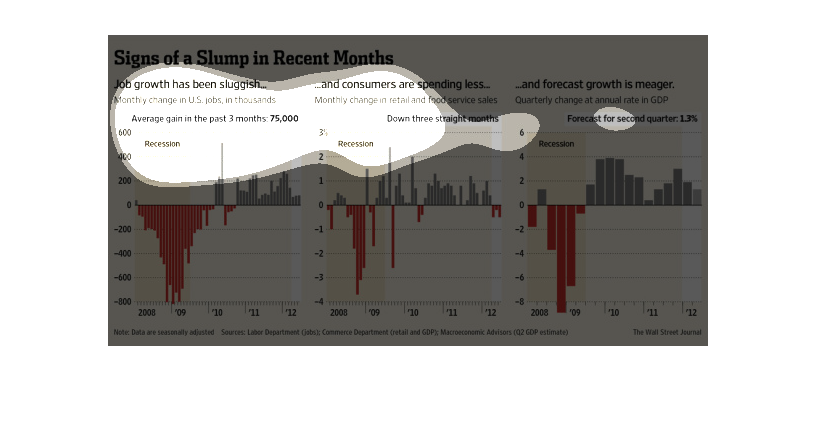
This chart shows signs of a "slump" in the recent months. Job growth is down, spending is
down, and  forecast growth is meager. All of this is since the Recession.
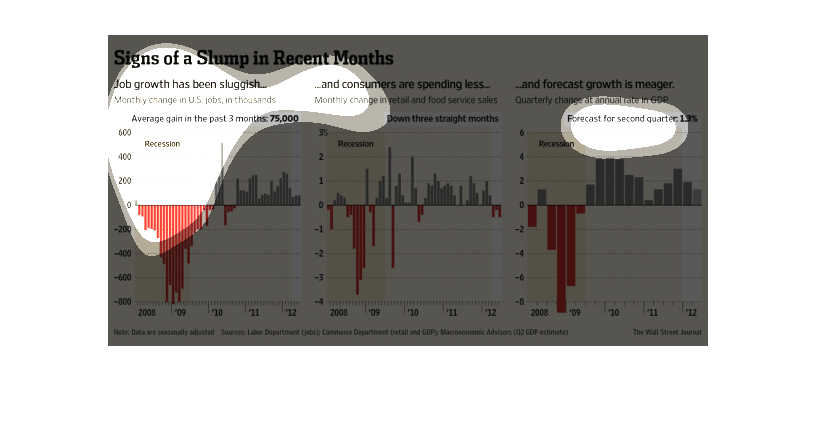
This chart describes signs of a slump in recent months. Specifically, job growth has been
sluggish. Different categories on the chart are represented by different colors.
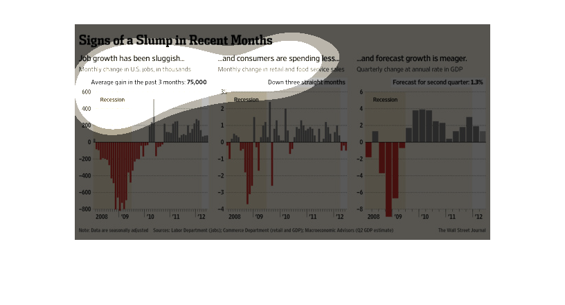
This chart is signs of slump in recent months in jobs. Job growth has been very sluggish according
to this chart. Down in the last three months. With hop of a gain in the next three.
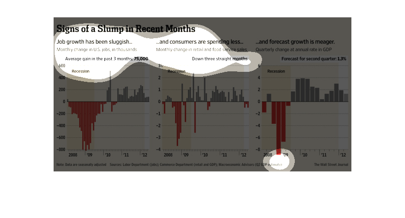
The image depicts how job growth has been slower than expected, also that consumers are spending
less and the overall forecast growth looking smaller and less significant that hoped. The
economic recovery is slower than hoped for.
This chart from the Economist or similar publication shows the signs of a economic slump in
recent months and how spending and other indicators are trending down
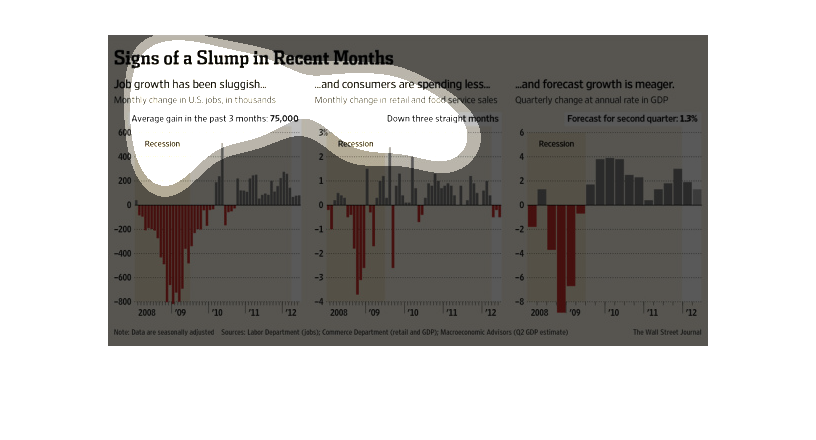
These three graphs show that job growth has gotten slower in the past few months, though it
is still positive; consumer spending has dropped; and forecast growth is down.
This series of graphs shows monthly changes in US jobs, monthly changes in retail and food
service sales, and quarterly changes in annual GDP rate from 2008 to 2012.
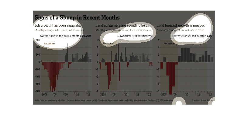
This chart describes signs of a slump in recent months. Specifically, job growth has been
slugglish. Different categories are represented by different colors.
This chart details sluggish job growth on the left hand side, consumer spending changes in
retail and food services in the middle, and forecast growth in GDP on the right hand side.
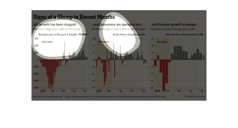
The image depicts US job growth being rather slow, while consumes are spending less money,
and the forecasts for future growth looking somewhat small. The recovery post-recession isn't
as fast as people expected.
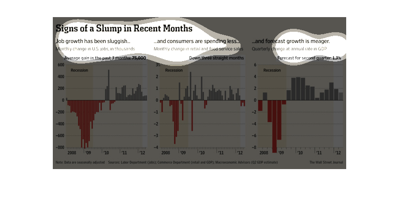
The image depicts various signs of a slump in recent months due to a sluggish economy.  The
graph on the left shows the average gain the last three months.  The center graph shows growth
down for three straight months.  The right graph shows the forecast for the second quarter.
 Red bars illustrate losses and gray bars show gains.  The charts are very clear and concise.
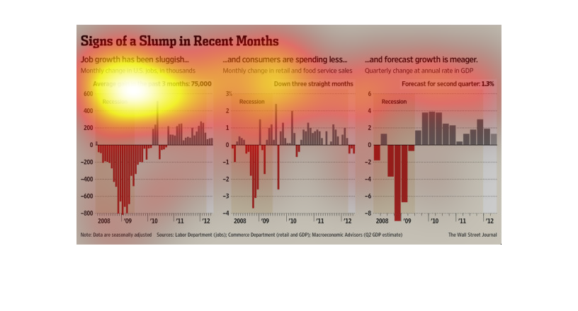
The recession has hit everyone worldwide pretty hard. People lost jobs and homes because of
it; there has never been an easy fix for it. In this Wall Street Journal study we see that
in spades.
The title of the graphic is signs of a slump in recent months. It says that job growth has
been sluggish, consumers are spending less, and forecast growth is meager.
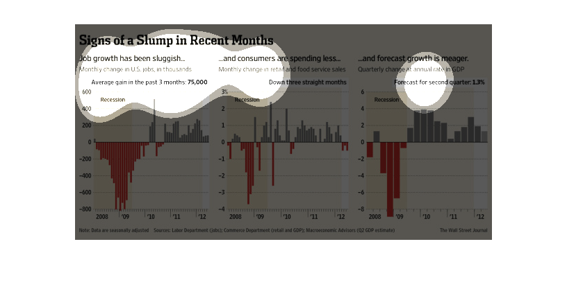
This chart from the Wall Street Journal shows how the leading indicators int he United States
are pointing to a slight slump in economic growth.
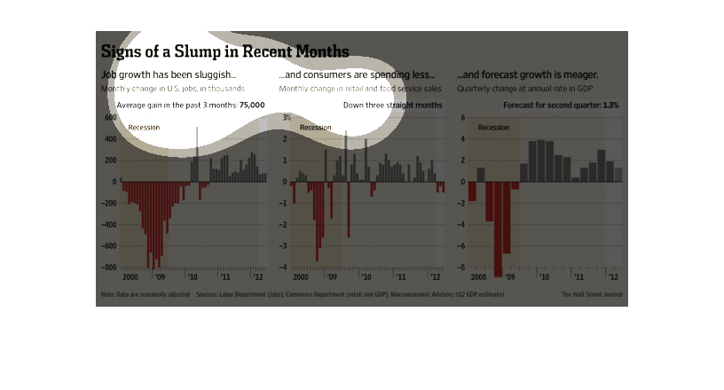
Job growth has been meager and consumers are spending less in turn. Also, forecasted growth
is meager. These graphs seem scaled oddly as well to show the specific information it is trying
to show.