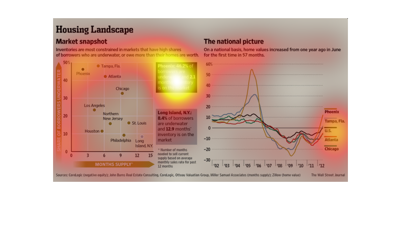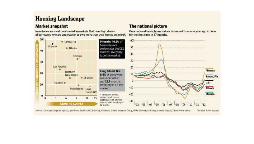
This chart from the Wall Street Journal shows how the housing market looks nationally over
time and how it has slightly improved since the great recession
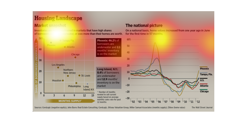
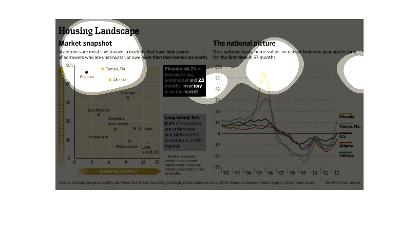
This chart from the Wall Street Journal shows how the housing market has fared since the great
recession in the United States and southeastern United States
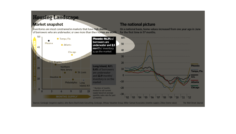
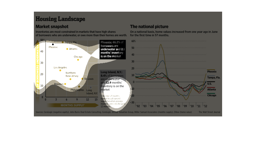
This graph depicts a the Housing landscape as a market snapshot as well as a national picture
with the highest spike of pricing in 2006 and again in 2012.
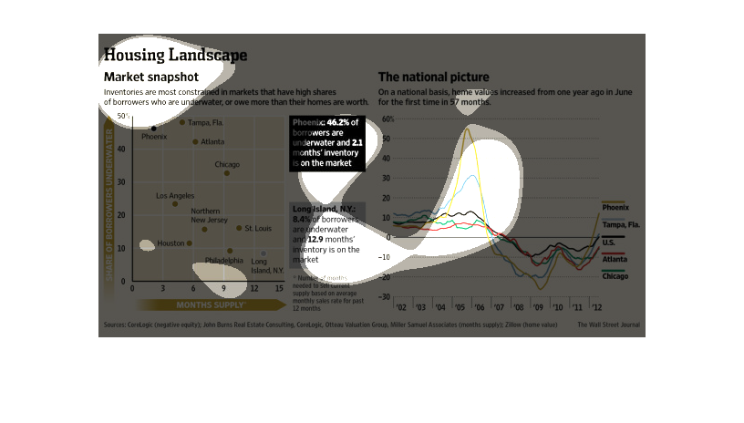
This is an image showing a house's location on a map and the value of real estate since last
year in different states compared to the national average.
This chart describes the housing landscape. Specifically, Market snapshot. Inventories are
most constrained in markets that have high shares of borrowers.
This picture is a line graph that is talking about Housing Landscape. It shows a market snap
shot that has the line graph, an area map, and some information about the areas.
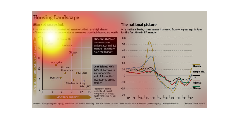
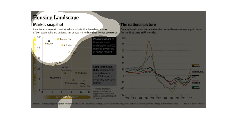
Housing Landscape, a market snapshot.  Inventories are most constrained in markets that have
high shares of borrowers who are underwater, or own more than their homes are worth.  One
graph shows a months supply of homes in major areas of the US like Los Angeles and Northern
New Jersey.  Another give a national picture using a graph, showing that home values increase
over the previous year. Cities included: Phoenix, Tampa, and Atlanta.
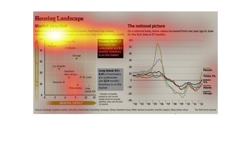
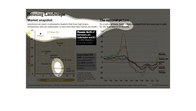
This snapshot of the housing market shows the percentage of homeowners underwater with their
debts in a scatterplot across different US cities, and a color coded graph of home prices
across the same cities.
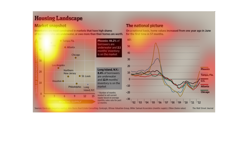
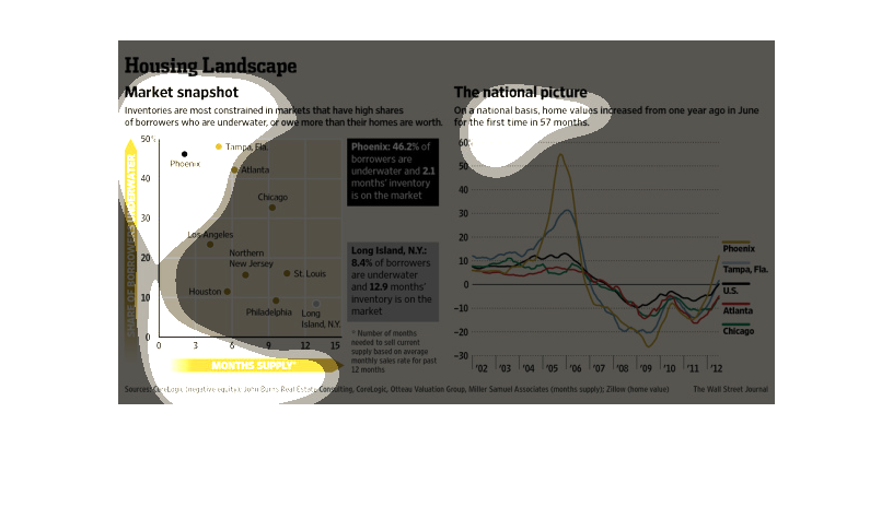
This chart shows the percentage of home owners in major cities that owe more than the house
is worth. There is also shows what the percentage vs the total amount of the us
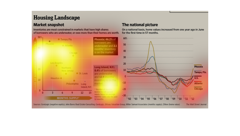
The housing market is in flux, and no one knows how its going to go down for the market; at
least that is what we are lead to believe from this research conducted by the Wall Street
Journal.
This image shows or depicts in line graph statistical format information concerning how inventories
are most constrained in markets that have high shares.
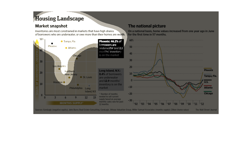
On a national basis home values increased from one year ago in June for the first time in
57 months.  There is a graph of the constraint of lenders markets who have borrowers who are
underwater, or owe more than their homes are worth.
The image shows that many borrowers are underwater. Also it shows that the value of houses
across the United States has been increasing in large cities such as Tampa, Atlanta, Chicago,
and Phoenix.