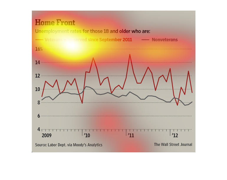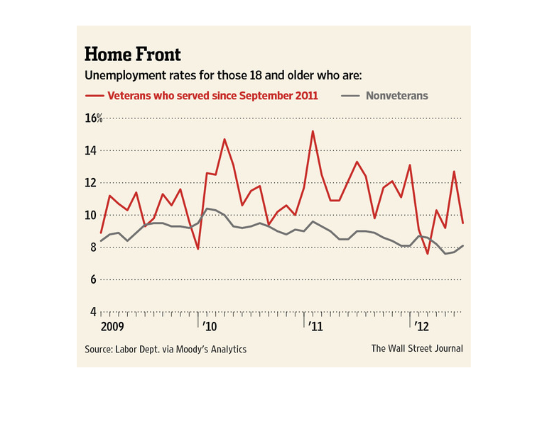
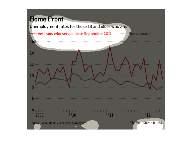
This chart shows the difference in unemployment rates from 2009 to 2012 between veterans who
served since sept 2011 and nonveterans. Consistently the veterans were unemployed at a higher
rate even reaching 9% higher than a nonveteran.
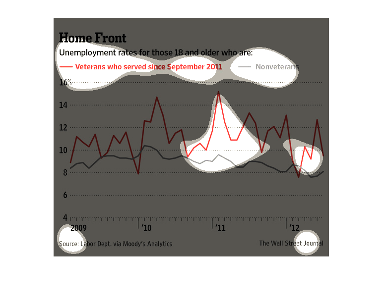
The image depicts unemployment rates for those 18 and older who are either veterans who have
served since September 2011 versus non-veterans. New veterans have a much higher unemployment
rate than non-veterans.
This chart from the Wall Street Journal shows how the unemployment rate between veterans and
non veterans is starkly different, and much higher for veterans


This chart describes home front. Specifically, unemployment rates for those eighteen and older
who are veterans who served since September of the year 2011.
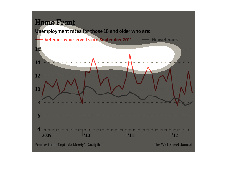
In this study conducted by the Wall Street Journal- its source being the Labor Department-
we see the unemployment rate among war veterans 18 and older.
This image is called "Home Front." It depicts unemployment rates for those who are 18 and
older based on those who are veterans since September, 2011 versus nonveterans.  Percentages
are shown in red on the graph from just below 8% to almost 15% from the years 2009-2012.
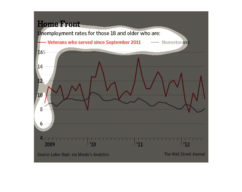
This is a series of charts and related statistics depicting the unemployment rates for those
18 and older, separated by veterans and non-veterans fro 2009 to 2012.
This graph show unemployment rates of veterans who served since Sept. 2011 and non-veterans.
This graph shows 2009 to 2012. Veteran unemployment is the highest with spikes of 14 and 15
percent.
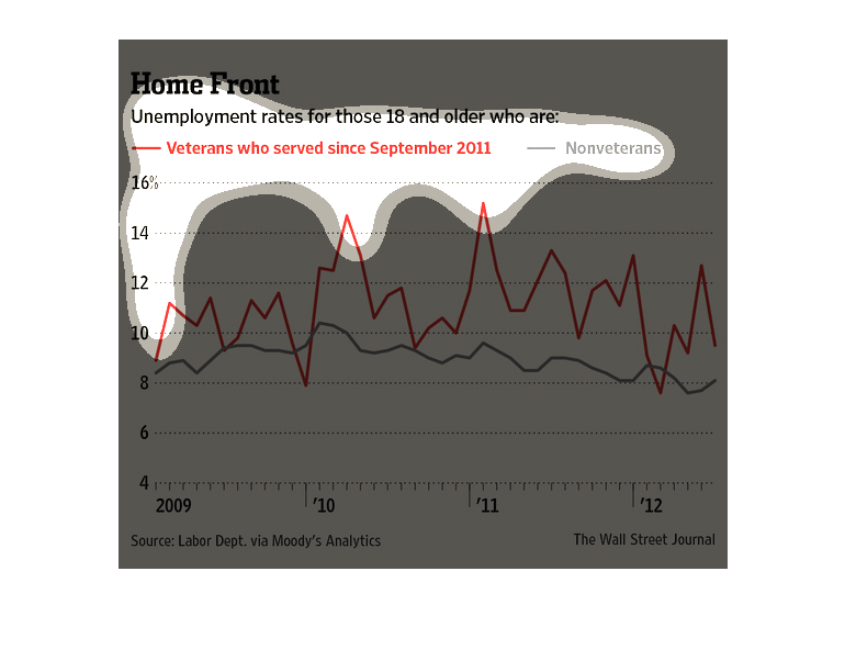
This graph shows unemployment rates for those age 18 and older who are veterans who served
since September 2011 and nonveterans for the years 2009 to 2012.
The image depicts unemployment rates for those 18 and older who are veterans who served since
September 2011, and non-veterans. Veterans have a higher unemployment rate than non-veterans.
This chart shows the unemployment rate for those 18 and older focusing on veterans who have
served since September 2011 versus non-veterans.  The highest rate of ~16% unemployment for
the veteran category was in 2011, while the highest rate of unemployment of ~10.5% for the
non-veteran category was in 2010. Veteran unemployment rates are higher than the non-veteran
unemployment rates.
The title of the graph is home front. It shows the unemployment rate from those who are 18
and older who are veterans who served since September 2011 and nonvets.
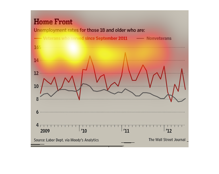
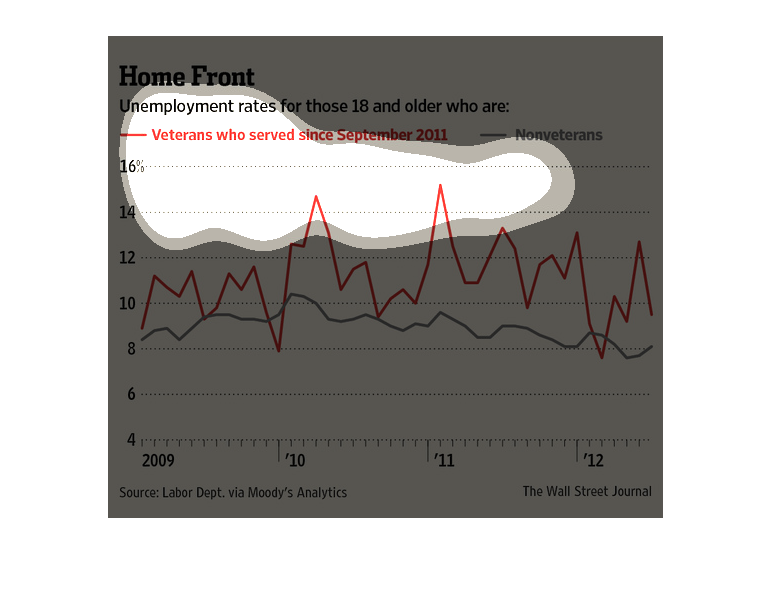
This chart from the Wall Street Journal shows how the unemployment rate between veterans and
non veterans has changed over time, and theres a gap between the two
This chart describes home front. Specifically, unemployment rates for those eighteen and older
. Different categories are represented by different colors.