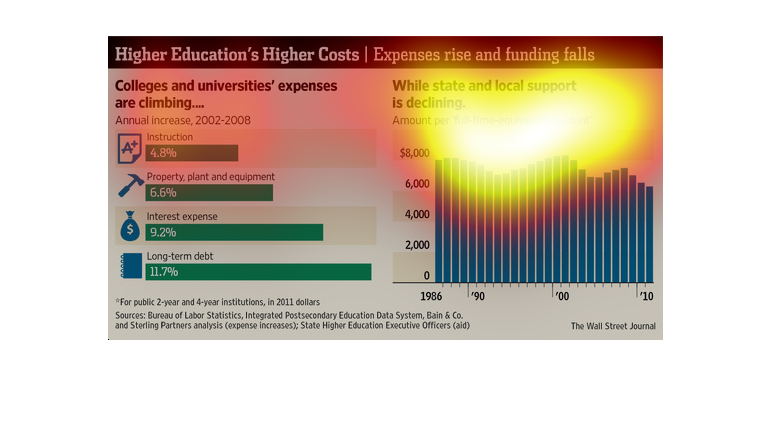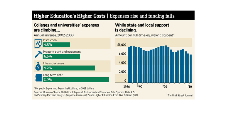
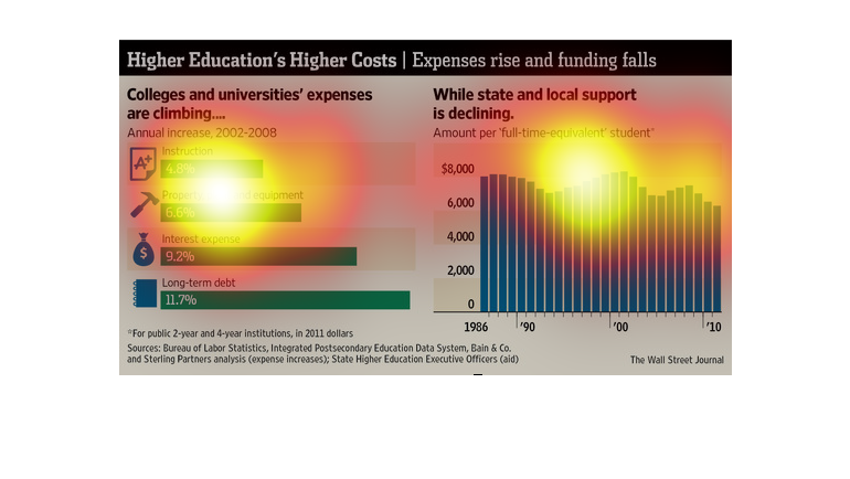
These graphs indicate that the cost of higher education is increasing while the funding for
it is falling. There has been an increase related to all college expenses including instruction,
property and equipment, interest, and long term debt. Long term debt has the largest increase
at 11.7%. At the same time, the amount of state and local support per student has steadily
been on the decline and is at only about $6000 per student now.
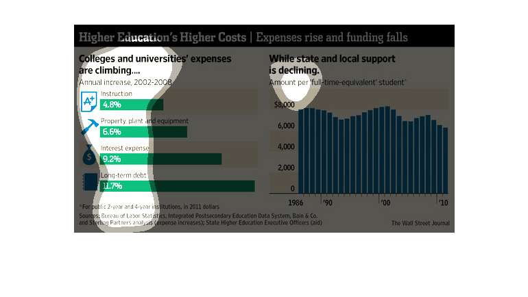
This chart shows the amount of college costs and how they have been increasing over time .
The chart breaks soap the expense by category and type of debt

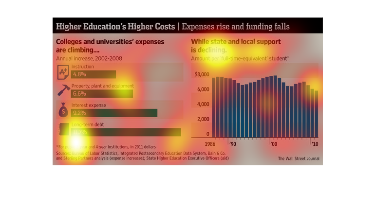
The image depicts how college and university costs are rising, while state and local support
is declining. The data indicates that higher education is becoming even more expensive with
less subsidization opportunities.
This chart from the Wall Street Journal shows how higher education costs have consistently
grown at a rapid clip while state funding has dropped a lot
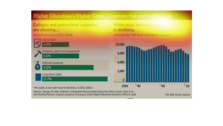
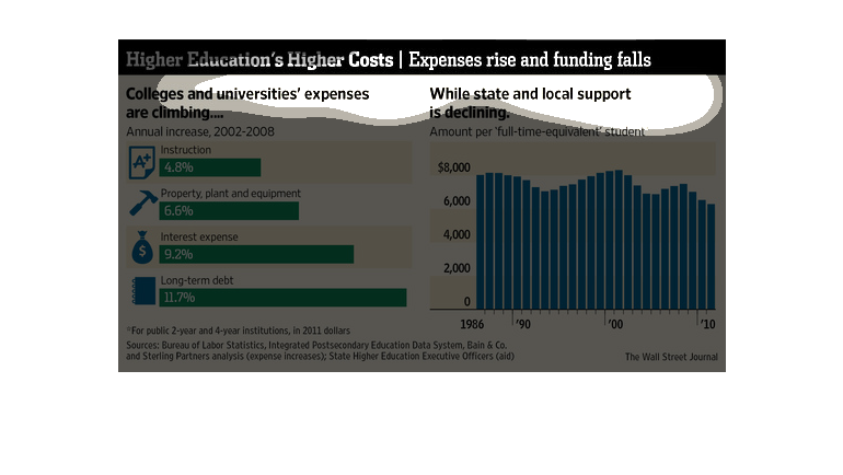
This is a chart that is showing the rise of cost and decline of funding. The education has
more to pay in the chart while the funding it shows declining in another chart.
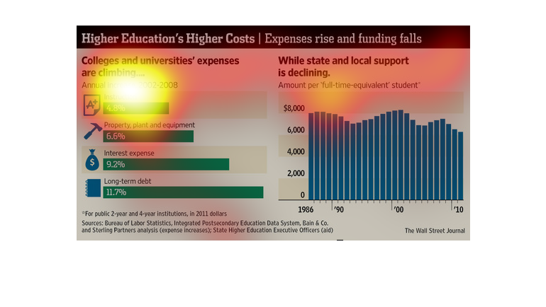
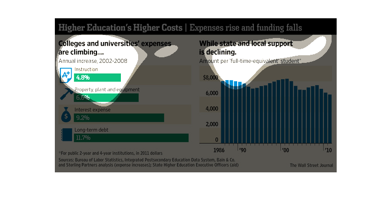
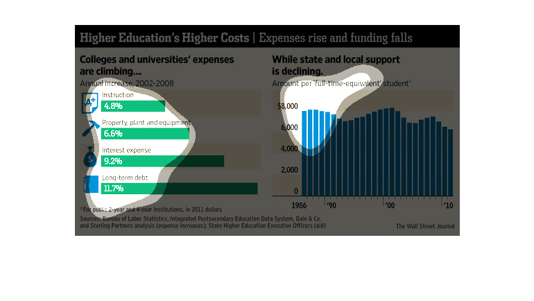
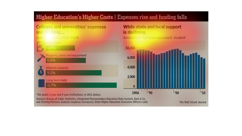
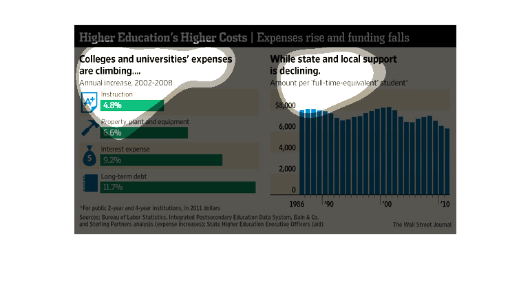
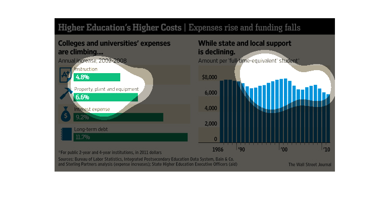
The left side of the chart shows increase in college and university expenses from 2002 to
2008 and the right side shows the amount of state and local support per full time student
declining.
The cost of secondary education is climbing higher and higher while the assistance from the
state and local areas is declining. A staggering 11.7% increase in one area of costs.
This chart shows that while University and college expenses rose steadily between 2002 and
2008, state and local financial support per student has been steadily declining from a peak
of nearly $8,000 per student to approximately $6,000 per student.
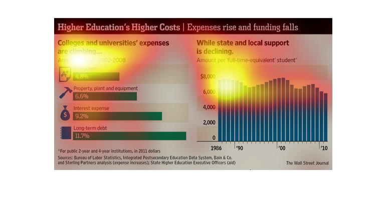
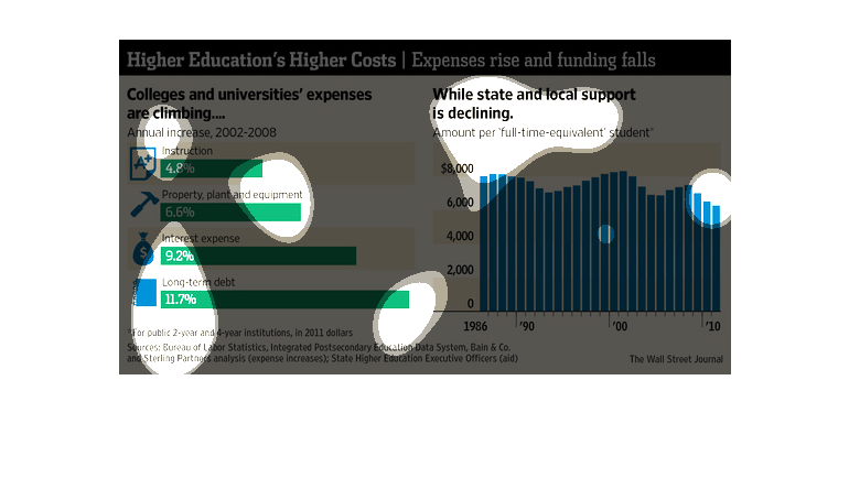
Higher education cost showed with a graph describing how state and local support is declining
from 1986 to 2010 and also a breakdown of annual cost and their increase.
This chart describes higher education's higher costs. Specifically, expenses rise and funding
falls. Different categories are represented by different colors.
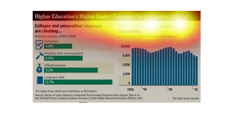
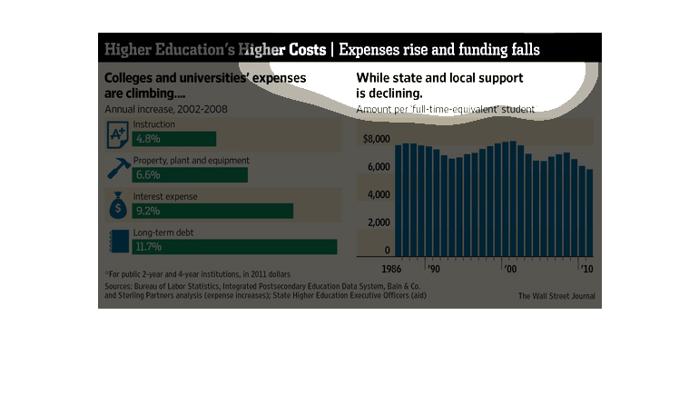
The following chart shows how the costs of a college education is skyrocketing, however the
amount of state and federal aid and support toward college students is on the decline.
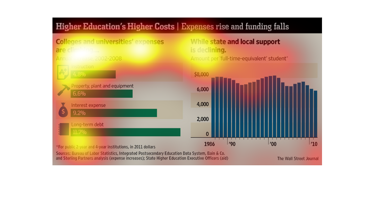
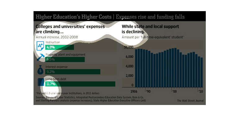
This chart describes higher education's higher costs. Specifically, expenses rise and funding
falls. Categories on the chart includes instruction, property, plant and equipment.
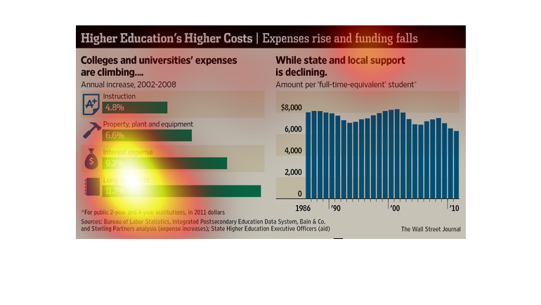
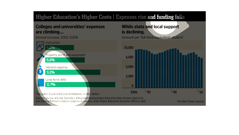
This chart from the Wall Street Journal shows how higher education or college costs have increased
dramatically recently while state funding has dropped
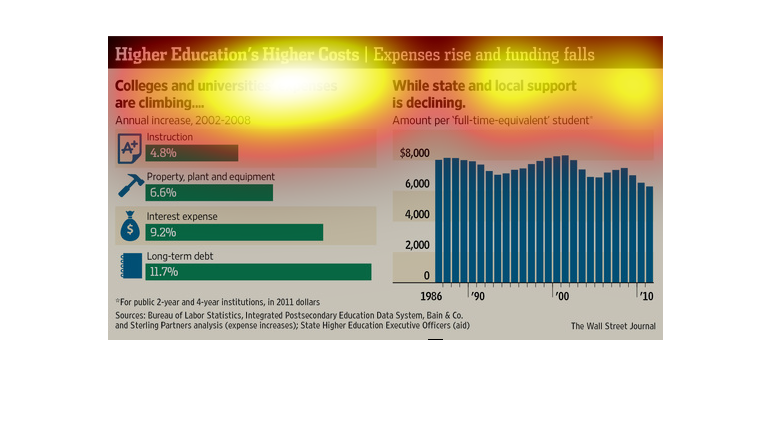
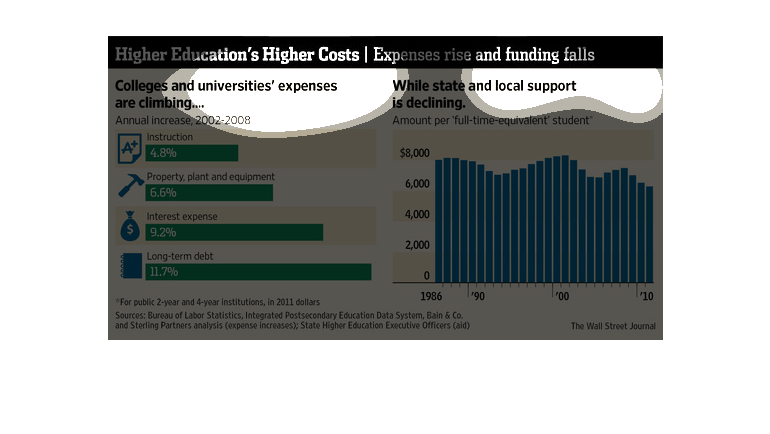
higher education higher costs expling how expenses rise and funding falls grapgh shows college
and universities spending habits. and how state support is declining