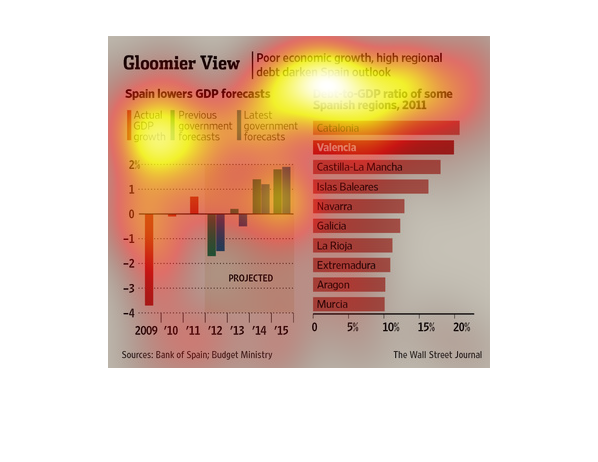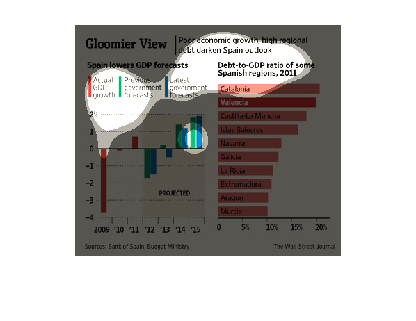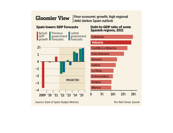
This chart from the Wall Street Journal shows how the economic outlook for spain is changing
for the worse and is gloomier because of their debt troubles
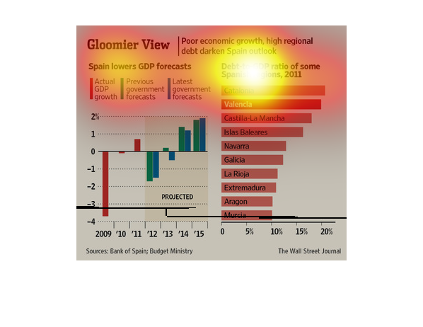
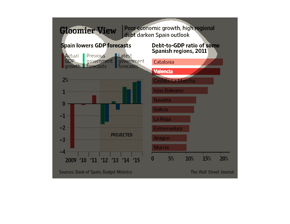
One of the charts in the image shows the actual, projected and revised GDP for the years 2009
through 2015.  The other chart in the image  shows the debt to GDP ratios from several regions
in Spain.  The overall image demonstrates the poor economic outlook in the various regions
in Spain.
This chart from the Wall Street Journal shows how spain's economy is expected to be challenged
due to rising debt and unemployment relative to other euro zone countries
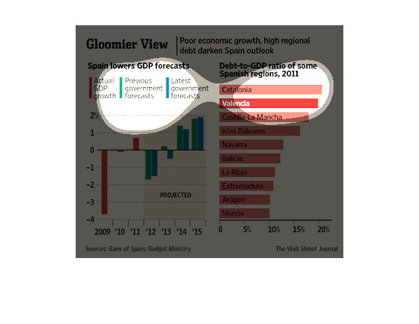
This chart describes Spain's poor economic outlook. Spain's actual GDP growth is -4% compared
to a projected growth of -1.5%. The debt to GDP ratio of Catalonia is 20%.
Gloomier View| slower economy groeth, high regional debt darken's spain's outlook. Debt to
GDP ratios by region are high, GDP growth has more than failed to meet expectations .
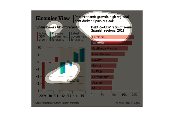
This graph shows a lack of economic growth and and high levels of debt Spain. Catalonia is
the region with the highest debt to GDP ratio of about 20% in 2011.
This chart describes gloomier view. Specifically, poor economic growth, high regional debt
darken Spain outlook. Categories include Catalonia and Valencia.
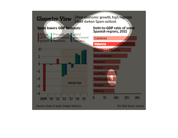
This chart shows the gdp projections for Spain . It compares three different projections .
The chart also breaks down the gdp growth by region of spaiy
The name of this graph is called gloomier  view. The bar graph has two or three colors red
blue and green. How cool is that and why is that so cool because it it's is
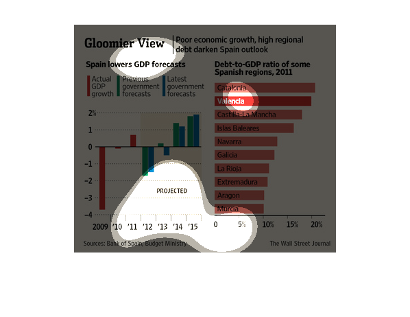
The image shows or depicts in statistical bar graph format information concerning how Spain's
poor economic growth and high regional debt darkens Spain's outlook.
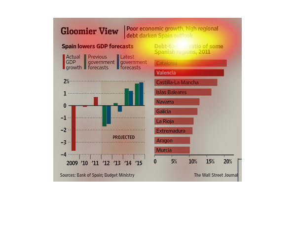
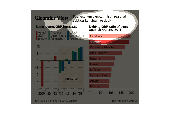
The image shows how Spain has a lower GDP forecast. Spains debt increased as a infographic
shows of 2011. The image also describes what percentage of projected and actual GDP growth
there are.