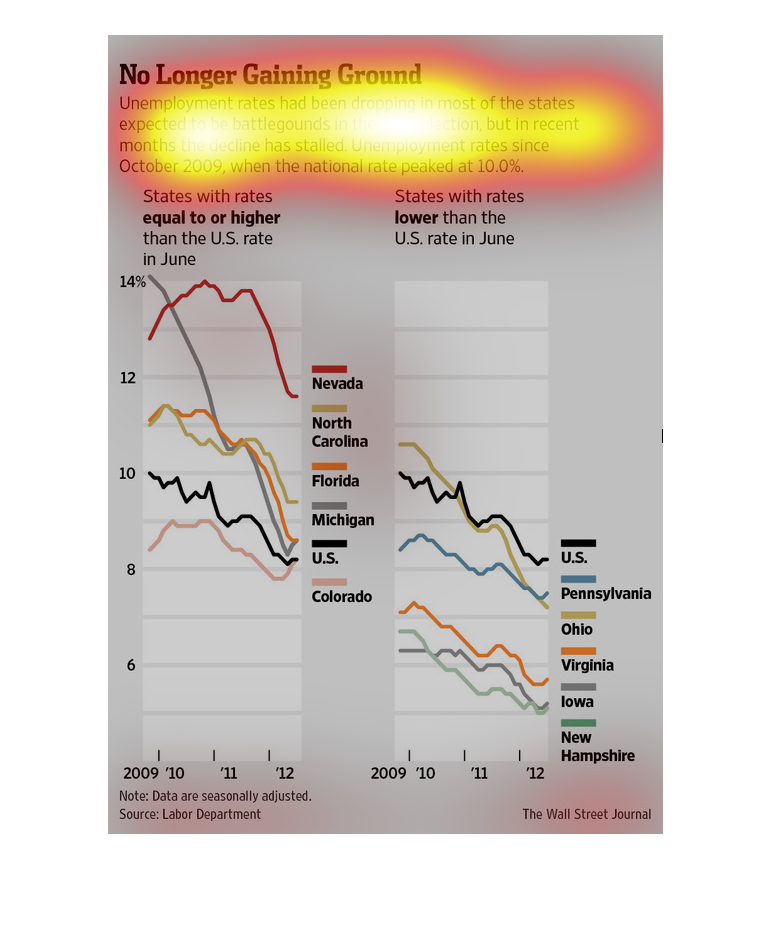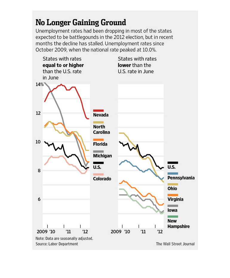
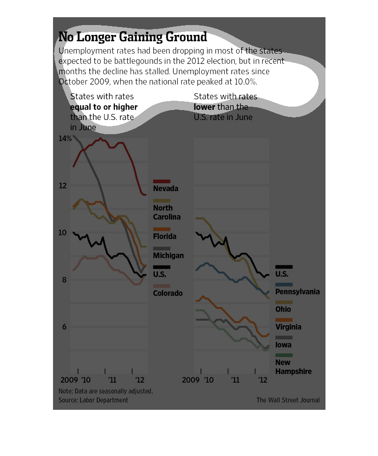
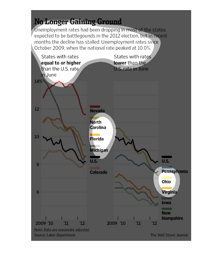
The image depicts the unemployment rate dropping in most battleground states ahead of the
2012 general election in the US. However, the decrease has stalled in recent months.
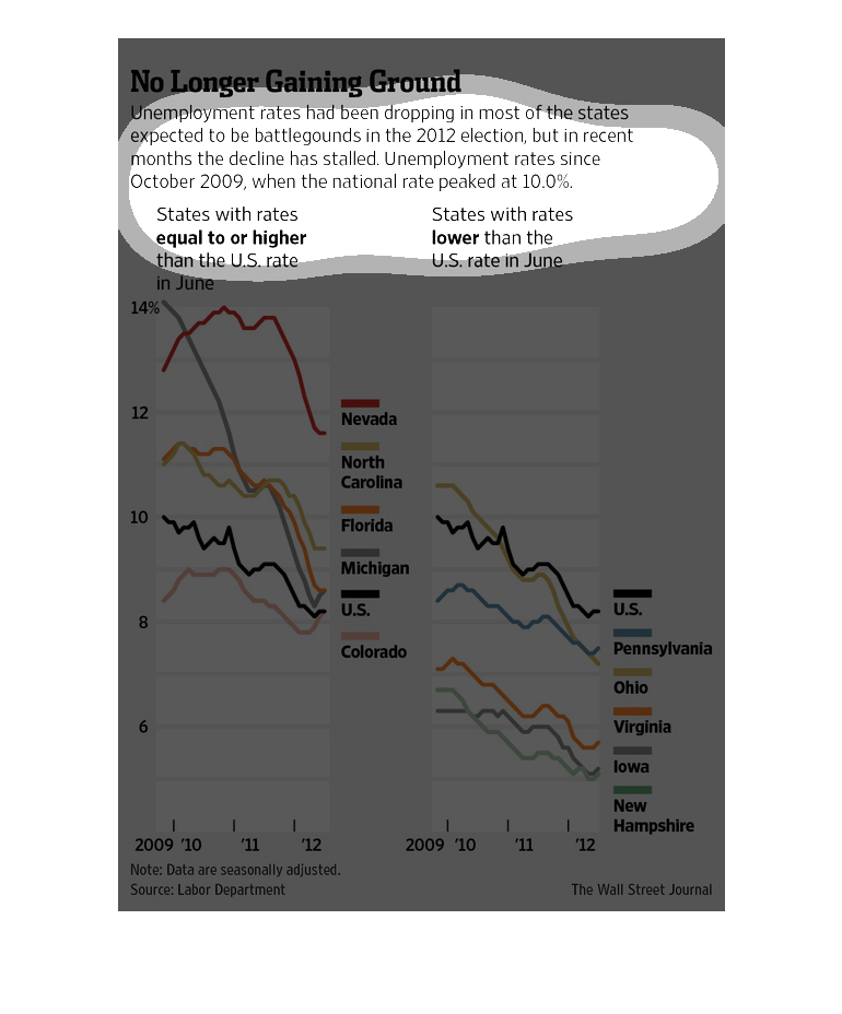
This graph depicts the trend in the unemployment rate in key battleground states for the 2012
presidential election.  Results are shown from 2009-2012, and are divided into the battleground
states with unemployment rates above the national average, and those below.
The graphs describe battleground states that had unemployment rates = to or  higher than the
US rate in June and battleground states that had unemployment rates lower than the US rate
in June. Since the rates have stalled, these this topic may not be a point to use in the 2012
elections.
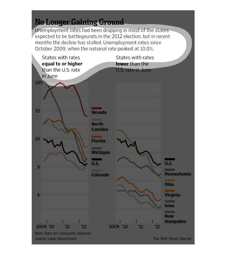
The title of the graph is no longer gaining ground. It says that unemployment rates have been
dropping in most of the states expected to be battleground states in the 2012 election.
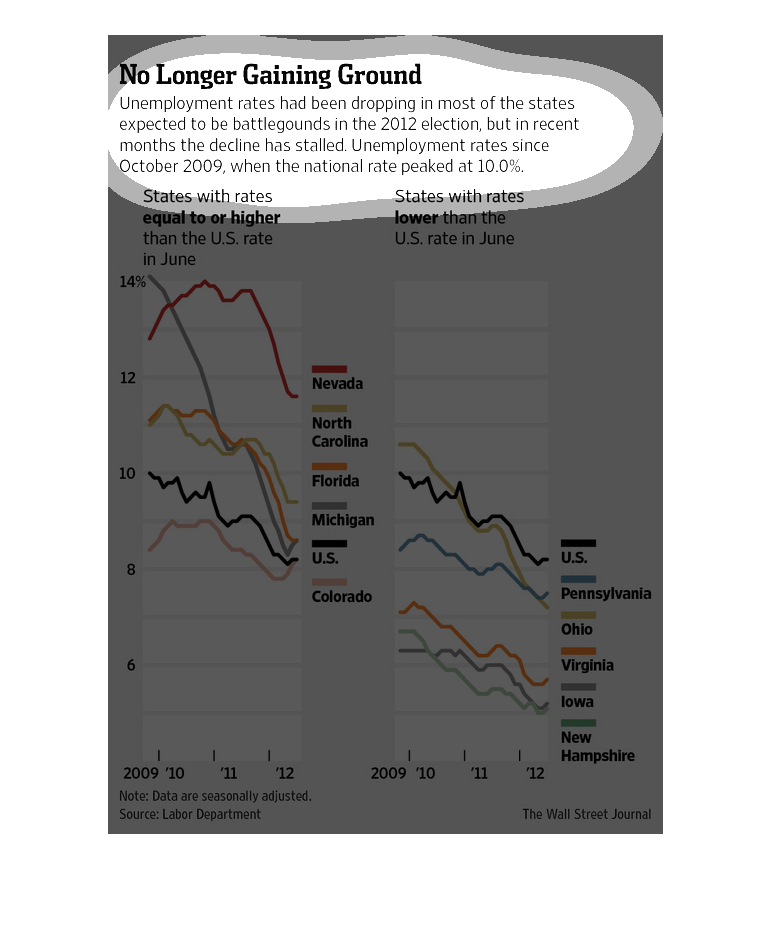
This chart describes no longer gaining ground. Specifically, unemployment rates have been
dropping in most of the states expected to be battleground states.
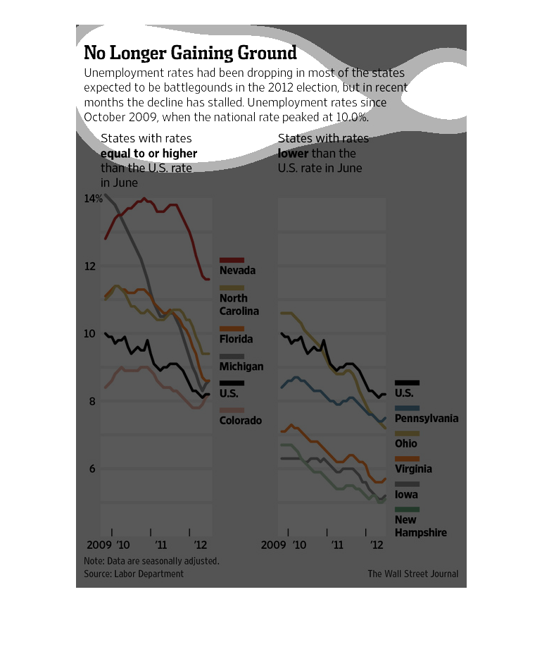
In this study conducted by the Wall Street Journal, from materials obtained from the Labor
Department, we see in this graph the breakdown by each state in unemployment, and the ramifications
of that issue in the Presidential Election.
This chart from the Wall Street Journal shows how unemployment rates in the United States
have been declining consistently since the great recession
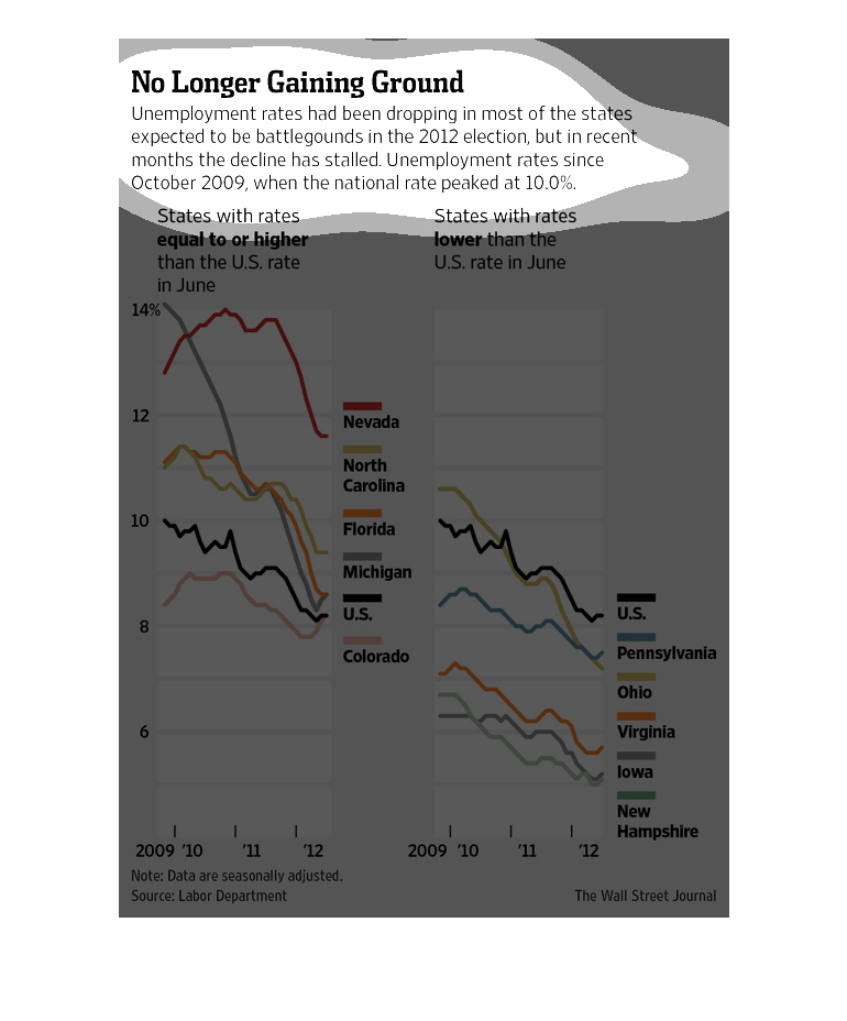
This graph details unemployment rates and shows states with rates equal to or higher than
the US rate compared to those with rates lower than the US rate.
This chart from the Wall Street Journal shows how the unemployment rate has steadily dropped
from 10% in the great recession to less than 5% today.
This graph shows unemployment rates between 2009 and 2012. They have been steadily dropping
since 2009 when the unemployment peaked at 10%, but recently have been on the rise again.
Pennsylvania, Ohio,Virignia, Iowa, and New Hampshire's rates were specifically compared to
the US overall.
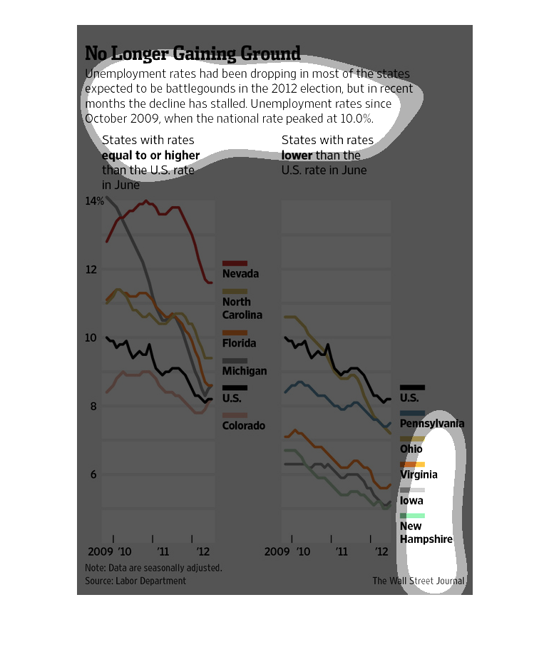
This graph is showing how the rate of unemployment has decreased from October 2009- 2012.
The states involved are Nevada, North Carolina, Flordia, Michigan and then you have the overall
rate of the U.S.
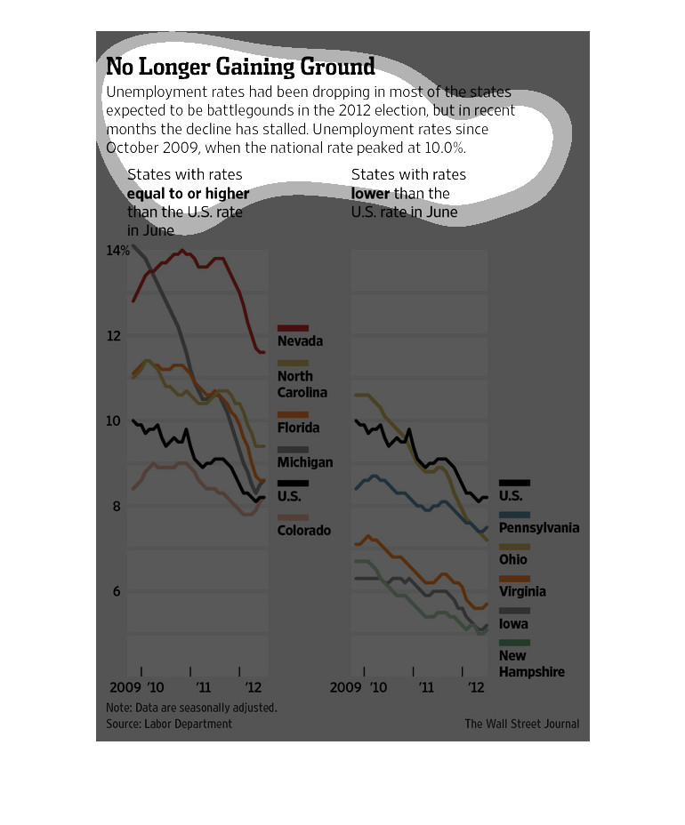
This image shows or depicts in line graph statistical format information concerning how unemployment
rates were stable in 2009, but then an increase up until 2012.
This is a series of color coded charts and related statistics depicting that in 2012 battleground
states the unemployment rate had been dropping but had started to stall.
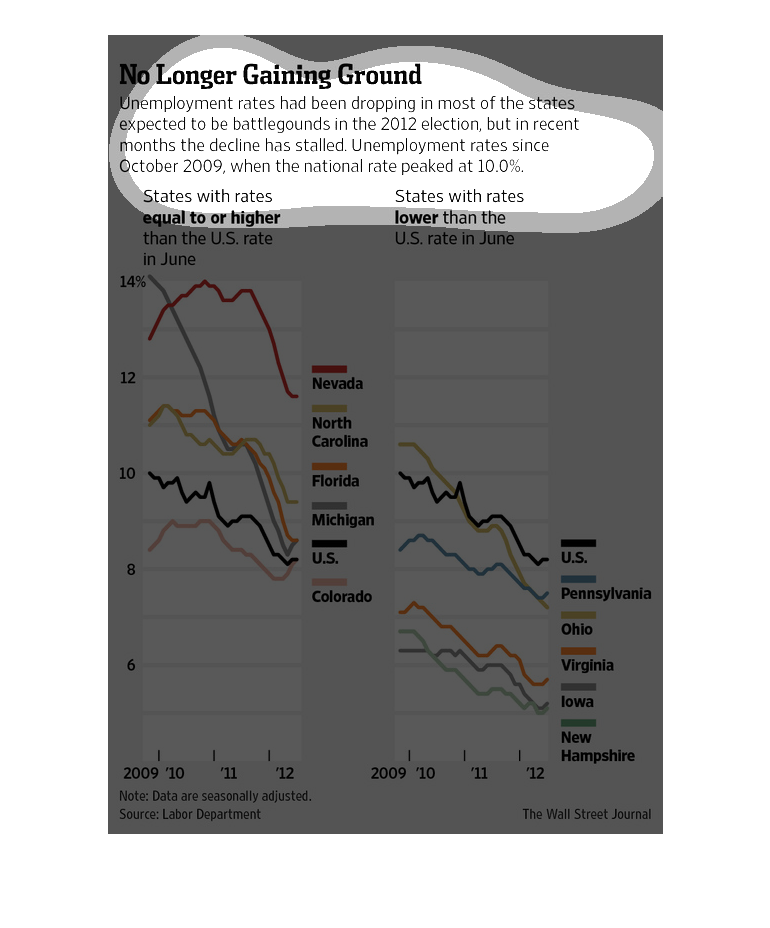
No longer Gaining ground  Unemployment rates nationwide have been dropping especially in states
seen as political battlegrounds. Unemployment rates dropped steadily between 2009 and 2012.