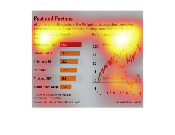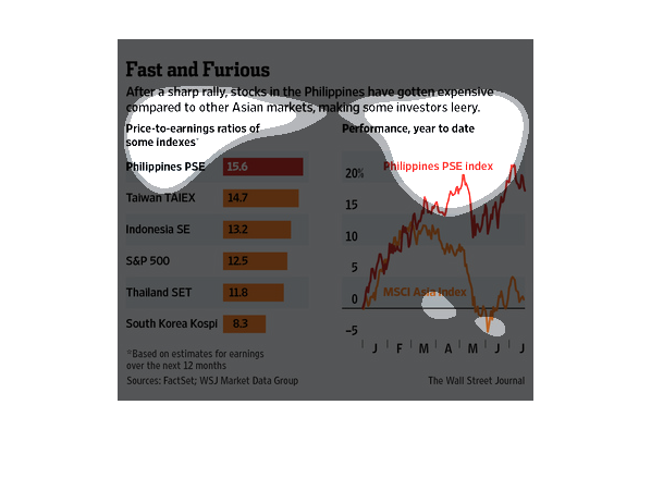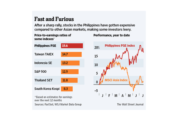
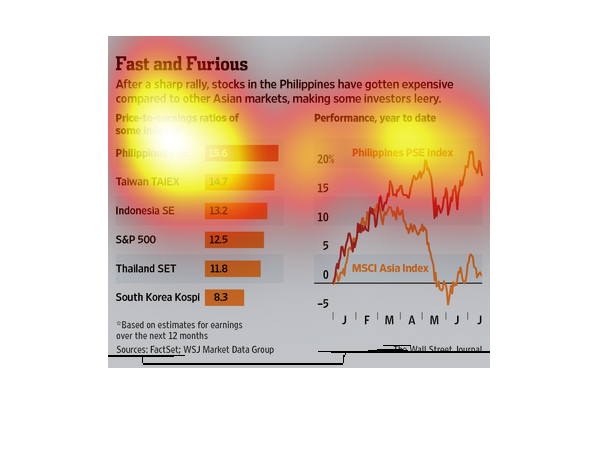
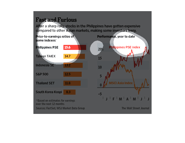
This chart describes fast and furious. Specifically, after a sharp rally, stocks in the Philippines
have gotten expensively compared to other Asia markets.

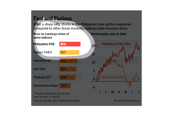
The image depicts how stocks in the Philippines are becoming more expensive compared to other
Asian markets, which is making investors worried. The Philippine stocks appear to be more
expensive than any other country listed.
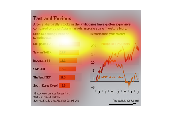
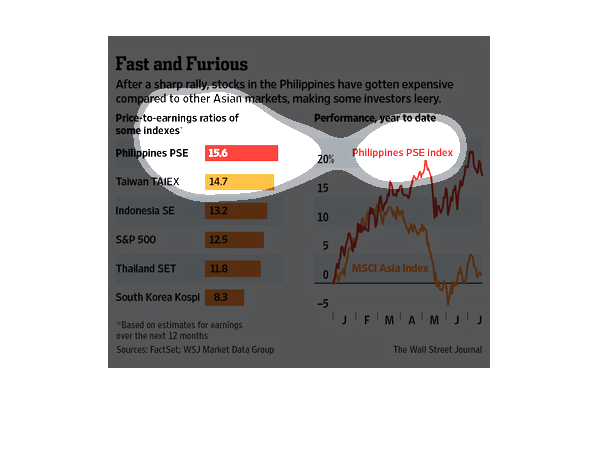
This is a series of color coded graphs, charts and related statistics depicting that after
a sharp rally stocks in the Philippines had  gotten expensive compared to tother Asian markets.
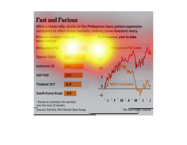
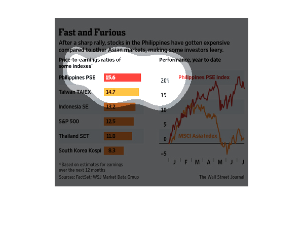
Titled Fast and Furious Price to Earning Ratios Philippines is on the top at 15.6 South Korea
on bottom at 8.3. There is a performance year to date for  the Philipines .
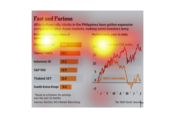
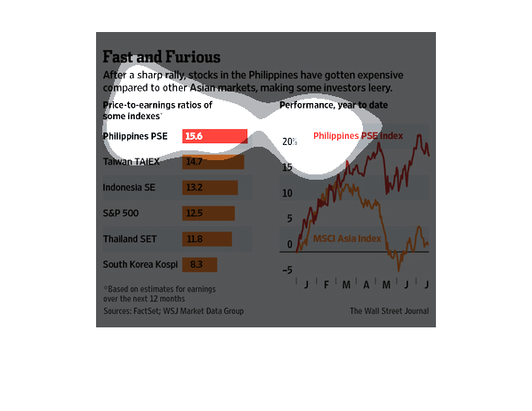
This chart describes fast and furious. Specifically, after a sharp rally, stocks  in the Philippines
have gotten expensive compared to other Asian markets.
It has something to do with fast and furious the movie. It talk about the rise of stocks i
the Phillipines. Investors feel leery. Its a comparison of countries.
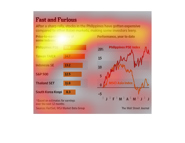
The title of the graph is fast and furious. It says that after a sharp rally, the stocks in
the Philippines have gotten expensive compared to other asian markets.
Stocks in the Philippine's have become more expensive in the Asian market. This is making
some investors concerned. The Philippines for example are at 15.6 versus south Korea who is
only at 8.3
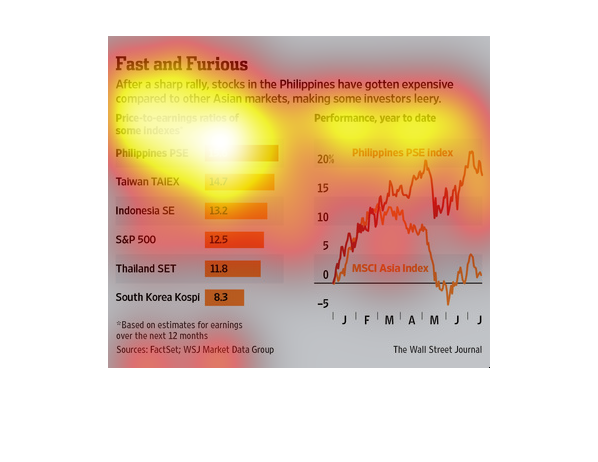
The image shows graphs that visually show the raising price of stock in the Philippines. The
graphs show  price to earning indexes in both real numbers and percentages.
This chart from the Wall Street Journal shows how the philippines stock market has grown rapidly
and may be a bubble among developing nations in the region
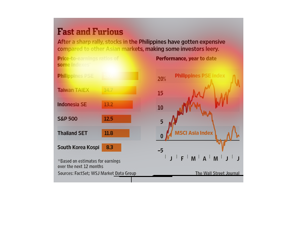
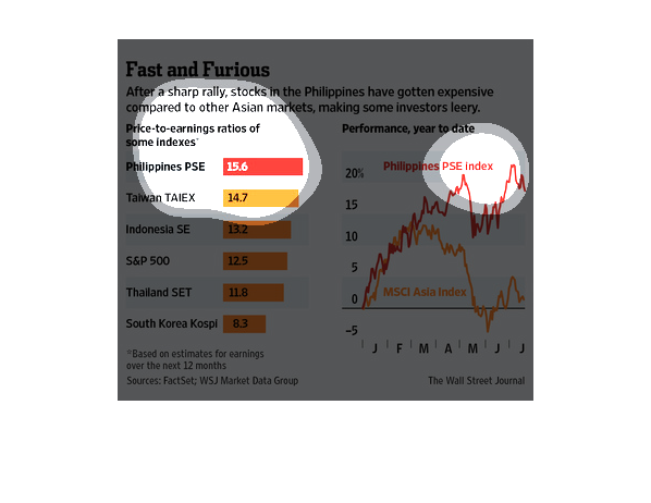
This image is of a graph that explains some markets in Asia, specifically Southeast Asia.
 It shows the performance for the year to date and actually includes two separate graphs.
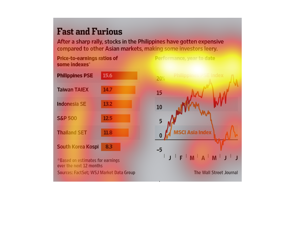
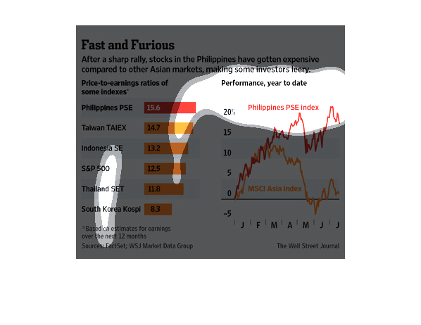
This chart from the Wall Street Journal shows how the stock market in the Philippines has
been on a rip roaring tear over time and is growing rapidly.
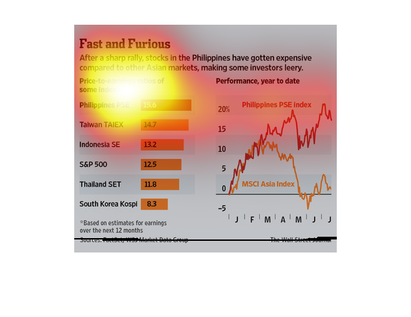
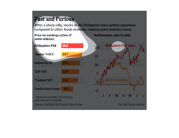
This image relates to the higher prices of stocks in the Philippines. The orange and red chart
to the left depicts the higher prices of stocks in the Philippines compared to other major
Asian markets. The chart on the left depicts the growth of the Philippines PSE Index over
the MSCI Asian Index.