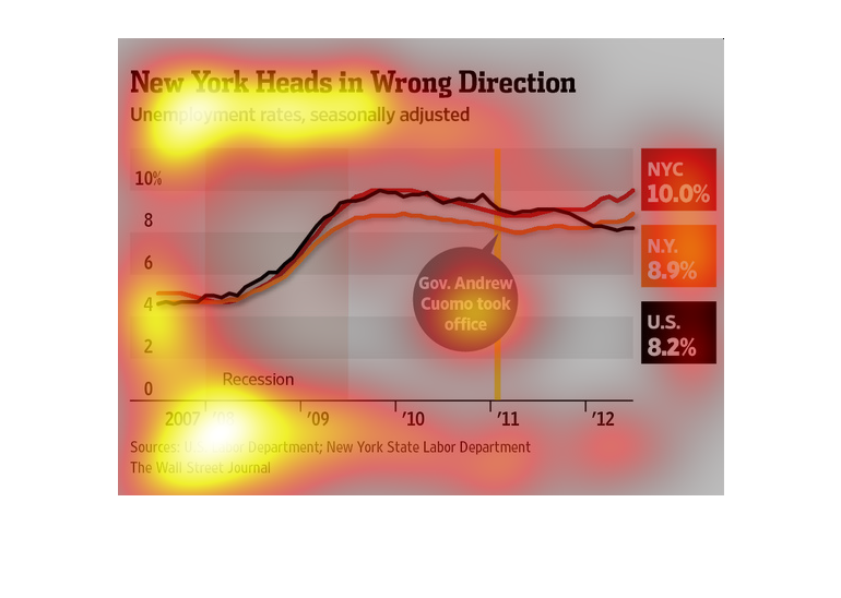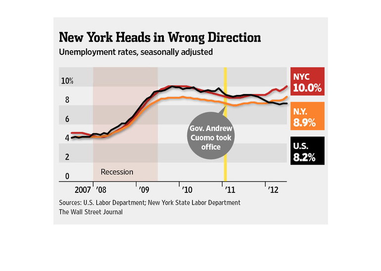
This is a chart showing New York un-employment rates. It shows them on a line chart versus
time. And the chart shows that unfortunately unemployment is rising in New York.
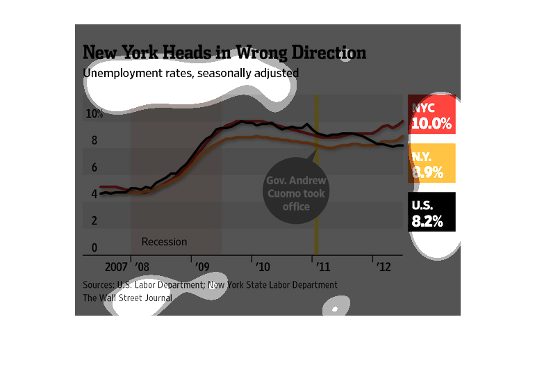
This graph shows New York unemployment rates seasonally adjusted and rates for New York City,
the state of New York, and the US as a whole from 2007 to 2012.
This image is entitled "New York Heads in Wrong Direction."  It shows unemployment rates which
have been seasonally adjusted.  Percentages range from 0% to 10%.  Dates range from 2007 -
2012.  According to the graph, U.S. unemployment rate was 8.2%, New York was 8.9%, and New
York City was 10.0%.  As depicted in the image, percentages did not improve when Governor
Andrew Cuomo took office.  Sources are from U.S. Labor Department and New York State Labor
Department.  Data was in The Wall Street Journal.
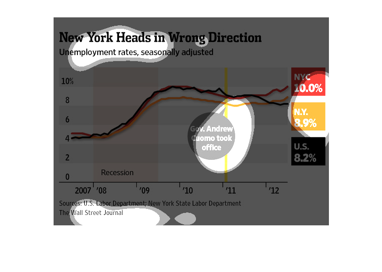
The title of the graph is New York heads in wrong direction: Unemployment rates seasonally
adjusted. It shows that the unemployment rate for New York City is 10 percent.
The image depicts unemployment rates, seasonally adjusted, in New York. NYC unemployment rates
 hover at 10.0%, with NY at 8.9%, and the US at 8.2% in the data provided. New York appears
to have a higher unemployment rate than the US average.
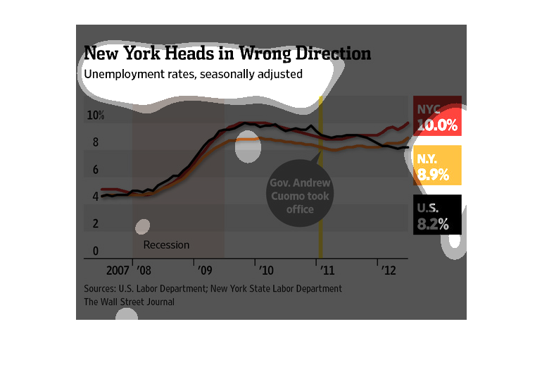
The graph depicts the unemployment rate in New York and how it is negatively impacting the
state as a whole. From the recession, we can see there was a great increase in the unemployment
in New York but after the recession, the unemployment rate has not returned to its low rate
as it previously was before. We can also see that from the graph, New York's unemployment
rate is greater than the unemployment rate of the country as a whole.
This is a series of color coded charts and related statistics depicting seasonally adjusted
unemployment rates from the years 2007 to 2012. It shows a sharp uptick and then a stabilization.
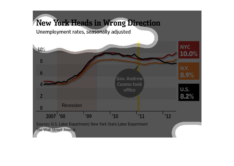
In this 2007 to 2012 study conducted by the Wall Street Journal from information obtained
from the New York State Labor Department, unemployment is going up and the states isn't doing
anything about it.
This chart from the Wall Street Journal shows how the unemployment rate during the recession
and recovery in New York City is higher than the national average
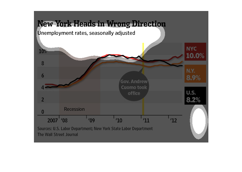
this graph shows New York unemployment rates seasonally adjusted from 2007 to 2012 with lines
for rates of New York City, New York state, and the US total.
The graph describes a rise in unemployment in New York City. The New York City unemployment
is 10% while the united states unemployment is 8.2%. The graph also shows at what point Governor
Cuomo took office.
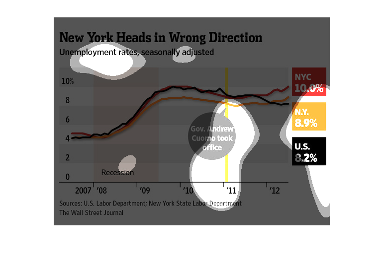
This chart describes New York heads in wrong direction. Specifically, unemployment rates,
seasonally adjusted. Different categories are represented by different colors.
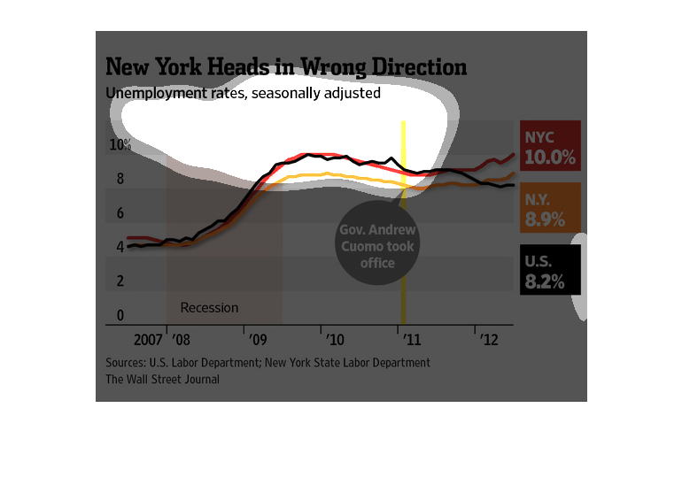
Unemployment rates seasonally adjusted in New York.  From 2007 to 2012 unemployment rates
are on the rise. NY unemployment rates are higher than U.S. unemployment rates, and NYC unemployment
rates are even higher.
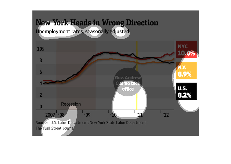
This graph is about New York and employment there from 2007-2012. It's about their employment
rates, seasonally adjusted. There was a Recession from the middle of 2007 until the middle
of 2009.