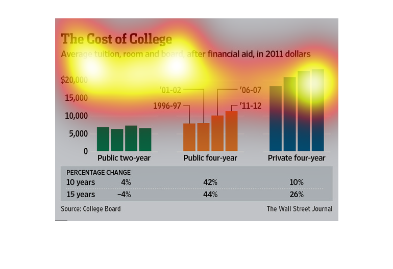
In this study by the Wall Street Journal- conducted by obtaining data from the College Board-
we see a rise in expenses for students after financial aid has been attributed.
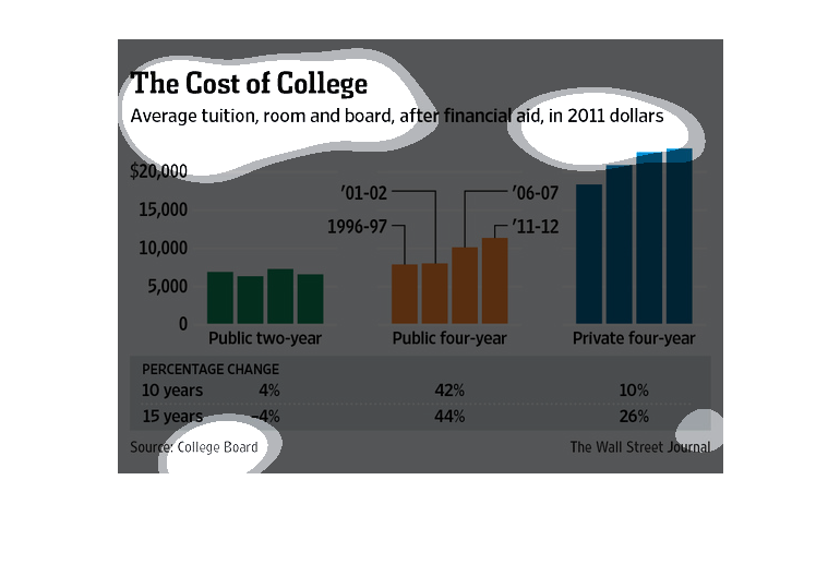
This chart shows the average tuition, room, and board for college after financial aid in 2011
dollars.  It compares public two year, public four year, and private four year colleges.
This is a series of color coded graphs and related statistics depicting average tuition, room
and board, after financial aid in terms of 2011 dollars.
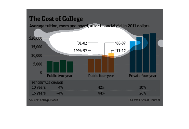
This chart describes the cost of college. Specifically, average tuition, room and board, after
financial aid, in 2011 dollars. Different categories are represented by different colors.
The image depicts the average tuition, room and board, after financial aid, in 2011 dollars.
Public two-year college seems to stay about the same cost at a much lower costs, with public
four-year college increasing somewhat, and private four-year college already much higher in
cost and rising.
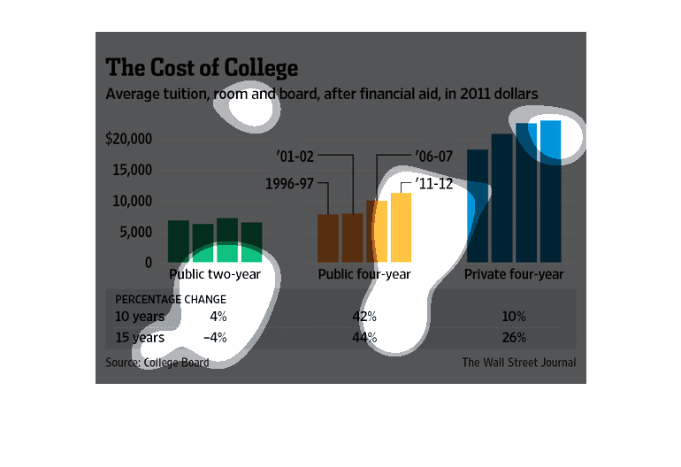
The title of the graph is cost of college. It shows the average tuition, room and board after
financial aid during 2011. The average cost was more for private colleges.
This chart from the Wall Street Journal shows how the cost of college in the United States
has increased dramatically as of 2011 from earlier years.
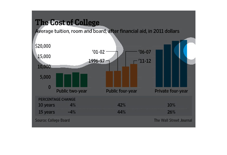
This chart from the Wall Street Journal shows how the cost of college in the united states
has increased dramatically over time and faster than inflation
These bar graphs show the steadily rising prices of college costs in public two year colleges,
public four year colleges, and private four year colleges.
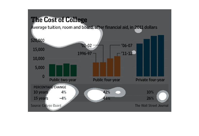
The graphic shows the cost of college as it changed every 5 years starting in 1996 and ending
in 2011. Aside from a public 2-year college, which has stayed consistent, the trend for cost
is going  upward ranging between 10% to 44% every 5 years. Public 4 year colleges are showing
the largest increase though are still cheaper than private institutions.

This graph depicts the costs associated with college as of 2011. They take into consideration
tuition, books, room and board, and financial aid. There are 3  graphs. 1 depicting the costs
associated with a 2 year tech college,1 depicting the costs associated with a public 4 year
college, and 1 that depicts the costs associated with a private 4 year college. There is a
bottom banner that informs of the changes in these numbers over a 10 and 15 year course.
This is a cost chart comparing different prices depending on what college is attended. It
shows from the 2 year all the way to private 4 year which is the most expensive.

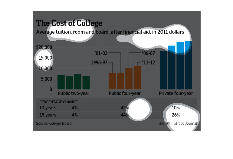
This chart describes the cost of college. Specifically,average, room and board, after financial
aid. Different categories are represented by different colors.
This graph is illustrating the actual cost of college. The graph is showing what college costs,
to include things such as tuition and room and board.