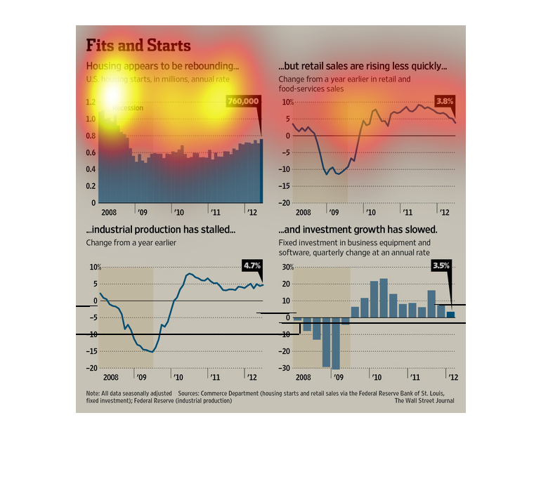
This graph is about Housing appears to be rebuilding but  retail sales are rising less quickly
within the years of 2008-2012. It also shows you industrial production has stalled and investment
growth has slowed.
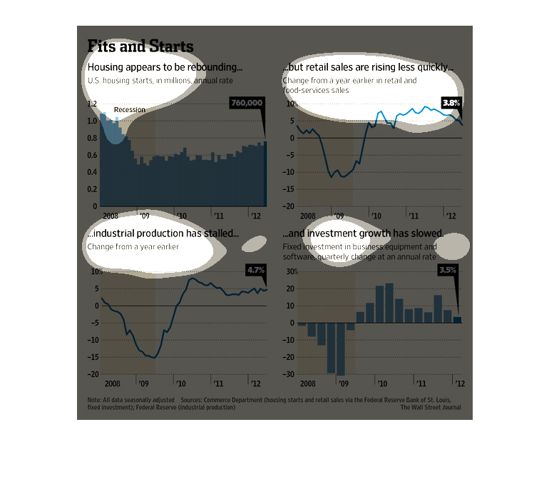
The image depicts how the housing market appears to be rebounding. After the 2008 fall off,
housing appears to have increased and stabilized as of 2012. However, industrial production,
retail sales and investment growth have slowed.
This chart from the Wall Street Journal shows how the housing market in the United States
is starting to rebound following the great recession and housing crash
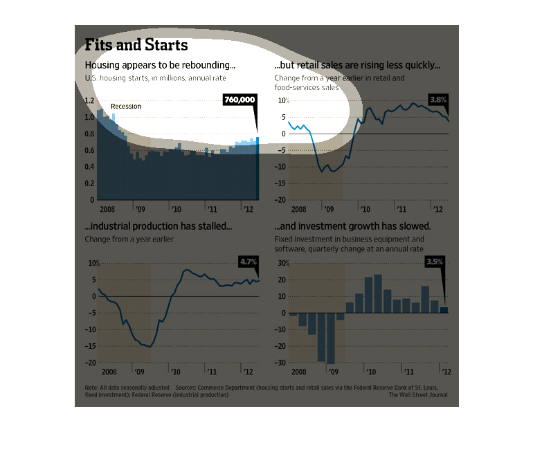
These charts are showing the growth or lack thereof, in several areas of the economy - housing,
retail sales, industrial production, and investment growth.  The housing sales seem to be
making a rebound.  The retail sales are also on the rise.  The industrial production has stalled
and the investment growth has slowed.  All of this data shows information from the year 2008
until 2012.
The image describes how housing sales has been improving while retail sales, industrial production,
and investment growth has been slowing down. There are four graphs which describe the these
things and it describes what it occuring in the United States.
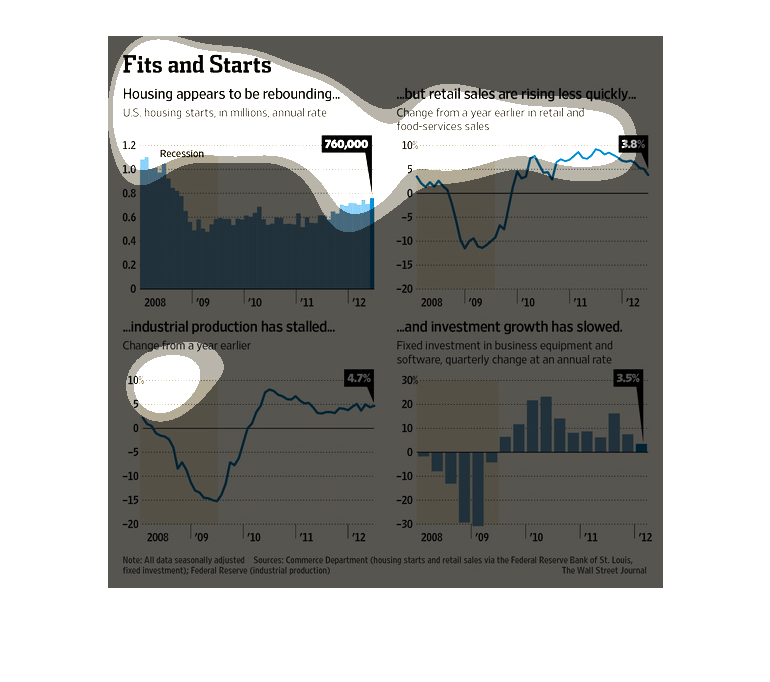
This chart shows US housing purchases. the change in retail and food purchase, sales, change
in industrial production, and fixed income growth for business equipment.
This chart describes fits and starts . Specifically, housing appears to be rebounding. Categories
on the chart include recession, investment growth, and retail sales.
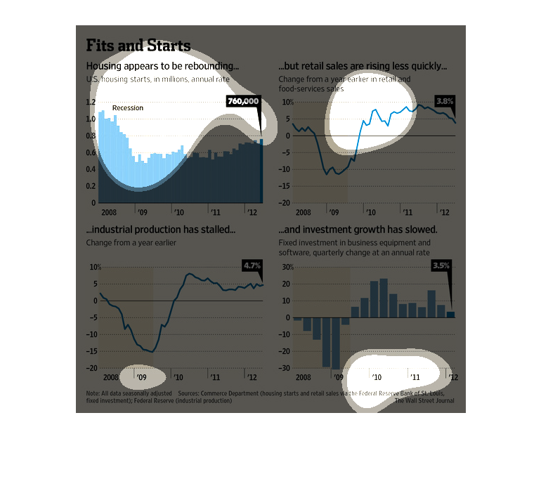
Charts showing the housing marking is rebounding but retail sales are slower to recover.
In 2008 the housing rate was over 1 billion, It fell to less than half of that one year later.
 It has been rising since at at 2012 recovered to 760k.    Retail sells dropped from just
under 5% in 2008 to -10% in 2009, it's lowest.  In 2010 it sky rocketed above 5% and bounced
around, falling to 3.8% in 2012.   Industrial production dropped to it's lowest in 2009 and
rose back to normal in 2010.  It has stall at that rate from 2010 to 2012.  It looks to be
even with 2008 production.  Industrial growth has slowed. Industrial growth was in the negative
2008 and 2009,  in 2010 it was booming but 2011 and 2012 it dropped back down.  The rates
are still better than 2008.
This chart shows the state of the US economy from 2008-2012. Housing prices are increasing,
but retail prices, industrial production, and investment are all taking longer to recover.
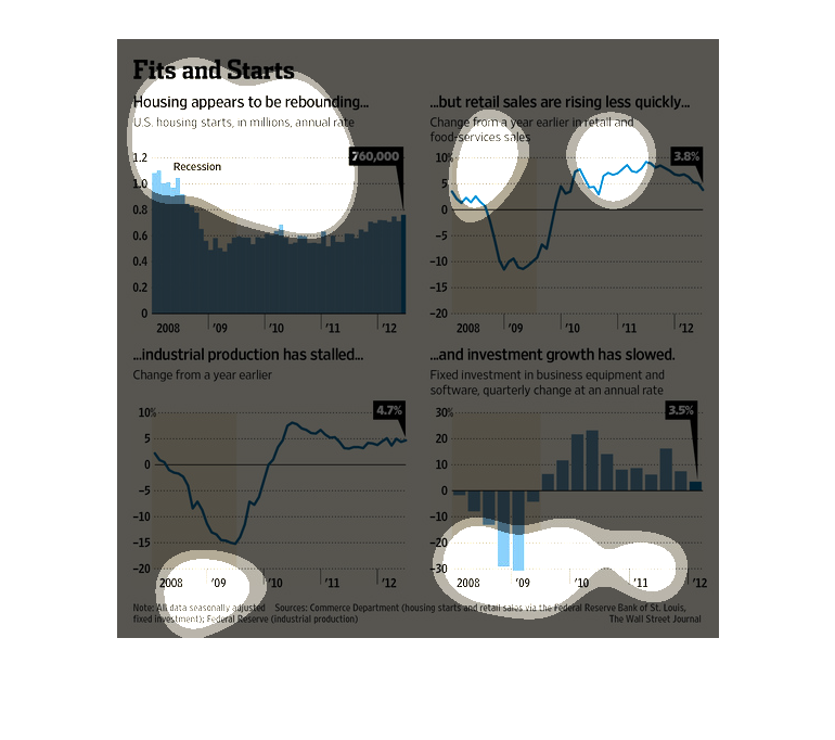
This chart describes fits and starts. Specifically, housing appears to be appearing, but retail
sales are rising less quickly. The chart includes a number of graphs.
This chart clearly displays how, in the current economy, that housing appears to be rebounding.
The chart also shows that retail sales are rising much less quickly.
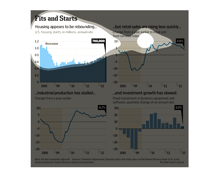
Housing is a volatile industry that can keep going up and down forever. In this graphic we
see the utmost detail in that trend and how to predict what is going to happen in the future.
This chart from the Wall Street Journal shows how the housing market has started to grow but
also is stumbling a bit so it is not as healthy as thought
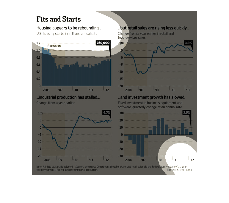
This chart/graph displays that housing is making a come back, but retail sales are falling.
The graph shows the years from 2008-2012. It also states that industry production has been
stalled as well.
This is a series of graphs, charts and related statistics depicting that U.S. home sales appeared
to be rebounding, but retail sales had risen less quickly.