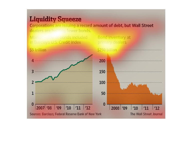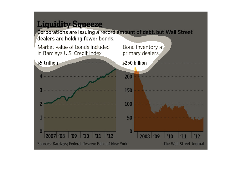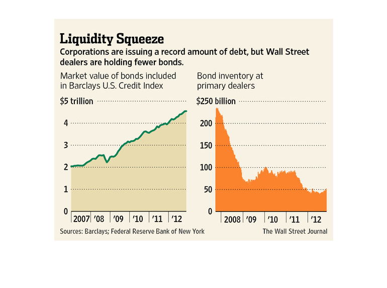
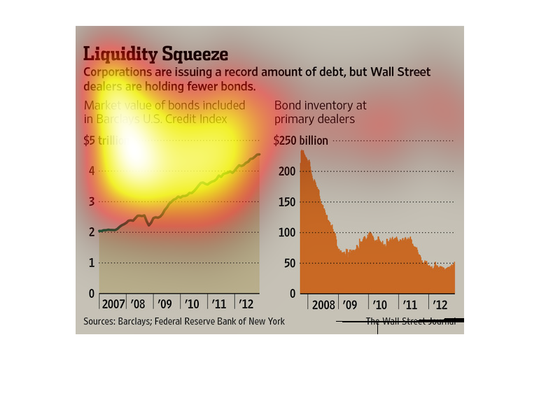
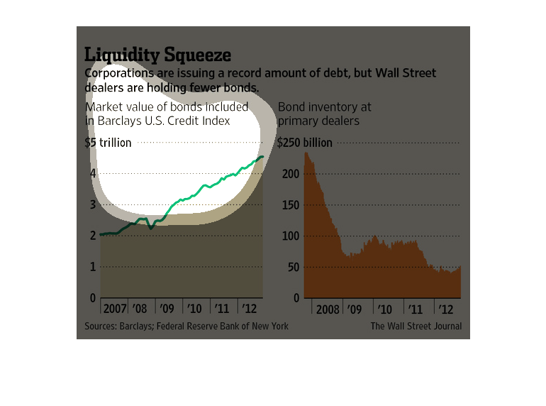
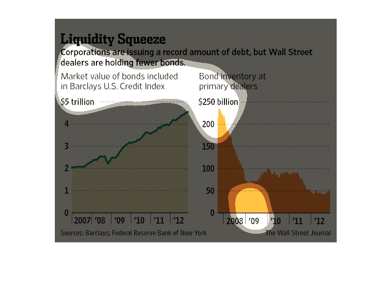
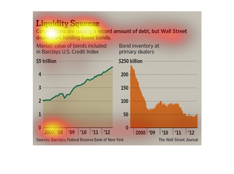
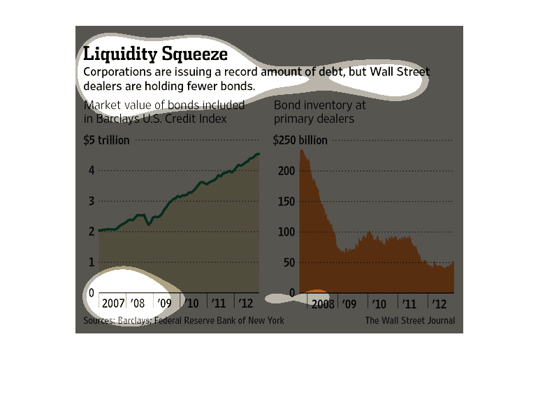
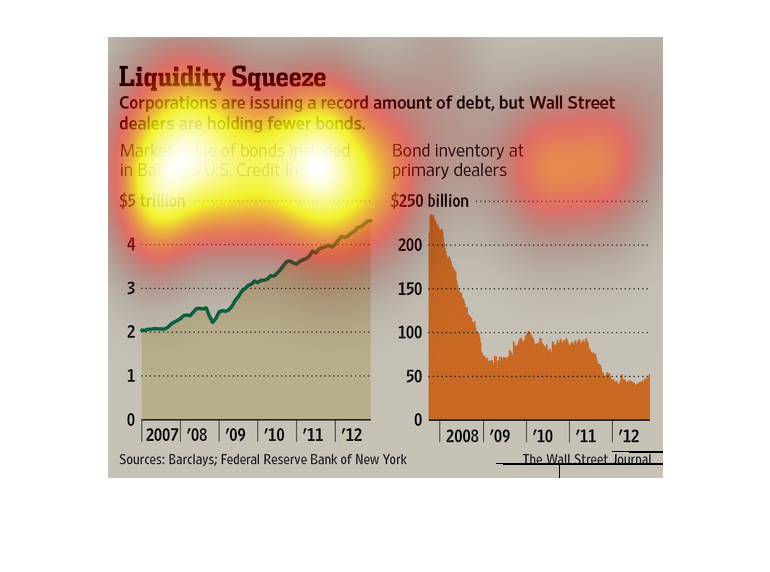
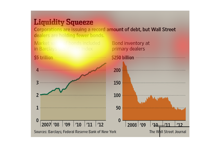
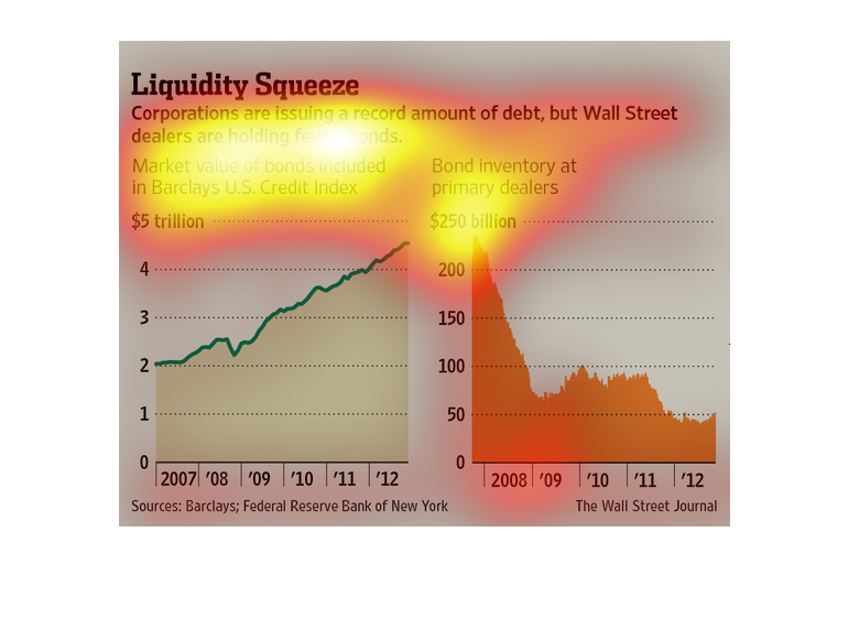
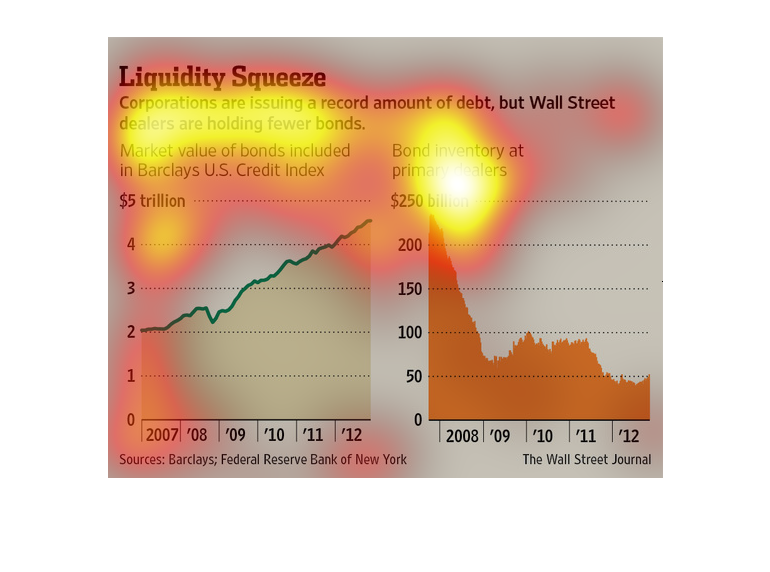
This chart describes liquidity squeeze. Corporations are issuing a record amount of debt,
but Wall Street dealers are holding fewer bonds. The chart includes to graph charts.
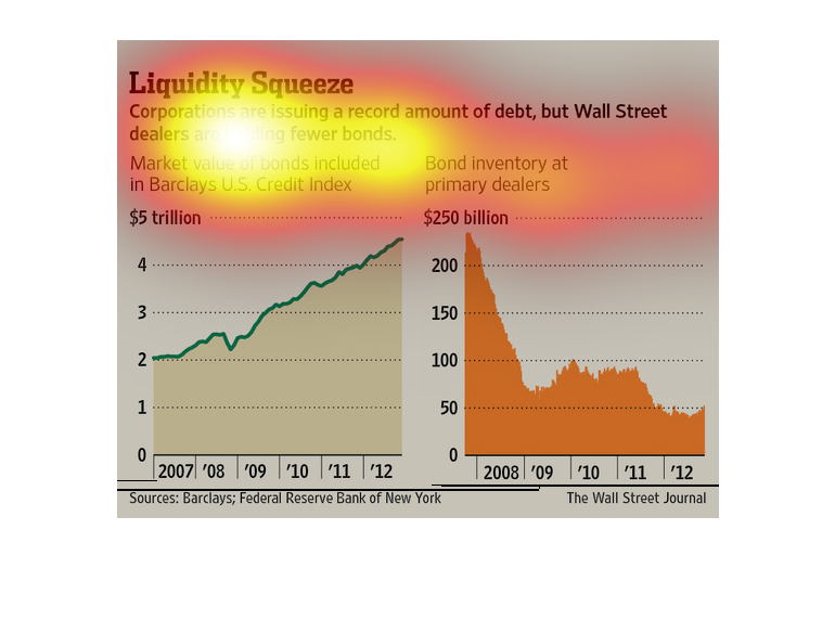
This is a series of color coded charts with related statistics depicting that corporations
were issuing a record amount of debt, but Wall Street dealers were holding fewer bonds.
This chart describes liquidity squeeze. Specifically, corporations are  issuing a record amount
debt. Different categories are represented by different colors.
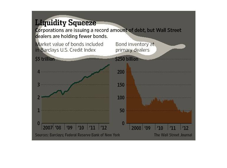
Titled: "Liquidity Squeeze" The description states 'Corporations are issuing a record amount
of debt, but Wall Street dealers are holding fewer bonds.'  There are two graphs. The left
graph shows the 'Market value of bonds included in Barclays U.S. credit index'. The graph
shows a massive rise in debt going up from $2 trillion from 2007 to just below $5 trillion
by 2012.  The right graph shows the 'Bond inventory at primary dealers'. The amount decreases
starting from below $250 billion on 2008 down to around $55-$60 billion on 2009. It rises
back up to $100 billion between 2010 to 2011 before decreasing to $50 billion by 2012.  This
shows a direct correlation between debt increase and bond inventory decrease as time passes.
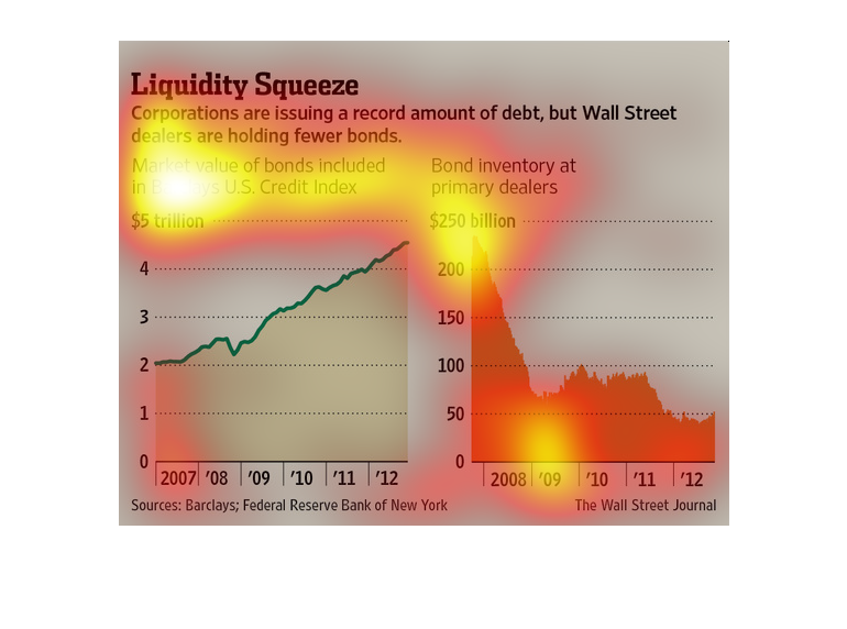
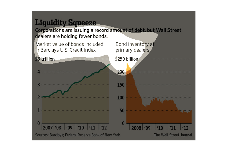
The Wall Street Journal conducted this research in regards to the vast deficit- from 2007
to 2012- in funds for large corporations, which has lead them to increasing their debt.
The corporations shown in this graph seem to be issuing a large amount of debt and it shows
their debt increasing over time, but in another chart it shows the debt decreasing for the
wall street journal
The image depicts how corporations are issuing record amounts of debt, while wallstreet buyers
are holding onto few bonds. The value of bonds increases and the availability continues to
decrease.

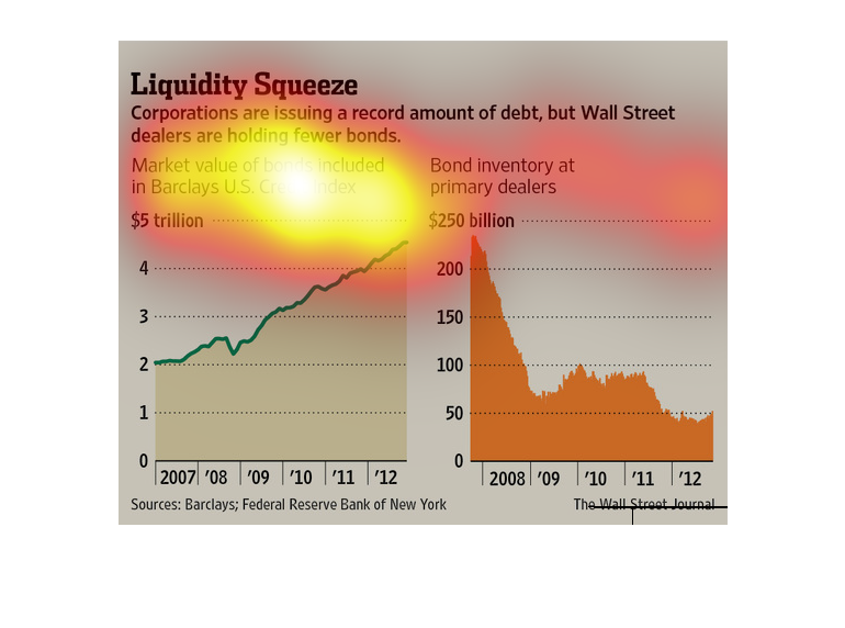
The title of the graphic is liquidity squeeze. It says that corporations are issuing a record
amount of debt, but Wall street dealers are holding fewer bonds.
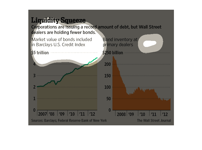
This chart from the Wall Street Journal shows how large companies in the United States are
issuing more debt but that banks are not holding them, creating a liquidity squeeze
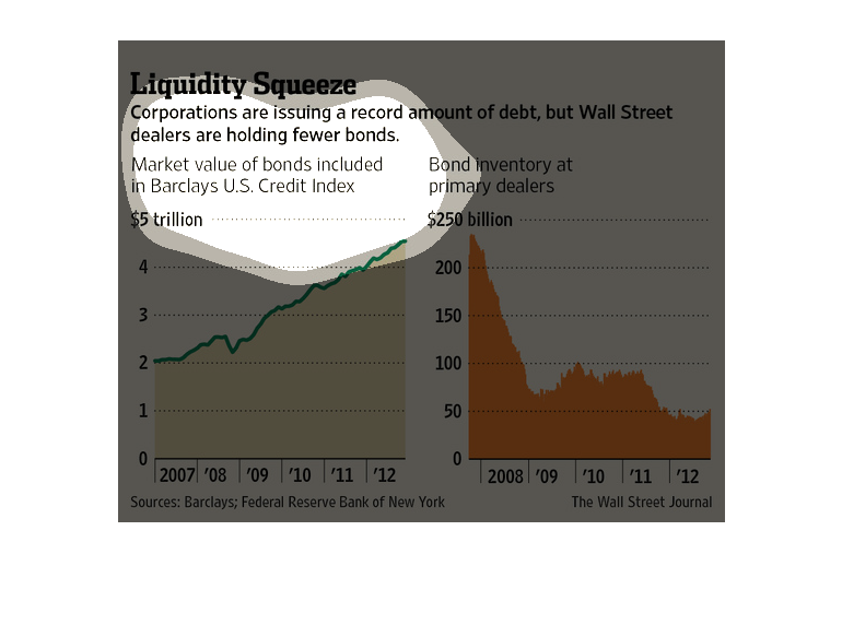
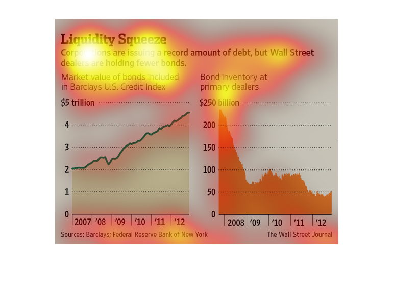
These two charts describe the relationship between the market value of bonds and bond inventory
from 2007 to 2012 to describe corporations issuing debt even though Wall Street holds less
bonds. The first chart shows a steady increase in market value of bonds, which reached approximately
$4.5 trillion in 2012. The second chart shows a significant decline in bond inventory, which
fell to approximately $50 billion in 2009 from $250 billion in 2008.
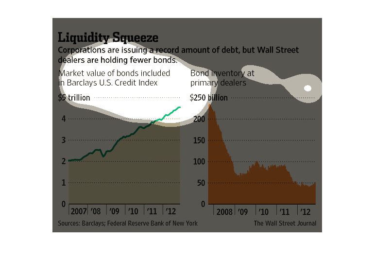
These two graphs illustrate that while corporations are issuing a record amount of debt, major
players on Wall St. own fewer bonds than ever. I wonder if this indicates that foreign investors
are buying up a large portion of this debt?
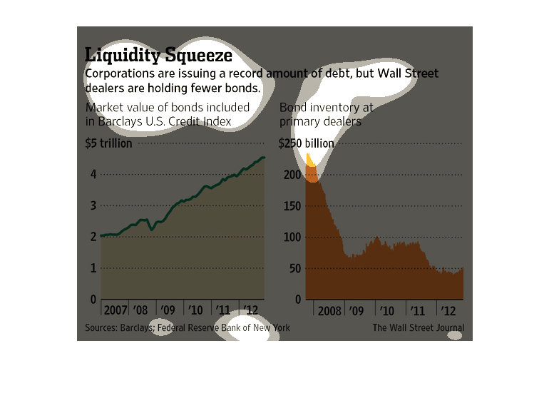
Corporations are issuing a new record amount of debt. While this is occurring, Wall Street
itself is strangely holding fewer bonds of collection. The market value of bonds steadily
increased from 2007 to 2012 from 2 trillion dollars to over 4 trillion. Oddly though, bond
inventory decreased sharply In the same years.
These charts show that despite the amount of debt companies are now reportedly in, Wall Street
dealers still have fewer bonds to work with. It gives information from 2007-2012, showing
the difference between Market Value Bonds and actual bond inventory.