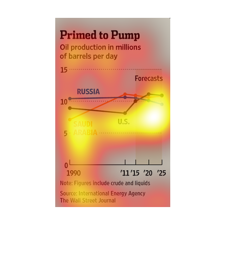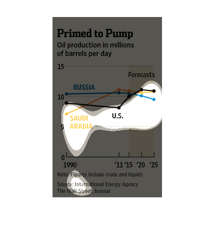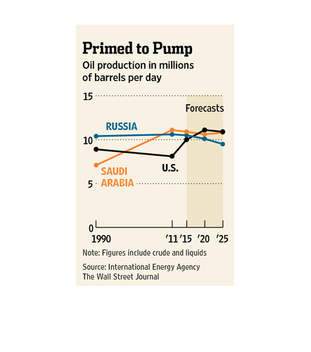
This chart is titled Primed to pump oil production in barrels per day. Chart begins in 1990
and will conclude in 2025. The chart shows oil production in Saudi Arabia and Russia.
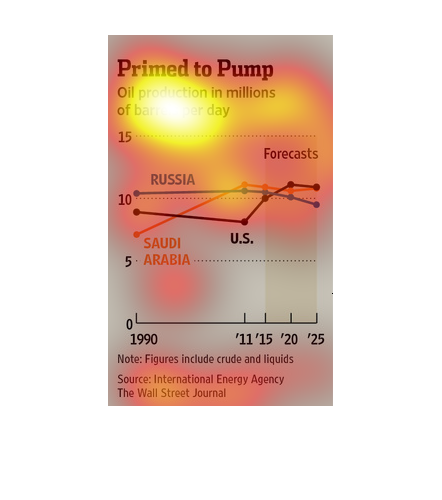
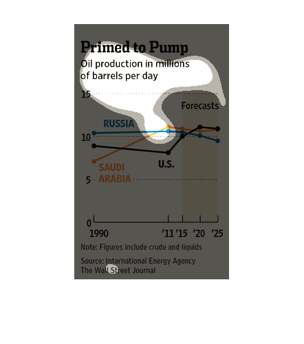
This graph illustrates the oil production in millions of barrels per day from 1990 to the
forecasted value in 2025.  It has lines displayed for Saudi Arabia, Russia, and the US.
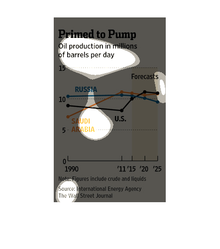
This chart describes primed to pump. Specifically, oil production in millions of barrels per
day. Different categories on the chart are represented by different colors.
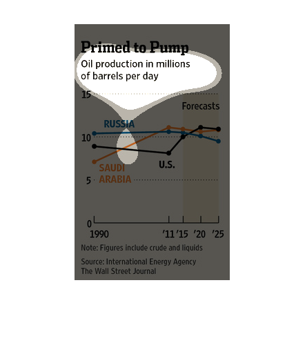
This chart from the Wall Street Journal shows how global oil production has risen between
the Saudis, Russians, and Americans which leads to a glut in supply
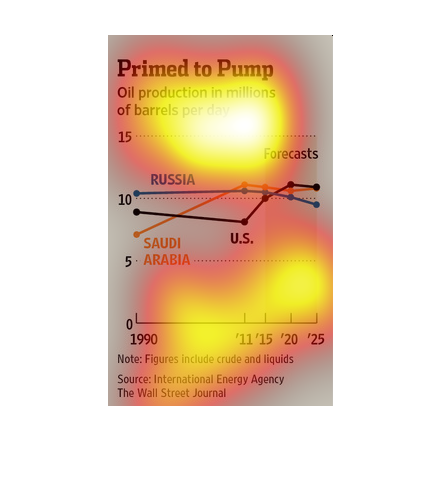
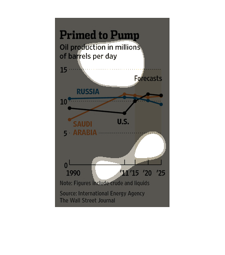
In this study conducted by the Wall Street Journal, from materials obtained from the International
Energy Agency, we see that the production of oil has not decreased but remained the same,
while consumption has slowed and thus prices.
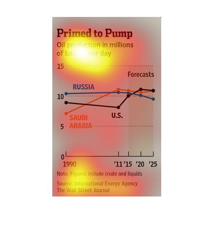
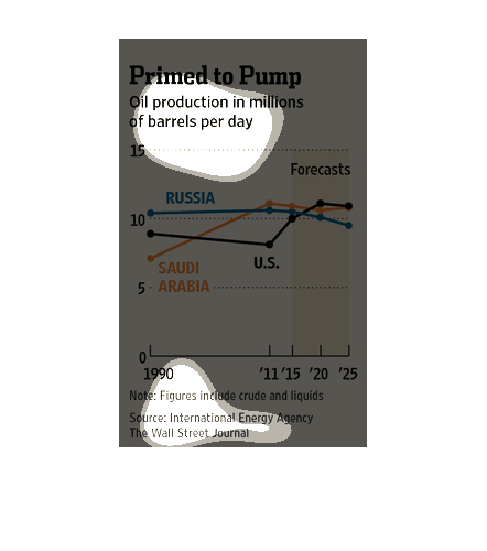
This is a series of color coded charts depicting oil production in millions of barrels per
day from 1990 and projected out to 2025. It shows a projected slow down in Russia particularly.
This image is entitled "Primed to Pump."  It shows a graph of oil production per day (in millions).
 The two countries depicted are Russia and Saudi Arabia.  The graph shows production from
1990 through a predicted production in 2025.
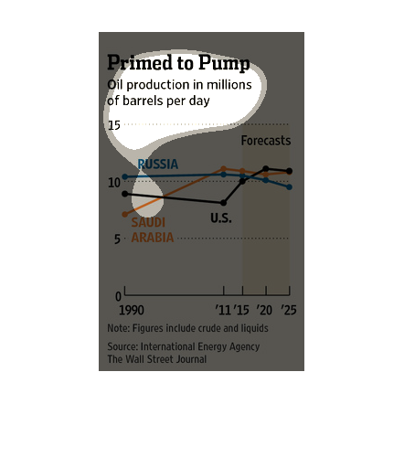
This graph shows how much oil is pumped per day from the ground by a selection of countries,
including the United States, Russia, and Saudi Arabia. Data is taken from 1990 and projected
to 2025.
This chart from the Wall Street Journal shows how oil production has changed and increased
in recent times. It shows how it numbers tens of millions of barrels
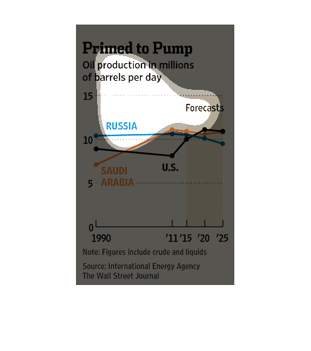
This graph shows the amount of oil production in millions of barrels per day for the countries
of Russia, Saudi Arabia, and the United States from 1990 to forecast up to 2025.
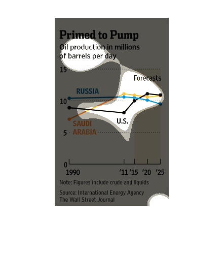
This chart shows the amount of oil production in millions of barrels per day.  Currently the
U.S. and Saudi Arabia produce the largest amount of barrels per day.  In 1990 the largest
amount was produced by Russia.
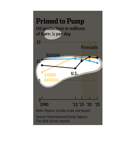
This chart demonstrates oil production per day broken down by country for the years 1990 through
2015 and predicted through 2025.  Countries of interest are Russia, Saudi Arabia, and US.
 Chart axes are poorly demarcated.  In 1990, Russia produced the most, follows by US, and
Saudi Arabia.  In 2011, Saudi Arabia had exceeded Russia, and US had lagged behind sharply.
 By 2015, Saudi Arabia and Russia had lost slightly, while the US had closed the gap, and
it is predicted that the US will continue to advance, while Russia will continue to lag.