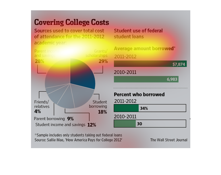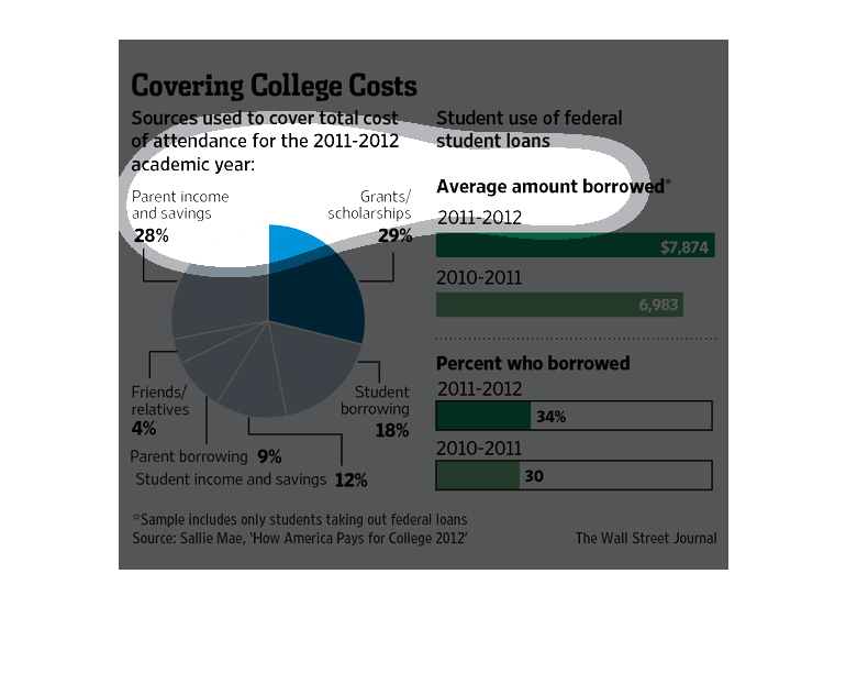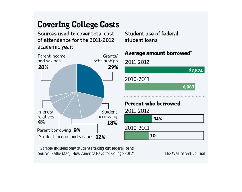
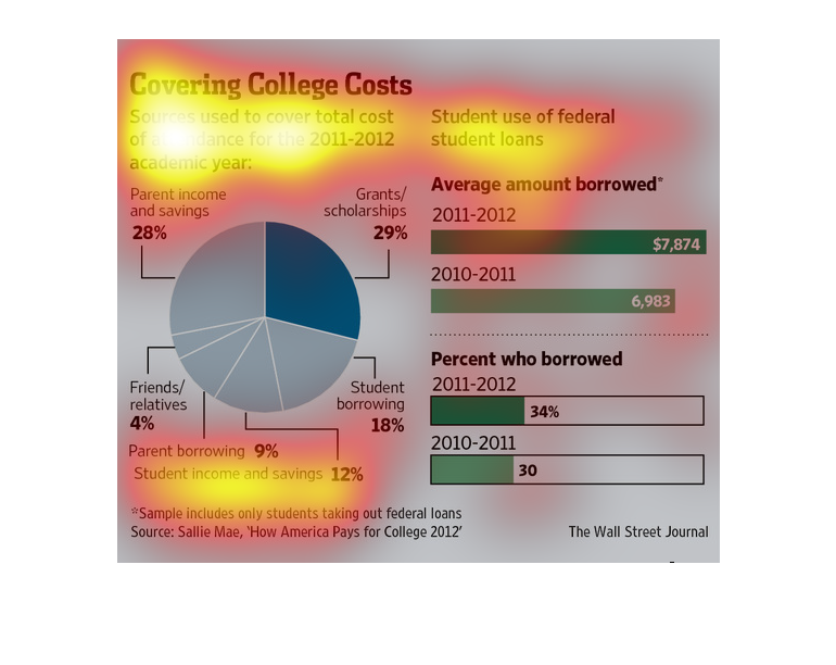
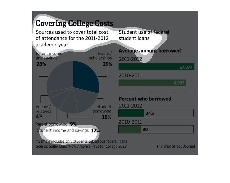
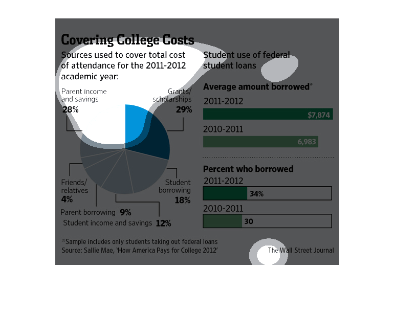
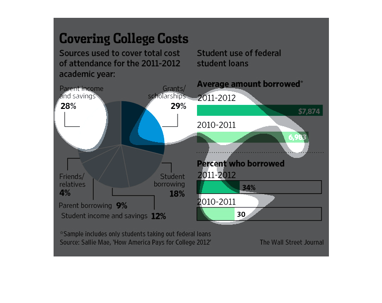
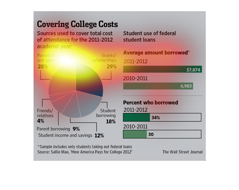
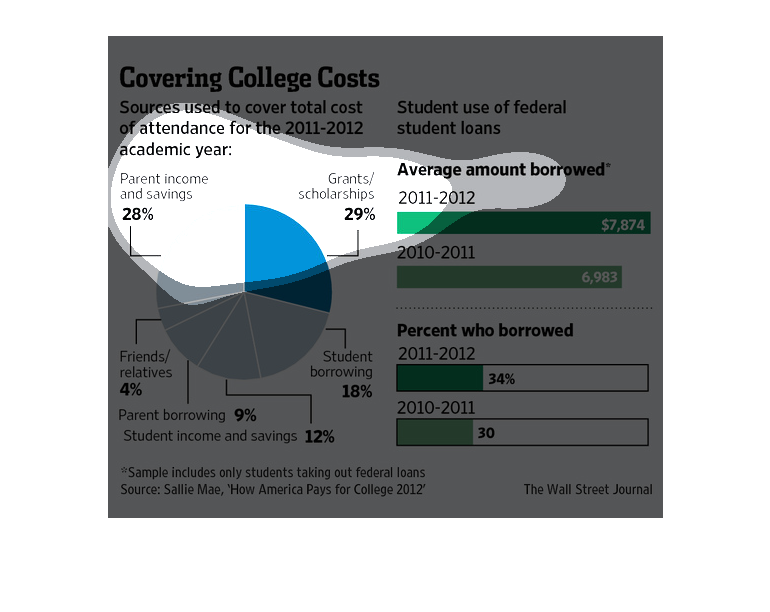
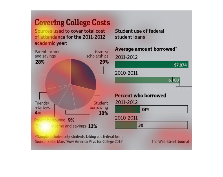
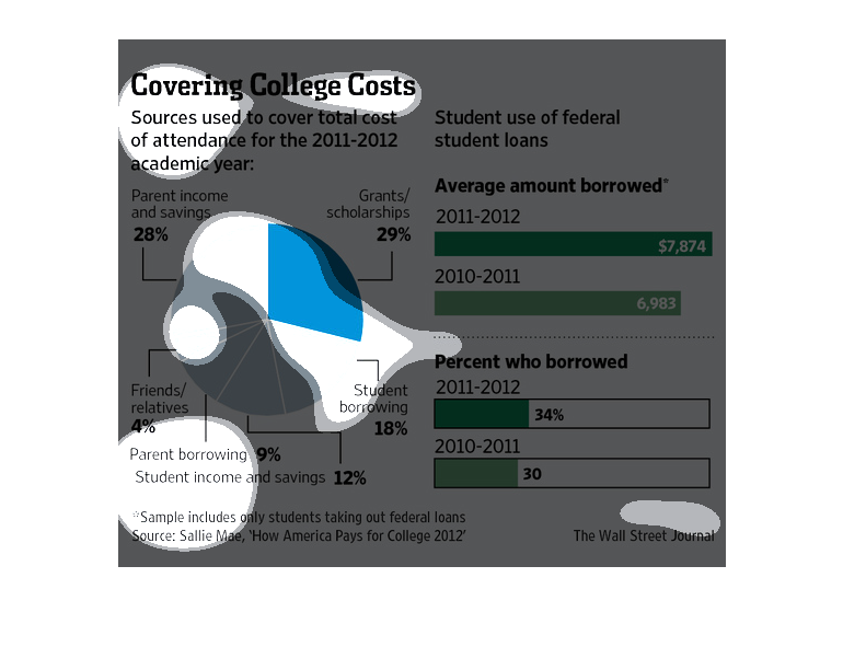
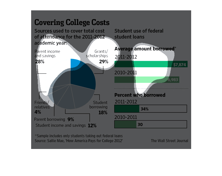
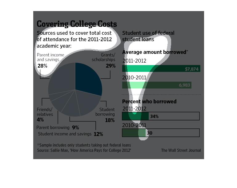
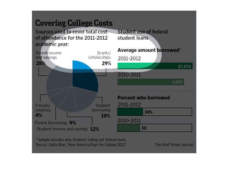
The charts show how students are covering college costs. The pie chart shows that grants/scholarships
comprise the biggest source used to cover college costs in 2011-2012. accounting for 29%,
followed by parent income and savings at 28%.  Other sources of college funding include student
borrowing (18%), student income and savings (12%), parent borrowing (9%), and friends/relatives
(4%).  The student use of federal loans has been increasing. The average amount borrowed increased
by 13% from $6,983 in 2010-2011 to $7,874 in 2011-2012; while the percent who borrowed rose
by 13% from 30% to 34%.
This is a series of charts, graphs and related statistics depicting that sources used to cover
total cost of attendance for the 2011-2012 academic year.
This chart from the Wall Street Journal shows how students are financing college education
in 2012 with the majority not coming from a combo of work and loans
This chart shows the sources used to cover college costs in 2011-2011. Grants and scolarships
covered 29%, parental savings covered 28%, and student loans covered 18%. 34% of students
borrowed money in 2011-2012 for an average of $7,874.
Titled covering college costs. Shows students use of federal loans with an average amount
of $7,874 (38% of students had federal loans) borrowed in 2011-2012 and $6938 in 2010 (30%
of students had federal loans). There's a pie chart showing where students got most of their
loans, grants/scholarships being the highest at 29%.
This chart illustrates sources used to cover the total cost of attendance for an academic
year including parent income and savings and grants and scholarships.
In this study conducted by the Wall Street Journal we see that there is a huge problem as
far as the disbursement of wealth with the students loans going sky high
The title of the graph is covering college costs. It gives the sources used to cover the total
cost of college attendance for the 2011-2012 college year.
This chart shows sources used to cover total cost of academic attendance including scholarships
and grants and parents income and earnings as well as students use of federal loans and average
amount borrowed.
This chart from the Wall Street Journal shows how the cost of college in the United States
is being covered primarily from parents and grants/scholarships.
The image depicts the different sources used to cover total cost of college attendance during
the 2011-2012 years. Grants and scholarships cover a majority with 29%, followed by parents
income and savings with 28%. Borrowing of student loans is also increasing.
The image depicts sources of college cost coverage by category. The largest portion comes
from grants/scholarships with 29%, with parents income and saving coming in second with 28%.
Data also cites student use of federal loans.
This chart describes covering college costs. Specifically, sources used to cover total cost
of attendance sine 2011-2012. Different categories are represented by different colors.
This image is a pie chart describing the different sources used to pay for college for the
2011-2012 school year. Grants and scholarships come in around 29% which is almost equal with
parents savings at 28% The remaining 43% is split between student borrowing, income and savings,
parent borrowing and friends and relatives. It also describes how the average student borrowed
more money for the 2011-2012 school year than ever before.
This chart describes covering college costs. Sources used to cover total cost at attendance
for the 2011-2012 academic year. Different categories have different colors.