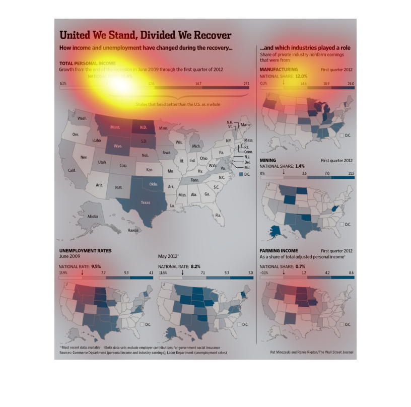
This chart from the Wall Street Journal shows how income and unemployment has changed since
the great recesssion in certain regions in the united states
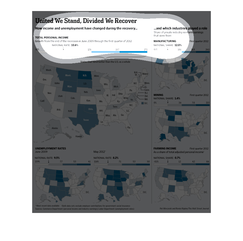
This chart describes united we stand, divided we recover. Specifically, how income and unemployment
have changed during the recovery. Categories are represented by different colors.

This is a chart of the united states of america showing about income and unemployment. It
shows all the states in different colors and the colors show different information.
United we Stand, Divided we recover | how income and unemployment have changed during the
recovery. industrial growth on the eastern half of the united states while the most wealth
AND unemployment is seen on the other side of the unites states.
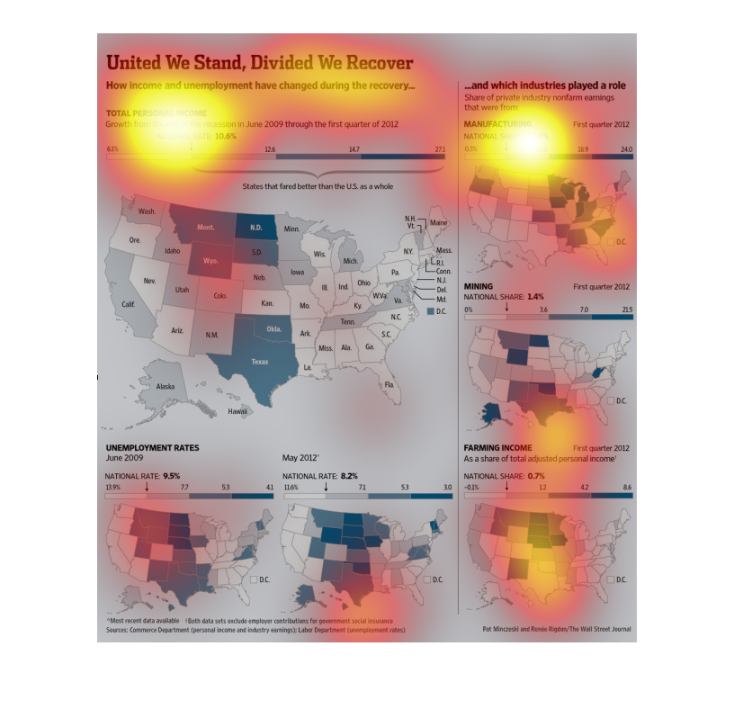
This is a series of maps of the United States and related statistics depicting how income
and unemployment had changed during the recovery from the financial crises.
this chart illustrates how income and unemployment have changed during the recovery.  It has
a United States map representing total personal income by area as well as data for mining,
manufacturing, and farming income.
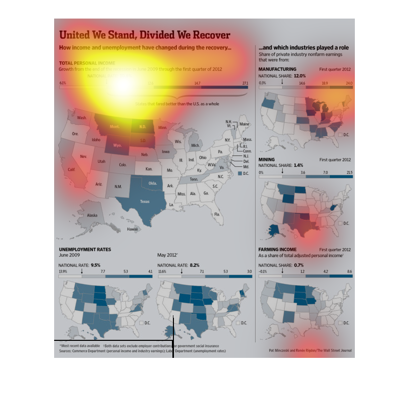
This chart from the Wall Street Journal shows how the economic recovery is affecting specific
states more than others when measured in income increases and unemployment rates
This graph details information about how the United States has recovered in the way of income
and unemployment. The chart appears to contain information from year 2009 to year 2012. It
also details information about the personal income growth rate with a national growth at 10.0%,
the unemployment rates with a national growth at 9.5%. It also details the industries that
have played a role in the recovery and by what percentage; manufacturing, mining, and farming.
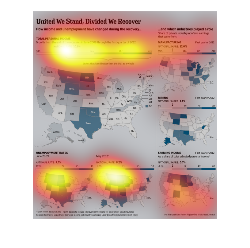
This image almost dictates that areas high in farming have the most unemployed, however faired
well during the recession.  It also appears that manufacturing states have the lowest unemployment.
Overall it looks like recovery is on the mend.
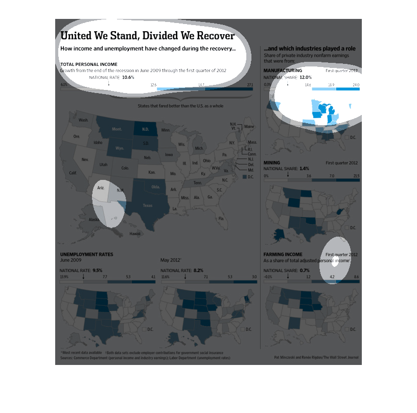
In this study on a State to State level, we see that each member of the union has done better
to stimulate growth and job opportunities for its citizens that the Federally funded efforts.
On a state level we see the various degrees of success they have had.
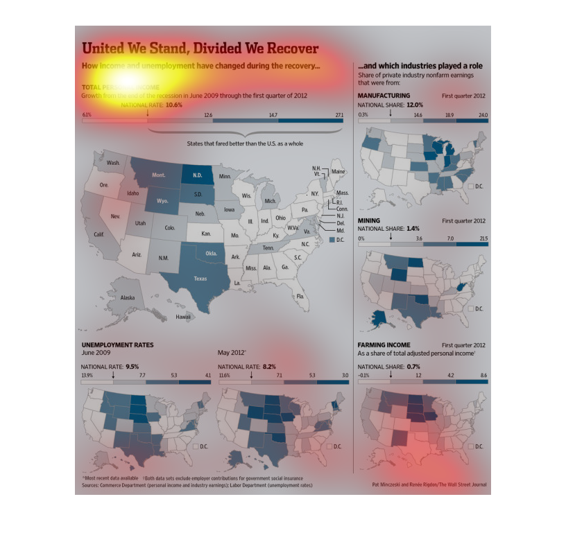
This chart describes united we stand, divided we recover. Specifically, how income and unemployment
have changed. Different categories are represented by different colors.
The caption for this image is, "United we stand, divided we recover, How income and unemployment
have changed during the recovery".  There are six maps of the continental United States.
Each one of the maps display economic indicators from different segments including: unemployment
rates, farming income, manufacturing, and mining.
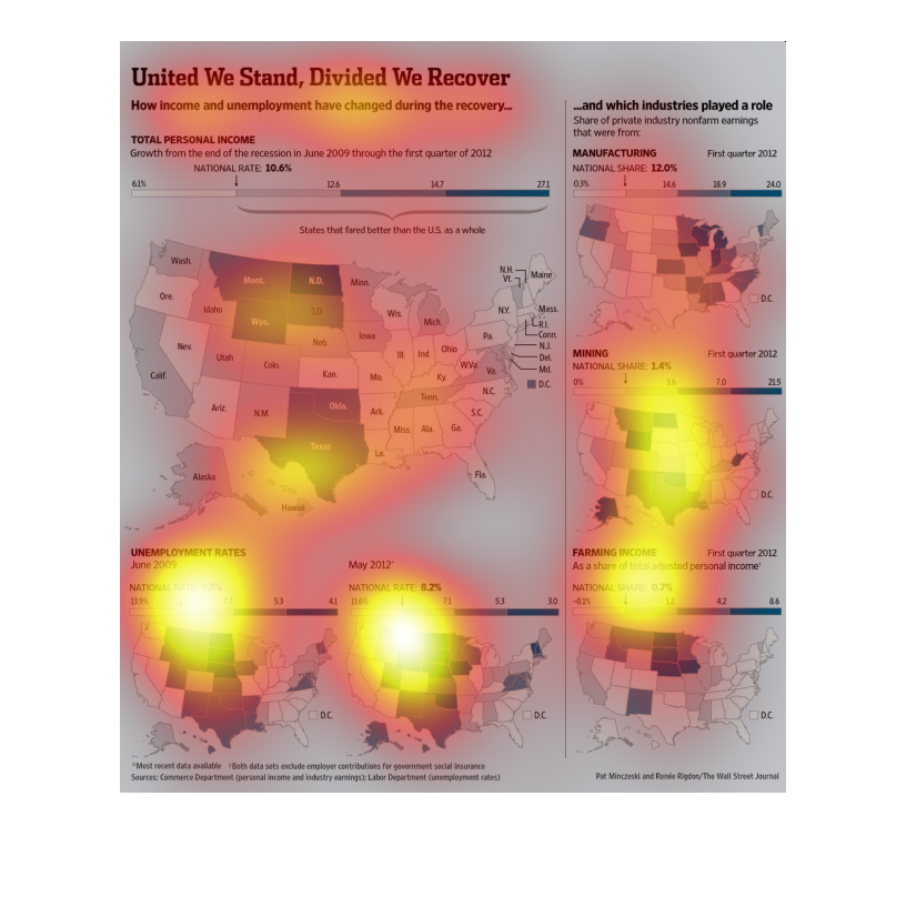
Unemployment rates are lower in some states than the national average.  National rates have
gone down over a 3 year period.  The manufacturing industry has been doing well while the
mining and farming industries not so good.
The image depicts how income and unemployment has changed during the economic recovery in
the US. The image shows certain states struggling with unemployment, reduced manufacturing
and production, while others fair somewhat better in the recovery.