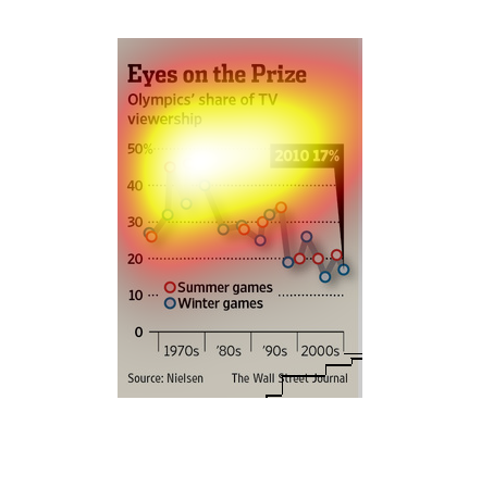
This is titled "Eyes on the Prize" and is a chart describing Olympics' share of the TV viewership.
Overall viewership has gone down from the 1980's to the 2000's. The Winter games have had
a higher viewership in the later years.
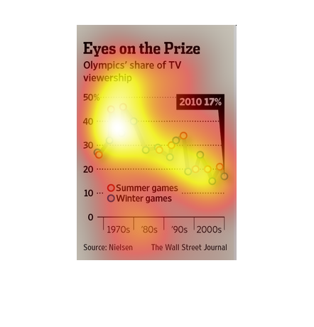
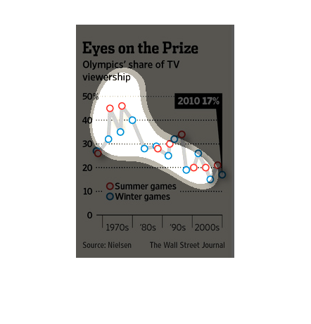
In this study conducted by the Wall Street Journal- from researched gathered in a forty year
span- we see that the average cost of covering the Olympics has gone up considerably.
This is a chart with eyes on the prize. Showing how people viewing Olympics have change over
the years. In 1970's many people were watching the Olympics. By the 1980's a huge amount of
people enjoyed watching. But an all time low in the years of 2000.
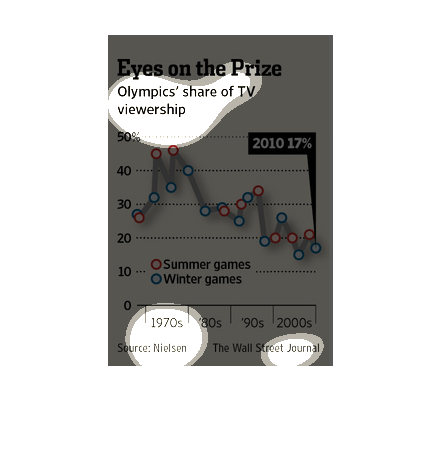
This chart shows the Olympics' share of TV viewership from the 1970s to the 2000s.  It has
a line for the Summer games and a line for the Winter games.
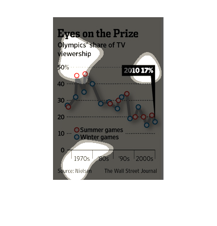
This is a chart along with related statistics depicting the Olympics share of TV viewership
from the 1970's through the 2000's. It shows a broad downward trend across this time period.
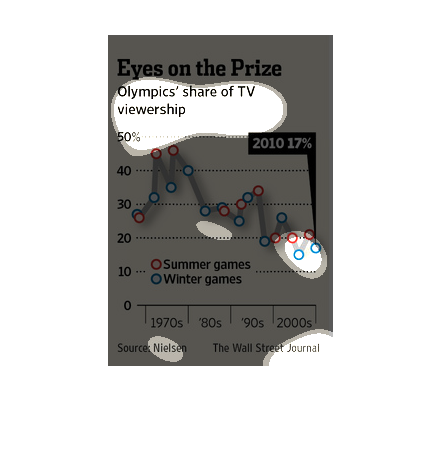
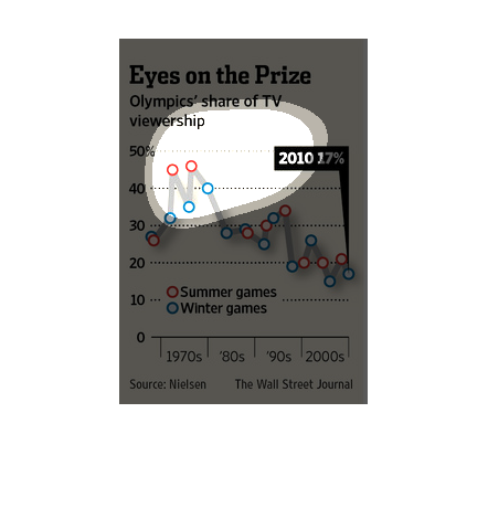
This chart describes eyes on the prize. Specifically, Olympics' share of TV viewership. Categories
on the chart include Summer Olympic games and Winter games.
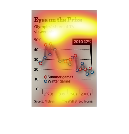
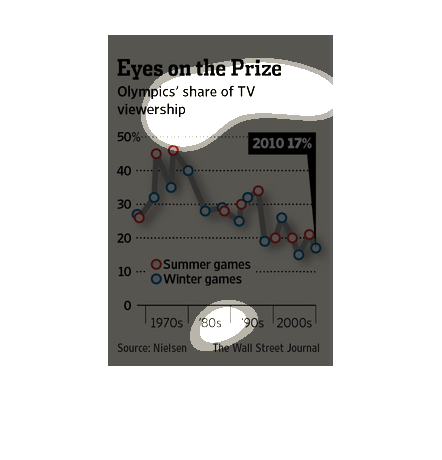
This chart describes eyes on the prize. Specifically, Olympics' share of TV viewership. Different
categories are represented by different colors on the chart.
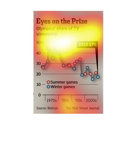
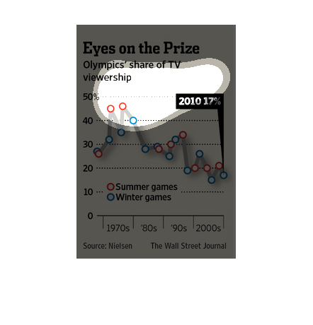
The image depicts The Olympics share of TV viewership, comparing Summer Games and Winter Games.
Overall audience has decreased since 1970, with the Summer Olympics slightly ahead of the
Winter Olympics in recent years.

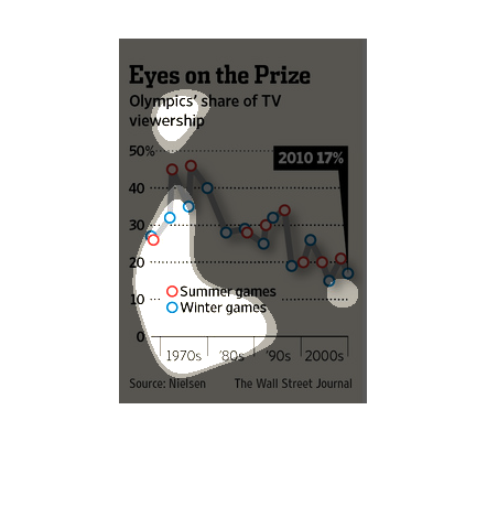
The image depicts the Olympics share of TV viewership. Summer Olympics are compared to Winter
Olympics, with Summer Olympics garnering higher ratings over the decades studied. Overall,
ratings are down for both.
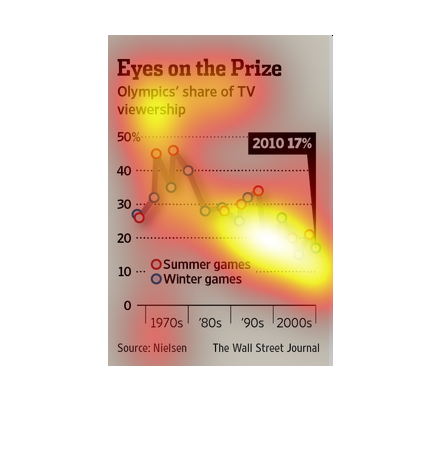
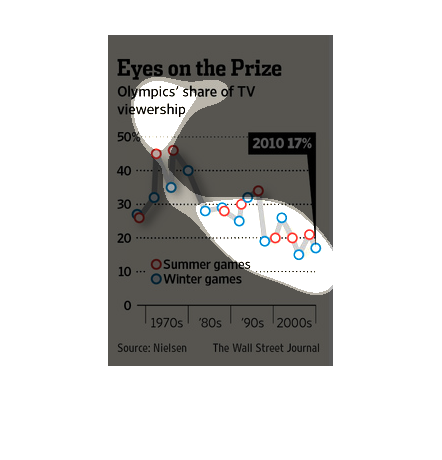
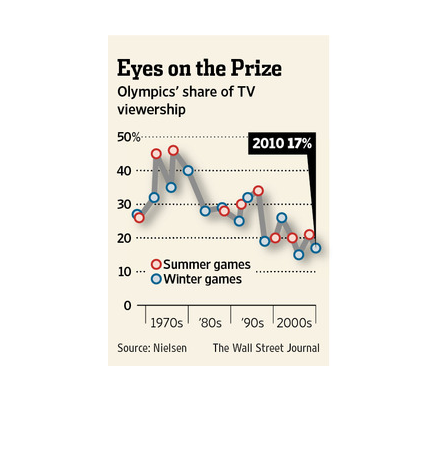
The title of the graph is eyes on the prize. It shows the Olympic's share of TV viewership.
The summer games show that they consist of a little less than 50 percent of Tv viewership.
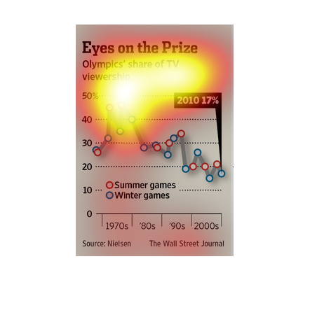
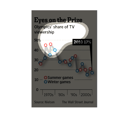
This chart from the Wall Street Journal shows how television viewership patterns for the summer
olympics have changed over time and become more valuable
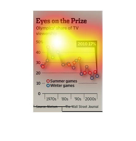
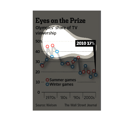
This chart compares the Olympic's share viewership of the summer and winter Olympic games.
Overall, percentage share of the games has been declining since the 1970's.
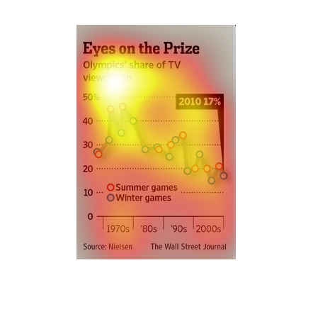
The chart shows the viewership/market share of the olympics on TV starting from the 1970s
through the 2000s. The olympics has steadily lost market share as time has gone on with the
2000s being the lowest at 15-20% share. The olympics peaked in viewership/market share around
1976.
This chart from the Wall Street Journal shows how broadcast companies are targeting viewership
during the olympics and how it is declining over time