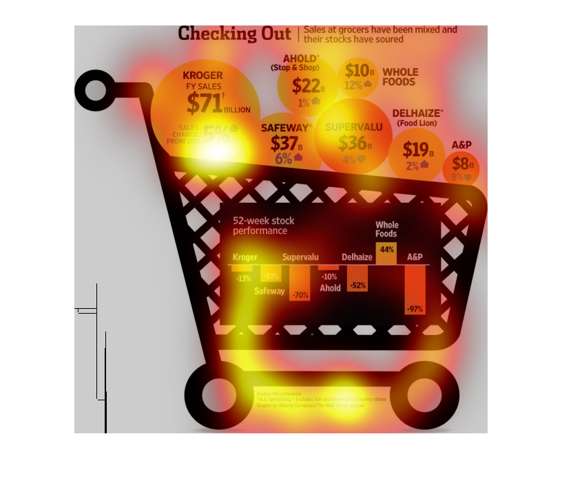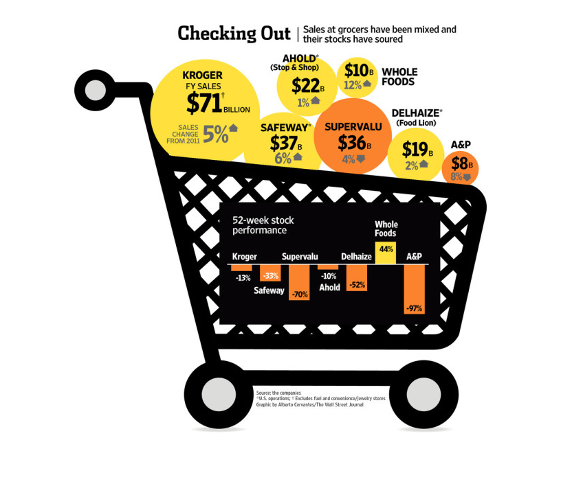
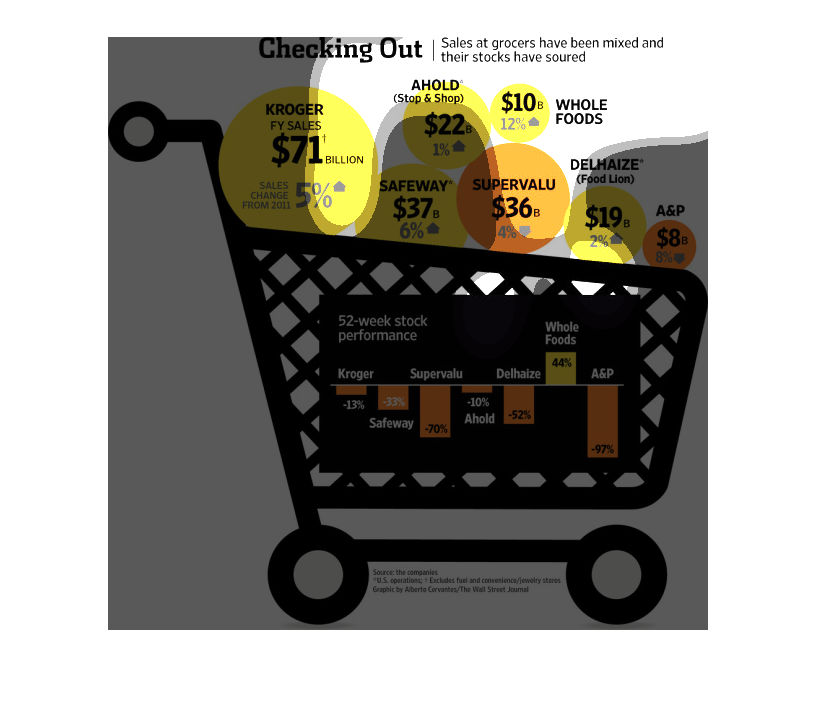
The image depicts how sales at groceries have been mixed, with stocks turning somewhat negative
based on sales data. The 5-week performance of a majority of listed companies was negative.
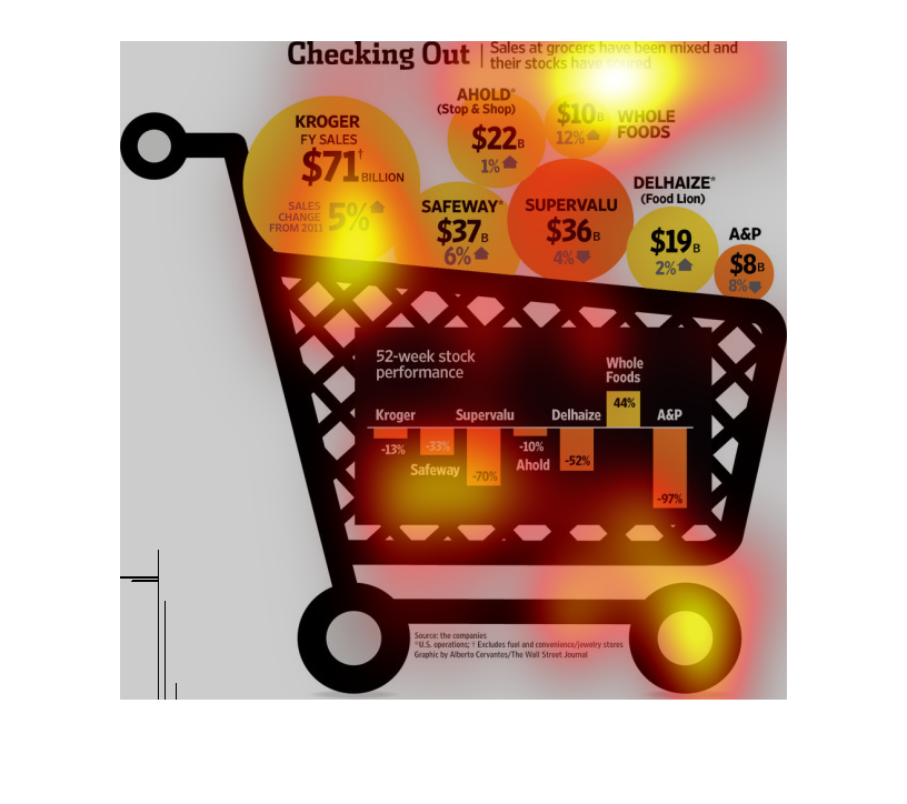
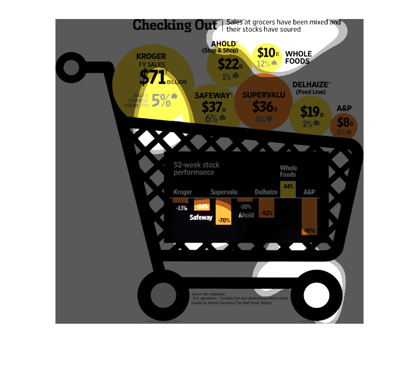
This graphic is showing how the sales in grocery stores have shown mixed results and the stocks
for those stores are not doing so well.  Kroger, Safeway, Stop and Shop, and Food Lion all
showed a rise in fiscal year sales.  over a 52 week period. The only store that showed a growth
in stock prices over a 52 week period was Whole Foods.
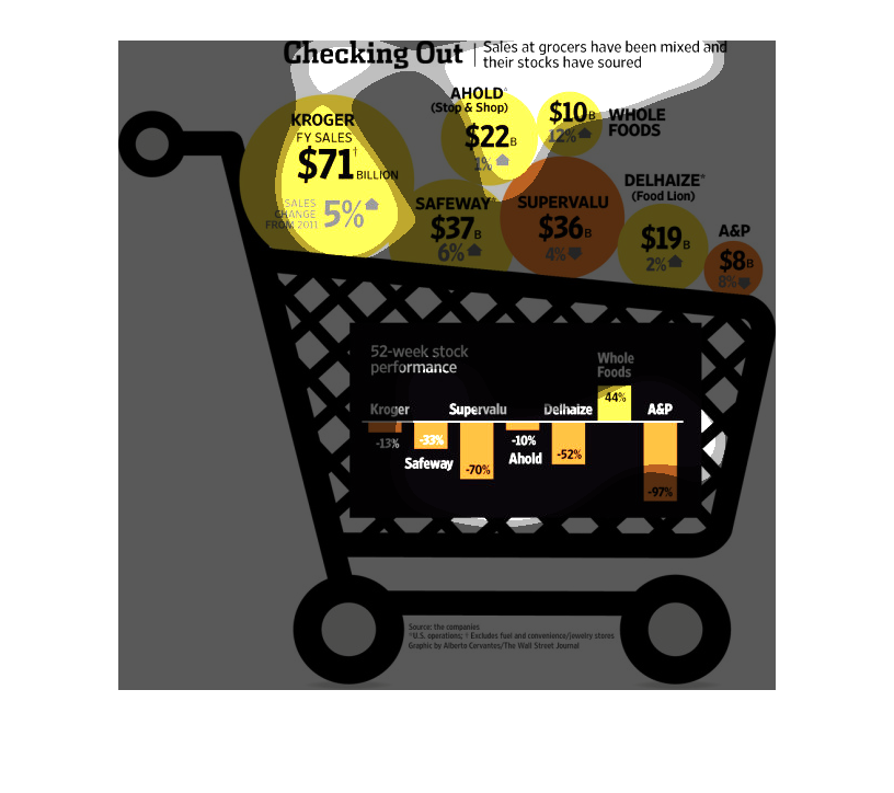
The image shows a shopping cart commenting on the mixed economic results of grocery stores.
All of the grocery stores besides Whole Foods has been declining. Whole Foods stock portfolio
has been up 44% and implies that it doesn't use sales tactics for their basis of revenue.
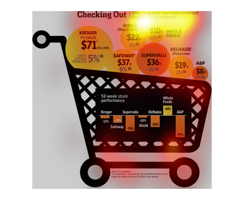
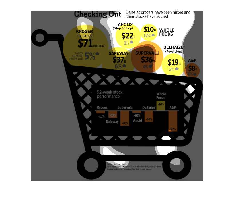
Sells at grocery stores mixed and stocks soured.  Kroger sales up 5% to 71 billion. Ahold
(stop & shop) up 1% to 22 billion. Safeway up 6% to 37 billion. Whole Foods up 12% to 10 billion.
Delhaize (food lion) up 2% to 19 billion. A&P down 85 to 8 billion. Supervalu down 4% to 36
billion.  52 week stock performance: Kroger down 13% Ahold down 10% Safeway down 33% Whole
food up 44% Delhaize down 52% A&P down 97% Supervalu down 70%

This chart from the Wall Street Journal shows how the average cart size for grocers is flat
lining or decreasing, which is having impacts on the stock prices

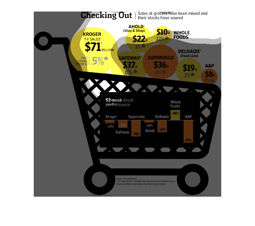
This chart shows the sales change in different grocery stores from 2011 and their stock performance.
Kroger's sales increased by $71 billion, Supervalu sales have decreased by $36 billion. Whole
Foods stock increased by 44%, all others decreased.
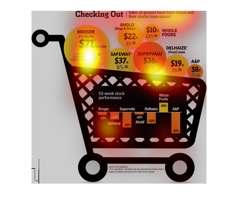
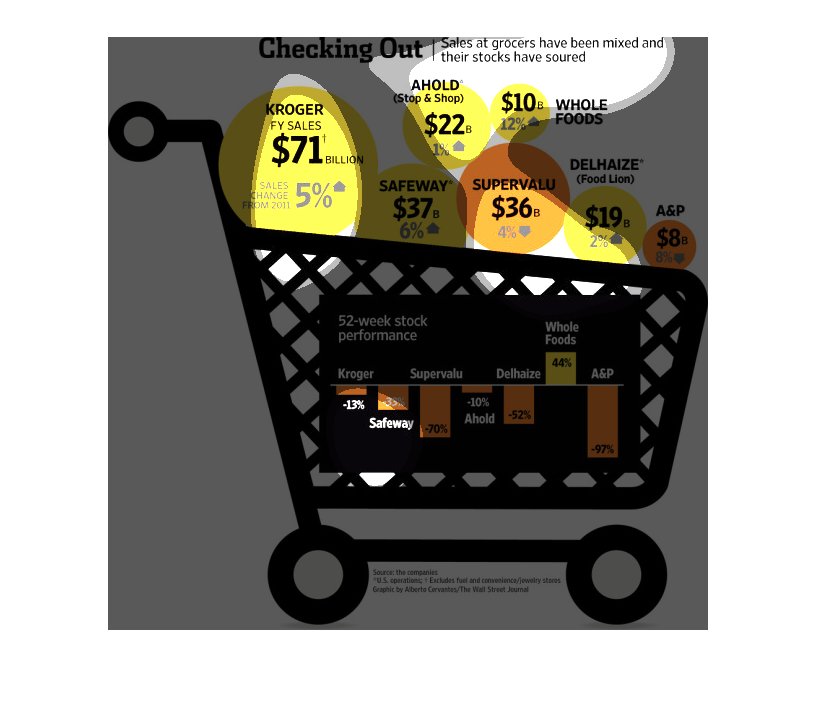
This chart describes checking out. Specifically, sales at grocers have been mixed and their
stocks have soured. Different categories are represented by different colors.
Shopping these days has become a real chore, especially for people on a budget. In this country
you need to learn the value of stretching a dollar in order to survive, and know where to
buy your food according to this graphic.
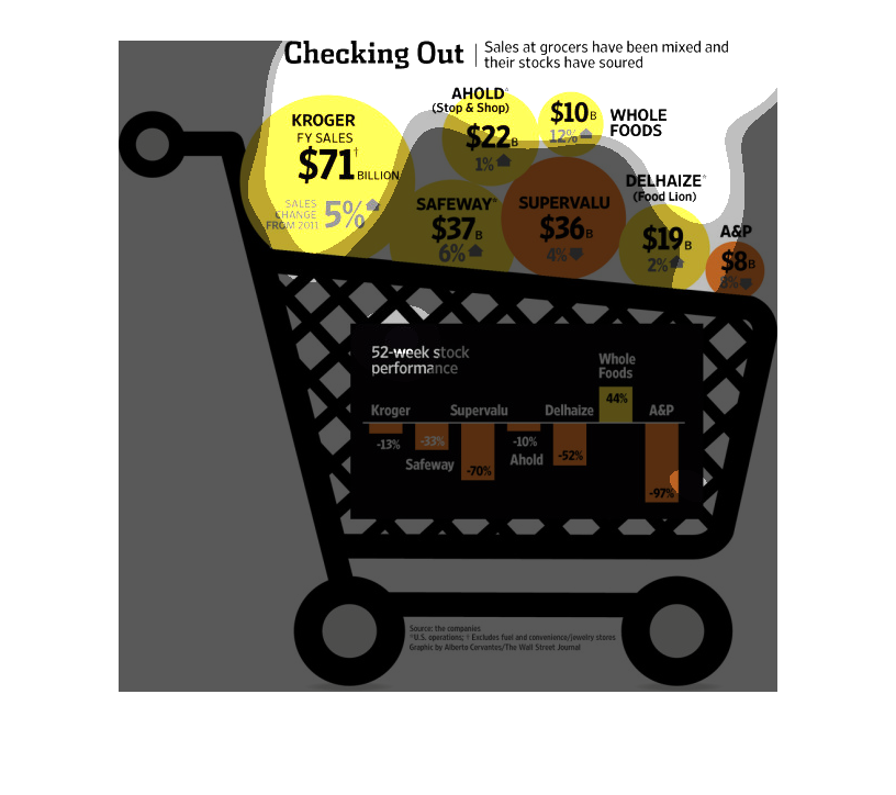
This chart describes checking out. Specifically, sales at grocers have been mixed and their
stocks have soured. Different categories are represented by different colors.
This chart details the sales at different grocery store chains throughout the United States
with Kroger having the biggest market share, followed by SuperValu and Safeway.
This chart from the Wall Street Journal shows how sales growth per transaction at grocery
stores has flat lined or decreased, leading to decreases in share price
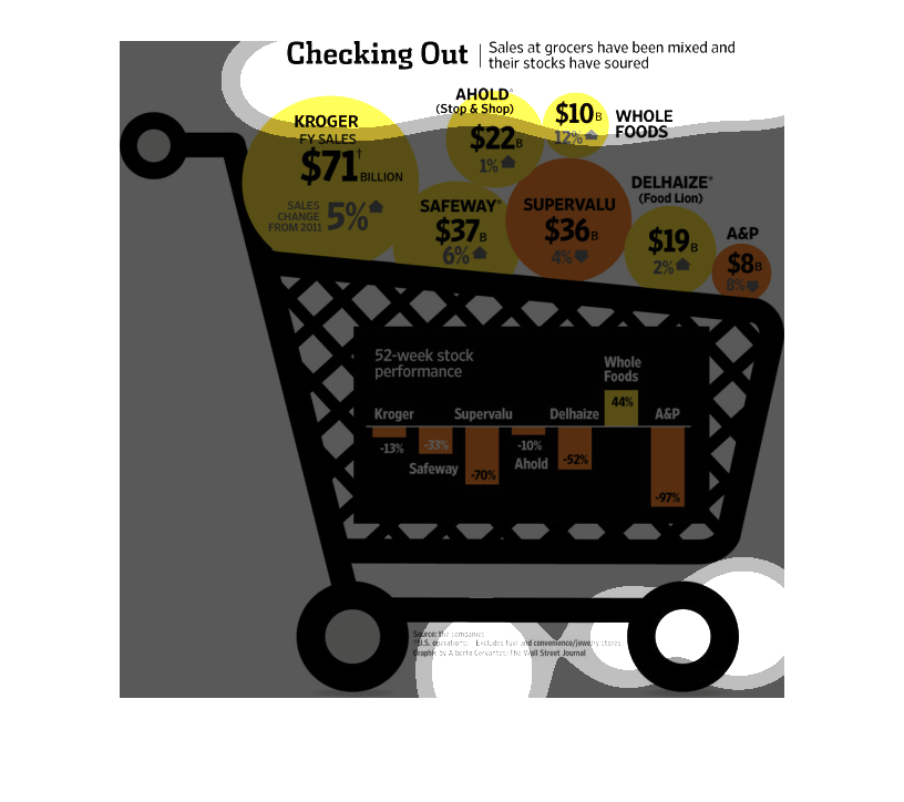
This graph/chart displays that grocery store shopping has been varied, but stocks have been
souring. Krogers is at top with 71 billion sales. The other on the list includes Supervalue
and Whole Foods.
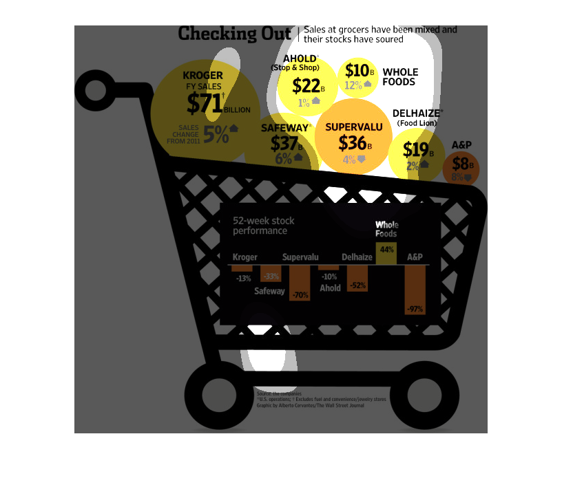
This is a diagram of a shopping cart with related statistics overlaid depicting that sales
at grocers had been mixed and and their stock prices had soured.

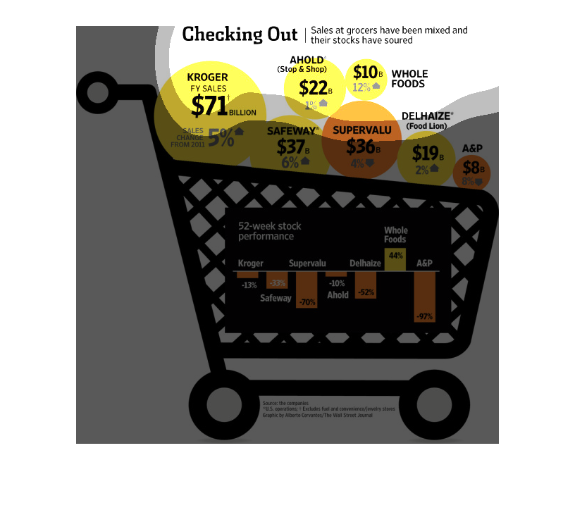
This chart shows the sales of major grocery stores in us. It compares the  percentage of sales
increases broken down by each grocery store over a time period
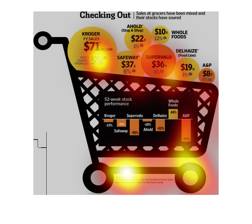
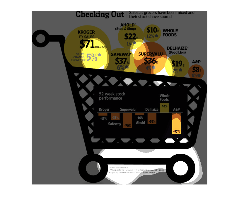
This graph depicts the total revenues for large grocers, and their year over year change.
 At the bottom of the chart is each grocers' stock price change in the last 52 weeks (dated
2011).