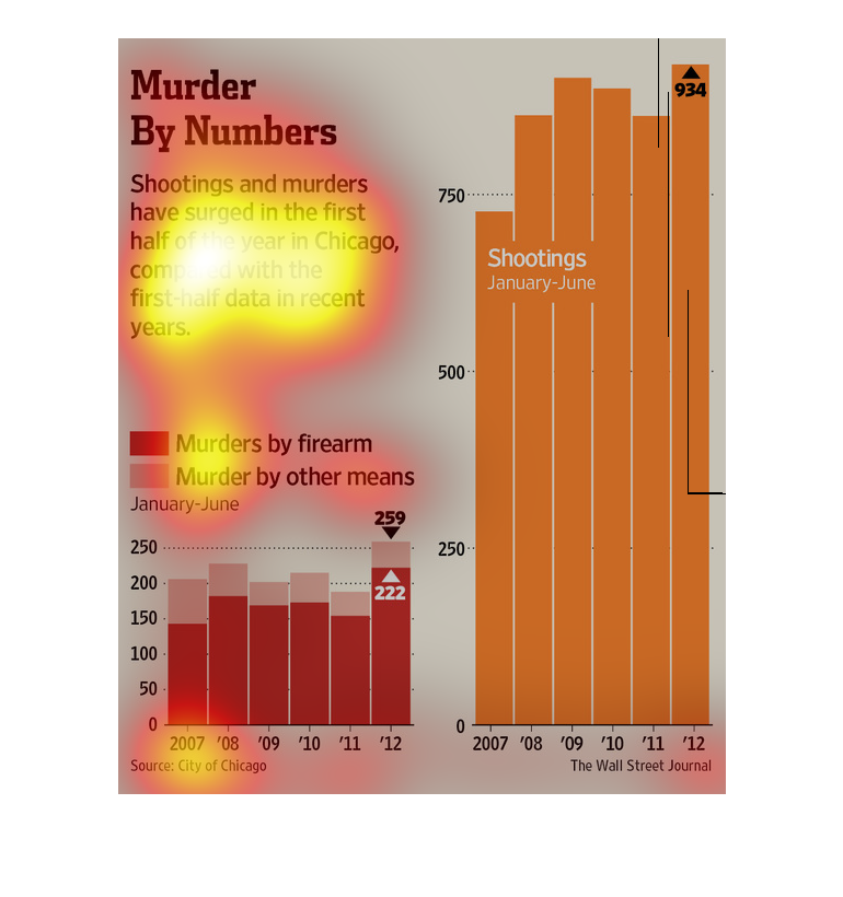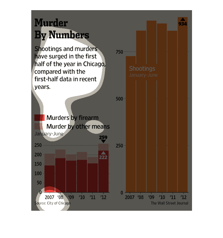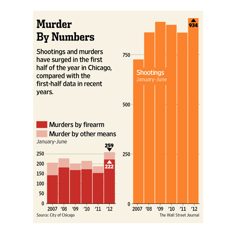
These graphs show the number of reported shootings and total murders (from both firearms and
other means), in the city of Chicago over the period of 2007-2012.
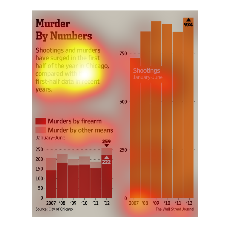
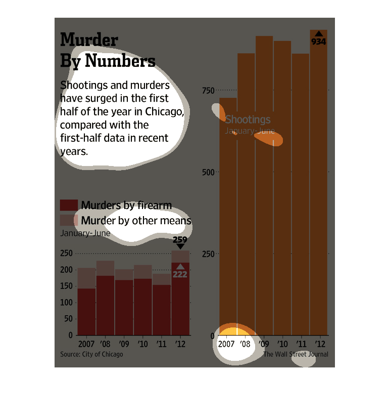
The caption for this graph is, "Murder By Numbers, Shootings and Murders have surged in the
first half of the year in Chicago compared with the first half data in recent years ".  There
are two bar graphs displayed.  One graph depicts murders that occurred with a firearm and
those committed with out one.  The other graph depicts shooting between January and June from
2007-2012.

This chart/graph displays that murder is on the high for Chicago. It contains a graph of murders
by firearm and murders by other means from January to June.
The image depicts murders and shootings increasing in the first half of the year in Chicago
compared with the first-half data in recent years. Murders have increase by hundreds compared
to prior years.
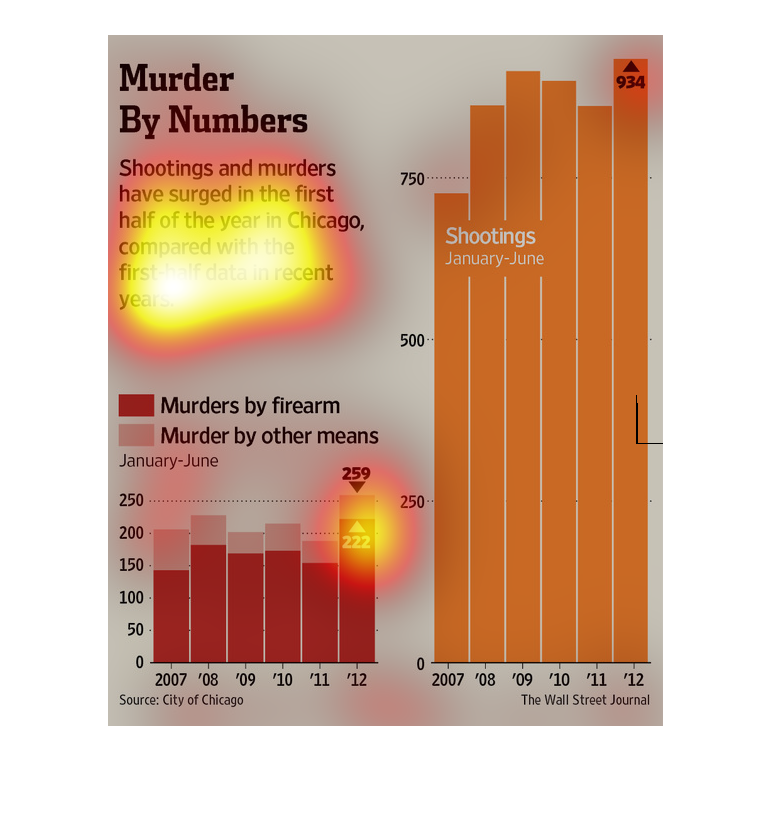
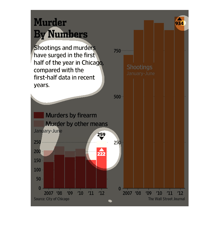
This chart from the Wall Street Journal shows how the murder rate in Chicago is rising rapidly
and has reached record highs each year over the past few years
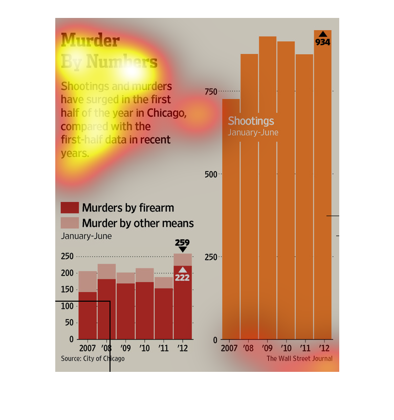
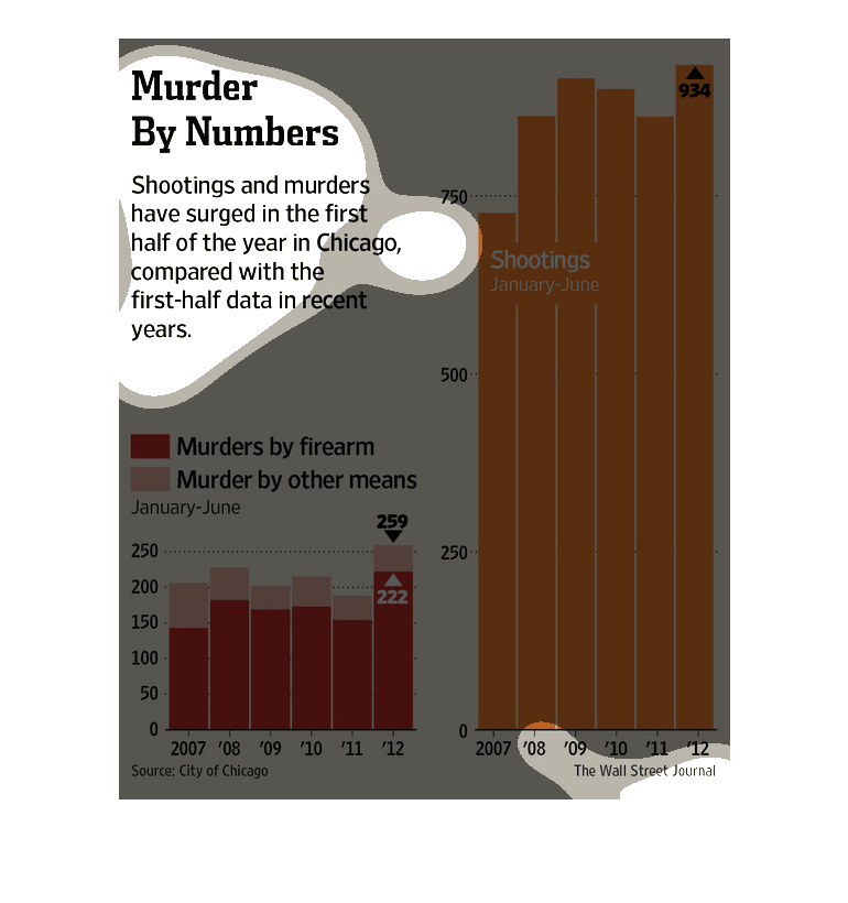
The left graph shows murders by firearm compared to murders by other means.  The left graph
shows number of shooting from 2007 to 2012, the same period of time.
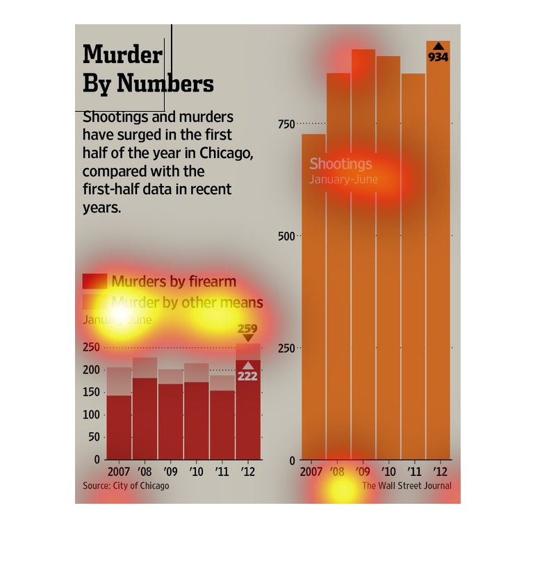
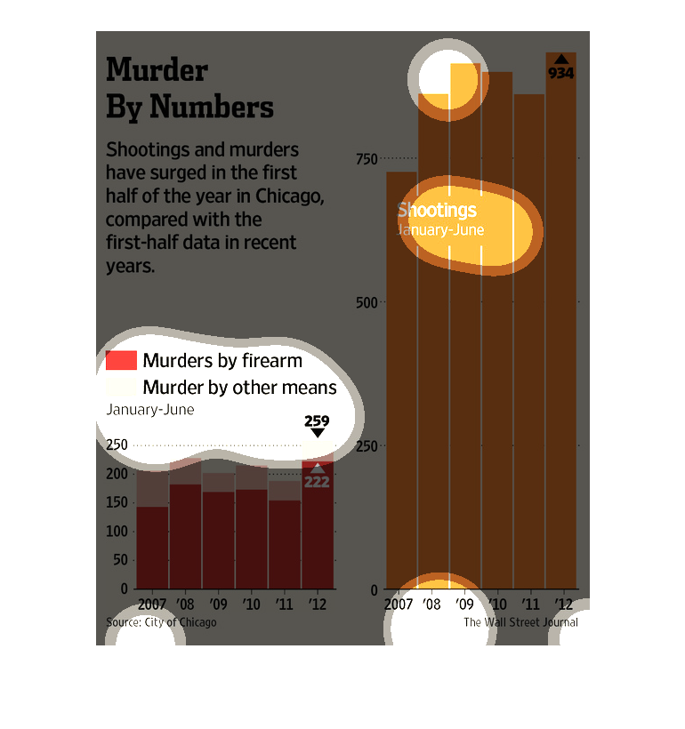
This chart describes murder by numbers. Specifically, shootings and murders have surged in
the first half of the year in Chicago compared with the first half data in recent years.
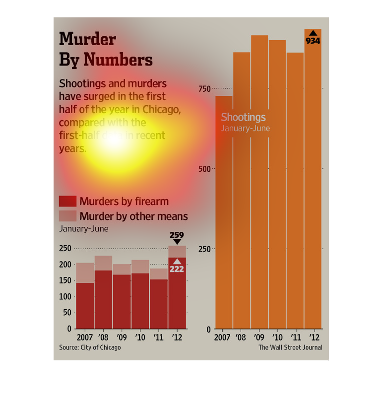
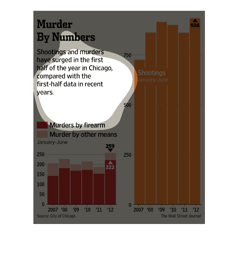
This image has three sections. There is a title and explanatory text to the top left. Below
that, and to the right, are two bar charts.  The title is Murder By Numbers: shootings and
Murders have surged in the first half of the year in Chicago compared to the first half of
years previously.  From January to June, the number of deaths is 259 and 222, respectively,
for the most recent year, compared to levels of around 200 in previous years.  The other graphic:
934 in 2012, which is higher than previous years.
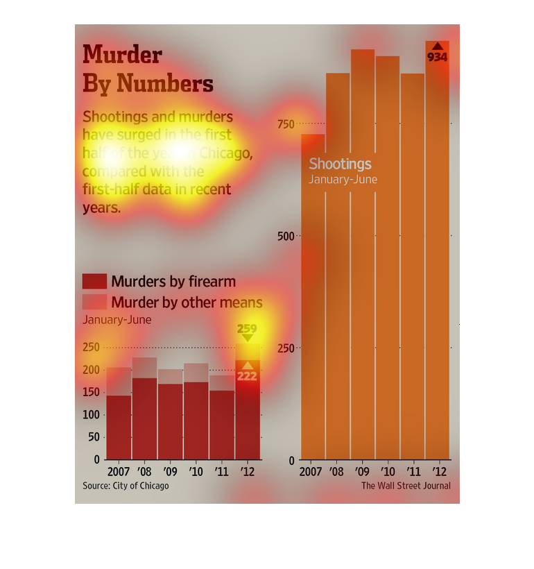
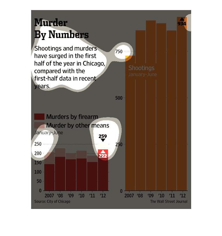
This chart describes murder by numbers. Specifically, shootings and murders have surged in
the first half of the year. Different categories are represented by different colors.
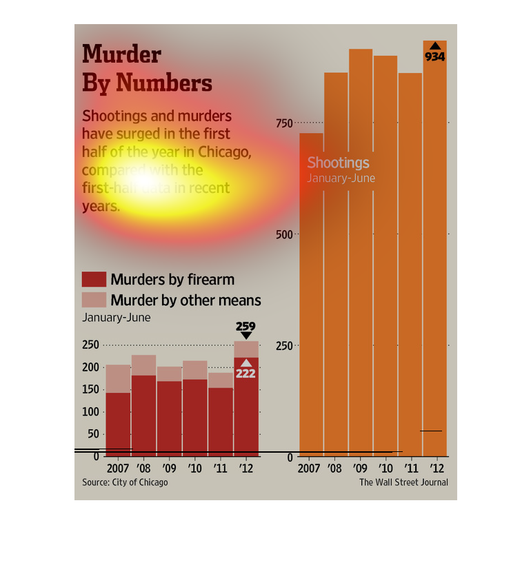
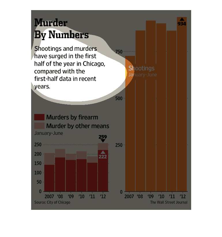
These charts show that the murder rate in chicago have risen in the first few months of 2012.
On the left is a chart color coded by firearm murders and other means, and on the right is
a graph of total shootings.
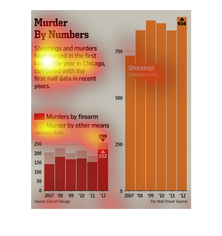
Shootings and murder rates have surged in Chicago compared to recent years.  One chart shows
percentages of murders by arm versus murders by other means.  It shows results of murders
by other means being higher that that of with arms.
This is a chart about murder rates in Chicago. It shows that over time they are growing and
there is a chart telling whether it was by fire arms or other ways.
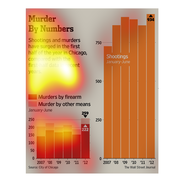
This chart shows the increase in murders (by firearm and other means) and shootings in the
first half of the year in Chicago over last year. There were 934 shootings.
In this study conducted by the Wall Street Journal from documents obtained from the city of
Chicago, gangland violence is on the rise with firearm deaths account for more than half those
reported.