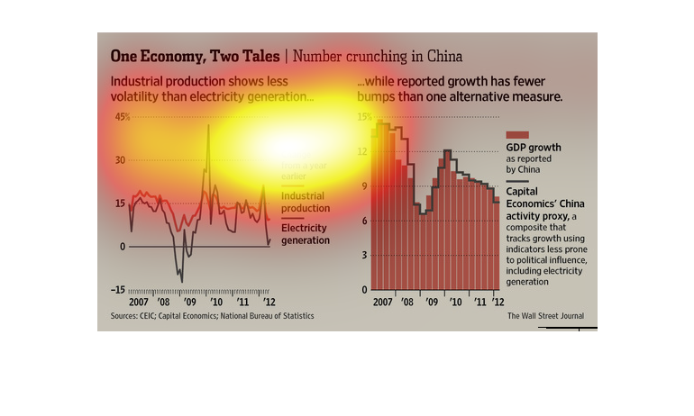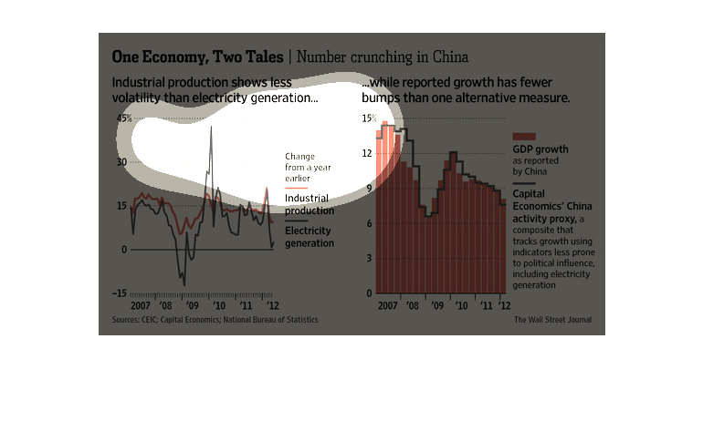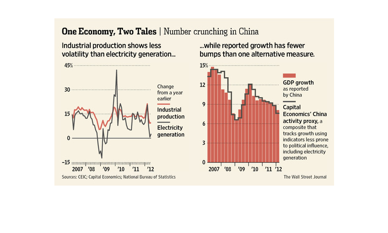
This is a series of color coded charts and graphs with related statistics depicting the various
sectors in which the country of China is either growing or slowing.
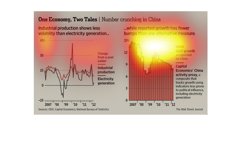
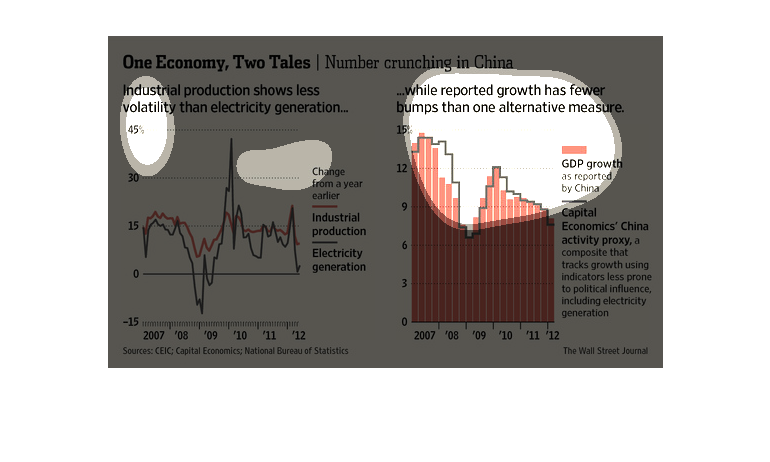
This appears to be a graph chart showing the industrial production in regards to the electricity
generated from 2007 until 2012 in China.  It displays the change from years 2007 until 2012.

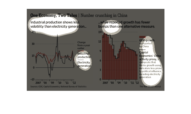
One Economy | Two Tales, number crunching in china. industrial production according to line
graph appears stable, while growth had been more up and down it appears to have plateaued.
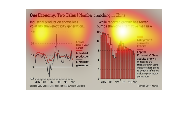
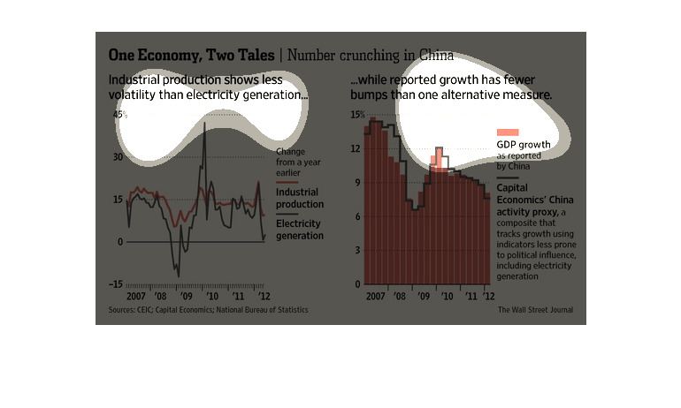
This image shows 2 graphs which shows two sides of the China's Economy.  the Graph on the
left shows that industrial productivity shows less volatility than electricity generation,
the graph on the right shows tracks GDP using factors like electricity generation
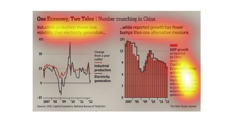
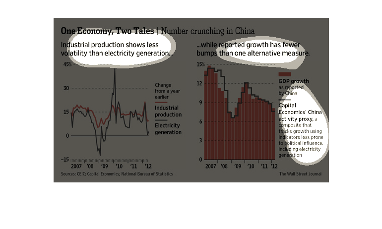
This chart describes one economy, two tales. Specifically, industrial production shows less
volatility than electricity generated. Categories include change from a year earlier.
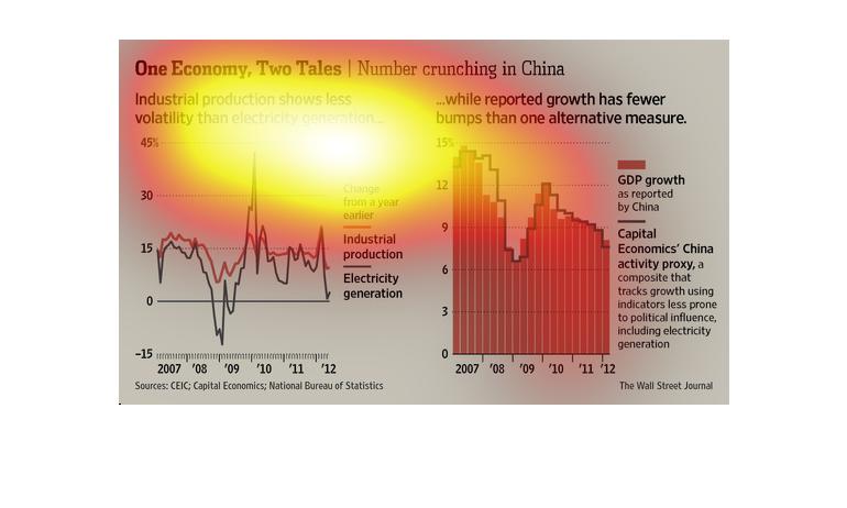
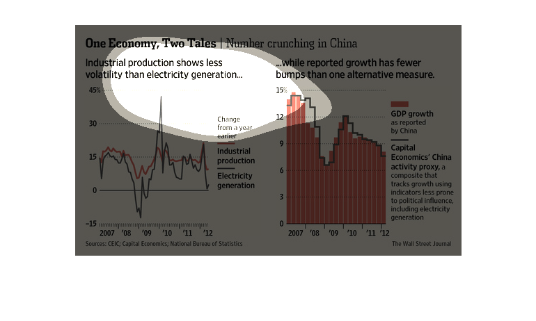
Two different graphs are showing two different sides of the Chinese economy.  One chart is
showing a lowering in volatility indicating an improving economy whereas the other is showing
the slowing growth of the economy.
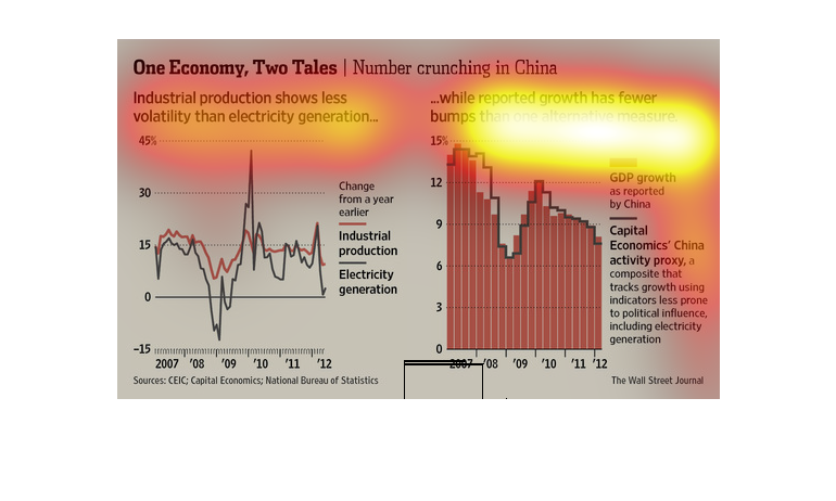
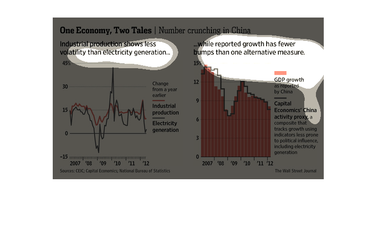
This chart from the Wall Street Journal shows how the economy  of china has changed and may
not be consistent based on the data publicly available to analysts
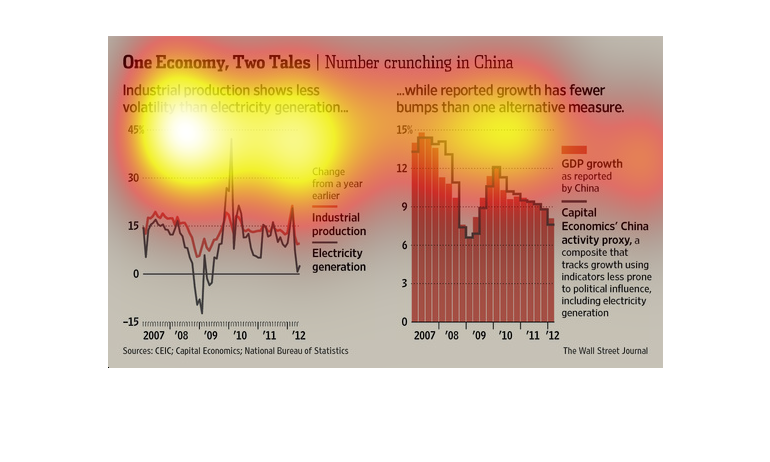
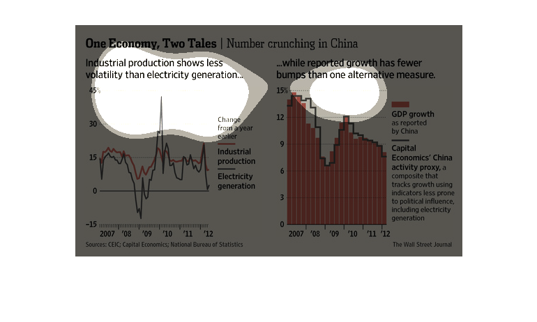
Titled "One economy, two tales| Number crunching in china." Shows a line graph comparing industrial
production against electrical generation from 2007 to 2012, with industrial production being
more stable. There's a bar graph next to the line graph showing stats about GDP.
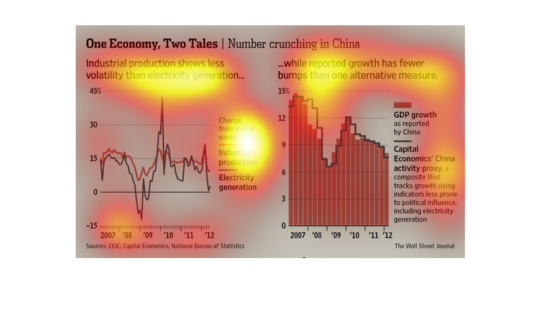
This chart from the Wall Street Journal shows how the economy in china is not matching well
with the publicly available data, specifically manufacturing capacity and GDP growth
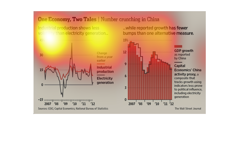
The caption for this poster is, "One Economy, Two Tales, Number crunching in China".  One
graph displays information on industrial production and electricity generation.  The other
graph displays China's GDP using a standard method along side an alternative index measuring
it's GDP.
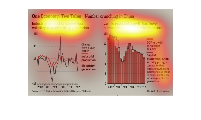
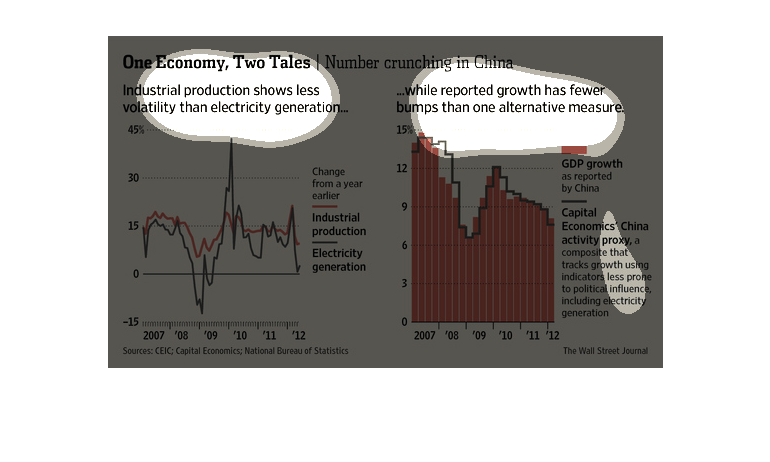
The image depicts economic statistics in China's economy. Industrial production, electricity
generation, GDP growth and capital economics are listed, and data shows leveling off and stability
in the many sectors.

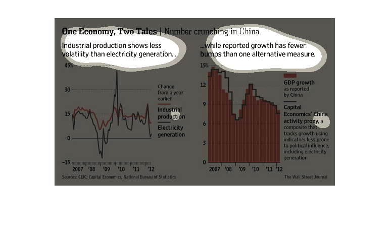
A chart from the Wall Street journal depicting economic growth in China and the relationship
between industrial growth and electricity generation. There is also a chart that compares
GDP as reported by China with indicators which are less likely to be swayed by politics.
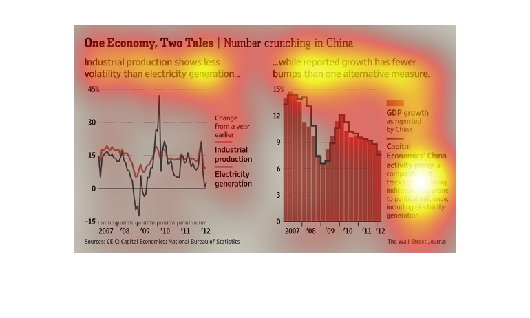
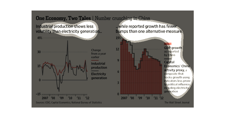
The image has a graph that shows the lack of volatility in China. The amount of volatility
has decreased when compared to the amount the electricity generation caused.