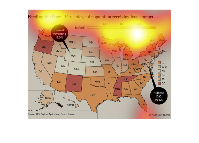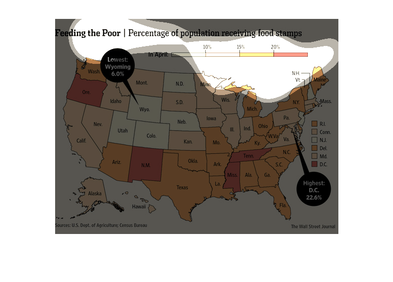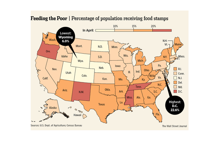
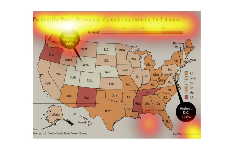
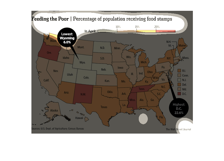
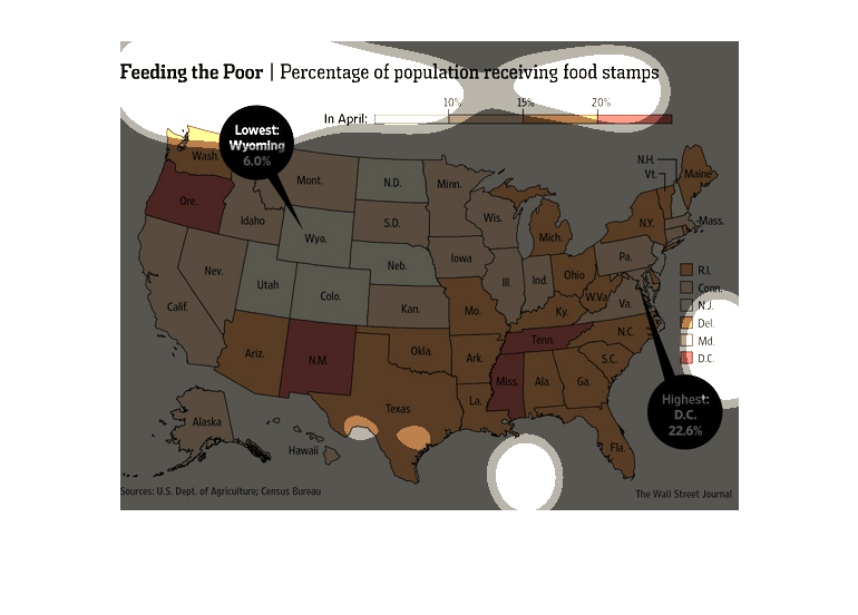
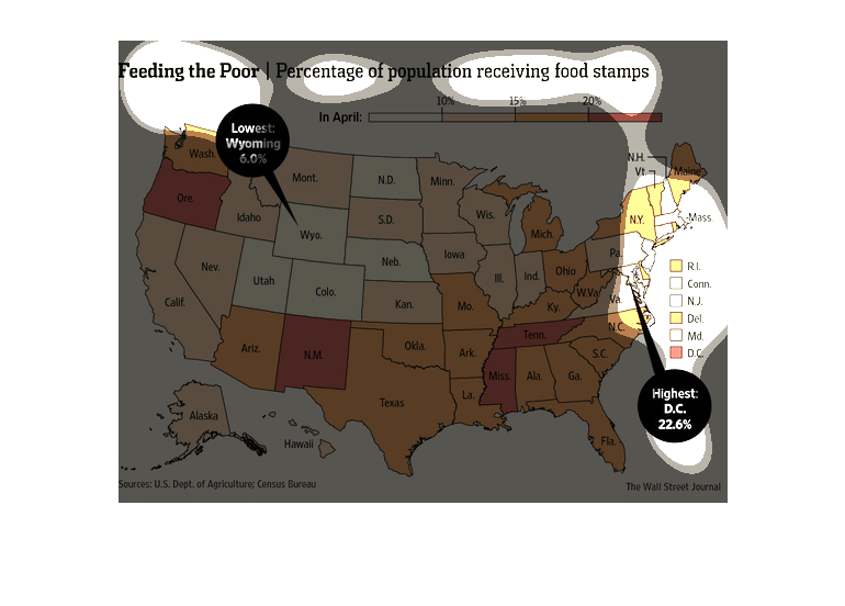
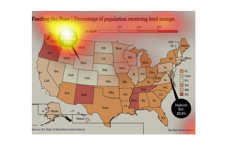
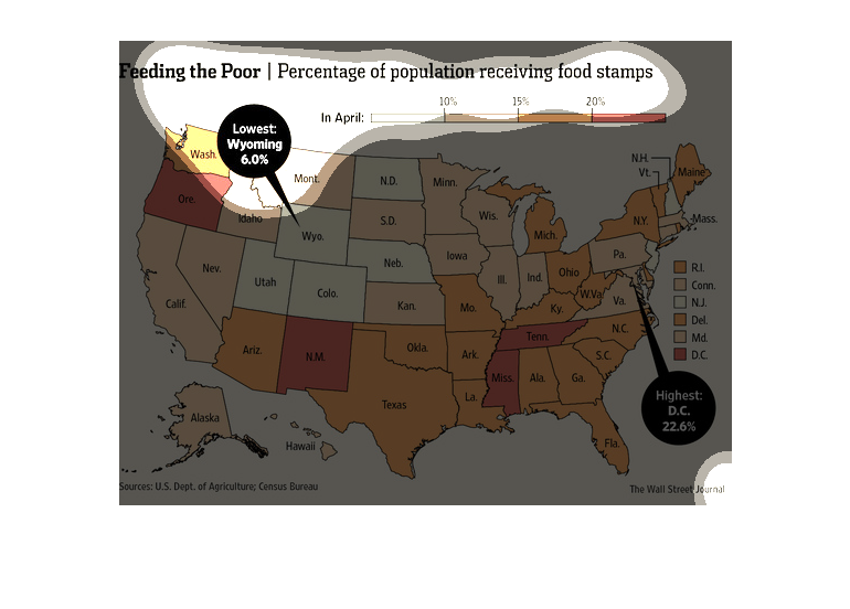
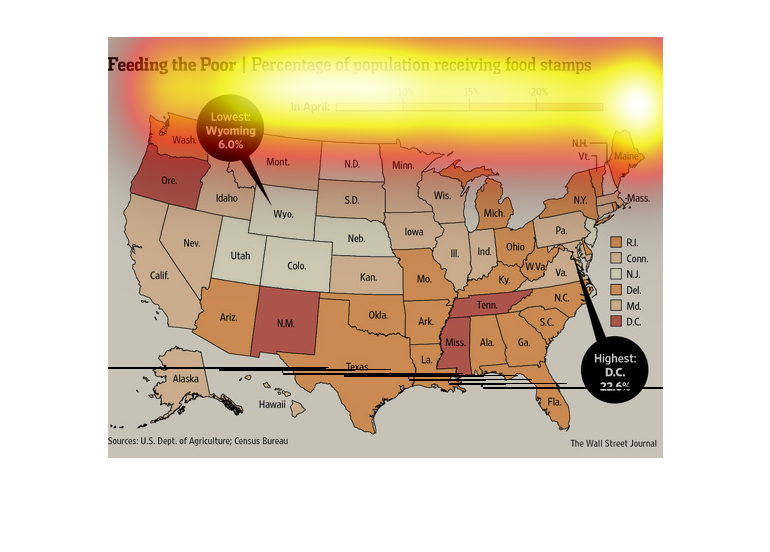
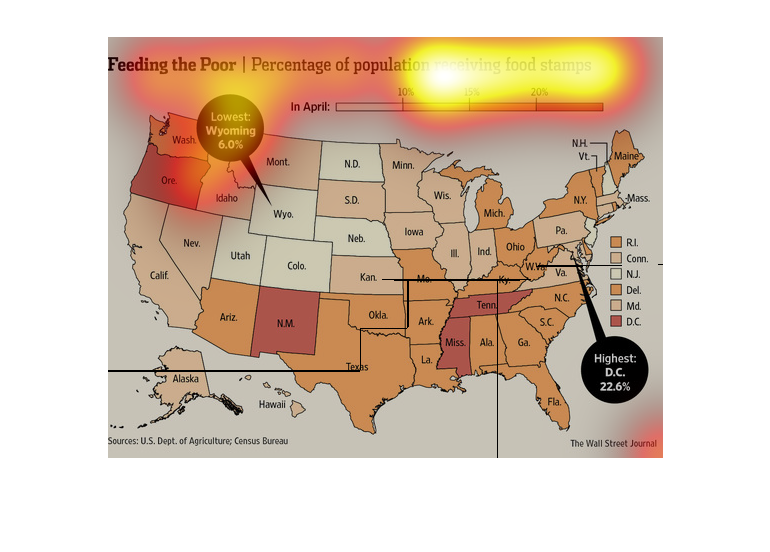
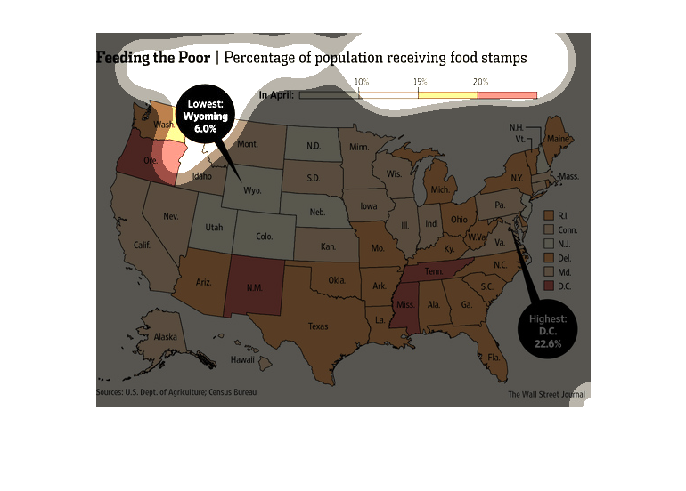
This is a map of the USA showing the percentage of people receiving food stamps. The highest
percentage is in D.C. with 22.6%, and the lowest is I Wyoming with 6.0%.
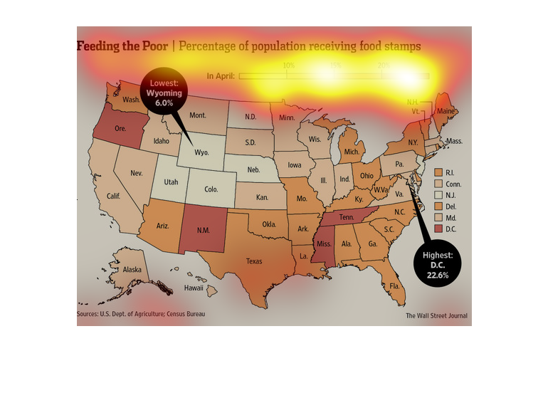
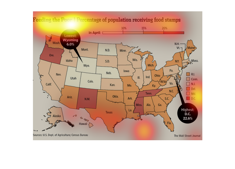
This chart is feeding the poor. Percentage of population that is on food stamps. Since April
there has been a twenty percent rise in the individuals who receive food stamps in America.
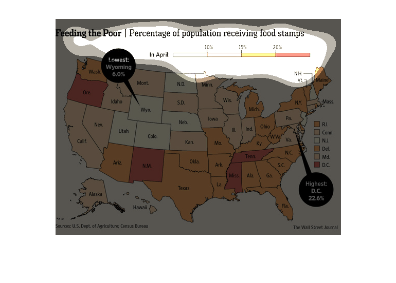
This chart describes feeding the poor. Specifically, the percentage of the population receiving
food stamps. Different categories on the chart are represented by different colors.
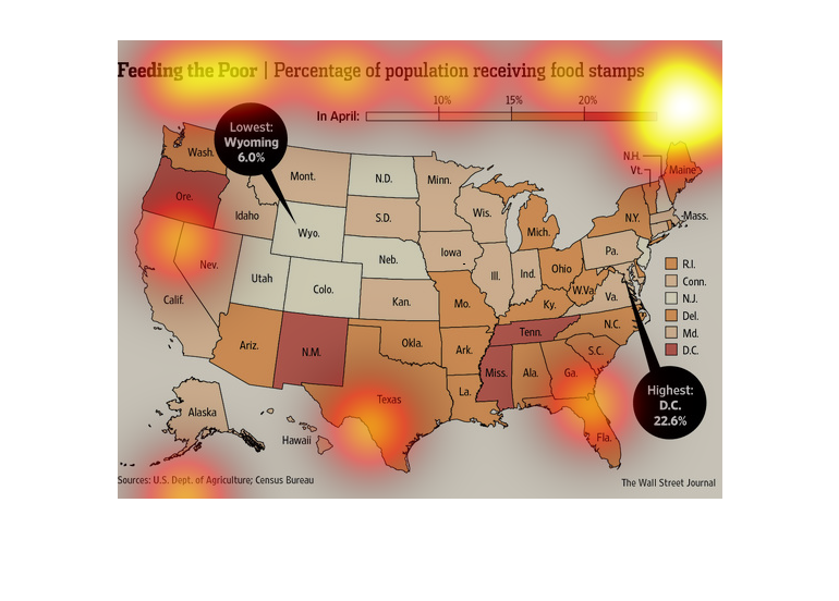
This is a heat map of the United States showing the percentage of the US population that is
receiving food stamps by area.  It shows Oregon, New Mexico, Tennessee and Mississippi with
the highest rates.
This chart describes feeding the poor. Specifically, percentage of population receiving food
stamps. Different categories are represented by different colors.
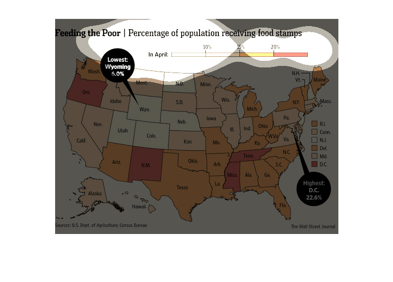
The image depicts the percentage of population receiving food stamps. A majority of states
appear to have between 15%-20% of individuals using food stamps in individual states.
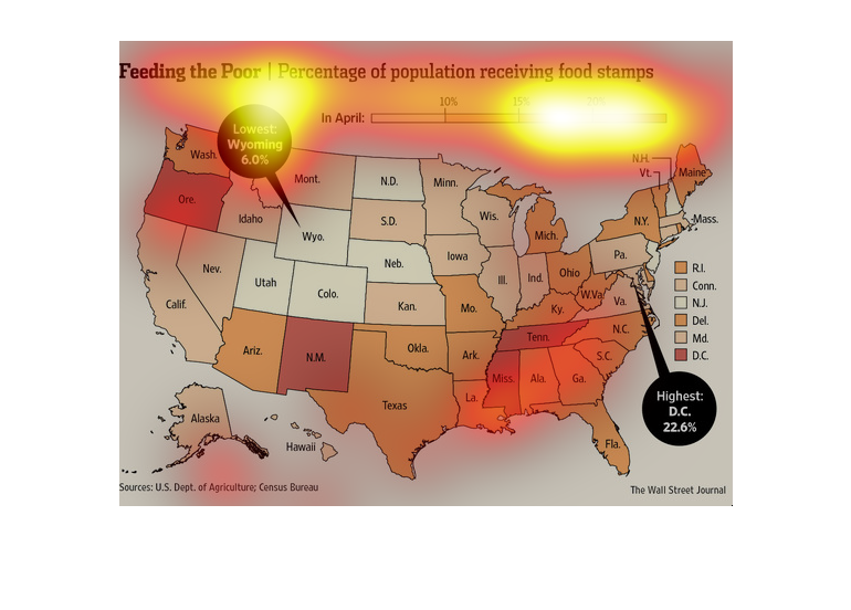
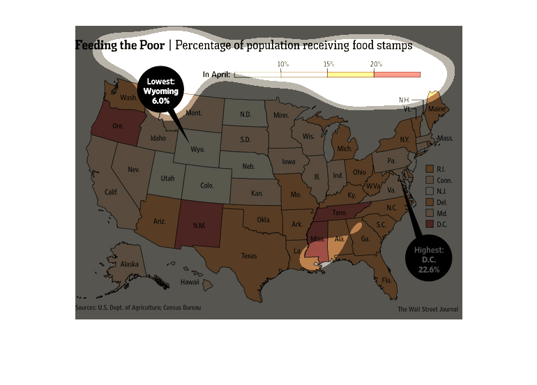
The image is a map of the united states. The map indicates the percentage of people receiving
food stamps in each state. The highest percentages is Washington DC at 22.6% and the lowest
is Wyoming at 6%

The image depicts the percentage of population receiving food stamps across the US. Wyoming
has the lowest percentage at 6.0% and Washington DC having the highest at 22.6%. Many states
hover around the 15%-20% number.
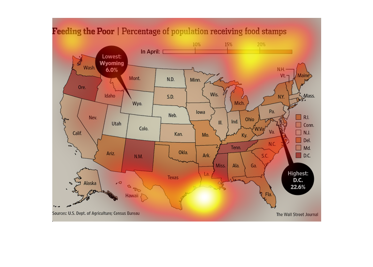
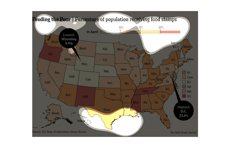
This image shows the percentage of the population of the United States in each state. The
lowest percentage is in Wyoming, while the highest percentage is in Washington D.C.
This chart from the Wall Street Journal shows how the population of food stamp recipients
is distributed within the united states and in the south in particular
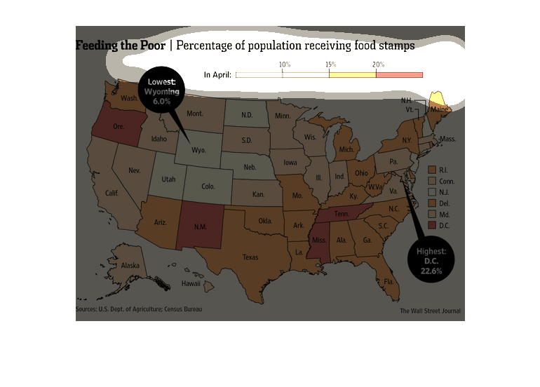
This chart from the Wall Street Journal shows the population of each state that is receiving
federal food stamp benefits, which is primarily the south.
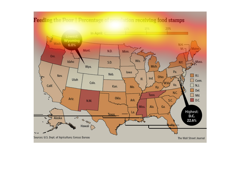
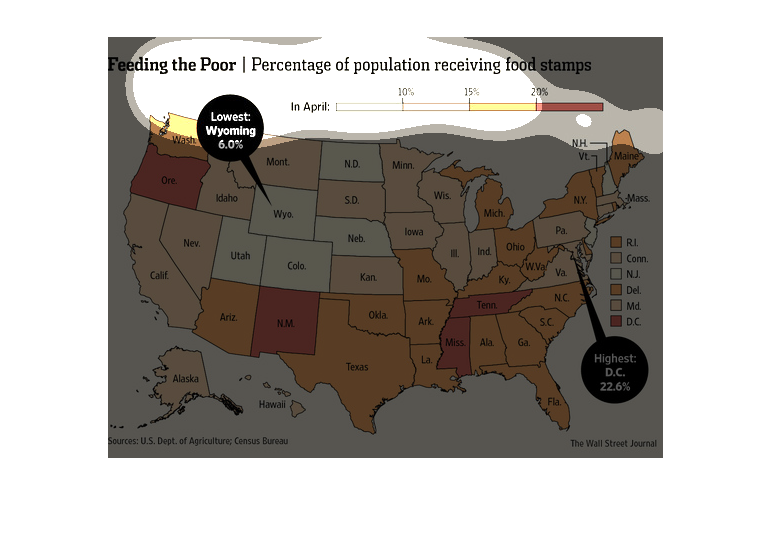
This is a US map illustrating feeding the poor showing population receiving food stamps by
state.  Wyoming has the lowest percentage and DC has the highest percentage.
There are a lot of hungry mouths to feed in America, as this study from the Wall Street Journal
leads us to believe. From research obtained by the U.S department of Agriculture, people on
food stamps are on the rise.
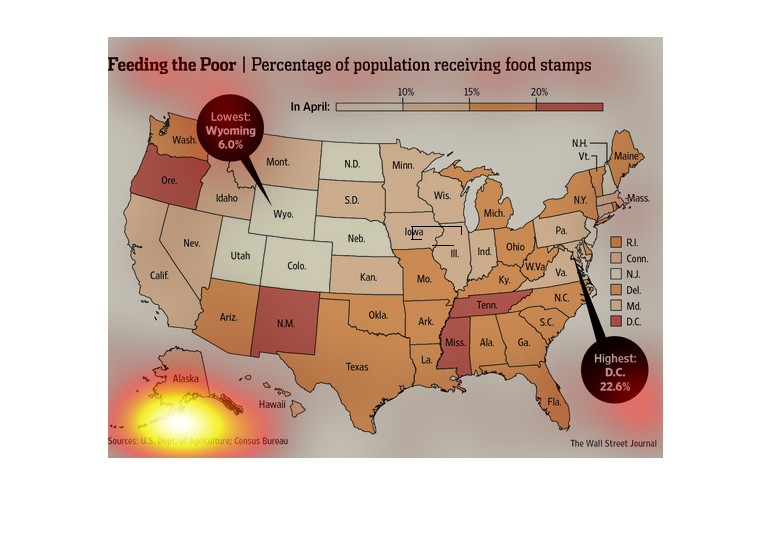
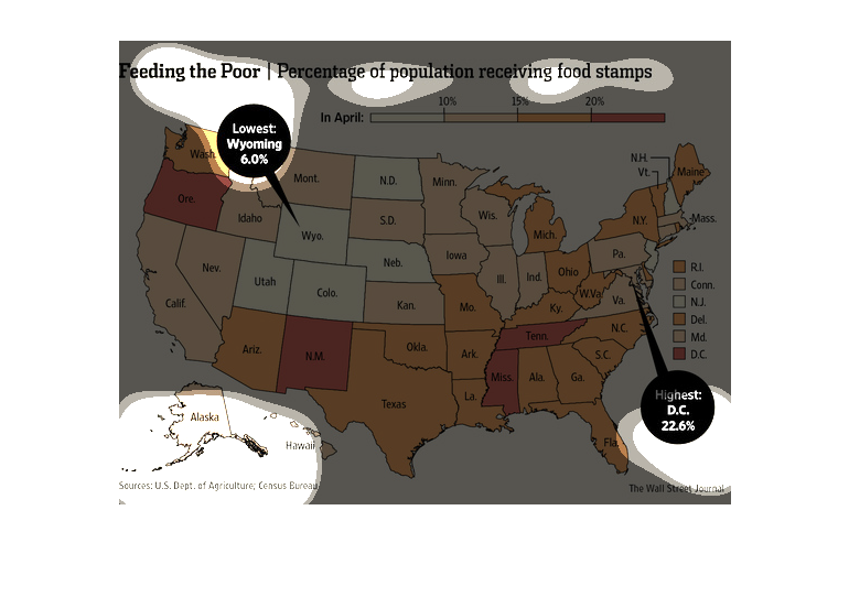
This graph illustrates the percentage of people receiving food stamps per state. The graph
is attempting to illustrate not only national but state stats as well.