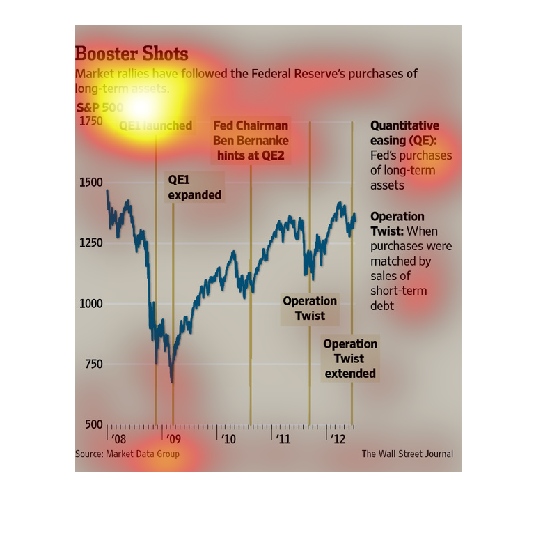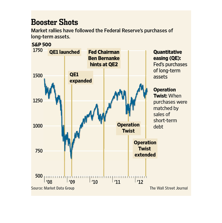
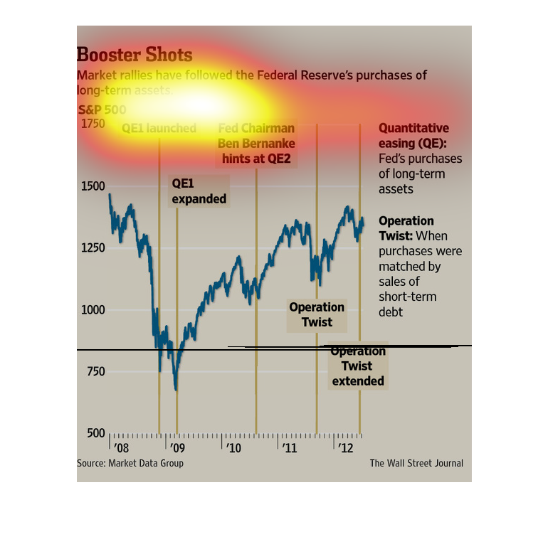
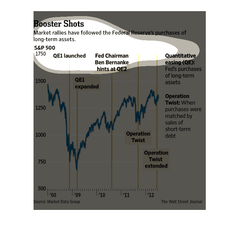
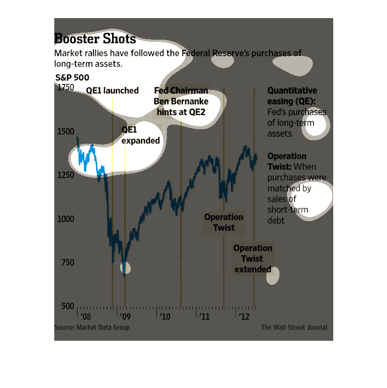
The caption for this poster is, "Booster Shot, Market rallies have followed the Federal Reserve's
purchases of long term assets".  This poster features one graph that follows trending data
patterns of the Federal Reserve between 2008-2012 and their acquiring of long term assets.
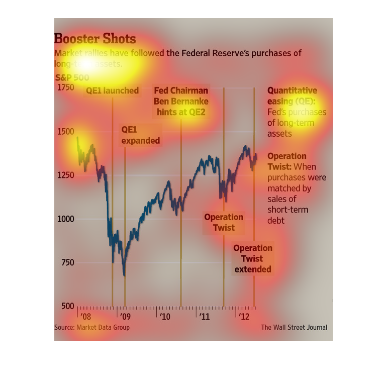
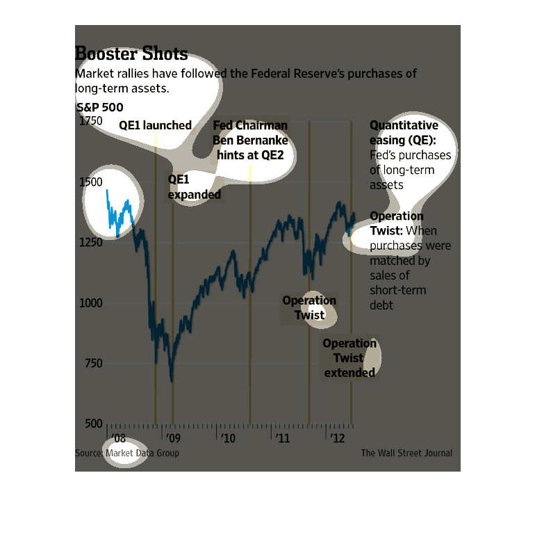
This image shows or depicts in line graph statistical format information concerning booster
shots. Market rallies have followed the Federal Reserve's purchases of long-term assets.
This graph shows how the market reacts after the Ferderal Reserve buy bonds in an effort to
stimulate the economy. It is a simply line graph that shows the s&P 500 index over time.
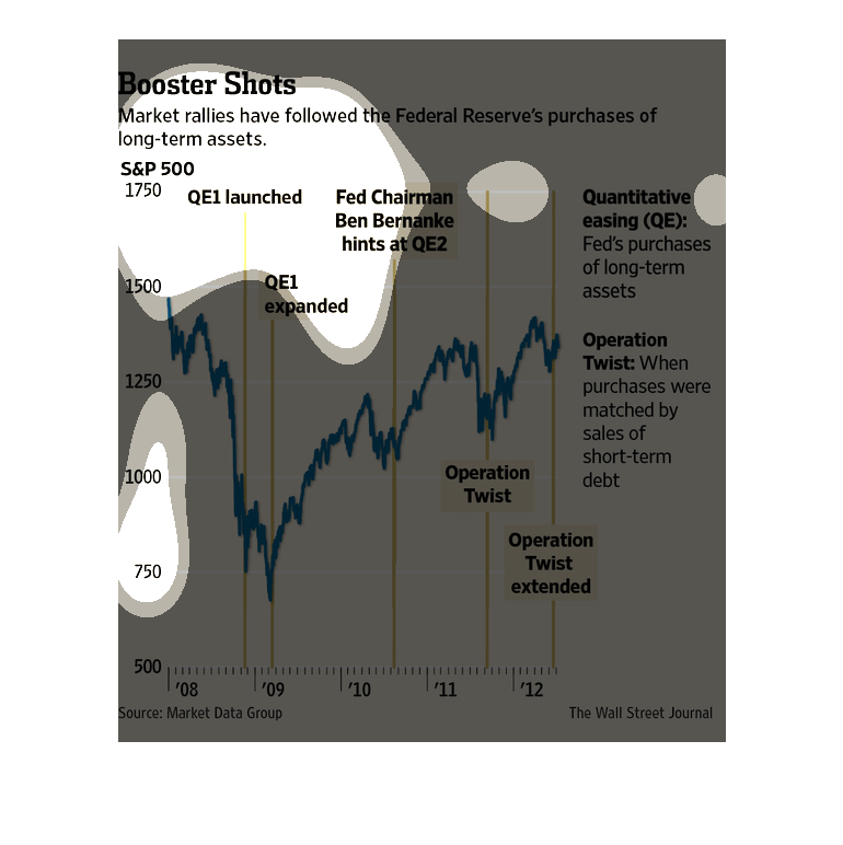
This chart from the Wall Street Journal shows how the federal reserve's changes in interest
rates have boosted growth in the stock market, which may be a bubble
This is a chart of Booster Shots describing the market state following actions by the Fed
over multiple years. There was an initial plunge and then Federal Reserve strategies took
the market back up.

This chart from the Wall Street Journal shows how the market, specifically the S&P 500, have
changed or grown after the Federal Reserve has altered its bond buying
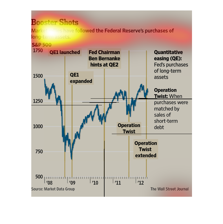
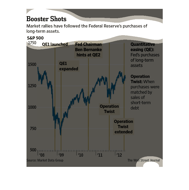
This graph from 2008 to 2012 shows the markets uptick as the federal reserve purchases assets.
Specific purchases are denoted along the timeline as the years progress.
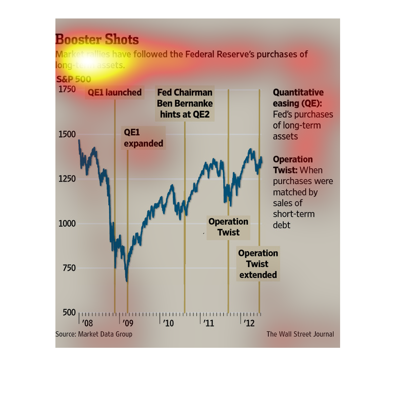
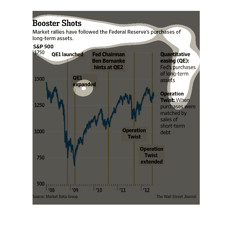
This is a large graph of the federal reserves purchasing of certain assets. It shows the amount
and that is put up against the amount of time that has passed.
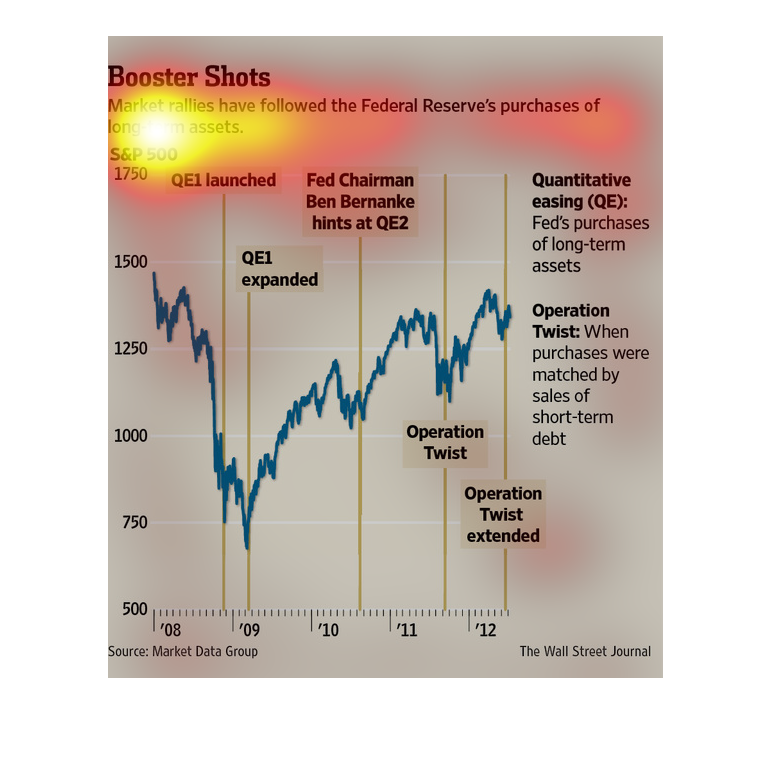
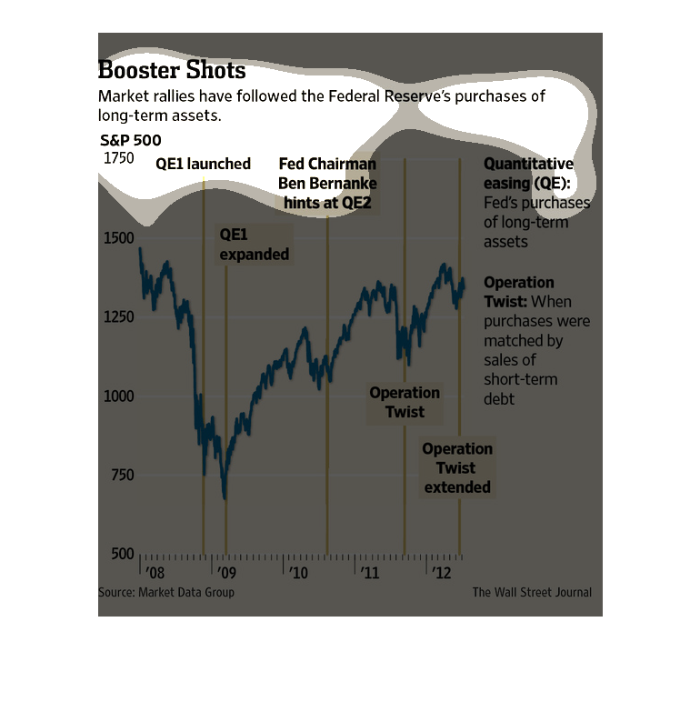
The title of the graphic is boosted shots. It says that market rallies have followed the federal
reserve's purchases of long-term assets. It shows the feds purchases of long term assets.
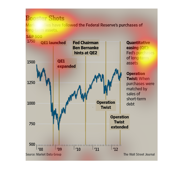
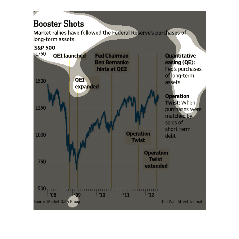
This chart describes boosted shots. Specifically, market rallies have followed the federal
reserve's purchases. Categories include quantitative easing.
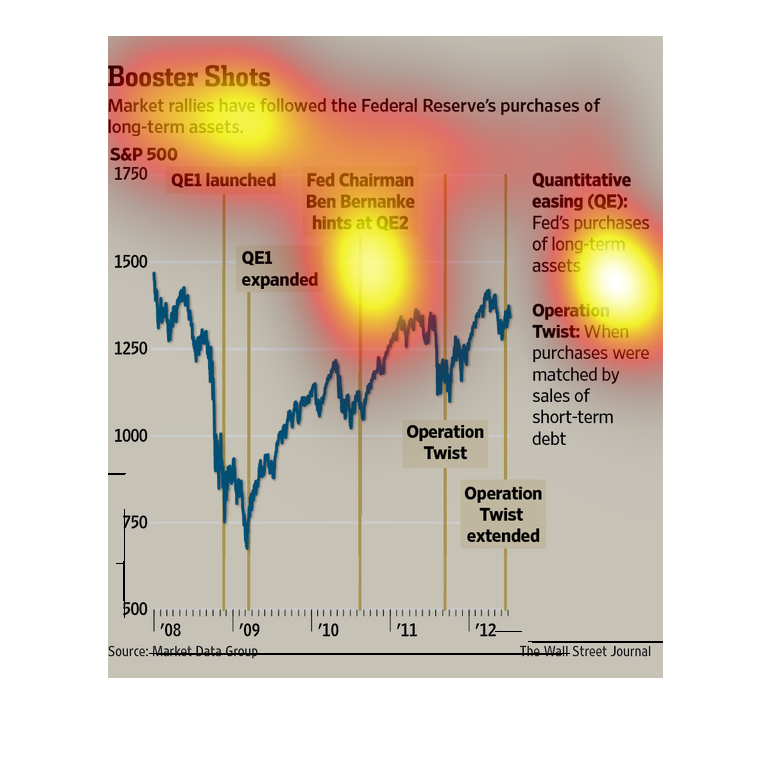
This graph is about Market rallies that have followed the Federal Reserve's purchase of long-term
assets from 2008-2012. It shows that they were at their lowest during 2009.
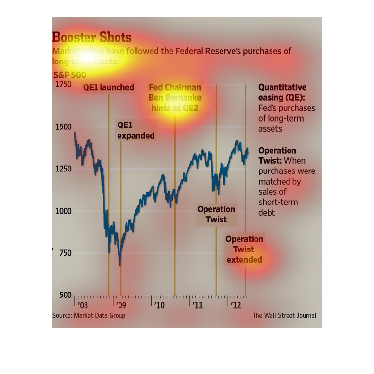
This chart describes booster shots. Specifically, markets rallies have followed the federal
reserve's purchases of long term assets. Categories on the chart include QE1 Expanded.
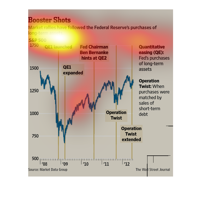
This is a color coded chart with related statistics depicting that market rallies had followed
the Federal Reserve's purchases of long term assets at the time.
This line graph describes what the Federal Reserve has been buying as long term assets over
the years 2008 to 2012. The lowest point is in 2009, at 750.