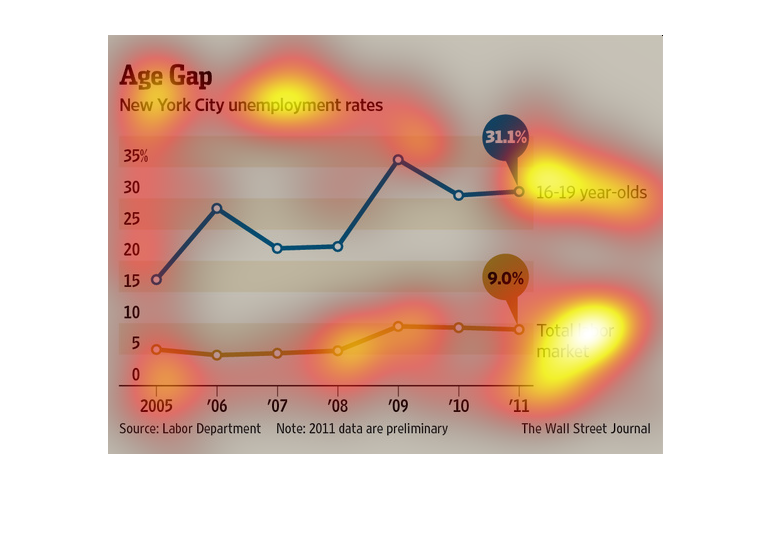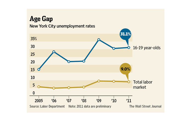
This chart from the Wall Street Journal shows how in New York City the unemployment gap is
wide for people who are young versus the overall population
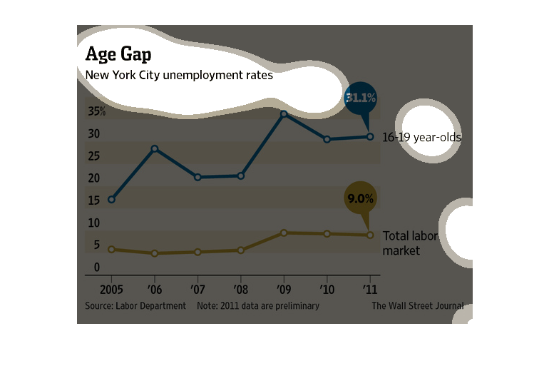
This is a series of color coded charts and related statistics depicting the New York City
unemployment rate  from the years 2005 to 2011. It shows an uptick, then a flattening.
In a study conducted by the Wall Street Journal- its source being the Labor Department- we
see from the periods of 2005 to 2011 the vast amount of unemployment in New York City residents.
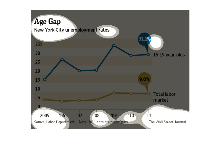
AGE GAP: Unemployment rates for New York City is shown on a single graph that spans the entire
image.  For the most recent time frame (2011), 31.1% is the rate for New York City 16-19 year
olds, while the total labor market fared at 9.0%.
This line graph illustrates New York city unemployment rates and shows they are much higher
for 16 to 19 year olds than for the total labor market from 2005 to 2011.
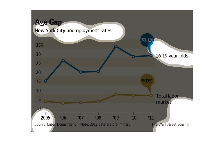
This image is entitled "Age Gap."  Is shows New York City unemployment rates.  Percentages
(on left side of graph) range from 0% to 35%.  Dates range from 2005 - 2011.  Over this length
of time, according to the chart, the total labor market is at 9% and 16-19 year-olds comprise
31.1% of the unemployment market.  Data was obtained from The Wall Street Journal.
This chart describes the age gaps between those in the labor market of New York from the years
of 2005 to 2011. From the graph we can see that there are two spikes where there was an increase
in the number of 19-year olds. These spikes also indicate that there was a great increase
in the age gap between 19-year olds and those in the labor market. However, from the graph
we can see that the labor market is increasing overtime but not significantly. From the graph,
we could possibly predict these trends could be due to more younger people joining the work
force and older people who have retired or are in the later years of their career have returned
to work.
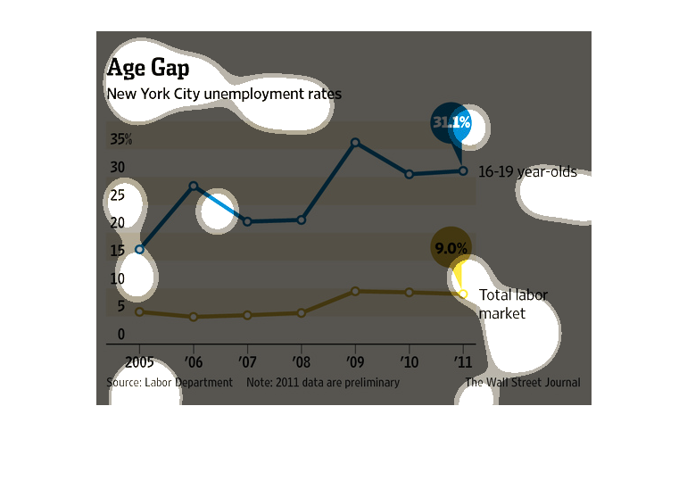
This chart describes age gap. Specifically, New York City's unemployment rates. Different
categories on the chart are represented by different colors.
This chart from the Wall Street Journal shows how the unemployment rate between young and
older populations is large in New YOrk City during the recession
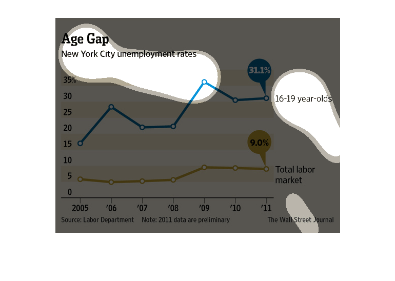
This image shows the unemployment rate in New York City, and how 16 to 19 year-olds are less
employed than the total labor market. Overall, this age group is less employed than in 2005.
The image shows the age gap in unemployment rates with a line graph. It shows that the unemployment
rates of 16-19 year olds is 31.1% while the general unemployment is 9%.
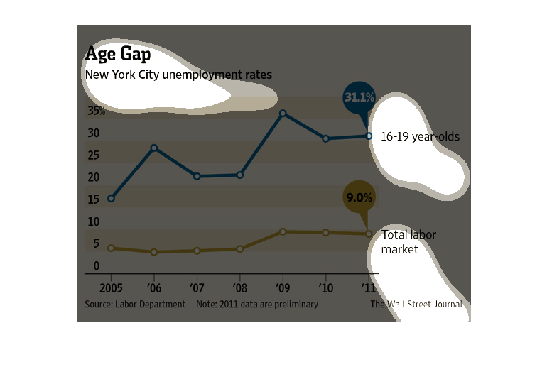
This image graphs the age gap in New York City unemployment rates. Between 2005 and 2011,
unemployment amongst 16-19 year-olds has risen from approximately 15% to 31.1%, whereas unemployment
in the total labor market has showed a much less significant increase of approximately 5%
to 9%.
This chart shows the age gap in New York City's unemployment rate. In 16-19 year olds throughout
the years, it shows that the unemployment rate varies greatly. In the entire job market, the
rate has remained pretty stagnant from 2005-2011.