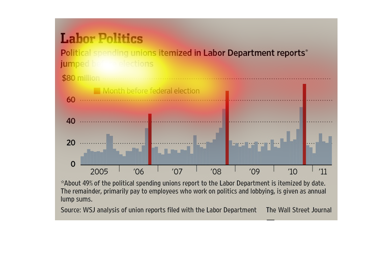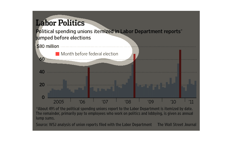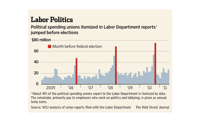
This chart from the Wall Street Journal shows how labor unions in the united states spent
funds on political activities and how it has spiked in election years
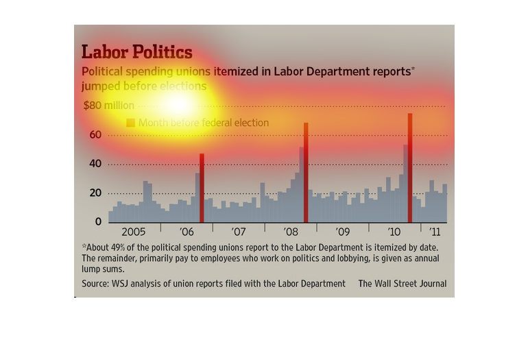
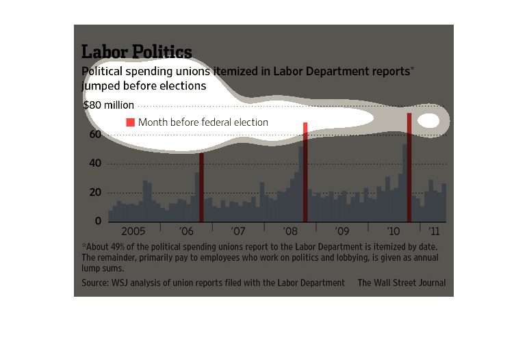
This chart describes labor politics. Specifically, political spending unions itemized in labor
department reports jumped before elections. The highest spike on the chart comes in 2010.
This bar chart shows political spending that unions itemized in labor department reports and
how the amounts jumped before U.S. presidential elections.
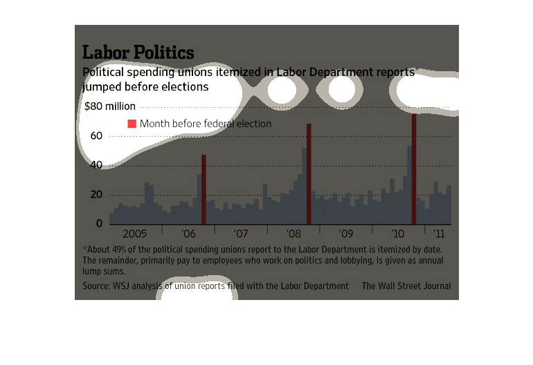
Labor Politics | political spending unions itemized in labor department reports jumped before
elections, before each election there is increased spending leading up to, and then a spike
the month before election.
This is a color coded bar graph and related statistics depicting that political spending unions
itemized in Labor Department reports jumped before elections.
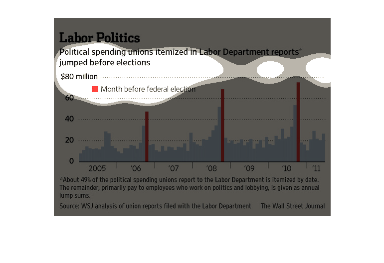
This chart from the Wall Street Journal shows how political spending by unions has increased
consistently over time and spikes in presidential years.
This chart details information regarding Political Labor spending from year 2005 to year 2010.
This chart specifically shows that amounts spent the month directly before an election soar
drastically above the previous months. This chart gets it's information from union reports
that are filed with the labor department.
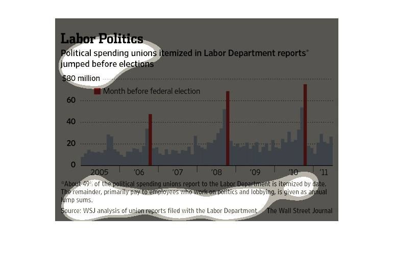
This graph shows a direct correlation of political spending increases the month before election.
 There is a slow rise of spending leading up to the election, however the month before is
the highest.  The month prior often doubles, or even triples that of non-peak spending.
In this study conducted by the Wall Street Journal from statistics obtained from the Labor
Department, we see that from 2005 to 2010 goverment spending on labor unions has gone up considerably.
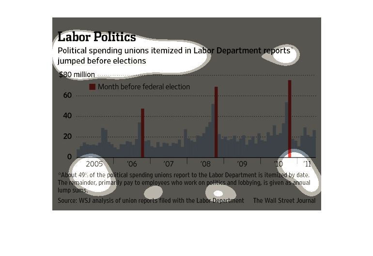
This graph depicts the political spending year by year, and shows that the labor unions spent
much much more in federal election years than any other years. The graph goes from 2005 to
2011 and shows and average of 49% greater spending by the labor board in election years.
The image depicts political spending unions itemized in labor department reports. The data
indicates that spending increases greatly the month before a federal election takes place.
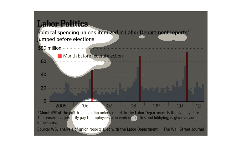
This is a bout political spending and unions. It shows in this chart that it is itemized by
the date. The chart shows an increase of this as time goes by.
This chart describes labor politics. Specifically, political spending unions itemized in labor
department reports. Different categories are represented by different colors.
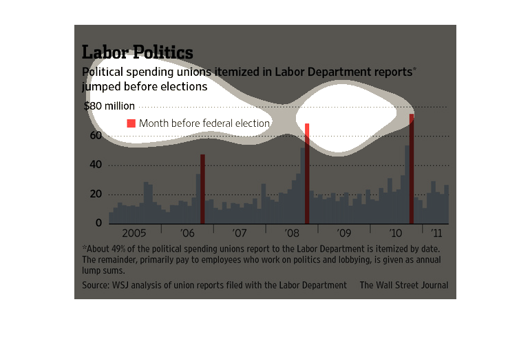
This graph is illustrating the of money spent for "political spending". The graph not only
shows the amount of money spent, it also itemizes the amounts.